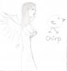
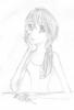
My Lame Art! cuz it's fun :P
#1
Posted 11 August 2004 - 01:24 PM
newho, my little doodle of a girl...no one in paticular...if i went to the trouble of giving her red hair she'd be me, but i'm too lazy for that, so here we go
(by the way feel free to criticise...constructive please tho, i'm fragile :lol: but go for it, i'm posting it here to improve, so any suggestions would be great)
#2
Posted 11 August 2004 - 01:46 PM
face, not so pointy,
the chin should line up with the left eye
can't think of anything else. must mean its very good, which it is
#4
Posted 11 August 2004 - 05:46 PM
Anyways, good job!
#5
Posted 11 August 2004 - 06:47 PM
My artwork is an insult to everything known as art. Now, that is lame...
Nice job Kate ^_^
#8
Posted 11 August 2004 - 10:07 PM
Quote
#9
Posted 12 August 2004 - 01:21 AM
It's good, but it's not all that great. You got a little bit of the kiddie American curves and such, so I suggest looking at some anime material. You know, Google Image search for things like Angelic Layer or Inu-Yasha, or maybe even look at some of Camelot's artwork on Golden Sun. Maybe you might improve. :joy:
And that kinda looks like Bakura from Yu-Gi-Oh!, by the way.
#11
Posted 12 August 2004 - 11:07 PM
Practice makes perfect! :( Keep it up, it looks spiffy.
#14
Posted 27 August 2004 - 08:35 PM
just make the face less pointy. and add a little more detail. otherwise, it's good. nice job. i'll show that one i was talking about anyway.
#15
Posted 27 August 2004 - 08:52 PM
#16
Posted 28 August 2004 - 04:38 PM
#17
Posted 28 August 2004 - 05:26 PM
#18
Posted 28 August 2004 - 05:28 PM
kate, on Aug 28 2004, 06:38 PM, said:
This topic shouldn't be called Lame Art...Its should be called great art...
Nice Kate...I like the penguin...Cute...
#19
Posted 05 September 2004 - 06:21 PM
#20
Posted 11 September 2004 - 03:11 PM
#21
Posted 11 September 2004 - 03:40 PM
ahhh! attack of the clones (sorry)
back on kates wonderful topic ^.~
#22
Posted 11 September 2004 - 05:33 PM
#23
Posted 11 September 2004 - 05:42 PM
#24
Posted 11 September 2004 - 05:45 PM
#25
Posted 12 September 2004 - 01:11 PM
Yes, scanners are evil. EEEEVIL! They totally mangle everything.
#27
Posted 12 September 2004 - 08:56 PM
#28
Posted 12 September 2004 - 09:25 PM
#29
Posted 13 September 2004 - 08:11 AM
http://img.photobucket.com/albums/v449/lightningstar/quote06.jpg
#30
Posted 13 September 2004 - 04:14 PM
#31
Posted 14 September 2004 - 12:00 AM
just as I was about to say, try drawing with photoshop. PM me if you want a good site for that.
very nice, very nice indeed. you became better and better. from a normal, quite nice picture, you started making very detailed pictures. I can see you watch the length of body parts very carefully. that is good, but here is a quick tip: sometimes it's better not to do so. you see that drawing before the one you just posted? the arms are the length they has to be, if you look at a human body. but in anime-style pictures, it looks less IMO. try paying less attention to such things, because if you made the arms a little shorter, it would be even better. ofcourse, this is just a tip, and I'm just an amateur, so don't pay much attention to me :)
#32
Posted 14 September 2004 - 07:29 AM
#33
Posted 14 September 2004 - 08:16 AM
when i first started drawing, i traced ALOT of things. but its good to do that, because then you learn the dimensions and over time you can start to draw without tracing (heck, sometimes i still do it, just to get the heads right) but don't get tooo comfy tracing because you want to see how YOU are doing on your own.
#34
Posted 22 September 2004 - 04:49 PM
#35
Posted 23 September 2004 - 12:00 AM
Continue to drawings. They're very nice to look at you know!
#36
Posted 24 September 2004 - 05:23 AM
#37
Posted 09 October 2004 - 09:17 PM

EDIT: full view please (cuz alot of thingies make it smaller to fit the page...shush, I know what I'm talking about)
#38
Posted 09 October 2004 - 09:40 PM
No, I'm not laughing at you or your picture. I'm laughing at what it would look like if i drew it! :lol:
Excellent job, but I don't know what the means, coming from a guy who draws stick figures. ^_^
#39
Posted 09 October 2004 - 09:47 PM
#40
Posted 09 October 2004 - 11:40 PM
#41
Posted 10 October 2004 - 04:42 PM
Dude, that is awesome. Why do you say it's lame? Best art I've seen on the internet.
#42
Posted 12 October 2004 - 05:24 AM
#43
Posted 12 October 2004 - 09:57 AM
I've skimmed through the pages, YOU'VE IMPROVED SOOO MUCH!!! The anatomy is PERFECT!!! I could never do that, without rubbing it out until the page ripped ^_^
Good Job!!!
#44
Posted 13 October 2004 - 09:16 AM
I would realy like to see more. I also relize that the scanner makes most of your pictures come out lighter then what they realy are.
Keep up the good work!
#45
Posted 19 November 2004 - 10:45 PM
- the head is too big for the body
- the arms are to long
- the head is at a messed up position for the way she's supposed to be leaning
- her hands are totally ******
- the supposed "rose" looks like anything but
- there is a serious lack of shading, and the miniscule amounts that there is look like ****
- my scanner completely ****** it :angry:
and that's just for starters. I'm proud of the hair tho...cept as I said before, my scanner keeled it. me thinks I should just take a pic of it and show that...it would prolly have higher detail even with my non-1337 camera...newho...it's a pic...of a chick...feel proud.
#46
Posted 19 November 2004 - 10:47 PM
#47
Posted 20 November 2004 - 05:33 AM
#48
Posted 20 November 2004 - 06:19 AM
It's really good kate! The hair especially!
#49
Posted 20 November 2004 - 07:29 AM
#50
Posted 20 November 2004 - 08:29 AM
#51
Posted 20 November 2004 - 08:09 PM
#52
Posted 03 December 2004 - 08:53 PM
#53
Posted 03 December 2004 - 08:59 PM
#54
Posted 04 December 2004 - 08:53 AM
the girls herself is really very well drawn and i cannot think of anything to criticse about her...however...there is a smudge thing at the right hand i side which i honestly am praying isnt past of the art and if it is then im just an intellectual pygmy and pay no attention to the fact i just called it a smudge.
the girl is brillain though kate - well done^^
#55
Posted 04 December 2004 - 08:55 AM
#56
Posted 04 December 2004 - 10:08 AM
#57
Posted 04 December 2004 - 11:56 AM
#59
Posted 14 January 2005 - 09:19 AM
#60
Posted 14 January 2005 - 09:26 AM
#61
Posted 14 January 2005 - 10:06 AM
there ya go ;) I luv the drawing kate, bit depressing though
#64
Posted 17 January 2005 - 11:17 AM
#65
Posted 18 January 2005 - 10:01 AM
#66
Posted 23 January 2005 - 05:40 PM
kate, on Dec 3 2004, 10:53 PM, said:
That one is really cool, the shading on the skirt/dress things is great!