
Page 1 of 1
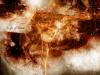
An Image Made By Me
#1

- New User
- Group: Members
- Posts: 22
- Joined: 30-April 05
- Location:In the Boat of the Banished Prince, trying to catch...Aang
Posted 30 April 2005 - 05:29 PM
took me 2 hours to make, yes 2 hours, including rendering time, please critique ^^
#2

- Captain Cannabis
-

- Group: Veterans
- Posts: 4,901
- Joined: 08-July 04
- Gender:Male
- Location:Manitouwadge, Ontario
-
AKA Mallick/PDM/GDUB3000/Sir
Posted 30 April 2005 - 06:40 PM
Unless you made the tutorial on that a long time ago, and just starting to show it off now ... You're passing a tutorial off as your own work. =/
#3
- New User
- Group: Members
- Posts: 22
- Joined: 30-April 05
- Location:In the Boat of the Banished Prince, trying to catch...Aang
Posted 30 April 2005 - 07:02 PM
i dont get what your saying...I made it myself, I have the PSD file, and each layer I used, just cause it looks "Similar" it doesnt mean i stole it, I have made lots of things that look similar, I even made a Music Vid for a game someone thought i stole till they watched the other one again and saw that it was totally diff, i dunno how to prove it but to put the psd file up, but I dont wanna do that, post that image u thought I "stole" cause I never have seen a tutorial on it, I had to figure out how to completly do this on my own, I have looked for tutorials to make things like this for months
#4

- Cool
-
- Group: Veterans
- Posts: 6,678
- Joined: 07-February 04
- Gender:Male
- Location:Room 101
- Interests:Metal, philosophy, percussion, literature, writing, theology, personal fitness, live music, tattoos.
-
AKA Agatio
Posted 31 May 2005 - 05:18 AM
Back off PDM.
Nice image, I don't like the text, and maybe a different colours, but overall it's pretty good :lol: .
Nice image, I don't like the text, and maybe a different colours, but overall it's pretty good :lol: .
#5
- Disciple
-
- Group: Members
- Posts: 1,233
- Joined: 26-April 04
- Location:Never the same
- Interests:Serving my fellow man. What greater joy is there than this?
Posted 31 May 2005 - 06:29 AM
I didn't even see the text till agatio mentioned it.
Good image though!
Good image though!
#6
- Cool
-
- Group: Veterans
- Posts: 6,678
- Joined: 07-February 04
- Gender:Male
- Location:Room 101
- Interests:Metal, philosophy, percussion, literature, writing, theology, personal fitness, live music, tattoos.
-
AKA Agatio
Posted 31 May 2005 - 06:35 AM
I just find text, unless it's subtle, a distraction on wallpapers, I'd rather a big graphic that a graphic witha title, or noticable text.
#7
- Chaos Lord
-
- Group: Members
- Posts: 926
- Joined: 19-June 04
- Location:Sweden
Posted 01 June 2005 - 03:47 PM
Mhm, that's a really good image you made. I wish I could do that. ^^
#8

- Disciple
-
- Group: Members
- Posts: 1,860
- Joined: 22-January 05
- Gender:Female
- Location:Outside your window, watching....waiting
- Interests:Go Away...
Posted 01 June 2005 - 04:02 PM
I like it alot , it looks like a beggining screen of a video game.
#9

- Disciple
-
- Group: Members
- Posts: 1,087
- Joined: 23-January 05
- Interests:Video games, RPGs, Flight Sims, Art, Super Smash Bros, Zelda, Golden Sun...<br /><br />omg this used to be mah sig.<br />[url=http://www.gameroom.com/blinkcomic]<br />[img]http://www.get--a--life.com/OTHER/blinkstale.jpg[/img]<br />[/url][url=http://www.get--a--life.com/POLKA/polkaindex.html]<br />[img]http://www.get--a--life.com/IMG/polkabanner8.gif[/img]<br />[/url]<<--Click!
Posted 01 June 2005 - 04:08 PM
If only it was an animated gif...
#10
- Cool
-
- Group: Veterans
- Posts: 6,678
- Joined: 07-February 04
- Gender:Male
- Location:Room 101
- Interests:Metal, philosophy, percussion, literature, writing, theology, personal fitness, live music, tattoos.
-
AKA Agatio
Posted 01 June 2005 - 04:09 PM
A wallpaper size animated .gif, I'd like to see that :P
#11
- Disciple
-
- Group: Members
- Posts: 1,087
- Joined: 23-January 05
- Interests:Video games, RPGs, Flight Sims, Art, Super Smash Bros, Zelda, Golden Sun...<br /><br />omg this used to be mah sig.<br />[url=http://www.gameroom.com/blinkcomic]<br />[img]http://www.get--a--life.com/OTHER/blinkstale.jpg[/img]<br />[/url][url=http://www.get--a--life.com/POLKA/polkaindex.html]<br />[img]http://www.get--a--life.com/IMG/polkabanner8.gif[/img]<br />[/url]<<--Click!
Posted 01 June 2005 - 10:54 PM
Naw, I just mean if those lines were moving like they were alive, like waves or something, like a passing cloud, you know...
#12
- Cool
-
- Group: Veterans
- Posts: 6,678
- Joined: 07-February 04
- Gender:Male
- Location:Room 101
- Interests:Metal, philosophy, percussion, literature, writing, theology, personal fitness, live music, tattoos.
-
AKA Agatio
Posted 02 June 2005 - 12:01 AM
Yeah, but then you have to double or triple the filesize, or it would just lose quality (gif = 256 colours). Maybe a flash.
#13

- Disciple
-
- Group: Members
- Posts: 1,643
- Joined: 06-February 04
Posted 02 June 2005 - 10:45 AM
Simple serif or sans-serif text, and small at that, is the best for wallpapers. Avoid fancy fonts.
Now, one of the problems I have is there's no strong point of interest. Monochromatic can be good sometimes, but usually there will be something with a contrasting look to the rest of the image to make it stand out. I'm not seeing that.
It's pretty decent otherwise. I think you should try and increase the impact of the render, by either trashing the blend, or just changing the color.
Page 1 of 1