
http://www.zappoartblog.com/index2.php
Do note that it is NOT fully functional, and the home page is meant as a representation of the overall look. Comments appreciated. IE and Opera issues still need some working out. If you're some ignorant baffoon who is still using IE, then I have no pity upon your soul! >:] But here's the link to the deviantArt submission as well =P http://www.deviantar.../view/23852519/
Page 1 of 1
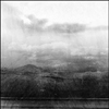
Zappo "organic" Layout A secondary "skin"
#2

- Master Adept
-

- Group: Admin
- Posts: 2,521
- Joined: 15-February 04
- Gender:Male
- Location:Toronto, Ontario
Posted 09 October 2005 - 09:35 PM
I think some more top and bottom paddingo on the horizontal navigation would look good as well as a slightly wider "home" picture.
Other than that, it looks good.
Other than that, it looks good.
#3
- Disciple
-
- Group: Members
- Posts: 1,422
- Joined: 28-February 04
- Gender:Male
- Location:Aussieland
Posted 09 October 2005 - 11:11 PM
Also make those same links a bit brighter. Right now it's too close to the background colour.
Otherwise it is very cool :P.
Otherwise it is very cool :P.
#4

- Cool
-
- Group: Veterans
- Posts: 6,678
- Joined: 07-February 04
- Gender:Male
- Location:Room 101
- Interests:Metal, philosophy, percussion, literature, writing, theology, personal fitness, live music, tattoos.
-
AKA Agatio
Posted 11 October 2005 - 09:34 PM
Headers oversized, and I don't think it's centered, though it may not be meant to be.
Probably belongs in the artwork forum though.
Probably belongs in the artwork forum though.
#5

- Lebron James
-
- Group: Veterans
- Posts: 10,366
- Joined: 04-October 04
- Gender:Male
- Location:Winnipeg, MB
Posted 12 October 2005 - 11:05 AM
Very cool. The art at the top is awesome and the layout is very good. I really like it, Andross.
#6

- Disciple
-
- Group: Veterans
- Posts: 1,300
- Joined: 07-March 04
- Gender:Male
- Location:Netherlands
-
AKA Neo_Genesis
Posted 12 October 2005 - 01:29 PM
I can't see why some don't like it. I may not have much expierience with lay-outs and such, but I really like this one. It gives some sort of "nature"-like feeling. Great work, Andross.
#7

- Disciple
-
- Group: Members
- Posts: 1,643
- Joined: 06-February 04
Posted 12 October 2005 - 07:37 PM
 Agatio, on Oct 11 2005, 10:34 PM, said:
Headers oversized, and I don't think it's centered, though it may not be meant to be.
Probably belongs in the artwork forum though.
Probably belongs in the artwork forum though.
That's what's intended ...
Page 1 of 1