
Some guy with a bloody knife...
Sig, Avatar, And Set Rating Topic Rate other people's Sig/Avatar and Set!
#6001

- High Sheriff
-

- Group: Moderator
- Posts: 11,988
- Joined: 21-July 04
- Gender:Male
- Location:Sitting on a fence and drinking root beer
-
AKA Wind Dude (WD)
Posted 17 December 2007 - 10:46 PM
#6002

- Loose cannon Cop with nothing to lose
-
- Group: Veterans
- Posts: 4,998
- Joined: 22-March 07
- Gender:Male
- Location:Segmentum Obscurus
-
AKA Darksword
Posted 17 December 2007 - 11:07 PM
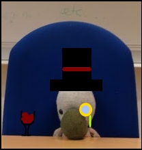
Some guy with a bloody knife...and explosions.
Your avy is too cute. And you new one makes me want to hug my laptop. It's cruel and unusual.
Your avy is too cute. And you new one makes me want to hug my laptop. It's cruel and unusual.
#6003

- Chaos Lord
-
- Group: Veterans
- Posts: 793
- Joined: 30-October 07
- Gender:Male
- Location:Coztopia
- Interests:Video games, Computer, Card games, Theatre
-
AKA killercoz
Posted 17 December 2007 - 11:14 PM
 DarkSword, on Dec 18 2007, 12:07 AM, said:
Some guy with a bloody knife...and explosions.
Your avy is too cute. And you new one makes me want to hug my laptop. It's cruel and unusual.
Your avy is too cute. And you new one makes me want to hug my laptop. It's cruel and unusual.
I disagree. The new one is good.
#6004
- Loose cannon Cop with nothing to lose
-
- Group: Veterans
- Posts: 4,998
- Joined: 22-March 07
- Gender:Male
- Location:Segmentum Obscurus
-
AKA Darksword
Posted 17 December 2007 - 11:18 PM
ANYWAY, I'm going to try and get a set up later. But, lacking a Fireworks program, it won't be as awesomerific as other members'.
#6005

- Lord
-
- Group: Members
- Posts: 252
- Joined: 11-July 04
- Gender:Male
- Location:The Darkest Corner In Space
- Interests:Full Metal Alchemist<br /><br />Final Fantasy<br /><br />Fire Emblem<br /><br />Golden Sun<br /><br />Maybe drawing<br />(not that good)<br /><br />Naruto<br /><br />Bleach<br /><br />Ice cream<br /><br />Rocky I, II, III, IV, & V
-
AKA EarthAdept
Posted 18 December 2007 - 01:42 AM
Good avatar, medicore sig.
#6006
- Master Adept
-
- Group: Veterans
- Posts: 4,002
- Joined: 23-June 05
- Gender:Male
- Location:Somewhere in Europe
- Interests:Nom nom nom. Cookies.
Posted 18 December 2007 - 09:52 AM
Your sig combination is too big. The upper one is nice though.
*recalls random rulish thingie about sigs*
*recalls random rulish thingie about sigs*
#6007
- Loose cannon Cop with nothing to lose
-
- Group: Veterans
- Posts: 4,998
- Joined: 22-March 07
- Gender:Male
- Location:Segmentum Obscurus
-
AKA Darksword
Posted 18 December 2007 - 05:49 PM
Sig attempt failed ): . Any artist wanting to make me feel better or rub it in can check my request topic in the Art section.
SS, your set is great. But I don't really understand what it says.
8/10
SS, your set is great. But I don't really understand what it says.
8/10
#6008

- Nebuchadnezzar
-
- Group: Veterans
- Posts: 11,279
- Joined: 16-December 05
- Gender:Male
- Location:37°48′S, 144°57′E.
- Interests:.5% per annum.
-
AKA Spam King
Posted 18 December 2007 - 08:14 PM
'I am the sad snow-stealing snowman.'
#6009

- Master Adept
-
- Group: Veterans
- Posts: 8,730
- Joined: 09-June 06
- Gender:Male
- Location:England
- Interests:EVERYTHING EVER
Posted 19 December 2007 - 01:31 AM
It's because it never snows where he lives.
#6010
- Master Adept
-
- Group: Veterans
- Posts: 4,002
- Joined: 23-June 05
- Gender:Male
- Location:Somewhere in Europe
- Interests:Nom nom nom. Cookies.
Posted 19 December 2007 - 10:24 AM
Yep, and I finally found the culprit.
#6011

- Banned
-
- Group: Veterans
- Posts: 4,301
- Joined: 05-September 05
- Gender:Male
- Location:where horses with broken legs go =D
- Interests:research it
-
AKA Dullahan
Posted 19 December 2007 - 12:12 PM
there are plenty of things in Holland that can make you think its snowing if you consume enough of them.
7/10 for matchyness
7/10 for matchyness
#6012

- Disciple
-
- Group: Members
- Posts: 1,860
- Joined: 22-January 05
- Gender:Female
- Location:Outside your window, watching....waiting
- Interests:Go Away...
Posted 19 December 2007 - 02:20 PM
Laharl: I like the avatar's creativityness...
Avatar: 8/10
Sig: 8/10
Set: 8.5/10
Avatar: 8/10
Sig: 8/10
Set: 8.5/10
#6013
- Banned
-
- Group: Veterans
- Posts: 4,301
- Joined: 05-September 05
- Gender:Male
- Location:where horses with broken legs go =D
- Interests:research it
-
AKA Dullahan
Posted 27 December 2007 - 09:25 PM
back to Lucky Star i go....
is the sig okay or is it raping too much bandwidth?
is the sig okay or is it raping too much bandwidth?
#6014
- Master Adept
-
- Group: Veterans
- Posts: 4,002
- Joined: 23-June 05
- Gender:Male
- Location:Somewhere in Europe
- Interests:Nom nom nom. Cookies.
Posted 28 December 2007 - 04:13 AM
It justs make me crazy because it's so busy.
Cool though.
Cool though.
#6015

- Master Adept
-
- Group: Veterans
- Posts: 2,902
- Joined: 21-June 04
- Gender:Female
- Location:Tucson, Arizona
- Interests:I've got hobby A.D.D.
-
AKA lightningstar/Icy
Posted 28 December 2007 - 09:27 PM
@Laharl: They're both really cute. Is that the Haruhi dance? I always get stuck watching it when I pass by your posts XD It's original though; you don't see many animated ones around here. Set: 9/10
@SS:
Avatar: Umm...a snowman...cool? ^-^; 4
Signature: Well it's very clean... 2
@SS:
Avatar: Umm...a snowman...cool? ^-^; 4
Signature: Well it's very clean... 2
#6016
- Nebuchadnezzar
-
- Group: Veterans
- Posts: 11,279
- Joined: 16-December 05
- Gender:Male
- Location:37°48′S, 144°57′E.
- Interests:.5% per annum.
-
AKA Spam King
Posted 28 December 2007 - 09:35 PM
lightningstar
Avatar: Hmm...bubbles? You get points for transparency though. 6.0/10
Signature: I'm not a big fan of computer-coloured sketches; at least, that's what it looks like. It leaves too much space around the edges as well, especially with that wing. I can tell you worked on it though, and transparency is a plus. 6.5/10
Overall: 7.0/10 (yes, I know that doesn't make sense XD)
#6017
- Master Adept
-
- Group: Veterans
- Posts: 2,902
- Joined: 21-June 04
- Gender:Female
- Location:Tucson, Arizona
- Interests:I've got hobby A.D.D.
-
AKA lightningstar/Icy
Posted 28 December 2007 - 10:09 PM
XD Haha, they're snowfluf things, and I agree with the space around, but I was aiming for simplicity. The drawing is actually done by Amuria on DeviantArt. (If you've read encyclopedia dramatica, you'd know the big controversy with her)
#6018
- Master Adept
-
- Group: Veterans
- Posts: 2,902
- Joined: 21-June 04
- Gender:Female
- Location:Tucson, Arizona
- Interests:I've got hobby A.D.D.
-
AKA lightningstar/Icy
Posted 28 December 2007 - 10:09 PM
Edit: Sorry, sorry, Double post on accident x.x; I musta hit the button twice.
#6019
- Nebuchadnezzar
-
- Group: Veterans
- Posts: 11,279
- Joined: 16-December 05
- Gender:Male
- Location:37°48′S, 144°57′E.
- Interests:.5% per annum.
-
AKA Spam King
Posted 28 December 2007 - 10:25 PM
Why don't you rate me? ^_^
#6020
- Master Adept
-
- Group: Veterans
- Posts: 2,902
- Joined: 21-June 04
- Gender:Female
- Location:Tucson, Arizona
- Interests:I've got hobby A.D.D.
-
AKA lightningstar/Icy
Posted 28 December 2007 - 10:30 PM
Alright then,
Avatar: So it's a bald guy...It could use a border or something to make it spiffiful...5/10
Signature: Not bad, but it still could use a border too. Also, I'd suggest making it as long as your other banner so they line up, but that's minor. 7/10
Overall: 6/10
Avatar: So it's a bald guy...It could use a border or something to make it spiffiful...5/10
Signature: Not bad, but it still could use a border too. Also, I'd suggest making it as long as your other banner so they line up, but that's minor. 7/10
Overall: 6/10
#6021
- Nebuchadnezzar
-
- Group: Veterans
- Posts: 11,279
- Joined: 16-December 05
- Gender:Male
- Location:37°48′S, 144°57′E.
- Interests:.5% per annum.
-
AKA Spam King
Posted 28 December 2007 - 11:29 PM
He's not just any old bald guy. ^_^
How's this?
How's this?
#6022

- The toast in your toaster
-
- Group: Veterans
- Posts: 12,421
- Joined: 04-April 06
- Gender:Male
- Location:The toaster in your kitchen.
- Interests:Parkour, Martial Arts, Music, Network Administration,
-
AKA The toast in the toaster in your kitchen.
Posted 29 December 2007 - 12:03 AM
Split: 'salright. It's not incredible though. 5.5/10
Icy: That's a very good drawing. But, it's a bit big for a sig IMO. 8.5/10
I've got a set in progress somewhere. Just don't know where.
Icy: That's a very good drawing. But, it's a bit big for a sig IMO. 8.5/10
I've got a set in progress somewhere. Just don't know where.
#6023
- High Sheriff
-
- Group: Moderator
- Posts: 11,988
- Joined: 21-July 04
- Gender:Male
- Location:Sitting on a fence and drinking root beer
-
AKA Wind Dude (WD)
Posted 29 December 2007 - 11:43 AM
@Laharl everybody and their dog has that sig. =/
How about me? (I'm aware that the sig is blown up, I'll fix it later)
How about me? (I'm aware that the sig is blown up, I'll fix it later)
#6024
- Banned
-
- Group: Veterans
- Posts: 4,301
- Joined: 05-September 05
- Gender:Male
- Location:where horses with broken legs go =D
- Interests:research it
-
AKA Dullahan
Posted 29 December 2007 - 12:14 PM
doesnt stop it being win.
as for your set WD, i likes it. 8/10 for now, will go up when you fix the sig
as for your set WD, i likes it. 8/10 for now, will go up when you fix the sig
#6025
- High Sheriff
-
- Group: Moderator
- Posts: 11,988
- Joined: 21-July 04
- Gender:Male
- Location:Sitting on a fence and drinking root beer
-
AKA Wind Dude (WD)
Posted 29 December 2007 - 01:58 PM
I remember when I first saw that image. It's hypnotic for some reason. And not for the reasons you think.
I'll give it an 8.5/10, it's certainly eye-catching in it's busy-ness.
I'll give it an 8.5/10, it's certainly eye-catching in it's busy-ness.
#6026
- High Sheriff
-
- Group: Moderator
- Posts: 11,988
- Joined: 21-July 04
- Gender:Male
- Location:Sitting on a fence and drinking root beer
-
AKA Wind Dude (WD)
Posted 30 December 2007 - 02:51 PM
Hmm I prefer the short and wide Xfire profile as it shows the most information with the least vertical space, but it looks a little weird with the small sig. Any tips?
#6027
- Master Adept
-
- Group: Veterans
- Posts: 2,902
- Joined: 21-June 04
- Gender:Female
- Location:Tucson, Arizona
- Interests:I've got hobby A.D.D.
-
AKA lightningstar/Icy
Posted 30 December 2007 - 03:45 PM
Either center your signature or make the top banner longer. Or you could just get rid of the xfire thing all together. One thing's for sure, put a break between your Witcher sig and the xfire part. It looks a bit cramped together.
#6028

- Disciple
-
- Group: Veterans
- Posts: 1,769
- Joined: 06-October 07
- Gender:Male
- Location:LongGuy Land
Posted 03 January 2008 - 05:30 PM
My new wario set kinda sucks, doesn't it?
#6029

- Master Adept
-
- Group: Veterans
- Posts: 2,900
- Joined: 24-July 04
- Gender:Female
- Location:over thar
- Interests:rpgs (duh :P), internet (my precioussss)...other things computer related...and penguins! (penguin'd)
-
AKA The Best Woman Ever.
Posted 03 January 2008 - 05:33 PM
he scares me o.o
laharl's set is pure win. I agree with wd, it's so hypnotic @.@ very big though with the quotes and whatnat n.n
laharl's set is pure win. I agree with wd, it's so hypnotic @.@ very big though with the quotes and whatnat n.n
#6030
- High Sheriff
-
- Group: Moderator
- Posts: 11,988
- Joined: 21-July 04
- Gender:Male
- Location:Sitting on a fence and drinking root beer
-
AKA Wind Dude (WD)
Posted 03 January 2008 - 07:24 PM
ihk it's a 7/10
This better?
This better?
#6031
- Master Adept
-
- Group: Veterans
- Posts: 2,902
- Joined: 21-June 04
- Gender:Female
- Location:Tucson, Arizona
- Interests:I've got hobby A.D.D.
-
AKA lightningstar/Icy
Posted 03 January 2008 - 07:40 PM
Eh, a little bit. The white space is still a little bit noticable. Maybe put a border around the red part; that would draw more attention to the red area and away from the white. Or you could also do dots like this :
................. to align where you want to put the image, and then change the dot's color to white.
What about mine? :3 Yesh, I know it's girly.
................. to align where you want to put the image, and then change the dot's color to white.
What about mine? :3 Yesh, I know it's girly.
#6032

- Can't touch this.
-
- Group: Admin
- Posts: 6,607
- Joined: 28-March 04
- Gender:Male
- Location:New York City, Boston
Posted 04 January 2008 - 01:07 AM
I love your set Icy, very cute and well-done. I especially like the subtle color change in the sig, and also, the drawings are great! Are they your work?
At any rate, absolutely beautiful, definitely gets the full 5 stars from me. :P
At any rate, absolutely beautiful, definitely gets the full 5 stars from me. :P
#6033
- High Sheriff
-
- Group: Moderator
- Posts: 11,988
- Joined: 21-July 04
- Gender:Male
- Location:Sitting on a fence and drinking root beer
-
AKA Wind Dude (WD)
Posted 04 January 2008 - 01:11 AM
lightningstar, on Jan 3 2008, 05:40 PM, said:
Eh, a little bit. The white space is still a little bit noticable.
You're right. Strange because I thought I told photoshop to make those places transparent (invisible). What I did was make an empty layer that's 450 pixels in width and put a layer over that which was the sig and in the middle, flattened the image, then saved.
#6034
- Nebuchadnezzar
-
- Group: Veterans
- Posts: 11,279
- Joined: 16-December 05
- Gender:Male
- Location:37°48′S, 144°57′E.
- Interests:.5% per annum.
-
AKA Spam King
Posted 04 January 2008 - 02:13 AM
Empty doesn't necessarily mean transparent. Also, I don't think JPGs can be transparent in the first place. Try this:
http://img410.imageshack.us/img410/8288/thewitchersigmi7.png
And I hope you realise you are blatantly ripping off my sig in many ways. :P
http://img410.imageshack.us/img410/8288/thewitchersigmi7.png
And I hope you realise you are blatantly ripping off my sig in many ways. :P
#6035
- Master Adept
-
- Group: Veterans
- Posts: 2,902
- Joined: 21-June 04
- Gender:Female
- Location:Tucson, Arizona
- Interests:I've got hobby A.D.D.
-
AKA lightningstar/Icy
Posted 04 January 2008 - 02:31 AM
Golden Legacy, on Jan 4 2008, 12:07 AM, said:
I love your set Icy, very cute and well-done. I especially like the subtle color change in the sig, and also, the drawings are great! Are they your work?
At any rate, absolutely beautiful, definitely gets the full 5 stars from me. :P
At any rate, absolutely beautiful, definitely gets the full 5 stars from me. :P
No, the art is from a scanlation of Special A by Minami Maki-- a sort of "unknown" in the manga world, but it's cute.
#6036
- High Sheriff
-
- Group: Moderator
- Posts: 11,988
- Joined: 21-July 04
- Gender:Male
- Location:Sitting on a fence and drinking root beer
-
AKA Wind Dude (WD)
Posted 04 January 2008 - 12:47 PM
Spam King, on Jan 4 2008, 12:13 AM, said:
Empty doesn't necessarily mean transparent. Also, I don't think JPGs can be transparent in the first place.
You know what's funny is that I could see the white spaces when I was looking from a laptop, but it looks transparent when I'm looking from a PC. So I really don't know.
#6037

- Master Adept
-
- Group: Veterans
- Posts: 8,895
- Joined: 28-January 04
- Gender:Male
-
AKA YouTube Dude
Posted 04 January 2008 - 03:57 PM
hmm, what's wrong with my set? I kinda like it, but I kinda don't x.x
#6038
- Master Adept
-
- Group: Veterans
- Posts: 2,900
- Joined: 24-July 04
- Gender:Female
- Location:over thar
- Interests:rpgs (duh :P), internet (my precioussss)...other things computer related...and penguins! (penguin'd)
-
AKA The Best Woman Ever.
Posted 04 January 2008 - 04:00 PM
homg it's a fuzzy kitty!!! mmk I like it because it's adorable n.n
It does seem like a strange thing to pick though. Well laid out however :P
It does seem like a strange thing to pick though. Well laid out however :P
#6039
- Master Adept
-
- Group: Veterans
- Posts: 4,002
- Joined: 23-June 05
- Gender:Male
- Location:Somewhere in Europe
- Interests:Nom nom nom. Cookies.
Posted 04 January 2008 - 04:10 PM
It's nice, cool and stuff.
It just doesn't scream .eugine though.
I guess you just had that roy for too long.
It just doesn't scream .eugine though.
I guess you just had that roy for too long.
#6040
- Master Adept
-
- Group: Veterans
- Posts: 8,895
- Joined: 28-January 04
- Gender:Male
-
AKA YouTube Dude
Posted 04 January 2008 - 04:16 PM
It was either the Amur Leopard or an Avatar set. Should I make an Avatar set?
#6041
- Master Adept
-
- Group: Veterans
- Posts: 4,002
- Joined: 23-June 05
- Gender:Male
- Location:Somewhere in Europe
- Interests:Nom nom nom. Cookies.
Posted 04 January 2008 - 04:22 PM
Nah, I think the Amur Leopard set is... is... more you?
Kind of contradicting myself here, I just can't see the Avatar set turning out better, I'd love to be suprised though.
Kind of contradicting myself here, I just can't see the Avatar set turning out better, I'd love to be suprised though.
#6042

- Master Adept
-
- Group: Veterans
- Posts: 4,114
- Joined: 29-April 07
- Gender:Male
- Location:Sky Haven, the island in the sky
- Interests:video games, RPGs in particular, reading, mostly sci-fi and Graphic Novels, Kenshin is the best.<br />
-
AKA escout
Posted 04 January 2008 - 04:57 PM
I think the big cat is cool, besides, I have an Avatar avatar.
#6043
- Nebuchadnezzar
-
- Group: Veterans
- Posts: 11,279
- Joined: 16-December 05
- Gender:Male
- Location:37°48′S, 144°57′E.
- Interests:.5% per annum.
-
AKA Spam King
Posted 04 January 2008 - 05:41 PM
It's African, so I guess it suits you...?
#6044
- Master Adept
-
- Group: Veterans
- Posts: 8,895
- Joined: 28-January 04
- Gender:Male
-
AKA YouTube Dude
Posted 04 January 2008 - 05:42 PM
The Amur Leopard is found in Asia x3
#6045
- Nebuchadnezzar
-
- Group: Veterans
- Posts: 11,279
- Joined: 16-December 05
- Gender:Male
- Location:37°48′S, 144°57′E.
- Interests:.5% per annum.
-
AKA Spam King
Posted 04 January 2008 - 05:44 PM
Oh, right...
I wish MD would come back.
I wish MD would come back.
#6046
- High Sheriff
-
- Group: Moderator
- Posts: 11,988
- Joined: 21-July 04
- Gender:Male
- Location:Sitting on a fence and drinking root beer
-
AKA Wind Dude (WD)
Posted 04 January 2008 - 05:44 PM
Eugine I looooove your new set!
9/10 all the way.
9/10 all the way.
#6047
- Nebuchadnezzar
-
- Group: Veterans
- Posts: 11,279
- Joined: 16-December 05
- Gender:Male
- Location:37°48′S, 144°57′E.
- Interests:.5% per annum.
-
AKA Spam King
Posted 04 January 2008 - 05:55 PM
A GIF speaks a thousand words.
http://img403.imageshack.us/img403/1716/comparisonvt7.gif
http://img403.imageshack.us/img403/1716/comparisonvt7.gif
#6048
- High Sheriff
-
- Group: Moderator
- Posts: 11,988
- Joined: 21-July 04
- Gender:Male
- Location:Sitting on a fence and drinking root beer
-
AKA Wind Dude (WD)
Posted 04 January 2008 - 08:21 PM
Huh. I see what you mean now. I was only taking Icy's advice to split the Xfire and sig part, but, hey does it bother you? XD
#6049
- Nebuchadnezzar
-
- Group: Veterans
- Posts: 11,279
- Joined: 16-December 05
- Gender:Male
- Location:37°48′S, 144°57′E.
- Interests:.5% per annum.
-
AKA Spam King
Posted 05 January 2008 - 03:19 AM
'Course I don't mind. I normally dislike people duplicating my good ideas, but in your defence there isn't really much of a better way to arrange things. Though I do find it highly suspicious that you are playing the same game as I.
*shifty eyes*
*shifty eyes*
#6050
- High Sheriff
-
- Group: Moderator
- Posts: 11,988
- Joined: 21-July 04
- Gender:Male
- Location:Sitting on a fence and drinking root beer
-
AKA Wind Dude (WD)
Posted 05 January 2008 - 05:38 PM
I have Rollercoaster Tycoon 3!
Would somebody please rate someone's set?
Would somebody please rate someone's set?
#6051
- Disciple
-
- Group: Veterans
- Posts: 1,769
- Joined: 06-October 07
- Gender:Male
- Location:LongGuy Land
Posted 05 January 2008 - 05:51 PM
Um, your sig is cool WD and I like how it matches the avatar. The wolf is cool. I don't get the X-fire thing though, what is it? Is it a game of some sort?
9/10
9/10
#6052
- High Sheriff
-
- Group: Moderator
- Posts: 11,988
- Joined: 21-July 04
- Gender:Male
- Location:Sitting on a fence and drinking root beer
-
AKA Wind Dude (WD)
Posted 05 January 2008 - 06:24 PM
There are basically two things Xfire is good for and why I use it: Game tracking, and in-game chatting.
I also think it's neat because I can show other people what games I like and what I play most. It's interesting to see how many hours I waste playing games. :P Further questions, click on it and it'll take you to my profile and you can look at the FAQ from there.
I also think it's neat because I can show other people what games I like and what I play most. It's interesting to see how many hours I waste playing games. :P Further questions, click on it and it'll take you to my profile and you can look at the FAQ from there.
#6053
- Nebuchadnezzar
-
- Group: Veterans
- Posts: 11,279
- Joined: 16-December 05
- Gender:Male
- Location:37°48′S, 144°57′E.
- Interests:.5% per annum.
-
AKA Spam King
Posted 05 January 2008 - 06:51 PM
Lemontime has about 300 hours clocked for Guild Wars. Phr33k.
#6054
- Disciple
-
- Group: Members
- Posts: 2,013
- Joined: 27-May 06
- Gender:Male
- Location:Your local pharmacist
- Interests:Drums, Guitar Hero, pretending to play guitar, getting awesome at the one song I know how to play on bass, school(yeah, I'm such a loser) music, mohney, etc.<br /><br />I suppose I'll give you an abbreviated list of bands that I like:<br />Relient K<br />Switchfoot<br />Guster<br />Angels and Airwaves<br />Arcade Fire<br />Porcupine Tree<br />Weezer<br />Mae<br /><br />It's sorta a weird mix of mainstream and not so mainstream.<br />I like a lot of single songs too...<br /><br />Bands I need to look at:<br />Plastic Constellations<br />Cauterize<br />Patent Pending<br />And a bunch of local bands that you'll probably never hear of.<br /><br />Pandora rocks.<br /><br />I'm running out of things to say here.<br /><br />Perhaps I like duct tape?<br /><br />Yeah. This likely won't be touched for another year when my tastes have completely changed.<br />
Posted 05 January 2008 - 09:05 PM
I had no idea there was a Lost video game. Cool? I guess? It's kinda simple, but that's not really a problem...And the dude in the avatar is whats-his-face from the show, yeah? 7/10 Nothing wrong with it.
#6055
- Nebuchadnezzar
-
- Group: Veterans
- Posts: 11,279
- Joined: 16-December 05
- Gender:Male
- Location:37°48′S, 144°57′E.
- Interests:.5% per annum.
-
AKA Spam King
Posted 05 January 2008 - 10:47 PM
That's what I like about it. It's not super-impressive, it's just simple and clean.
#6056

- Lord
-
- Group: Members
- Posts: 288
- Joined: 22-April 05
- Gender:Female
- Location:TARDIS
Posted 08 January 2008 - 07:08 AM
It's simple.
I give it a 7/10, because it's not that whomg hawt, but still nice.
RATE TICH PLS@@
I give it a 7/10, because it's not that whomg hawt, but still nice.
RATE TICH PLS@@
#6057
- Nebuchadnezzar
-
- Group: Veterans
- Posts: 11,279
- Joined: 16-December 05
- Gender:Male
- Location:37°48′S, 144°57′E.
- Interests:.5% per annum.
-
AKA Spam King
Posted 08 January 2008 - 04:34 PM
Mathak Kraven
Avatar: Looks glassy, I liek blue. 7.0/10
Signature: Yay Portal! The animation is a bit choppy though, I'd recommend you speed it up to about 10fps. Nice loop too. 8.0/10
Overall: 7.5/10
What happened to you anyway?
Avatar: Looks glassy, I liek blue. 7.0/10
Signature: Yay Portal! The animation is a bit choppy though, I'd recommend you speed it up to about 10fps. Nice loop too. 8.0/10
Overall: 7.5/10
What happened to you anyway?
#6058

- Slayer
-
- Group: Members
- Posts: 340
- Joined: 08-January 08
- Gender:Female
- Location:Lemuria ftw.
- Interests:Mostly video games (Golden Sun, Halo, Starcraft, Pokemon) and art.
Posted 08 January 2008 - 08:28 PM
Avatar: 7/10. Funny picture, it makes you seem like the resident wise person.
Signature: 9/10. I never watched the show or played the game, but the signature is pretty!
Overall: 8/10
Signature: 9/10. I never watched the show or played the game, but the signature is pretty!
Overall: 8/10
#6059
- Master Adept
-
- Group: Veterans
- Posts: 2,902
- Joined: 21-June 04
- Gender:Female
- Location:Tucson, Arizona
- Interests:I've got hobby A.D.D.
-
AKA lightningstar/Icy
Posted 09 January 2008 - 01:05 AM
@ZA: The avatar is pretty neat with Piers' psynergy, though I feel that it's lacking a real substantial background. Maybe something from TLA, or even on top of mt aleph! 6/10
@WD: I've been quoted :3 I feel so loved! The reason you two have similar signatures is because I both gave you the same advice. DURR. ^_^
~1000!~
@WD: I've been quoted :3 I feel so loved! The reason you two have similar signatures is because I both gave you the same advice. DURR. ^_^
~1000!~
#6060
- Nebuchadnezzar
-
- Group: Veterans
- Posts: 11,279
- Joined: 16-December 05
- Gender:Male
- Location:37°48′S, 144°57′E.
- Interests:.5% per annum.
-
AKA Spam King
Posted 09 January 2008 - 03:02 AM
Heh, good point. Congrats on reaching 1000 anyway.
~ 2998 ~
~ 2998 ~
#6061
- Loose cannon Cop with nothing to lose
-
- Group: Veterans
- Posts: 4,998
- Joined: 22-March 07
- Gender:Male
- Location:Segmentum Obscurus
-
AKA Darksword
Posted 09 January 2008 - 05:53 PM
7/10 It's nice, but their's nothing much going on in it.
I think Icy's sig might have gone better with my avy, what do you think?
I think Icy's sig might have gone better with my avy, what do you think?
#6062
- Banned
-
- Group: Veterans
- Posts: 4,301
- Joined: 05-September 05
- Gender:Male
- Location:where horses with broken legs go =D
- Interests:research it
-
AKA Dullahan
Posted 09 January 2008 - 06:56 PM
nice sig. 40k FTW 8.5/10
avy is okay 7/10
overall 8/10
avy is okay 7/10
overall 8/10
#6063
- The toast in your toaster
-
- Group: Veterans
- Posts: 12,421
- Joined: 04-April 06
- Gender:Male
- Location:The toaster in your kitchen.
- Interests:Parkour, Martial Arts, Music, Network Administration,
-
AKA The toast in the toaster in your kitchen.
Posted 09 January 2008 - 09:01 PM
I take all credit for makeing DS's sig. -_- But no, seriously.
So yeah, I had a set brewing, but it got lost somewhere.
So yeah, I had a set brewing, but it got lost somewhere.
#6064

- Master Adept
-
- Group: Moderator
- Posts: 4,875
- Joined: 19-August 04
- Gender:Male
- Location:Calabasas, California
- Interests:Inside your pants.
Posted 16 January 2008 - 07:50 PM
Ferraris are the sexiest cars ever created.
Avie - 8.5/10
Sig - 9/10
Set - 9/10
Avie - 8.5/10
Sig - 9/10
Set - 9/10
#6065
- Master Adept
-
- Group: Veterans
- Posts: 8,730
- Joined: 09-June 06
- Gender:Male
- Location:England
- Interests:EVERYTHING EVER
Posted 17 January 2008 - 05:13 PM
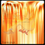
Ferrari's are also the most overrated cars ever created.
GSN, I cant give you a high score because the image quality is crap. Plus it's just 3 pictures in a line with a border effect. Not especially creative or good quality, 3/10
GSN, I cant give you a high score because the image quality is crap. Plus it's just 3 pictures in a line with a border effect. Not especially creative or good quality, 3/10
#6066
- Nebuchadnezzar
-
- Group: Veterans
- Posts: 11,279
- Joined: 16-December 05
- Gender:Male
- Location:37°48′S, 144°57′E.
- Interests:.5% per annum.
-
AKA Spam King
Posted 17 January 2008 - 05:14 PM
Wow gsn, you really like bevels. :P
#6067
- Master Adept
-
- Group: Moderator
- Posts: 4,875
- Joined: 19-August 04
- Gender:Male
- Location:Calabasas, California
- Interests:Inside your pants.
Posted 17 January 2008 - 05:22 PM
Earth Dude, on Jan 17 2008, 03:13 PM, said:
Ferrari's are also the most overrated cars ever created.
GSN, I cant give you a high score because the image quality is crap. Plus it's just 3 pictures in a line with a border effect. Not especially creative or good quality, 3/10
GSN, I cant give you a high score because the image quality is crap. Plus it's just 3 pictures in a line with a border effect. Not especially creative or good quality, 3/10
Three pictures in a line with a border effect is sexy. ;_; Also, the image quality isn't crap in any way; I made the pictures look like that to give them a different effect. You don't like the effect, not the quality. :|
Your avie/sig are the big drill dudes from Bioshock, right? They're good, 8/10 for both.
#6068
- Nebuchadnezzar
-
- Group: Veterans
- Posts: 11,279
- Joined: 16-December 05
- Gender:Male
- Location:37°48′S, 144°57′E.
- Interests:.5% per annum.
-
AKA Spam King
Posted 17 January 2008 - 05:23 PM
Even if it is an effect, it looks convincingly JPG, and a very bad one at that.
#6069
- Master Adept
-
- Group: Veterans
- Posts: 8,730
- Joined: 09-June 06
- Gender:Male
- Location:England
- Interests:EVERYTHING EVER
Posted 19 January 2008 - 11:30 AM
I need a new set. I'll make one now, rate when i'm done.
Oh, gsn, much better. Nice effects, but the gsninja font looks a bit like word art on M$ word. And the avatar doesnt look creative at all with the effect you used, it just looks like a bad quality picture. 7/10
Oh, gsn, much better. Nice effects, but the gsninja font looks a bit like word art on M$ word. And the avatar doesnt look creative at all with the effect you used, it just looks like a bad quality picture. 7/10
#6070
- Nebuchadnezzar
-
- Group: Veterans
- Posts: 11,279
- Joined: 16-December 05
- Gender:Male
- Location:37°48′S, 144°57′E.
- Interests:.5% per annum.
-
AKA Spam King
Posted 19 January 2008 - 03:59 PM
The words don't look like MS Word on that one at all. Not any effect I've seen.
#6071
- Master Adept
-
- Group: Veterans
- Posts: 8,730
- Joined: 09-June 06
- Gender:Male
- Location:England
- Interests:EVERYTHING EVER
Posted 20 January 2008 - 03:29 AM
Well it stands out against the background, it contrasts too much with the rest of the style.
Sorry to be a critic, but..well I am :P
New sig, cant be bothered with an avvie.
Sorry to be a critic, but..well I am :P
New sig, cant be bothered with an avvie.
#6072
- High Sheriff
-
- Group: Moderator
- Posts: 11,988
- Joined: 21-July 04
- Gender:Male
- Location:Sitting on a fence and drinking root beer
-
AKA Wind Dude (WD)
Posted 20 January 2008 - 03:34 AM
Sig is alright. Could use a border or something, it looks a bit strange that it ends abruptly on the right side.
8/10
8/10
#6073
- Master Adept
-
- Group: Veterans
- Posts: 8,730
- Joined: 09-June 06
- Gender:Male
- Location:England
- Interests:EVERYTHING EVER
Posted 20 January 2008 - 04:29 AM
It does have a white border, it's just difficult to see.
#6074
- The toast in your toaster
-
- Group: Veterans
- Posts: 12,421
- Joined: 04-April 06
- Gender:Male
- Location:The toaster in your kitchen.
- Interests:Parkour, Martial Arts, Music, Network Administration,
-
AKA The toast in the toaster in your kitchen.
Posted 20 January 2008 - 04:59 AM
Well then use a darker border. :P
The avatar is funny, and sig looks nice, but they don't match. An avatar to go with the sig would be nice. 7/10
The avatar is funny, and sig looks nice, but they don't match. An avatar to go with the sig would be nice. 7/10
#6075
- Lord
-
- Group: Members
- Posts: 288
- Joined: 22-April 05
- Gender:Female
- Location:TARDIS
Posted 20 January 2008 - 06:51 AM
Spam King, on Jan 8 2008, 11:34 PM, said:
Signature: Yay Portal! The animation is a bit choppy though, I'd recommend you speed it up to about 10fps. Nice loop too. 8.0/10
Overall: 7.5/10
What happened to you anyway?
Overall: 7.5/10
What happened to you anyway?
I would change the speed, but Imageready was being a butt to me and I couldn't humanly possible figure out the speed. I also have this other one and for some reason with the same amount of speed it goes differently.
http://img.photobucket.com/albums/v654/mathak/rightround.gif
I is confuzed :P
Wind Dude
Nice matching set although the cars don't really blend with thebackground though. But whetever, I think that was the purpose.
Avatar 8/10
Sig 8/10
#6076
- High Sheriff
-
- Group: Moderator
- Posts: 11,988
- Joined: 21-July 04
- Gender:Male
- Location:Sitting on a fence and drinking root beer
-
AKA Wind Dude (WD)
Posted 20 January 2008 - 12:23 PM
Mathak Kraven, on Jan 20 2008, 04:51 AM, said:
Wind Dude
Nice matching set although the cars don't really blend with thebackground though. But whetever, I think that was the purpose.
Avatar 8/10
Sig 8/10
Nice matching set although the cars don't really blend with thebackground though. But whetever, I think that was the purpose.
Avatar 8/10
Sig 8/10
But I'm not the one with cars in my sig.
And I kind of like the other version of your sig,
#6077
- Nebuchadnezzar
-
- Group: Veterans
- Posts: 11,279
- Joined: 16-December 05
- Gender:Male
- Location:37°48′S, 144°57′E.
- Interests:.5% per annum.
-
AKA Spam King
Posted 20 January 2008 - 02:09 PM
Mathak Kraven, on Jan 20 2008, 11:51 PM, said:
I would change the speed, but Imageready was being a butt to me and I couldn't humanly possible figure out the speed. I also have this other one and for some reason with the same amount of speed it goes differently.
http://img.photobucket.com/albums/v654/mathak/rightround.gif
I is confuzed :P
http://img.photobucket.com/albums/v654/mathak/rightround.gif
I is confuzed :P
Both your images are running at roughly 6.5fps according to my program. I made some sped-up versions if you're insterested in using them.
http://img100.imageshack.us/img100/5983/walkingincirclesfw3.gif
http://img409.imageshack.us/img409/7997/rightroundjm4.gif
Thanks to the Microsoft GIF Animator the impossible, is easy. :)
#6078
- The toast in your toaster
-
- Group: Veterans
- Posts: 12,421
- Joined: 04-April 06
- Gender:Male
- Location:The toaster in your kitchen.
- Interests:Parkour, Martial Arts, Music, Network Administration,
-
AKA The toast in the toaster in your kitchen.
Posted 20 January 2008 - 08:37 PM
Mathak Kraven, on Jan 20 2008, 04:51 AM, said:
Toasty:
Nice matching set although the cars don't really blend with thebackground though. But whetever, I think that was the purpose.
Avatar 8/10
Sig 8/10
Nice matching set although the cars don't really blend with thebackground though. But whetever, I think that was the purpose.
Avatar 8/10
Sig 8/10
Yeah, the name change confused some people at first. I'm going to change it back as soon as I can.
Anyway, it's supposed to be a car sitting in a room with a wall of firey stuff behind it. Not a flat picture. So I guess the car isn's supposed to really blend in.
Split: The sig and avatar don't really match, but the sig is kinda cool I suppose. 6.5/10
#6079

- God
-
- Group: Veterans
- Posts: 8,290
- Joined: 21-December 07
- Gender:Male
- Location:Fuck you stalker
-
AKA A Gangster Chimppp
Posted 20 January 2008 - 08:41 PM
When I was on a different comp I saw the sig you had, and it looks preatty good
Avy-7/10.
Sig-8/10
My stuff sucks, so I might ask somebody to make me a set.
Avy-7/10.
Sig-8/10
My stuff sucks, so I might ask somebody to make me a set.
#6080
- Master Adept
-
- Group: Veterans
- Posts: 4,114
- Joined: 29-April 07
- Gender:Male
- Location:Sky Haven, the island in the sky
- Interests:video games, RPGs in particular, reading, mostly sci-fi and Graphic Novels, Kenshin is the best.<br />
-
AKA escout
Posted 20 January 2008 - 10:00 PM
I can't wait to get photoshop so I can make me a nice sig. Maybe I'll use image ready to animate it.
#6081
- Loose cannon Cop with nothing to lose
-
- Group: Veterans
- Posts: 4,998
- Joined: 22-March 07
- Gender:Male
- Location:Segmentum Obscurus
-
AKA Darksword
Posted 20 January 2008 - 11:41 PM
Toasty should go back to the dragon :P
#6082
- Banned
-
- Group: Veterans
- Posts: 4,301
- Joined: 05-September 05
- Gender:Male
- Location:where horses with broken legs go =D
- Interests:research it
-
AKA Dullahan
Posted 21 January 2008 - 02:10 AM
farewell dancing sig *sniff*
soon my shana fandom will be complete :3
what do you think of this one?
soon my shana fandom will be complete :3
what do you think of this one?
#6083
- Master Adept
-
- Group: Veterans
- Posts: 4,114
- Joined: 29-April 07
- Gender:Male
- Location:Sky Haven, the island in the sky
- Interests:video games, RPGs in particular, reading, mostly sci-fi and Graphic Novels, Kenshin is the best.<br />
-
AKA escout
Posted 21 January 2008 - 09:02 AM
that looks really good laharl. they match and go well together. And the color shceme looks good too. 9.9/10
#6084
- Squire
-
- Group: Members
- Posts: 36
- Joined: 21-January 08
- Gender:Male
- Location:Wouldn't you like to know?
Posted 21 January 2008 - 08:58 PM
Has nice lighting, but a little more could be done. 6/10
#6085
- Master Adept
-
- Group: Veterans
- Posts: 2,902
- Joined: 21-June 04
- Gender:Female
- Location:Tucson, Arizona
- Interests:I've got hobby A.D.D.
-
AKA lightningstar/Icy
Posted 21 January 2008 - 10:46 PM
Very nice and clean, which is surprising for most newer members. Although, it's almost a little too clean. Maybe fancy it up with a different border or something. Otherwise, it's awesome.
9/10
9/10
#6086
- Master Adept
-
- Group: Veterans
- Posts: 4,114
- Joined: 29-April 07
- Gender:Male
- Location:Sky Haven, the island in the sky
- Interests:video games, RPGs in particular, reading, mostly sci-fi and Graphic Novels, Kenshin is the best.<br />
-
AKA escout
Posted 21 January 2008 - 11:22 PM
set looks good Icy. you get my Ultra Rare, Engraved , Foil-Holographic 10/10 rating.
what is it from again?
Edit: I'm going to try and work on a sig at school tomorrow. I think it willbe Kenshin themed. And I think I'll make an Avatar to go with it too.
what is it from again?
Edit: I'm going to try and work on a sig at school tomorrow. I think it willbe Kenshin themed. And I think I'll make an Avatar to go with it too.
#6087
- Master Adept
-
- Group: Veterans
- Posts: 2,902
- Joined: 21-June 04
- Gender:Female
- Location:Tucson, Arizona
- Interests:I've got hobby A.D.D.
-
AKA lightningstar/Icy
Posted 22 January 2008 - 12:12 AM
Haha, Special A, the shojo about the top 7 students at this one academy.
Oi, if you need me too, I can make a spiffy sig for you. *loves to make sigs and avatars*
Oi, if you need me too, I can make a spiffy sig for you. *loves to make sigs and avatars*
#6088
- Master Adept
-
- Group: Veterans
- Posts: 4,114
- Joined: 29-April 07
- Gender:Male
- Location:Sky Haven, the island in the sky
- Interests:video games, RPGs in particular, reading, mostly sci-fi and Graphic Novels, Kenshin is the best.<br />
-
AKA escout
Posted 22 January 2008 - 12:24 AM
let me try and make on first. there are several computers on campus that I canuse that have photoshop. I just have to find an open lab that I can use.
#6089
- Disciple
-
- Group: Members
- Posts: 2,013
- Joined: 27-May 06
- Gender:Male
- Location:Your local pharmacist
- Interests:Drums, Guitar Hero, pretending to play guitar, getting awesome at the one song I know how to play on bass, school(yeah, I'm such a loser) music, mohney, etc.<br /><br />I suppose I'll give you an abbreviated list of bands that I like:<br />Relient K<br />Switchfoot<br />Guster<br />Angels and Airwaves<br />Arcade Fire<br />Porcupine Tree<br />Weezer<br />Mae<br /><br />It's sorta a weird mix of mainstream and not so mainstream.<br />I like a lot of single songs too...<br /><br />Bands I need to look at:<br />Plastic Constellations<br />Cauterize<br />Patent Pending<br />And a bunch of local bands that you'll probably never hear of.<br /><br />Pandora rocks.<br /><br />I'm running out of things to say here.<br /><br />Perhaps I like duct tape?<br /><br />Yeah. This likely won't be touched for another year when my tastes have completely changed.<br />
Posted 22 January 2008 - 07:17 PM
Photoshop FTW.
escout: An avatar without graininess! Hallelujah! 7/10
escout: An avatar without graininess! Hallelujah! 7/10
#6090
- Master Adept
-
- Group: Veterans
- Posts: 4,114
- Joined: 29-April 07
- Gender:Male
- Location:Sky Haven, the island in the sky
- Interests:video games, RPGs in particular, reading, mostly sci-fi and Graphic Novels, Kenshin is the best.<br />
-
AKA escout
Posted 23 January 2008 - 12:29 AM
new avatar what do you think
#6091
- Banned
-
- Group: Veterans
- Posts: 4,301
- Joined: 05-September 05
- Gender:Male
- Location:where horses with broken legs go =D
- Interests:research it
-
AKA Dullahan
Posted 23 January 2008 - 01:11 AM
yay Kenshin, pretty nice, matching sig plz
#6092
- Master Adept
-
- Group: Veterans
- Posts: 4,114
- Joined: 29-April 07
- Gender:Male
- Location:Sky Haven, the island in the sky
- Interests:video games, RPGs in particular, reading, mostly sci-fi and Graphic Novels, Kenshin is the best.<br />
-
AKA escout
Posted 23 January 2008 - 01:16 AM
I will, I just need to work on a nice them for it. Or I could use the same image and streetch it into a sig.
#6093
- Banned
-
- Group: Veterans
- Posts: 4,301
- Joined: 05-September 05
- Gender:Male
- Location:where horses with broken legs go =D
- Interests:research it
-
AKA Dullahan
Posted 23 January 2008 - 01:57 AM
escout, on Jan 23 2008, 07:16 AM, said:
Or I could use the same image and streetch it into a sig.
that would be very silly. please dont do that
#6094

- Gallant
-
- Group: Members
- Posts: 167
- Joined: 24-October 07
- Gender:Female
- Location:ottawa,ont,canada
Posted 23 January 2008 - 09:40 PM
i just change mine to gin from bleach he my fav charater.
i love yours laharl the slayer 10/10
i love yours laharl the slayer 10/10
#6095
- Master Adept
-
- Group: Veterans
- Posts: 4,114
- Joined: 29-April 07
- Gender:Male
- Location:Sky Haven, the island in the sky
- Interests:video games, RPGs in particular, reading, mostly sci-fi and Graphic Novels, Kenshin is the best.<br />
-
AKA escout
Posted 24 January 2008 - 08:31 PM
@ redchi 9 looks good. 8/10
With thanks to Icy, I now have a new sig. What do you guys think?
With thanks to Icy, I now have a new sig. What do you guys think?
#6096
- Banned
-
- Group: Veterans
- Posts: 4,301
- Joined: 05-September 05
- Gender:Male
- Location:where horses with broken legs go =D
- Interests:research it
-
AKA Dullahan
Posted 26 January 2008 - 06:27 AM
loving the sig Escout, very nice
great set 9/10
Kenshin ftw!
great set 9/10
Kenshin ftw!
#6097
- Master Adept
-
- Group: Veterans
- Posts: 4,114
- Joined: 29-April 07
- Gender:Male
- Location:Sky Haven, the island in the sky
- Interests:video games, RPGs in particular, reading, mostly sci-fi and Graphic Novels, Kenshin is the best.<br />
-
AKA escout
Posted 26 January 2008 - 10:16 AM
thanx, your set is good too. 9/10
#6098
- God
-
- Group: Veterans
- Posts: 8,290
- Joined: 21-December 07
- Gender:Male
- Location:Fuck you stalker
-
AKA A Gangster Chimppp
Posted 26 January 2008 - 05:39 PM
Very good sig, and the avy(if I can remember from yesterday) is very funny. It's the batman one right?
Avy-7/10
Sig-8/10.
Avy-7/10
Sig-8/10.
#6099
- Master Adept
-
- Group: Veterans
- Posts: 2,902
- Joined: 21-June 04
- Gender:Female
- Location:Tucson, Arizona
- Interests:I've got hobby A.D.D.
-
AKA lightningstar/Icy
Posted 27 January 2008 - 12:05 AM
Avatar- Animated, nice, but too pixelated. I would resize your avatar size in your avatar options to the size of the gif, so it doesn't look so pixelated. 5/10
Signature: Ah, kingdom hearts. I actually really like it, even though it's pretty simple. The text in the bottom right hand corner gives it a nice touch. 8/10
Signature: Ah, kingdom hearts. I actually really like it, even though it's pretty simple. The text in the bottom right hand corner gives it a nice touch. 8/10
#6100
- Master Adept
-
- Group: Veterans
- Posts: 4,114
- Joined: 29-April 07
- Gender:Male
- Location:Sky Haven, the island in the sky
- Interests:video games, RPGs in particular, reading, mostly sci-fi and Graphic Novels, Kenshin is the best.<br />
-
AKA escout
Posted 27 January 2008 - 09:30 AM
im just afraid of what the xxx is impliying.
and nice set Icy. I give it a 9.5/10, although I have now idea what Ergo Proxy is.
and nice set Icy. I give it a 9.5/10, although I have now idea what Ergo Proxy is.
#6101
- Nebuchadnezzar
-
- Group: Veterans
- Posts: 11,279
- Joined: 16-December 05
- Gender:Male
- Location:37°48′S, 144°57′E.
- Interests:.5% per annum.
-
AKA Spam King
Posted 27 January 2008 - 04:04 PM
Skidzorz
Avatar: Looks like a Digimon. You need to set the width to 75 pixels. 7/10
Signature: Awesome. Freaking love it. 10/10
Overall: Unique. 9/10
Avatar: Looks like a Digimon. You need to set the width to 75 pixels. 7/10
Signature: Awesome. Freaking love it. 10/10
Overall: Unique. 9/10
#6102
- God
-
- Group: Veterans
- Posts: 8,290
- Joined: 21-December 07
- Gender:Male
- Location:Fuck you stalker
-
AKA A Gangster Chimppp
Posted 27 January 2008 - 04:07 PM
The avy is some random FF gif. My sig was going to contain 8 Chocobo gif's in row, all different colours, and below it saying Beware The Chocobo Army, but alas, it was too long. Stupid links taking up too big of a space.
Max should edit it and allow more space, because it didn't really take up any space, jsut the link's i nthe [img] tags were long.
Meh.
My Avy would be chagned if *coughcough* somebdoy made one for me.
*COUGH*
Max should edit it and allow more space, because it didn't really take up any space, jsut the link's i nthe [img] tags were long.
Meh.
My Avy would be chagned if *coughcough* somebdoy made one for me.
*COUGH*
#6103
- Nebuchadnezzar
-
- Group: Veterans
- Posts: 11,279
- Joined: 16-December 05
- Gender:Male
- Location:37°48′S, 144°57′E.
- Interests:.5% per annum.
-
AKA Spam King
Posted 27 January 2008 - 04:08 PM
No no, you can do it in your control panel. Just go to the avatar menu, it's there.
#6105
- Nebuchadnezzar
-
- Group: Veterans
- Posts: 11,279
- Joined: 16-December 05
- Gender:Male
- Location:37°48′S, 144°57′E.
- Interests:.5% per annum.
-
AKA Spam King
Posted 27 January 2008 - 04:10 PM
Repeat?
#6106
- God
-
- Group: Veterans
- Posts: 8,290
- Joined: 21-December 07
- Gender:Male
- Location:Fuck you stalker
-
AKA A Gangster Chimppp
Posted 27 January 2008 - 04:12 PM
#6107
- Nebuchadnezzar
-
- Group: Veterans
- Posts: 11,279
- Joined: 16-December 05
- Gender:Male
- Location:37°48′S, 144°57′E.
- Interests:.5% per annum.
-
AKA Spam King
Posted 27 January 2008 - 04:14 PM
Board Message said:
Sorry, some required files are missing, if you intended to view a topic, it's possible that it's been moved or deleted. Please go back and try again.
You're confusing me.
#6108
- God
-
- Group: Veterans
- Posts: 8,290
- Joined: 21-December 07
- Gender:Male
- Location:Fuck you stalker
-
AKA A Gangster Chimppp
Posted 27 January 2008 - 04:17 PM
Wtf.
Try this.
Try this.
EDIT-WHAT THE ****.
http://www.goldensun-syndicate.net/forum/i...showtopic=11600
There, whatever.
Try this.
Try this.
EDIT-WHAT THE ****.
http://www.goldensun-syndicate.net/forum/i...showtopic=11600
There, whatever.
#6109
- Nebuchadnezzar
-
- Group: Veterans
- Posts: 11,279
- Joined: 16-December 05
- Gender:Male
- Location:37°48′S, 144°57′E.
- Interests:.5% per annum.
-
AKA Spam King
Posted 27 January 2008 - 04:24 PM
I was talking about your CURRENT AVATAR.
#6110
- God
-
- Group: Veterans
- Posts: 8,290
- Joined: 21-December 07
- Gender:Male
- Location:Fuck you stalker
-
AKA A Gangster Chimppp
Posted 27 January 2008 - 04:25 PM
Ahh, ok, well, still, that link was still not working.
I have no clue why. The link works with jsut [img] tags, but NOOOOOO, when I try to do the whole [img link]Click here[/ img] it doesn't work.
I have no clue why. The link works with jsut [img] tags, but NOOOOOO, when I try to do the whole [img link]Click here[/ img] it doesn't work.
#6111
- Nebuchadnezzar
-
- Group: Veterans
- Posts: 11,279
- Joined: 16-December 05
- Gender:Male
- Location:37°48′S, 144°57′E.
- Interests:.5% per annum.
-
AKA Spam King
Posted 27 January 2008 - 04:27 PM
What link? What image? Are you on something? :wacko:
#6112
- God
-
- Group: Veterans
- Posts: 8,290
- Joined: 21-December 07
- Gender:Male
- Location:Fuck you stalker
-
AKA A Gangster Chimppp
Posted 27 January 2008 - 04:30 PM
Wait, sorry, no, not [img] tags. [topic] tags. Ya, sorry about that.
[topic="0"]See I try to do this, but it fails, and says the link is broken, for some reason.[/topic]
But when I jsut put the link, like this...
http://www.goldensun-syndicate.net/forum/i...showtopic=11600
...it works perfectly.
[topic="0"]See I try to do this, but it fails, and says the link is broken, for some reason.[/topic]
But when I jsut put the link, like this...
http://www.goldensun-syndicate.net/forum/i...showtopic=11600
...it works perfectly.
#6113
- Nebuchadnezzar
-
- Group: Veterans
- Posts: 11,279
- Joined: 16-December 05
- Gender:Male
- Location:37°48′S, 144°57′E.
- Interests:.5% per annum.
-
AKA Spam King
Posted 27 January 2008 - 04:35 PM
That's because you're posting a link to Topic ID = 0, which doesn't exist.
#6114
- God
-
- Group: Veterans
- Posts: 8,290
- Joined: 21-December 07
- Gender:Male
- Location:Fuck you stalker
-
AKA A Gangster Chimppp
Posted 27 January 2008 - 04:36 PM
No I am not.
I am doing...
[ topic="http://www.goldensun-syndicate.net/forum/index.php?showtopic=11600"]This[/ topic]
...without the spaces.
I am doing...
[ topic="http://www.goldensun-syndicate.net/forum/index.php?showtopic=11600"]This[/ topic]
...without the spaces.
#6115
- Nebuchadnezzar
-
- Group: Veterans
- Posts: 11,279
- Joined: 16-December 05
- Gender:Male
- Location:37°48′S, 144°57′E.
- Interests:.5% per annum.
-
AKA Spam King
Posted 27 January 2008 - 04:37 PM
Why are you using topic tags? Just paste the link!
#6116
- God
-
- Group: Veterans
- Posts: 8,290
- Joined: 21-December 07
- Gender:Male
- Location:Fuck you stalker
-
AKA A Gangster Chimppp
Posted 27 January 2008 - 04:40 PM
Well, I wanted to do the whole "Click This" but it wasn't working.
FINE.
http://www.goldensun-syndicate.net/forum/i...showtopic=11600
There you go. But ya, do you understand why the topic tags don't work?
FINE.
http://www.goldensun-syndicate.net/forum/i...showtopic=11600
There you go. But ya, do you understand why the topic tags don't work?
#6117
- Nebuchadnezzar
-
- Group: Veterans
- Posts: 11,279
- Joined: 16-December 05
- Gender:Male
- Location:37°48′S, 144°57′E.
- Interests:.5% per annum.
-
AKA Spam King
Posted 27 January 2008 - 04:47 PM
Well to be honest, I don't think topic tags even exist. You'd probably want to use the url tags to achieve that effect. See:
http://www.google.com/ (normal link)
Google (url tags)
http://www.google.com/ (normal link)
Google (url tags)
#6118
- God
-
- Group: Veterans
- Posts: 8,290
- Joined: 21-December 07
- Gender:Male
- Location:Fuck you stalker
-
AKA A Gangster Chimppp
Posted 27 January 2008 - 04:50 PM
Split Infinity, on Jan 27 2008, 05:47 PM, said:
Well to be honest, I don't think topic tags even exist. You'd probably want to use the url tags to achieve that effect. See:
http://www.google.com/ (normal link)
Google (url tags)
http://www.google.com/ (normal link)
Google (url tags)
Ahh. Ok.
This?
Well that is what should be included in "Insert special Item", not the Topic tags that don't even work.
#6119
- Master Adept
-
- Group: Veterans
- Posts: 8,730
- Joined: 09-June 06
- Gender:Male
- Location:England
- Interests:EVERYTHING EVER
Posted 27 January 2008 - 04:50 PM
Yeah, you dont do [.topic][./topic] ( minus the .'s), you do what you were doing but replace 'topic' with ' url'
#6120
- God
-
- Group: Veterans
- Posts: 8,290
- Joined: 21-December 07
- Gender:Male
- Location:Fuck you stalker
-
AKA A Gangster Chimppp
Posted 27 January 2008 - 04:52 PM
Ya, that works. Well then the thing in "Insert Special Item" is jsut a waste of space?
#6121
- Master Adept
-
- Group: Veterans
- Posts: 8,730
- Joined: 09-June 06
- Gender:Male
- Location:England
- Interests:EVERYTHING EVER
Posted 27 January 2008 - 05:19 PM
Basically, yeah.
#6122
- God
-
- Group: Veterans
- Posts: 8,290
- Joined: 21-December 07
- Gender:Male
- Location:Fuck you stalker
-
AKA A Gangster Chimppp
Posted 27 January 2008 - 05:20 PM
Well that is, stupid. Can Max chagne that, or is it jsut part of IPB that can't be changed?
#6123
- Master Adept
-
- Group: Veterans
- Posts: 8,730
- Joined: 09-June 06
- Gender:Male
- Location:England
- Interests:EVERYTHING EVER
Posted 27 January 2008 - 05:41 PM
No idea, but in all honesty, there's not really much it's going to be used for anyway on a forum.
#6124
- The toast in your toaster
-
- Group: Veterans
- Posts: 12,421
- Joined: 04-April 06
- Gender:Male
- Location:The toaster in your kitchen.
- Interests:Parkour, Martial Arts, Music, Network Administration,
-
AKA The toast in the toaster in your kitchen.
Posted 27 January 2008 - 09:58 PM
Skidzorz, on Jan 27 2008, 02:36 PM, said:
No I am not.
I am doing...
[ topic="http://www.goldensun-syndicate.net/forum/index.php?showtopic=11600"]This[/ topic]
...without the spaces.
I am doing...
[ topic="http://www.goldensun-syndicate.net/forum/index.php?showtopic=11600"]This[/ topic]
...without the spaces.
It doesn't work like that Skidz. If you want to do that, you use [link] tags.
If you use topic tags, it works like this:
[ topic=11600]Avatar request[/topic ]
See?
#6125
- Nebuchadnezzar
-
- Group: Veterans
- Posts: 11,279
- Joined: 16-December 05
- Gender:Male
- Location:37°48′S, 144°57′E.
- Interests:.5% per annum.
-
AKA Spam King
Posted 28 January 2008 - 01:25 AM
Not [link] tags Toasty, [url] tags.
#6126
- God
-
- Group: Veterans
- Posts: 8,290
- Joined: 21-December 07
- Gender:Male
- Location:Fuck you stalker
-
AKA A Gangster Chimppp
Posted 28 January 2008 - 08:49 AM
Oh ok, thansk Toasty.
#6127
- Nebuchadnezzar
-
- Group: Veterans
- Posts: 11,279
- Joined: 16-December 05
- Gender:Male
- Location:37°48′S, 144°57′E.
- Interests:.5% per annum.
-
AKA Spam King
Posted 28 January 2008 - 05:57 PM
Why haven't you fixed your avatar?
#6128
- God
-
- Group: Veterans
- Posts: 8,290
- Joined: 21-December 07
- Gender:Male
- Location:Fuck you stalker
-
AKA A Gangster Chimppp
Posted 28 January 2008 - 05:59 PM
When I put it as 75 width, it looked WAY to skinny.
#6129
- Nebuchadnezzar
-
- Group: Veterans
- Posts: 11,279
- Joined: 16-December 05
- Gender:Male
- Location:37°48′S, 144°57′E.
- Interests:.5% per annum.
-
AKA Spam King
Posted 28 January 2008 - 06:00 PM
But that's how it's SUPPOSED to look.
http://www.goldensun-syndicate.net/forum/uploads/av-4689.gif
http://www.goldensun-syndicate.net/forum/uploads/av-4689.gif
#6130
- God
-
- Group: Veterans
- Posts: 8,290
- Joined: 21-December 07
- Gender:Male
- Location:Fuck you stalker
-
AKA A Gangster Chimppp
Posted 28 January 2008 - 06:03 PM
Meh, I like it like this. That just looked really small.
#6131
- Nebuchadnezzar
-
- Group: Veterans
- Posts: 11,279
- Joined: 16-December 05
- Gender:Male
- Location:37°48′S, 144°57′E.
- Interests:.5% per annum.
-
AKA Spam King
Posted 28 January 2008 - 06:06 PM
That looks even worse. But if you like it that way...
#6132
- Lord
-
- Group: Members
- Posts: 288
- Joined: 22-April 05
- Gender:Female
- Location:TARDIS
Posted 30 January 2008 - 09:36 AM
I made a new signature. :D
It's a MapleStory themed one but unlike most MapleStory animated sigs, it isn't crappy. :D
Rate and stuff please!
Skidzor, your avatar iss too big. original size > bigger size > smaller size. kk?
It's a MapleStory themed one but unlike most MapleStory animated sigs, it isn't crappy. :D
Rate and stuff please!
Skidzor, your avatar iss too big. original size > bigger size > smaller size. kk?
#6133
- High Sheriff
-
- Group: Moderator
- Posts: 11,988
- Joined: 21-July 04
- Gender:Male
- Location:Sitting on a fence and drinking root beer
-
AKA Wind Dude (WD)
Posted 03 February 2008 - 11:42 PM
Tich... doesn't really match.
8/10 on the av.
7/10 on the sig.
7/10 on the set.
Thanks to Toasty for awesome-ifying my set.
8/10 on the av.
7/10 on the sig.
7/10 on the set.
Thanks to Toasty for awesome-ifying my set.
#6134
- The toast in your toaster
-
- Group: Veterans
- Posts: 12,421
- Joined: 04-April 06
- Gender:Male
- Location:The toaster in your kitchen.
- Interests:Parkour, Martial Arts, Music, Network Administration,
-
AKA The toast in the toaster in your kitchen.
Posted 03 February 2008 - 11:56 PM
WD: Avatar - Wow. Whoever did that hexagonal overlay thingy really knew what he was doing. It looks epic.
Sig - I love the border on the sig. The black outline makes it look crisp, while the overlay on the inner edges gives it a glassy feel.
Overall: 10/10 The guy who did the work on it is a pro. :(
Sig - I love the border on the sig. The black outline makes it look crisp, while the overlay on the inner edges gives it a glassy feel.
Overall: 10/10 The guy who did the work on it is a pro. :(
#6135
- High Sheriff
-
- Group: Moderator
- Posts: 11,988
- Joined: 21-July 04
- Gender:Male
- Location:Sitting on a fence and drinking root beer
-
AKA Wind Dude (WD)
Posted 03 February 2008 - 11:57 PM
Hmm. A second opinion would be nice. I'm starting to doubt it a little. ;D
#6136
- Master Adept
-
- Group: Veterans
- Posts: 4,114
- Joined: 29-April 07
- Gender:Male
- Location:Sky Haven, the island in the sky
- Interests:video games, RPGs in particular, reading, mostly sci-fi and Graphic Novels, Kenshin is the best.<br />
-
AKA escout
Posted 03 February 2008 - 11:58 PM
I think it looks good. 9.9/10.
#6137
- God
-
- Group: Veterans
- Posts: 8,290
- Joined: 21-December 07
- Gender:Male
- Location:Fuck you stalker
-
AKA A Gangster Chimppp
Posted 04 February 2008 - 08:51 AM
Sig 9/10
Avy 7/10
Avy 7/10
#6138
- Master Adept
-
- Group: Veterans
- Posts: 4,002
- Joined: 23-June 05
- Gender:Male
- Location:Somewhere in Europe
- Interests:Nom nom nom. Cookies.
Posted 04 February 2008 - 03:40 PM
Remove the "thanks to toasty" to make it perfect.
#6139
- Disciple
-
- Group: Members
- Posts: 2,013
- Joined: 27-May 06
- Gender:Male
- Location:Your local pharmacist
- Interests:Drums, Guitar Hero, pretending to play guitar, getting awesome at the one song I know how to play on bass, school(yeah, I'm such a loser) music, mohney, etc.<br /><br />I suppose I'll give you an abbreviated list of bands that I like:<br />Relient K<br />Switchfoot<br />Guster<br />Angels and Airwaves<br />Arcade Fire<br />Porcupine Tree<br />Weezer<br />Mae<br /><br />It's sorta a weird mix of mainstream and not so mainstream.<br />I like a lot of single songs too...<br /><br />Bands I need to look at:<br />Plastic Constellations<br />Cauterize<br />Patent Pending<br />And a bunch of local bands that you'll probably never hear of.<br /><br />Pandora rocks.<br /><br />I'm running out of things to say here.<br /><br />Perhaps I like duct tape?<br /><br />Yeah. This likely won't be touched for another year when my tastes have completely changed.<br />
Posted 05 February 2008 - 07:12 PM
No one has rated this sig yet...*hint hint*
WD, it looks good. I have no idea what it is, however.
WD, it looks good. I have no idea what it is, however.
#6140
- God
-
- Group: Veterans
- Posts: 8,290
- Joined: 21-December 07
- Gender:Male
- Location:Fuck you stalker
-
AKA A Gangster Chimppp
Posted 05 February 2008 - 07:14 PM
Avy-8/10
Sig-7/10
Me rate Duck Of Flame's sig/avy.
Sig-7/10
Me rate Duck Of Flame's sig/avy.
#6141
- Disciple
-
- Group: Veterans
- Posts: 1,769
- Joined: 06-October 07
- Gender:Male
- Location:LongGuy Land
Posted 05 February 2008 - 08:10 PM
Avy- 8.5/10 kinda cool, but the picture is a little too dark
sig- 9/10 looks good, I like the little "Kingdom Hearts" at the bottom.
But they don't match, so 8/10
sig- 9/10 looks good, I like the little "Kingdom Hearts" at the bottom.
But they don't match, so 8/10
#6142
- The toast in your toaster
-
- Group: Veterans
- Posts: 12,421
- Joined: 04-April 06
- Gender:Male
- Location:The toaster in your kitchen.
- Interests:Parkour, Martial Arts, Music, Network Administration,
-
AKA The toast in the toaster in your kitchen.
Posted 05 February 2008 - 08:18 PM
Saturos Striker, on Feb 4 2008, 01:40 PM, said:
Remove the "thanks to toasty" to make it perfect.
D; But.....I made the border and awesome hexagonal effect!
Ihk, your avatar is one of the best gifs ever posted on teh internets. 9/10
#6143
- Can't touch this.
-
- Group: Admin
- Posts: 6,607
- Joined: 28-March 04
- Gender:Male
- Location:New York City, Boston
Posted 05 February 2008 - 08:37 PM
Much thanks to Toasty for adding in borders for my sig/avie.
#6144
- Nebuchadnezzar
-
- Group: Veterans
- Posts: 11,279
- Joined: 16-December 05
- Gender:Male
- Location:37°48′S, 144°57′E.
- Interests:.5% per annum.
-
AKA Spam King
Posted 07 February 2008 - 03:40 PM
I don't know GL, I like your sig the way it was before...
#6145
- Master Adept
-
- Group: Veterans
- Posts: 8,730
- Joined: 09-June 06
- Gender:Male
- Location:England
- Interests:EVERYTHING EVER
Posted 07 February 2008 - 03:45 PM
GL
Av: Looks good, but it's dated now. You've had that for like 2 years now, right? I like it, but it's time for a change.
Sig: Same as the av. It's good, but it's boring now. Still a good set though, 8/10
Av: Looks good, but it's dated now. You've had that for like 2 years now, right? I like it, but it's time for a change.
Sig: Same as the av. It's good, but it's boring now. Still a good set though, 8/10
#6146

- Lebron James
-
- Group: Veterans
- Posts: 10,366
- Joined: 04-October 04
- Gender:Male
- Location:Winnipeg, MB
Posted 07 February 2008 - 04:11 PM
Caael:
I'm sure when I criticize your set, you'll just say that you didn't try (which I'm sure you didn't). So I won't be a newb and give you the "OMG DISTORTED" treatment because I'm sure you're well aware with your two eyes that your avatar is distorted.
As for the sig, it's really nothing special, though the Halo font somewhat impresses me.
6/10 overall
#6147
- God
-
- Group: Veterans
- Posts: 8,290
- Joined: 21-December 07
- Gender:Male
- Location:Fuck you stalker
-
AKA A Gangster Chimppp
Posted 07 February 2008 - 04:12 PM
The avy is simple, but nice, and the sig includes The Tainted War, so it is prue win.
Avy-7/10
Sig-8/10
Avy-7/10
Sig-8/10
#6148
- Lebron James
-
- Group: Veterans
- Posts: 10,366
- Joined: 04-October 04
- Gender:Male
- Location:Winnipeg, MB
Posted 07 February 2008 - 04:14 PM
Did you even read the fanfic yet? If not, you should, I appreciate any and all readers.
Skidzorz:
Again, the animated gif for an avatar really annoys me (not to mention it too is distorted). It also fails to match any part of your sig, which is actually somewhat decently photoshopped. Also, get a newer quote. Team 1000 was awesome, but it's a new year. Come on.
6/10
Skidzorz:
Again, the animated gif for an avatar really annoys me (not to mention it too is distorted). It also fails to match any part of your sig, which is actually somewhat decently photoshopped. Also, get a newer quote. Team 1000 was awesome, but it's a new year. Come on.
6/10
#6149
- Master Adept
-
- Group: Veterans
- Posts: 8,730
- Joined: 09-June 06
- Gender:Male
- Location:England
- Interests:EVERYTHING EVER
Posted 07 February 2008 - 05:21 PM
Sea of Time, on Feb 7 2008, 10:11 PM, said:
Caael:
I'm sure when I criticize your set, you'll just say that you didn't try (which I'm sure you didn't). So I won't be a newb and give you the "OMG DISTORTED" treatment because I'm sure you're well aware with your two eyes that your avatar is distorted.
As for the sig, it's really nothing special, though the Halo font somewhat impresses me.
6/10 overall
I'm sure when I criticize your set, you'll just say that you didn't try (which I'm sure you didn't). So I won't be a newb and give you the "OMG DISTORTED" treatment because I'm sure you're well aware with your two eyes that your avatar is distorted.
As for the sig, it's really nothing special, though the Halo font somewhat impresses me.
6/10 overall
I didnt even make the avatar, originally it was 300x400 so it's been shrunk down loads. The sig took me 3 minutes, all I did was brighten it, crop it, border and then the text. I dont expect much.
#6150
- Lebron James
-
- Group: Veterans
- Posts: 10,366
- Joined: 04-October 04
- Gender:Male
- Location:Winnipeg, MB
Posted 07 February 2008 - 05:43 PM
Wind Dude:
The set is awesome. It matches, the design is awesome, and the image used is pro. Keep up the streak of good work.
10/10
The set is awesome. It matches, the design is awesome, and the image used is pro. Keep up the streak of good work.
10/10
#6151
- God
-
- Group: Veterans
- Posts: 8,290
- Joined: 21-December 07
- Gender:Male
- Location:Fuck you stalker
-
AKA A Gangster Chimppp
Posted 07 February 2008 - 06:20 PM
7/10-Avy
9/10-Sig
Changed your sig, because after reading parts of Tainted War, it jsut had to go up.
9/10-Sig
Changed your sig, because after reading parts of Tainted War, it jsut had to go up.
#6152
- Lebron James
-
- Group: Veterans
- Posts: 10,366
- Joined: 04-October 04
- Gender:Male
- Location:Winnipeg, MB
Posted 07 February 2008 - 06:22 PM
If you leave comments, I'll answer you so you can keep leaving comments! I really, really, really like comments and you like post count! EVERYONE WINS!
Sorry for the off-topic post...uhhhh...SS your set depresses me, get something summery. =)
Sorry for the off-topic post...uhhhh...SS your set depresses me, get something summery. =)
#6153
- Slayer
-
- Group: Members
- Posts: 340
- Joined: 08-January 08
- Gender:Female
- Location:Lemuria ftw.
- Interests:Mostly video games (Golden Sun, Halo, Starcraft, Pokemon) and art.
Posted 07 February 2008 - 06:41 PM
9/10 Avy
8/10 Sig
Your avatar is very wet, and it matches your name, so yay.
Sig has a neat poem thing and great ad placement. I shall read that story... eventually~
8/10 Sig
Your avatar is very wet, and it matches your name, so yay.
Sig has a neat poem thing and great ad placement. I shall read that story... eventually~
#6154
- God
-
- Group: Veterans
- Posts: 8,290
- Joined: 21-December 07
- Gender:Male
- Location:Fuck you stalker
-
AKA A Gangster Chimppp
Posted 07 February 2008 - 06:50 PM
Avy-Kind of simple, but gets the job done. 6/10
Sig-Very nice. 7/10.
I got a new sig. :(
Sig-Very nice. 7/10.
I got a new sig. :(
#6155
- Master Adept
-
- Group: Veterans
- Posts: 4,114
- Joined: 29-April 07
- Gender:Male
- Location:Sky Haven, the island in the sky
- Interests:video games, RPGs in particular, reading, mostly sci-fi and Graphic Novels, Kenshin is the best.<br />
-
AKA escout
Posted 07 February 2008 - 07:10 PM
Avi - 8/10 kinda long, but not too bad.
Sig - 8.3/10 Vinvect rocks, but Cloud is better.
Sig - 8.3/10 Vinvect rocks, but Cloud is better.
#6156
- Banned
-
- Group: Veterans
- Posts: 4,301
- Joined: 05-September 05
- Gender:Male
- Location:where horses with broken legs go =D
- Interests:research it
-
AKA Dullahan
Posted 07 February 2008 - 07:13 PM
@Skid:
your sig is pretty nice, if a little basic 8/10
your avatar is meh, get one matching your sig 4/10
Overall: 6.5/10. Make it match!
your sig is pretty nice, if a little basic 8/10
your avatar is meh, get one matching your sig 4/10
Overall: 6.5/10. Make it match!
#6157
- God
-
- Group: Veterans
- Posts: 8,290
- Joined: 21-December 07
- Gender:Male
- Location:Fuck you stalker
-
AKA A Gangster Chimppp
Posted 07 February 2008 - 07:15 PM
I don't get why people want it to match soo much. Making it different adds variety. Plus Icy took like FOREVER to make my avy, and I am not changing it for a while. I like it. :(.
Expect my sig to change regularily.
EDIT-There. It matches, somewhat,
Expect my sig to change regularily.
EDIT-There. It matches, somewhat,
#6158
- Gallant
-
- Group: Members
- Posts: 167
- Joined: 24-October 07
- Gender:Female
- Location:ottawa,ont,canada
Posted 07 February 2008 - 07:55 PM
i like your avvi and sig 10/10
#6159
- Master Adept
-
- Group: Veterans
- Posts: 2,902
- Joined: 21-June 04
- Gender:Female
- Location:Tucson, Arizona
- Interests:I've got hobby A.D.D.
-
AKA lightningstar/Icy
Posted 07 February 2008 - 07:56 PM
@ Skid:I like your sig! People like matching because it creates uniformity, which is one of the elements of design. I dunno, you look at something and you see that it has uniformity, and you're more likely to say "this look nice" rather than "this looks too uniform". The sig is nice because it's the same dark tone as the avatar. 9/10
The only thing I'd change about the avatar is that I'd add a border. :( 8/10
Set: 9/10.
Thanks for giving me so much credit. ^^ I just feel honored to be helping my community in whatever ways I can.
(And yeah, I know my set doesn't match at all. XP)
@redchi:
Alright, now here's an instance when uniformity can be bad. My advice is that you should choose one of your items to be animated, with the other static. It seems like you've got a lot going on, and it's a little distracting. IMO, make a shorter yet longer static banner in your sig, but keep your avatar the way it is, like Skid did.
Set: 6/10
#6160
- God
-
- Group: Veterans
- Posts: 8,290
- Joined: 21-December 07
- Gender:Male
- Location:Fuck you stalker
-
AKA A Gangster Chimppp
Posted 07 February 2008 - 08:08 PM
Man, even if it sucked beyond all beleif, I'd keep it, just because of how much work you put into it. Not that a border would hurt. *CoughCough*.
:(.
And ya, when I look at sets, ya, when they match, it does create a nice look, but when they are different, it just shows a difference that can work. Like for example, the Vincent sig that I had worked with it because it still had that dark look, but if I had a Jigglypuff sig, it wouldn't work at all.
#6161
- High Sheriff
-
- Group: Moderator
- Posts: 11,988
- Joined: 21-July 04
- Gender:Male
- Location:Sitting on a fence and drinking root beer
-
AKA Wind Dude (WD)
Posted 07 February 2008 - 08:22 PM
Matching sets are awesome. See mine. This is my favorite set in a looong while. :(
And skidz, well the shades of color used in the av match that of the sig... kind of, but it'd be better if they were actually matching.
Avatar: 7/10 I'm left in the dark as to what's going on in there.
Sig: 8/10 Nice but it's a little too simple.
Set: 7/10
And skidz, well the shades of color used in the av match that of the sig... kind of, but it'd be better if they were actually matching.
Avatar: 7/10 I'm left in the dark as to what's going on in there.
Sig: 8/10 Nice but it's a little too simple.
Set: 7/10
#6162
- God
-
- Group: Veterans
- Posts: 8,290
- Joined: 21-December 07
- Gender:Male
- Location:Fuck you stalker
-
AKA A Gangster Chimppp
Posted 07 February 2008 - 08:24 PM
I'm assumnig your set is from Crysis.
Avy-8/10
Sig-9/10
Set-8.5/10
Avy-8/10
Sig-9/10
Set-8.5/10
#6163
- The toast in your toaster
-
- Group: Veterans
- Posts: 12,421
- Joined: 04-April 06
- Gender:Male
- Location:The toaster in your kitchen.
- Interests:Parkour, Martial Arts, Music, Network Administration,
-
AKA The toast in the toaster in your kitchen.
Posted 08 February 2008 - 01:34 AM
Skidz: I don;t like the avatar much. It just seems....choppy, and squished/stretched. The sig is noce though. 8/10
And why do I not get credit for makeing someone's sig awesome? D:
And why do I not get credit for makeing someone's sig awesome? D:
#6164
- High Sheriff
-
- Group: Moderator
- Posts: 11,988
- Joined: 21-July 04
- Gender:Male
- Location:Sitting on a fence and drinking root beer
-
AKA Wind Dude (WD)
Posted 08 February 2008 - 07:24 PM
I found the images/made up the idea, and you put a little extra effect on it. >_>
#6165

- Cool
-
- Group: Veterans
- Posts: 6,678
- Joined: 07-February 04
- Gender:Male
- Location:Room 101
- Interests:Metal, philosophy, percussion, literature, writing, theology, personal fitness, live music, tattoos.
-
AKA Agatio
Posted 08 February 2008 - 07:36 PM
I'm not much of a car buff, but Toasty has a sweet set.
Avatar: 10/10
Signature: 8/10
Overall: 9/10
Mega.
Avatar: 10/10
Signature: 8/10
Overall: 9/10
Mega.
#6166
- Nebuchadnezzar
-
- Group: Veterans
- Posts: 11,279
- Joined: 16-December 05
- Gender:Male
- Location:37°48′S, 144°57′E.
- Interests:.5% per annum.
-
AKA Spam King
Posted 08 February 2008 - 07:45 PM
Agatio
Avatar: Ripped from the sig. 1/10
Signature: Scares me somewhat. 6.5/10
Overall: They match, but a little extra work on the avatar would be nice. 7/10
Avatar: Ripped from the sig. 1/10
Signature: Scares me somewhat. 6.5/10
Overall: They match, but a little extra work on the avatar would be nice. 7/10
#6167
- Cool
-
- Group: Veterans
- Posts: 6,678
- Joined: 07-February 04
- Gender:Male
- Location:Room 101
- Interests:Metal, philosophy, percussion, literature, writing, theology, personal fitness, live music, tattoos.
-
AKA Agatio
Posted 08 February 2008 - 11:09 PM
Who cares how much effort it takes as long as it looks good?
I don't mean to come across as a whinge, but that seems as though it's pretty poor reasoning for a 1/10.
I don't mean to come across as a whinge, but that seems as though it's pretty poor reasoning for a 1/10.
#6168
- Nebuchadnezzar
-
- Group: Veterans
- Posts: 11,279
- Joined: 16-December 05
- Gender:Male
- Location:37°48′S, 144°57′E.
- Interests:.5% per annum.
-
AKA Spam King
Posted 08 February 2008 - 11:11 PM
Because...it's six times smaller?
Lulz, I don't know.
Lulz, I don't know.
#6169
- Can't touch this.
-
- Group: Admin
- Posts: 6,607
- Joined: 28-March 04
- Gender:Male
- Location:New York City, Boston
Posted 08 February 2008 - 11:12 PM
I've never understood that criticism. Sure, a more custom avatar is nice, but what's wrong with taking it directly from the sig, especially if it looks great?
Besides, this is surely one of the best ways to make the avatar and signature match up, no?
Besides, this is surely one of the best ways to make the avatar and signature match up, no?
#6170
- Nebuchadnezzar
-
- Group: Veterans
- Posts: 11,279
- Joined: 16-December 05
- Gender:Male
- Location:37°48′S, 144°57′E.
- Interests:.5% per annum.
-
AKA Spam King
Posted 08 February 2008 - 11:30 PM
Well take your avatar, for example. It's fresh, it's different, it's unique. When I look at Agatio's avatar, all I see is a tiny square which shows me nothing I haven't already seen. In practicality, there's no point looking at it.
#6171
- High Sheriff
-
- Group: Moderator
- Posts: 11,988
- Joined: 21-July 04
- Gender:Male
- Location:Sitting on a fence and drinking root beer
-
AKA Wind Dude (WD)
Posted 08 February 2008 - 11:35 PM
I'm with Split on this one. I think sets that use the same image for both the sig and avatar are boring, though there are exceptions. Remember my Witcher set?
#6172
- Nebuchadnezzar
-
- Group: Veterans
- Posts: 11,279
- Joined: 16-December 05
- Gender:Male
- Location:37°48′S, 144°57′E.
- Interests:.5% per annum.
-
AKA Spam King
Posted 08 February 2008 - 11:41 PM
Even if WD took part of his sig, cropped it to an avatar, and then removed the hexagon effect, at least it would be different.
#6173
- Master Adept
-
- Group: Veterans
- Posts: 2,902
- Joined: 21-June 04
- Gender:Female
- Location:Tucson, Arizona
- Interests:I've got hobby A.D.D.
-
AKA lightningstar/Icy
Posted 09 February 2008 - 12:35 AM
Hm. Ripping out of a sig can work, other times it's phail. I like GL's set. It's clean, and a little different.
New set! D: and they're both Katara, yet different images. Happy now?
New set! D: and they're both Katara, yet different images. Happy now?
#6174
- Nebuchadnezzar
-
- Group: Veterans
- Posts: 11,279
- Joined: 16-December 05
- Gender:Male
- Location:37°48′S, 144°57′E.
- Interests:.5% per annum.
-
AKA Spam King
Posted 09 February 2008 - 01:33 AM
Looks fantastic. The only thing I would recommend is to put some anti-aliasing on the bubbles in your avatar, it looks like it was thrown together in Paint. Which is not always a bad thing, but still.
#6175
- Master Adept
-
- Group: Veterans
- Posts: 4,002
- Joined: 23-June 05
- Gender:Male
- Location:Somewhere in Europe
- Interests:Nom nom nom. Cookies.
Posted 09 February 2008 - 02:16 AM
Icy, on Feb 9 2008, 07:35 AM, said:
New set! D: and they're both Katara, yet different images. Happy now?
That's my only problem with it, she's a whiny little bish.
Nice though, 8.5/10
#6176
- The toast in your toaster
-
- Group: Veterans
- Posts: 12,421
- Joined: 04-April 06
- Gender:Male
- Location:The toaster in your kitchen.
- Interests:Parkour, Martial Arts, Music, Network Administration,
-
AKA The toast in the toaster in your kitchen.
Posted 09 February 2008 - 02:32 AM
Icy: I don;t think the avatar and sig match all that well, but it's still a nice set. I'd add antialiasing to the bubbles though. 8.5/10
But still....I put a whole 10 minutes of work and 50 minutes of messing around into that! :blink: Though I'm happy with the credit that's given in your sig atm. It's fair.
Wind Dude, on Feb 8 2008, 05:24 PM, said:
I found the images/made up the idea, and you put a little extra effect on it. >_>
But still....I put a whole 10 minutes of work and 50 minutes of messing around into that! :blink: Though I'm happy with the credit that's given in your sig atm. It's fair.
#6177
- Nebuchadnezzar
-
- Group: Veterans
- Posts: 11,279
- Joined: 16-December 05
- Gender:Male
- Location:37°48′S, 144°57′E.
- Interests:.5% per annum.
-
AKA Spam King
Posted 09 February 2008 - 02:35 AM
Way to copy my advice, Toasty. :blink:
#6178
- The toast in your toaster
-
- Group: Veterans
- Posts: 12,421
- Joined: 04-April 06
- Gender:Male
- Location:The toaster in your kitchen.
- Interests:Parkour, Martial Arts, Music, Network Administration,
-
AKA The toast in the toaster in your kitchen.
Posted 09 February 2008 - 02:49 AM
Way to make a pointless post split. :blink:
I was reinforcing your advice. It's different.
I was reinforcing your advice. It's different.
#6179
- Nebuchadnezzar
-
- Group: Veterans
- Posts: 11,279
- Joined: 16-December 05
- Gender:Male
- Location:37°48′S, 144°57′E.
- Interests:.5% per annum.
-
AKA Spam King
Posted 09 February 2008 - 03:00 AM
You didn't reinforce it at all, you just repeated it like I'd never even said it.
#6180
- High Sheriff
-
- Group: Moderator
- Posts: 11,988
- Joined: 21-July 04
- Gender:Male
- Location:Sitting on a fence and drinking root beer
-
AKA Wind Dude (WD)
Posted 09 February 2008 - 01:20 PM
Anyway, I'm liking the set Icy. It seems a little strange that Katara is drawn differently in the av from the sig. Also, Avatar (the show) isn't technically anime, just saying.
Av: 7.5/10 Same what these two said about the bubbles.
Sig: 9/10 Very nice.
Set: 8.5/10
Av: 7.5/10 Same what these two said about the bubbles.
Sig: 9/10 Very nice.
Set: 8.5/10
#6181
- Master Adept
-
- Group: Veterans
- Posts: 2,902
- Joined: 21-June 04
- Gender:Female
- Location:Tucson, Arizona
- Interests:I've got hobby A.D.D.
-
AKA lightningstar/Icy
Posted 09 February 2008 - 08:38 PM
>> it's anime enough. It's more anime than rugrats, and it has it's own manga. Therefore, it's considered anime in my world.
@S.S. : she is not! I love the episode in book one where they go to the northern water tribe and she battles the old b-tard that wouldn't let her learn water bending just 'cuz she was a girl. She's kinda like my RP character ^^ (a lot like it, actually).
And on my avatar: I wanted it to have that pixelated look, though I agree, it doesn't match the sig. But after ALL I WAS HEARING about having avatars ripped from the sig, I thought it would be GOOD to have two different images. Make up your mind, people! </rant>
Anyways, onto rating WD's set.
Avatar: It's good, however, in order for it to match, I think the border needs to be darker. The hexagonal overlay looks nice though. [8/10]
Signature: Pretty darn cool, although it's kind of big (height-wise) [9/10]
Set: [8.5/10]
#6182
- Banned
-
- Group: Veterans
- Posts: 4,301
- Joined: 05-September 05
- Gender:Male
- Location:where horses with broken legs go =D
- Interests:research it
-
AKA Dullahan
Posted 09 February 2008 - 08:59 PM
your sig seems to be absent, but the avatar is nice 8/10
what anime is it from?
EDIT: Sig has returned, matches with avatar but there's just something about it, colour perhaps that's meh. 7/10
i recall Escout being the only person who actually rated my current set :/
what anime is it from?
EDIT: Sig has returned, matches with avatar but there's just something about it, colour perhaps that's meh. 7/10
i recall Escout being the only person who actually rated my current set :/
#6183
- Master Adept
-
- Group: Veterans
- Posts: 2,902
- Joined: 21-June 04
- Gender:Female
- Location:Tucson, Arizona
- Interests:I've got hobby A.D.D.
-
AKA lightningstar/Icy
Posted 09 February 2008 - 11:41 PM
It's from Avatar: The Last Airbender (as WD said, it's not "technically" anime, but it's close enough.)
Avatar: Something about it looks kinda pixelated, like it was saved one too many times as a .jpeg or .gif. It could use a darker border, especially since you're using a "warm" color. A dark border would add a nice, sharp effect. However, it does match the sig, which is a plus. [6/10]
Signature: Very cool; I love what you did with the background and the lighting, but again, a darker border would be better. [9/10]
Set: [8.5/10]
#6184
- Can't touch this.
-
- Group: Admin
- Posts: 6,607
- Joined: 28-March 04
- Gender:Male
- Location:New York City, Boston
Posted 09 February 2008 - 11:48 PM
Fantastic Avatar set, Katara. You might have mentioned this before, so forgive me - but is the art in the sig original? It's superb and very accurately done. Nice effects with the bubbles. Overall, great sig save for a bit of visible "jagged-ness" in the avatar.
8.6/10
8.6/10
#6185
- Loose cannon Cop with nothing to lose
-
- Group: Veterans
- Posts: 4,998
- Joined: 22-March 07
- Gender:Male
- Location:Segmentum Obscurus
-
AKA Darksword
Posted 10 February 2008 - 01:03 AM
I can barely beleive you changed your set. I like the avatar, but the sig sucks. There's this big empty space on it that needs something in there.
4/10 :\
4/10 :\
#6186
- God
-
- Group: Veterans
- Posts: 8,290
- Joined: 21-December 07
- Gender:Male
- Location:Fuck you stalker
-
AKA A Gangster Chimppp
Posted 10 February 2008 - 01:14 AM
Finally, you changed that stupid Avy. I mean, ya, Wahammer rox, but l;ike, enough is enouh. I really LOVE the sig. And even though the avy is from the sig, it's is preatty cool.
Avy-7/10
Sig-8/10
Avy-7/10
Sig-8/10
#6187
- Loose cannon Cop with nothing to lose
-
- Group: Veterans
- Posts: 4,998
- Joined: 22-March 07
- Gender:Male
- Location:Segmentum Obscurus
-
AKA Darksword
Posted 10 February 2008 - 01:22 AM
It's still a Warhammer set :\
I like your sig, but I haven't seen your sig. My computer reads it really slowly.
Sig-8/10
I like your sig, but I haven't seen your sig. My computer reads it really slowly.
Sig-8/10
#6188
- Nebuchadnezzar
-
- Group: Veterans
- Posts: 11,279
- Joined: 16-December 05
- Gender:Male
- Location:37°48′S, 144°57′E.
- Interests:.5% per annum.
-
AKA Spam King
Posted 10 February 2008 - 01:46 AM
You like his sig, yet you haven't seen it.
Of course.
Of course.
#6189
- The toast in your toaster
-
- Group: Veterans
- Posts: 12,421
- Joined: 04-April 06
- Gender:Male
- Location:The toaster in your kitchen.
- Interests:Parkour, Martial Arts, Music, Network Administration,
-
AKA The toast in the toaster in your kitchen.
Posted 10 February 2008 - 02:05 AM
Skidzorz, on Feb 9 2008, 11:14 PM, said:
Finally, you changed that stupid Avy. I mean, ya, Wahammer rox, but l;ike, enough is enouh. I really LOVE the sig. And even though the avy is from the sig, it's is preatty cool.
Avy-7/10
Sig-8/10
Avy-7/10
Sig-8/10
I technically made that avatar. D:
You set doesn't really match Split. You should go back to that KH set you had a long time ago.
#6190
- Nebuchadnezzar
-
- Group: Veterans
- Posts: 11,279
- Joined: 16-December 05
- Gender:Male
- Location:37°48′S, 144°57′E.
- Interests:.5% per annum.
-
AKA Spam King
Posted 10 February 2008 - 02:08 AM
No you didn't, Icy made it.
And yeah, I'm not completely satisifed with this one at the moment.
And yeah, I'm not completely satisifed with this one at the moment.
#6191
- The toast in your toaster
-
- Group: Veterans
- Posts: 12,421
- Joined: 04-April 06
- Gender:Male
- Location:The toaster in your kitchen.
- Interests:Parkour, Martial Arts, Music, Network Administration,
-
AKA The toast in the toaster in your kitchen.
Posted 10 February 2008 - 02:13 AM
I meant his OLD set, numbnuts. I made the red sig, and his avatar was a cropped out section of his sig.
#6192
- High Sheriff
-
- Group: Moderator
- Posts: 11,988
- Joined: 21-July 04
- Gender:Male
- Location:Sitting on a fence and drinking root beer
-
AKA Wind Dude (WD)
Posted 10 February 2008 - 02:51 AM
Yeah, Split, your KH sets were awesome.
#6193
- Nebuchadnezzar
-
- Group: Veterans
- Posts: 11,279
- Joined: 16-December 05
- Gender:Male
- Location:37°48′S, 144°57′E.
- Interests:.5% per annum.
-
AKA Spam King
Posted 10 February 2008 - 03:00 AM
You know, I just might put it back again. It's the only set people truly recognise me by.
#6194
- God
-
- Group: Veterans
- Posts: 8,290
- Joined: 21-December 07
- Gender:Male
- Location:Fuck you stalker
-
AKA A Gangster Chimppp
Posted 10 February 2008 - 03:32 AM
The avy is just a pic from Lost, and isn;t that original. The sig is alrigght, but still could have alot to be added to it.,
Avy-5/10
Soig-7/10
Avy-5/10
Soig-7/10
#6195
- Master Adept
-
- Group: Veterans
- Posts: 4,002
- Joined: 23-June 05
- Gender:Male
- Location:Somewhere in Europe
- Interests:Nom nom nom. Cookies.
Posted 10 February 2008 - 01:49 PM
The avy movie was made for widescreen, resulting into wied heads in the avy. Cool part of the movie though, too small to see properly. 5/10
Sig, the lettertype doesn't blend in well, the two empty spaces left and right of cloud aren't that nice either. Since his head got cut off, there should be less empty space, or just one. 7/10
Sig, the lettertype doesn't blend in well, the two empty spaces left and right of cloud aren't that nice either. Since his head got cut off, there should be less empty space, or just one. 7/10
#6196

- Disciple
-
- Group: Members
- Posts: 1,585
- Joined: 25-October 04
- Gender:Female
- Location:Inside a Jar
- Interests:..Truffles, White Chocolates, Flying, RPGing & a Smile.
Posted 10 February 2008 - 02:22 PM
SS - Lawl, yay snowman. Very very cute, but the cyan boarder doesn't suit it. 7/10
#6197
- Can't touch this.
-
- Group: Admin
- Posts: 6,607
- Joined: 28-March 04
- Gender:Male
- Location:New York City, Boston
Posted 10 February 2008 - 03:58 PM
Somia: Absolutely stunning. Don't know what else to say, but that is most definitely one of the best sets I've ever seen.
5 stars
5 stars
#6198
- High Sheriff
-
- Group: Moderator
- Posts: 11,988
- Joined: 21-July 04
- Gender:Male
- Location:Sitting on a fence and drinking root beer
-
AKA Wind Dude (WD)
Posted 10 February 2008 - 04:11 PM
Hmm. Neither seem to match except the fact they're both using two blond dudes with a chibi style. Cloud and Link?
Av: 6.5/10 It needs a border. Also, a bit hard to tell it's Cloud at first.
Sig: 7/10 Also needs a border, seems a little strange that Link's head is popping out of nowhere.
Set: 6/10 I hate to give it a hard time when I was one of those telling you to get something new, but it isn't that great. =/
Av: 6.5/10 It needs a border. Also, a bit hard to tell it's Cloud at first.
Sig: 7/10 Also needs a border, seems a little strange that Link's head is popping out of nowhere.
Set: 6/10 I hate to give it a hard time when I was one of those telling you to get something new, but it isn't that great. =/
#6199
- Master Adept
-
- Group: Veterans
- Posts: 2,902
- Joined: 21-June 04
- Gender:Female
- Location:Tucson, Arizona
- Interests:I've got hobby A.D.D.
-
AKA lightningstar/Icy
Posted 10 February 2008 - 04:30 PM
I'll rate GL's since I already rated yours, WD. I edited my avatar too, btw.
Avatar: Cute! A nice border would do it great justice, though. 7/10
Signature: I'm going to have to go with what the others are saying. The black space next to link is just begging to have something put there, be it text or a awesome background. 6/10
Set: They don't really match, but they are somehow adorable. I give it a 7/10 for cuteness.
@GL: no, they're fanarts of other artists. Haha, I only wish I could draw that well XD
#6200
- High Sheriff
-
- Group: Moderator
- Posts: 11,988
- Joined: 21-July 04
- Gender:Male
- Location:Sitting on a fence and drinking root beer
-
AKA Wind Dude (WD)
Posted 10 February 2008 - 04:36 PM
Yeah, the set seems reaaally blank. Nice to see you go back to Link sets though, I remember you used to have one a long time ago.