
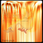
photoshop is being a twat at the moment, its not recognising the new fonts i installed and not letting me saves files with borders (wtf??)
so i'm stuck with this for now. thoughts? ways to improve?
Sig, Avatar, And Set Rating Topic Rate other people's Sig/Avatar and Set!
#6201

- Banned
-

- Group: Veterans
- Posts: 4,301
- Joined: 05-September 05
- Gender:Male
- Location:where horses with broken legs go =D
- Interests:research it
-
AKA Dullahan
Posted 10 February 2008 - 06:28 PM
#6202

- Can't touch this.
-
- Group: Admin
- Posts: 6,607
- Joined: 28-March 04
- Gender:Male
- Location:New York City, Boston
Posted 10 February 2008 - 06:36 PM
Thanks for the criticism, everyone. I know it's not a perfect set, but I personally just found it to be a welcome change from the Yondaime set that I've had for a year+ now.
I actually went for a minimalist approach - I like simplicity, and along with the Wind Waker-art style (which you all know is a game I thoroughly enjoyed), it was all I wanted in a sig.
That said, if the simple approach doesn't click with everyone else here, what do you suggest I put in the space?
I actually went for a minimalist approach - I like simplicity, and along with the Wind Waker-art style (which you all know is a game I thoroughly enjoyed), it was all I wanted in a sig.
That said, if the simple approach doesn't click with everyone else here, what do you suggest I put in the space?
#6203

- Disciple
-
- Group: Veterans
- Posts: 1,769
- Joined: 06-October 07
- Gender:Male
- Location:LongGuy Land
Posted 10 February 2008 - 06:39 PM
Nice GL, the sig looks like Link from Phantom Hourglass. It's a bit too simplistic though.
I like the avvy too, they both kind of match, even if they are different.
8/10
New Fawful set!
I like the avvy too, they both kind of match, even if they are different.
8/10
New Fawful set!
#6204

- High Sheriff
-
- Group: Moderator
- Posts: 11,988
- Joined: 21-July 04
- Gender:Male
- Location:Sitting on a fence and drinking root beer
-
AKA Wind Dude (WD)
Posted 10 February 2008 - 07:14 PM
Haha, the avatar is so ripped from the sig it's a bit silly. At least take the exclamation mark out of the avatar. XD
Av: 7/10
Sig: 8.5/10
Set: 7.5/10
GL, simplicity is good. But right now, it looks more blank than simple. Try some more images with WW Link for the sig, possibly another chibi Cloud too.
Av: 7/10
Sig: 8.5/10
Set: 7.5/10
GL, simplicity is good. But right now, it looks more blank than simple. Try some more images with WW Link for the sig, possibly another chibi Cloud too.
#6205

- Master Adept
-
- Group: Veterans
- Posts: 8,730
- Joined: 09-June 06
- Gender:Male
- Location:England
- Interests:EVERYTHING EVER
Posted 11 February 2008 - 03:18 PM
New set. Well not really a set, but new sig and av.
WD: Loving the crysis set. The hexagon overlay is awesome and despite it just being a clip from the box art, the overlay makes the avatar look new and futurey. The sig is just as awesome and the lighting in it is very well done. One of my favourite sets on this forum. 9.5/10
WD: Loving the crysis set. The hexagon overlay is awesome and despite it just being a clip from the box art, the overlay makes the avatar look new and futurey. The sig is just as awesome and the lighting in it is very well done. One of my favourite sets on this forum. 9.5/10
#6206

- The toast in your toaster
-
- Group: Veterans
- Posts: 12,421
- Joined: 04-April 06
- Gender:Male
- Location:The toaster in your kitchen.
- Interests:Parkour, Martial Arts, Music, Network Administration,
-
AKA The toast in the toaster in your kitchen.
Posted 12 February 2008 - 12:24 AM
:D
Paint.NET ftw. :joy: Seriously though. It's free, it's got tons of plugins, and I've only had one small problem with it in the entire time I've used it.
My only complaint about your set is the stretched avatar. 8/10
 laharl the slayer, on Feb 10 2008, 04:28 PM, said:
photoshop is being a twat at the moment, its not recognising the new fonts i installed and not letting me saves files with borders (wtf??)
so i'm stuck with this for now. thoughts? ways to improve?
so i'm stuck with this for now. thoughts? ways to improve?
Paint.NET ftw. :joy: Seriously though. It's free, it's got tons of plugins, and I've only had one small problem with it in the entire time I've used it.
My only complaint about your set is the stretched avatar. 8/10
#6207

- Nebuchadnezzar
-
- Group: Veterans
- Posts: 11,279
- Joined: 16-December 05
- Gender:Male
- Location:37°48′S, 144°57′E.
- Interests:.5% per annum.
-
AKA Spam King
Posted 12 February 2008 - 03:46 AM
I think it's the sig that's stretched, not the avatar. Notice the difference in quality?
#6208
- Master Adept
-
- Group: Veterans
- Posts: 8,730
- Joined: 09-June 06
- Gender:Male
- Location:England
- Interests:EVERYTHING EVER
Posted 12 February 2008 - 11:07 AM
RATE MY SSEEEEEEEEEEEEEEET
#6209

- Master Adept
-
- Group: Veterans
- Posts: 4,114
- Joined: 29-April 07
- Gender:Male
- Location:Sky Haven, the island in the sky
- Interests:video games, RPGs in particular, reading, mostly sci-fi and Graphic Novels, Kenshin is the best.<br />
-
AKA escout
Posted 12 February 2008 - 09:20 PM
@ Caael - avi 3/10, sig 6/10
Hey skid, if you want a new sig, check this out. I hope the guy that made it comes back soon.
Hey skid, if you want a new sig, check this out. I hope the guy that made it comes back soon.
Blaze, on Aug 23 2006, 08:53 PM, said:
Another
http://i50.photobucket.com/albums/f322/Blazeexe/new%20work/90679b2b.jpg
http://i50.photobucket.com/albums/f322/Blazeexe/new%20work/90679b2b.jpg
#6210
- Nebuchadnezzar
-
- Group: Veterans
- Posts: 11,279
- Joined: 16-December 05
- Gender:Male
- Location:37°48′S, 144°57′E.
- Interests:.5% per annum.
-
AKA Spam King
Posted 13 February 2008 - 01:06 AM
Who's the guy that made it then?
#6211
- Master Adept
-
- Group: Veterans
- Posts: 8,730
- Joined: 09-June 06
- Gender:Male
- Location:England
- Interests:EVERYTHING EVER
Posted 13 February 2008 - 01:59 AM
Escout, you didnt give any improvements or any good points about it. Explain, because I want to know how to make it better. Numbers aren't useful.
#6212
- The toast in your toaster
-
- Group: Veterans
- Posts: 12,421
- Joined: 04-April 06
- Gender:Male
- Location:The toaster in your kitchen.
- Interests:Parkour, Martial Arts, Music, Network Administration,
-
AKA The toast in the toaster in your kitchen.
Posted 13 February 2008 - 03:25 AM
The avatar is just an animated image of some squid.....thing. It's not pleasing to the eye. 2/10
The sig is okay, but the guy takes up too much space. You can't see the background. Plus, he's just some guy from Halo with a custom suit of armor. 6/10
And Split, the sig escout posted was made by Blaze. Go check his art topic. You'll remember who he is.
The sig is okay, but the guy takes up too much space. You can't see the background. Plus, he's just some guy from Halo with a custom suit of armor. 6/10
And Split, the sig escout posted was made by Blaze. Go check his art topic. You'll remember who he is.
#6213
- Master Adept
-
- Group: Veterans
- Posts: 8,730
- Joined: 09-June 06
- Gender:Male
- Location:England
- Interests:EVERYTHING EVER
Posted 13 February 2008 - 09:43 AM
He's MY guy from Halo. You say he takes up too much space but look at the car in your sig. Frikkin' hypocrites...
#6214

- Squire
-
- Group: Members
- Posts: 32
- Joined: 25-June 06
- Location:Philadelphia,PA
Posted 13 February 2008 - 11:12 AM
"The avatar is just an animated image of some squid.....thing. It's not pleasing to the eye. 2/10"I'll take that quote from toasty >>..
Now for the sig,The text is bad the render isnt blended there is no lighting or depth..But I love the colors >_> so 6/10
Now for the sig,The text is bad the render isnt blended there is no lighting or depth..But I love the colors >_> so 6/10
#6215
- Banned
-
- Group: Veterans
- Posts: 4,301
- Joined: 05-September 05
- Gender:Male
- Location:where horses with broken legs go =D
- Interests:research it
-
AKA Dullahan
Posted 13 February 2008 - 11:27 AM
avatar: pretty nice, one of the better animated ones i've seen, its from Beck right? 9/10
sig1: its well made but i despise kingdom hearts so that marks it down 8/10
sig2: i have the wallaper you've cut that from :/ but its Shana so 8/10
no matching goodness so 6/10 as a set
sig1: its well made but i despise kingdom hearts so that marks it down 8/10
sig2: i have the wallaper you've cut that from :/ but its Shana so 8/10
no matching goodness so 6/10 as a set
#6216
- Master Adept
-
- Group: Veterans
- Posts: 8,730
- Joined: 09-June 06
- Gender:Male
- Location:England
- Interests:EVERYTHING EVER
Posted 13 February 2008 - 11:31 AM
It's tony harrison so actually it gets a 10/10 in my eyes, and i'm sure Laharl agrees.
#6217
- Banned
-
- Group: Veterans
- Posts: 4,301
- Joined: 05-September 05
- Gender:Male
- Location:where horses with broken legs go =D
- Interests:research it
-
AKA Dullahan
Posted 13 February 2008 - 11:36 AM
it is indeed awesome on those grounds, you needs to weave "This is an Outrage!" into it XD 9/10
sig is alright, even if i do hate Halo 7/10
sig is alright, even if i do hate Halo 7/10
#6218
- Master Adept
-
- Group: Veterans
- Posts: 8,730
- Joined: 09-June 06
- Gender:Male
- Location:England
- Interests:EVERYTHING EVER
Posted 13 February 2008 - 11:58 AM
I'm really not creative with sigs. I'll make a render for the background, plaster an image over the top and put a border in and thats about it.
#6219
- Disciple
-
- Group: Members
- Posts: 2,013
- Joined: 27-May 06
- Gender:Male
- Location:Your local pharmacist
- Interests:Drums, Guitar Hero, pretending to play guitar, getting awesome at the one song I know how to play on bass, school(yeah, I'm such a loser) music, mohney, etc.<br /><br />I suppose I'll give you an abbreviated list of bands that I like:<br />Relient K<br />Switchfoot<br />Guster<br />Angels and Airwaves<br />Arcade Fire<br />Porcupine Tree<br />Weezer<br />Mae<br /><br />It's sorta a weird mix of mainstream and not so mainstream.<br />I like a lot of single songs too...<br /><br />Bands I need to look at:<br />Plastic Constellations<br />Cauterize<br />Patent Pending<br />And a bunch of local bands that you'll probably never hear of.<br /><br />Pandora rocks.<br /><br />I'm running out of things to say here.<br /><br />Perhaps I like duct tape?<br /><br />Yeah. This likely won't be touched for another year when my tastes have completely changed.<br />
Posted 13 February 2008 - 08:29 PM
This is my new sig. It's weird...I spent a lot of time on that sun one, but this took 5 minutes and I like it a lot better.
Original
Original
#6220

- Master Adept
-
- Group: Veterans
- Posts: 2,900
- Joined: 24-July 04
- Gender:Female
- Location:over thar
- Interests:rpgs (duh :P), internet (my precioussss)...other things computer related...and penguins! (penguin'd)
-
AKA The Best Woman Ever.
Posted 13 February 2008 - 08:35 PM
omfg *hearts new sig* dude. that totally looks like hyrule castle from windwaker...except with a hot air balloon.
OH MAI GAWD it's deep. 50/10.
OH MAI GAWD it's deep. 50/10.
#6221
- Disciple
-
- Group: Members
- Posts: 2,013
- Joined: 27-May 06
- Gender:Male
- Location:Your local pharmacist
- Interests:Drums, Guitar Hero, pretending to play guitar, getting awesome at the one song I know how to play on bass, school(yeah, I'm such a loser) music, mohney, etc.<br /><br />I suppose I'll give you an abbreviated list of bands that I like:<br />Relient K<br />Switchfoot<br />Guster<br />Angels and Airwaves<br />Arcade Fire<br />Porcupine Tree<br />Weezer<br />Mae<br /><br />It's sorta a weird mix of mainstream and not so mainstream.<br />I like a lot of single songs too...<br /><br />Bands I need to look at:<br />Plastic Constellations<br />Cauterize<br />Patent Pending<br />And a bunch of local bands that you'll probably never hear of.<br /><br />Pandora rocks.<br /><br />I'm running out of things to say here.<br /><br />Perhaps I like duct tape?<br /><br />Yeah. This likely won't be touched for another year when my tastes have completely changed.<br />
Posted 14 February 2008 - 03:48 PM
I fixed it a little, since the white was sorta blinding.
And kate, the avatar is awesome.
And kate, the avatar is awesome.
#6222
- Disciple
-
- Group: Veterans
- Posts: 1,769
- Joined: 06-October 07
- Gender:Male
- Location:LongGuy Land
Posted 14 February 2008 - 04:07 PM
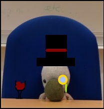
8/10 for the avatar- you should make the duck more visible
Just asking, are here supposed to be words in the avatar?
9/10 for the sig- It's awesome, cool picture, mysterious. The white hurts my eyes though.
Just asking, are here supposed to be words in the avatar?
9/10 for the sig- It's awesome, cool picture, mysterious. The white hurts my eyes though.
#6223
- Disciple
-
- Group: Members
- Posts: 2,013
- Joined: 27-May 06
- Gender:Male
- Location:Your local pharmacist
- Interests:Drums, Guitar Hero, pretending to play guitar, getting awesome at the one song I know how to play on bass, school(yeah, I'm such a loser) music, mohney, etc.<br /><br />I suppose I'll give you an abbreviated list of bands that I like:<br />Relient K<br />Switchfoot<br />Guster<br />Angels and Airwaves<br />Arcade Fire<br />Porcupine Tree<br />Weezer<br />Mae<br /><br />It's sorta a weird mix of mainstream and not so mainstream.<br />I like a lot of single songs too...<br /><br />Bands I need to look at:<br />Plastic Constellations<br />Cauterize<br />Patent Pending<br />And a bunch of local bands that you'll probably never hear of.<br /><br />Pandora rocks.<br /><br />I'm running out of things to say here.<br /><br />Perhaps I like duct tape?<br /><br />Yeah. This likely won't be touched for another year when my tastes have completely changed.<br />
Posted 14 February 2008 - 08:52 PM
True. I fixed it a little, but not enough...
And the words in the avvy aren't supposed to be visible...Funky design choice...I'm not a big fan of it anymore.
Fawful is pretty sweet. The avvy is a tad grainy, though. 7.5/10
And the words in the avvy aren't supposed to be visible...Funky design choice...I'm not a big fan of it anymore.
Fawful is pretty sweet. The avvy is a tad grainy, though. 7.5/10
#6224
- Can't touch this.
-
- Group: Admin
- Posts: 6,607
- Joined: 28-March 04
- Gender:Male
- Location:New York City, Boston
Posted 15 February 2008 - 08:49 PM
FlaimingDuck, that sig seems oddly familiar. It's nicely done, if slightly difficult to make out detail because the white is a little too strong. The avatar isn't bad either, it's just hard to make out any detail either. Consider making one to match your sig?
4.5 out of 5 for the sig
3 out of 5 for the avatar
7.5/10 total
4.5 out of 5 for the sig
3 out of 5 for the avatar
7.5/10 total
#6225

- Berserker
-
- Group: Members
- Posts: 436
- Joined: 18-January 07
- Gender:Female
- Location:Look behind you~ >3
- Interests:Anime: Trinity Blood, Bleach, and Samurai Champloo.<br />Manga: Xxx Holic, X/ 1999, and Dragon Knights<br />Game: Final Fantasy VII, .Hack GU, KH II, [b]Tales of the Abyss[/b]<br />---------------------<br />Favorite Characters: Sephiroth, Vincent, Leon/Squall, [b]JADE CURTISS[/b]<br />Favorite Online Game: RO<br />Favorite Colors: Blue, Purple, Black, Green<br />Favoirte Music: J-pop, Rock, Metal, J-rock, Pop.<br />Favorite all time artist: CLAMP<br />Favorite Band: System of a Down<br />Favorite Song: Kiss by a Rose, Sail (sp?)<br />Favorite Food: Chocolate<br />Favorite Word: Pie<br />---------------------<br />Total RPC: 5<br /><br />Names of RPC:<br /><br />Yuki Shadow (F)<br />Fay W. Sabakura (M)<br />Black Cat (F)<br />White Cat (M)<br />Fionn (M)
Posted 15 February 2008 - 09:37 PM
GL, I liked your old ava and sig better. XD;
the ava is pretty neat, but your sig doesn't have a color scheme and hence it made it look very ackward. You could have put more things on it because it looks empty.
I give it a 7/10.
the ava is pretty neat, but your sig doesn't have a color scheme and hence it made it look very ackward. You could have put more things on it because it looks empty.
I give it a 7/10.
#6226
- Nebuchadnezzar
-
- Group: Veterans
- Posts: 11,279
- Joined: 16-December 05
- Gender:Male
- Location:37°48′S, 144°57′E.
- Interests:.5% per annum.
-
AKA Spam King
Posted 15 February 2008 - 11:42 PM
...I'm not even going to bother with you until you reduce the size of your sig. :lol:
#6227

- Master Adept
-
- Group: Veterans
- Posts: 2,902
- Joined: 21-June 04
- Gender:Female
- Location:Tucson, Arizona
- Interests:I've got hobby A.D.D.
-
AKA lightningstar/Icy
Posted 15 February 2008 - 11:55 PM
Avatar: it matches, and in terms of design, it's nicely balanced, but it could use a border. 7/10
Sig: Looks good with your sig, however, you could have something to the left of sora, like your name or "Kingdom Hearts" or something. 8.5/10
set: 8/10
Sig: Looks good with your sig, however, you could have something to the left of sora, like your name or "Kingdom Hearts" or something. 8.5/10
set: 8/10
#6228
- Nebuchadnezzar
-
- Group: Veterans
- Posts: 11,279
- Joined: 16-December 05
- Gender:Male
- Location:37°48′S, 144°57′E.
- Interests:.5% per annum.
-
AKA Spam King
Posted 16 February 2008 - 12:07 AM
Icy
Avatar: Nice, looks a lot better than the bubble effect you had before. 7.5/10
Signature: Good match, even though they look kind of different. 7.5/10
Overall: 7.5/10
Avatar: Nice, looks a lot better than the bubble effect you had before. 7.5/10
Signature: Good match, even though they look kind of different. 7.5/10
Overall: 7.5/10
#6229
- Can't touch this.
-
- Group: Admin
- Posts: 6,607
- Joined: 28-March 04
- Gender:Male
- Location:New York City, Boston
Posted 16 February 2008 - 12:07 AM
I believe I've rated your set before Icy. It's great, the art work and water effect fit very well. Just a slight clash of art styles of Katara is perhaps it's only fault (they're both great drawings of her, but with evidently a different style/emotion conveyed with each).
Great set all the same, 4.5/5.
Great set all the same, 4.5/5.
#6230

- Loose cannon Cop with nothing to lose
-
- Group: Veterans
- Posts: 4,998
- Joined: 22-March 07
- Gender:Male
- Location:Segmentum Obscurus
-
AKA Darksword
Posted 16 February 2008 - 06:47 PM
Avatar: A little dark, but besides that, no complaints. 8/10
Sig: The guy looks like he's squeezing out a kiddney stone, and that swirl thing on the side is distracting me from the rest of the picture. 6/10
Sig: The guy looks like he's squeezing out a kiddney stone, and that swirl thing on the side is distracting me from the rest of the picture. 6/10
#6231

- Chaos Lord
-
- Group: Veterans
- Posts: 793
- Joined: 30-October 07
- Gender:Male
- Location:Coztopia
- Interests:Video games, Computer, Card games, Theatre
-
AKA killercoz
Posted 16 February 2008 - 11:26 PM
Sorry Darksword, but I want to comment on GL's new set. All I have to say is...HOW DARE YOU!!!!! WHO DO YOU THINK YOU ARE?!?!?!?!?! Let me explain, for the good 5 months I have been going onto GSSF one of the most interesting differences from this forum to my other one is the ability of choosing your own avatar. For some ridiculous reason the other forums only give you a few options, and when someone picks one they stick with it. Because you can pick whatever you want on GSSF, people change their avatar and signature constantly. Of course GL, this "rule" so to speak did not apply to you, because for 4 months straight you were the ONLY person to keep the same avatar. Now I kind of liked this for 2 reasons, one it showed your individuality and your ability to set your mind on something and 2 it allowed me to symbolize you with that blonde guy. Now I understand the complaint of it being a year and perhaps its time for change, and I understand and agree that a new avatar and sig was the way to go. Fine thats good, no problem. You picked 2 new characters link and some other blonde small character. I felt this was good and symbolized you well. I was very consumed with joy with the new vision of cute mini GL which I did call you once in TRT. YAY all is right in the worlds. Now you have a new set and it should be condemned to the hell I don't believe exists. It isn't your stlye and it doesn't show anything about you. It is unfortunately a failed attempt and should be removed ASAP. I wouldnt right this whole critical essay on this if I didnt care, BRING ONE OF THE OLD SETS BACK!!!!!!! Sorry if these sentyences lack some grammar because its late and a lot to write. Also, what does everyone think of the new set Icy made me???
#6232
- Nebuchadnezzar
-
- Group: Veterans
- Posts: 11,279
- Joined: 16-December 05
- Gender:Male
- Location:37°48′S, 144°57′E.
- Interests:.5% per annum.
-
AKA Spam King
Posted 16 February 2008 - 11:40 PM
At least half of that post was unnecessary. Paragraphs would have been nice too.
#6233
- Chaos Lord
-
- Group: Veterans
- Posts: 793
- Joined: 30-October 07
- Gender:Male
- Location:Coztopia
- Interests:Video games, Computer, Card games, Theatre
-
AKA killercoz
Posted 16 February 2008 - 11:54 PM
Split Infinity, on Feb 17 2008, 12:40 AM, said:
At least half of that post was unnecessary. Paragraphs would have been nice too.
IM sorry sir, but did you not notice teh whole:
killercoz, on Feb 17 2008, 12:26 AM, said:
Sorry if these sentyences lack some grammar because its late and a lot to write.
#6234
- Nebuchadnezzar
-
- Group: Veterans
- Posts: 11,279
- Joined: 16-December 05
- Gender:Male
- Location:37°48′S, 144°57′E.
- Interests:.5% per annum.
-
AKA Spam King
Posted 16 February 2008 - 11:55 PM
yea soz i cudnt be bothrd typng a gud post kthxbai
#6235
- Can't touch this.
-
- Group: Admin
- Posts: 6,607
- Joined: 28-March 04
- Gender:Male
- Location:New York City, Boston
Posted 17 February 2008 - 01:05 AM
DarkSword, on Feb 16 2008, 08:47 PM, said:
Avatar: A little dark, but besides that, no complaints. 8/10
Sig: The guy looks like he's squeezing out a kiddney stone, and that swirl thing on the side is distracting me from the rest of the picture. 6/10
Sig: The guy looks like he's squeezing out a kiddney stone, and that swirl thing on the side is distracting me from the rest of the picture. 6/10
Squeezing out a kidney stone?
Mm. No comment there.
killercoz, on Feb 17 2008, 01:26 AM, said:
Sorry Darksword, but I want to comment on GL's new set. All I have to say is...HOW DARE YOU!!!!! WHO DO YOU THINK YOU ARE?!?!?!?!?! Let me explain, for the good 5 months I have been going onto GSSF one of the most interesting differences from this forum to my other one is the ability of choosing your own avatar. For some ridiculous reason the other forums only give you a few options, and when someone picks one they stick with it. Because you can pick whatever you want on GSSF, people change their avatar and signature constantly. Of course GL, this "rule" so to speak did not apply to you, because for 4 months straight you were the ONLY person to keep the same avatar. Now I kind of liked this for 2 reasons, one it showed your individuality and your ability to set your mind on something and 2 it allowed me to symbolize you with that blonde guy. Now I understand the complaint of it being a year and perhaps its time for change, and I understand and agree that a new avatar and sig was the way to go. Fine thats good, no problem. You picked 2 new characters link and some other blonde small character. I felt this was good and symbolized you well. I was very consumed with joy with the new vision of cute mini GL which I did call you once in TRT. YAY all is right in the worlds. Now you have a new set and it should be condemned to the hell I don't believe exists. It isn't your stlye and it doesn't show anything about you. It is unfortunately a failed attempt and should be removed ASAP. I wouldnt right this whole critical essay on this if I didnt care, BRING ONE OF THE OLD SETS BACK!!!!!!! Sorry if these sentyences lack some grammar because its late and a lot to write. Also, what does everyone think of the new set Icy made me???
I read every word of your post (honestly), and to be perfectly honest I liked my old Yondaime set (the yellow/blonde guy one) most so far. I did feel as though it were time for a change (if nothing else just to "shake things up"), which is simply an impulse that comes and goes, and hence I went with the cute Wind Waker-styled Cloud/Link set.
For some reason though, as much as I liked the new style, I couldn't "click" with it. Maybe it's because I stuck with the Yondaime one for so long, and also because the signature was, admittedly, not as unique (considering it was simply official art), I felt I had to take a step back slightly and go back to "tried and true territory", namely Yondaime, because I had begun to associate with the blonde guy, who I happen to find a fascinating character (from the Naruto manga/anime, for reference).
I don't like constantly switching around avatars and signatures any more than you do, and believe me I feel and understand that. I'm simply going to take more time to "prepare" the cute Link/Cloud set I had a few days ago, and in the meanwhile I'll simply relive an old styled set, for nostalgia's sake.
#6236
- Chaos Lord
-
- Group: Veterans
- Posts: 793
- Joined: 30-October 07
- Gender:Male
- Location:Coztopia
- Interests:Video games, Computer, Card games, Theatre
-
AKA killercoz
Posted 17 February 2008 - 01:28 AM
Works for me. Whatcha ya think of the PC set?
#6237

- Disciple
-
- Group: Veterans
- Posts: 1,300
- Joined: 07-March 04
- Gender:Male
- Location:Netherlands
-
AKA Neo_Genesis
Posted 17 February 2008 - 04:18 AM
Riad;
The avatar is a rather cool animation, though I've never been a real fan of animated avatars. I'd have to rate it 7/10, purely out of my dislike of animations, hehe.
The signature, however, looks really good. Perfect background, and really well blended image. The text is a fantastic finishing touch. 9/10 for the signature!
So for an overall I'd go for 8/10. If you made the avatar matching, I'd go for a 9/10 or 10/10 even.
Killercoz;
Bright colors! Doesn't look bad at all, though. The only thing that worries me is the text, as it's not easy to read, and I don't really like the font. Overall I'd give an 8/10
As for my own set, it's easy to see I went for another style this time. I didn't want to do the known background+render, thus I choose for this. Hope you like it.
#6238
- Berserker
-
- Group: Members
- Posts: 436
- Joined: 18-January 07
- Gender:Female
- Location:Look behind you~ >3
- Interests:Anime: Trinity Blood, Bleach, and Samurai Champloo.<br />Manga: Xxx Holic, X/ 1999, and Dragon Knights<br />Game: Final Fantasy VII, .Hack GU, KH II, [b]Tales of the Abyss[/b]<br />---------------------<br />Favorite Characters: Sephiroth, Vincent, Leon/Squall, [b]JADE CURTISS[/b]<br />Favorite Online Game: RO<br />Favorite Colors: Blue, Purple, Black, Green<br />Favoirte Music: J-pop, Rock, Metal, J-rock, Pop.<br />Favorite all time artist: CLAMP<br />Favorite Band: System of a Down<br />Favorite Song: Kiss by a Rose, Sail (sp?)<br />Favorite Food: Chocolate<br />Favorite Word: Pie<br />---------------------<br />Total RPC: 5<br /><br />Names of RPC:<br /><br />Yuki Shadow (F)<br />Fay W. Sabakura (M)<br />Black Cat (F)<br />White Cat (M)<br />Fionn (M)
Posted 17 February 2008 - 11:26 PM
@Split: O.uch, that really hurt... a lot.
@Neo: I like it, it has a really simple design with a color scheme. In your cause, it is too clusters, maybe try to make some of the stuff 'faded' out or maybe use a different type of blue.
Also, I didn't noticed about the letters until I took a good look at it.
Overall, I like the simplicty of it. 8/10
#6239
- Master Adept
-
- Group: Veterans
- Posts: 2,900
- Joined: 24-July 04
- Gender:Female
- Location:over thar
- Interests:rpgs (duh :P), internet (my precioussss)...other things computer related...and penguins! (penguin'd)
-
AKA The Best Woman Ever.
Posted 18 February 2008 - 12:21 PM
neo your set is smexy. nuff said.
coz your sig is like a rainbow of awesome but i can't see your avy...mostly cause I ate it
split...honestly I'm a little ticked off you have the kh set. I don't know why, it just doesn't seem to fit. Sora is all good and pure D:
don't rate me, I've had the same set since the beginning of time.
coz your sig is like a rainbow of awesome but i can't see your avy...mostly cause I ate it
split...honestly I'm a little ticked off you have the kh set. I don't know why, it just doesn't seem to fit. Sora is all good and pure D:
don't rate me, I've had the same set since the beginning of time.
#6240
- Master Adept
-
- Group: Veterans
- Posts: 4,002
- Joined: 23-June 05
- Gender:Male
- Location:Somewhere in Europe
- Interests:Nom nom nom. Cookies.
Posted 18 February 2008 - 01:39 PM
People seem to take their sets way to seriously imo.
Sure, it's nice to have a fancy set, and if people like what they make, don't criticize it down the drain. That makes the little kitty next to me cry.
That said, split, why did you bring back that old set? I like the random lost one better.
Sure, it's nice to have a fancy set, and if people like what they make, don't criticize it down the drain. That makes the little kitty next to me cry.
That said, split, why did you bring back that old set? I like the random lost one better.
#6241
- Master Adept
-
- Group: Veterans
- Posts: 4,114
- Joined: 29-April 07
- Gender:Male
- Location:Sky Haven, the island in the sky
- Interests:video games, RPGs in particular, reading, mostly sci-fi and Graphic Novels, Kenshin is the best.<br />
-
AKA escout
Posted 18 February 2008 - 10:09 PM
Hey GL, I've been wondering, where did your avatar come from, it looks cool.
#6242
- Can't touch this.
-
- Group: Admin
- Posts: 6,607
- Joined: 28-March 04
- Gender:Male
- Location:New York City, Boston
Posted 18 February 2008 - 10:11 PM
Some random Naruto-based forum I was browsing through (Narutofan.com, I believe). I obviously haven't the skill nor the faintest idea myself on how to create this.
But hey, no complaints here. :lol:
But hey, no complaints here. :lol:
#6243
- Master Adept
-
- Group: Veterans
- Posts: 4,114
- Joined: 29-April 07
- Gender:Male
- Location:Sky Haven, the island in the sky
- Interests:video games, RPGs in particular, reading, mostly sci-fi and Graphic Novels, Kenshin is the best.<br />
-
AKA escout
Posted 18 February 2008 - 10:12 PM
whose in it?
#6244
- Can't touch this.
-
- Group: Admin
- Posts: 6,607
- Joined: 28-March 04
- Gender:Male
- Location:New York City, Boston
Posted 18 February 2008 - 10:14 PM
Yondaime, the 4th Hokage from Naruto who was killed attempting to defend the village from the Kyuubi (9-tailed fox demon), and ended up giving his life to seal the creature inside Naruto, who is the story's protagonist and titular character. [/unnecessarily thorough explanation]
P.S. *cough* 5-word limit *cough* =)
P.S. *cough* 5-word limit *cough* =)
#6245
- Master Adept
-
- Group: Veterans
- Posts: 4,114
- Joined: 29-April 07
- Gender:Male
- Location:Sky Haven, the island in the sky
- Interests:video games, RPGs in particular, reading, mostly sci-fi and Graphic Novels, Kenshin is the best.<br />
-
AKA escout
Posted 18 February 2008 - 10:16 PM
Oh, guess I need to watch more of the anime.
#6246
- Can't touch this.
-
- Group: Admin
- Posts: 6,607
- Joined: 28-March 04
- Gender:Male
- Location:New York City, Boston
Posted 18 February 2008 - 10:17 PM
Might I ask where you got your similarly-animated avatar from? That is Rurouni Kenshin, I'm sure.
#6247
- Master Adept
-
- Group: Veterans
- Posts: 4,114
- Joined: 29-April 07
- Gender:Male
- Location:Sky Haven, the island in the sky
- Interests:video games, RPGs in particular, reading, mostly sci-fi and Graphic Novels, Kenshin is the best.<br />
-
AKA escout
Posted 18 February 2008 - 10:19 PM
It's from the opening sequence to Rurouni Kenshin season one
#6248
- Can't touch this.
-
- Group: Admin
- Posts: 6,607
- Joined: 28-March 04
- Gender:Male
- Location:New York City, Boston
Posted 18 February 2008 - 10:20 PM
Ahh, that's right, the opening! I myself used to watch the English dub (yes, I know, "epic failz" and all that), and enjoyed it very much.
But not to get too off-topic here! The signature is absolutely amazing, Icy did a phenomenal job, I love Kenshin's overlaying face on the left-hand side. The avatar is good, if slightly choppy in animation, but the match is quite good. Overall, great set.
4.5/5
But not to get too off-topic here! The signature is absolutely amazing, Icy did a phenomenal job, I love Kenshin's overlaying face on the left-hand side. The avatar is good, if slightly choppy in animation, but the match is quite good. Overall, great set.
4.5/5
#6249
- Master Adept
-
- Group: Veterans
- Posts: 4,114
- Joined: 29-April 07
- Gender:Male
- Location:Sky Haven, the island in the sky
- Interests:video games, RPGs in particular, reading, mostly sci-fi and Graphic Novels, Kenshin is the best.<br />
-
AKA escout
Posted 18 February 2008 - 10:22 PM
thanks, your's get a 9/10 from me. :lol:
#6250
- Chaos Lord
-
- Group: Veterans
- Posts: 793
- Joined: 30-October 07
- Gender:Male
- Location:Coztopia
- Interests:Video games, Computer, Card games, Theatre
-
AKA killercoz
Posted 18 February 2008 - 10:25 PM
Hey GL I watch Naruto and I wanted to ask about somethink Im unsure of. If Saratoubi came after the 4th hokage, why wasnt he the fourth and the fourth hokage would be the third??
#6251
- Can't touch this.
-
- Group: Admin
- Posts: 6,607
- Joined: 28-March 04
- Gender:Male
- Location:New York City, Boston
Posted 18 February 2008 - 10:30 PM
killercoz, on Feb 19 2008, 12:25 AM, said:
Hey GL I watch Naruto and I wanted to ask about somethink Im unsure of. If Saratoubi came after the 4th hokage, why wasnt he the fourth and the fourth hokage would be the third??
I'll answer this, and then we'll get back to rating sets, sound good?
The thing is, Sarutobi was "retired" as Hokage, and the 4th succeeded him, as normal. However, the attack by the Kyuubi, and Yondaime (the 4th) dieing in the process was of course unexpected. So Sarutobi had to come back and resume the role of Hokage (think of it as "coming back out of retirement"), and that's how the story proceeds.
#6252
- Chaos Lord
-
- Group: Veterans
- Posts: 793
- Joined: 30-October 07
- Gender:Male
- Location:Coztopia
- Interests:Video games, Computer, Card games, Theatre
-
AKA killercoz
Posted 18 February 2008 - 10:30 PM
Ah that makes a lot of sense, thanks GL!!!
#6253
- Master Adept
-
- Group: Veterans
- Posts: 4,114
- Joined: 29-April 07
- Gender:Male
- Location:Sky Haven, the island in the sky
- Interests:video games, RPGs in particular, reading, mostly sci-fi and Graphic Novels, Kenshin is the best.<br />
-
AKA escout
Posted 18 February 2008 - 10:31 PM
Killercoz your set is phyadillic, 10/10 for the headtrip
#6254
- Chaos Lord
-
- Group: Veterans
- Posts: 793
- Joined: 30-October 07
- Gender:Male
- Location:Coztopia
- Interests:Video games, Computer, Card games, Theatre
-
AKA killercoz
Posted 18 February 2008 - 10:34 PM
Why thank you escout!! I also feel it fits my zany personality, don't you?
#6255

- Slayer
-
- Group: Members
- Posts: 340
- Joined: 08-January 08
- Gender:Female
- Location:Lemuria ftw.
- Interests:Mostly video games (Golden Sun, Halo, Starcraft, Pokemon) and art.
Posted 19 February 2008 - 01:49 AM
escout: 7/10. I looove your sig, but your avy makes me dizzy.
coz: 8/10: Trippy! Fun colors, wee, and neat words and confusing textures. And they match! Like a pair of socks. Sig could have had more of something dark in the background, though.
coz: 8/10: Trippy! Fun colors, wee, and neat words and confusing textures. And they match! Like a pair of socks. Sig could have had more of something dark in the background, though.
#6256
- Nebuchadnezzar
-
- Group: Veterans
- Posts: 11,279
- Joined: 16-December 05
- Gender:Male
- Location:37°48′S, 144°57′E.
- Interests:.5% per annum.
-
AKA Spam King
Posted 19 February 2008 - 02:18 AM
killercoz, on Feb 19 2008, 03:34 PM, said:
Why thank you escout!! I also feel it fits my zany personality, don't you?
...excuse me wtf r u talkin about?
#6257
- Loose cannon Cop with nothing to lose
-
- Group: Veterans
- Posts: 4,998
- Joined: 22-March 07
- Gender:Male
- Location:Segmentum Obscurus
-
AKA Darksword
Posted 19 February 2008 - 02:22 AM
I'm glad you got rid of Locke (I think thats how you spell his name), it made me picture you as an old man. The current sig is good, but its still an old one so...
7/10
7/10
#6258
- Slayer
-
- Group: Members
- Posts: 340
- Joined: 08-January 08
- Gender:Female
- Location:Lemuria ftw.
- Interests:Mostly video games (Golden Sun, Halo, Starcraft, Pokemon) and art.
Posted 19 February 2008 - 02:23 AM
DarkSword gets 9/10 cause it looks ubercool. It's fun to guess at what's in the picture, but I think it could use more red.
#6259
- Nebuchadnezzar
-
- Group: Veterans
- Posts: 11,279
- Joined: 16-December 05
- Gender:Male
- Location:37°48′S, 144°57′E.
- Interests:.5% per annum.
-
AKA Spam King
Posted 19 February 2008 - 02:25 AM
DarkSword, on Feb 19 2008, 07:22 PM, said:
I'm glad you got rid of Locke (I think thats how you spell his name), it made me picture you as an old man. The current sig is good, but its still an old one so...
7/10
7/10
That is not a valid criterion. :lol:
#6260
- Loose cannon Cop with nothing to lose
-
- Group: Veterans
- Posts: 4,998
- Joined: 22-March 07
- Gender:Male
- Location:Segmentum Obscurus
-
AKA Darksword
Posted 19 February 2008 - 02:31 AM
What do you think is in there?
looks good.
8/10
looks good.
8/10
#6261
- Nebuchadnezzar
-
- Group: Veterans
- Posts: 11,279
- Joined: 16-December 05
- Gender:Male
- Location:37°48′S, 144°57′E.
- Interests:.5% per annum.
-
AKA Spam King
Posted 19 February 2008 - 02:42 AM
Criterion is the singular form of criteria.
#6262
- Loose cannon Cop with nothing to lose
-
- Group: Veterans
- Posts: 4,998
- Joined: 22-March 07
- Gender:Male
- Location:Segmentum Obscurus
-
AKA Darksword
Posted 19 February 2008 - 02:47 AM
Ok, so why was that rating not a valid criterion?
#6263
- Nebuchadnezzar
-
- Group: Veterans
- Posts: 11,279
- Joined: 16-December 05
- Gender:Male
- Location:37°48′S, 144°57′E.
- Interests:.5% per annum.
-
AKA Spam King
Posted 19 February 2008 - 02:48 AM
Because you're discriminating on my set just because it's old?
#6264
- Loose cannon Cop with nothing to lose
-
- Group: Veterans
- Posts: 4,998
- Joined: 22-March 07
- Gender:Male
- Location:Segmentum Obscurus
-
AKA Darksword
Posted 19 February 2008 - 02:50 AM
I still said it was ok!
#6265
- Nebuchadnezzar
-
- Group: Veterans
- Posts: 11,279
- Joined: 16-December 05
- Gender:Male
- Location:37°48′S, 144°57′E.
- Interests:.5% per annum.
-
AKA Spam King
Posted 19 February 2008 - 02:51 AM
Yeah, but you used the word 'so' implying that it affected your rating.
#6266
- Loose cannon Cop with nothing to lose
-
- Group: Veterans
- Posts: 4,998
- Joined: 22-March 07
- Gender:Male
- Location:Segmentum Obscurus
-
AKA Darksword
Posted 19 February 2008 - 02:54 AM
It did. It didn't bring anything new to the table, so it got a lower rating. That doesnt mean I think it's a terrible set.
#6267
- Nebuchadnezzar
-
- Group: Veterans
- Posts: 11,279
- Joined: 16-December 05
- Gender:Male
- Location:37°48′S, 144°57′E.
- Interests:.5% per annum.
-
AKA Spam King
Posted 19 February 2008 - 02:55 AM
But it does has nostalgic value. This is the original me!
#6268
- Loose cannon Cop with nothing to lose
-
- Group: Veterans
- Posts: 4,998
- Joined: 22-March 07
- Gender:Male
- Location:Segmentum Obscurus
-
AKA Darksword
Posted 19 February 2008 - 02:57 AM
The oldest you I remember was that mars djini set.
#6269
- Nebuchadnezzar
-
- Group: Veterans
- Posts: 11,279
- Joined: 16-December 05
- Gender:Male
- Location:37°48′S, 144°57′E.
- Interests:.5% per annum.
-
AKA Spam King
Posted 19 February 2008 - 02:59 AM
I had it before then, I think.
#6270
- Master Adept
-
- Group: Veterans
- Posts: 4,002
- Joined: 23-June 05
- Gender:Male
- Location:Somewhere in Europe
- Interests:Nom nom nom. Cookies.
Posted 19 February 2008 - 05:56 AM
He means that it's nothing new.
...smart, aint I?
...smart, aint I?
#6271
- Disciple
-
- Group: Veterans
- Posts: 1,769
- Joined: 06-October 07
- Gender:Male
- Location:LongGuy Land
Posted 19 February 2008 - 09:28 AM
SS- I really like the snowman avatar, it's plain, simple, and fun to look at. You should bring back the snowman sig too.
8/10
8/10
#6272
- Chaos Lord
-
- Group: Veterans
- Posts: 793
- Joined: 30-October 07
- Gender:Male
- Location:Coztopia
- Interests:Video games, Computer, Card games, Theatre
-
AKA killercoz
Posted 19 February 2008 - 09:19 PM
Haaris, it is a well known fact that farful jerks off at the sight of Mario. because of this your set gets a 4/10.
#6273
- Disciple
-
- Group: Veterans
- Posts: 1,769
- Joined: 06-October 07
- Gender:Male
- Location:LongGuy Land
Posted 20 February 2008 - 09:05 AM
It is a well known fact that you're an idiot so...
your set gets a 4/10
your set gets a 4/10
#6274
- Chaos Lord
-
- Group: Veterans
- Posts: 793
- Joined: 30-October 07
- Gender:Male
- Location:Coztopia
- Interests:Video games, Computer, Card games, Theatre
-
AKA killercoz
Posted 20 February 2008 - 12:41 PM
My 4/10 is better than yours though.
#6275

- Cool
-
- Group: Veterans
- Posts: 6,678
- Joined: 07-February 04
- Gender:Male
- Location:Room 101
- Interests:Metal, philosophy, percussion, literature, writing, theology, personal fitness, live music, tattoos.
-
AKA Agatio
Posted 20 February 2008 - 01:08 PM
Blah new set, rate.
Both of the sets above me aren't really pleasing the eye. I'd give them 6/10 each. Not AWFUL, but nothing too great either.
Both of the sets above me aren't really pleasing the eye. I'd give them 6/10 each. Not AWFUL, but nothing too great either.
#6276
- Disciple
-
- Group: Veterans
- Posts: 1,769
- Joined: 06-October 07
- Gender:Male
- Location:LongGuy Land
Posted 20 February 2008 - 01:20 PM
It's a little dull, but nevertheless good. The avatar is creepy and I wish I could understand the sig, but it's cool.
8/10
8/10
#6277
- The toast in your toaster
-
- Group: Veterans
- Posts: 12,421
- Joined: 04-April 06
- Gender:Male
- Location:The toaster in your kitchen.
- Interests:Parkour, Martial Arts, Music, Network Administration,
-
AKA The toast in the toaster in your kitchen.
Posted 20 February 2008 - 11:22 PM
ihk: The sig is good, and I like the border. 8/10
The avatar is too pixleated though. I'd suggest adjusting the dimensions when you upload it to GSSF.
All I have to say about my new set, is I LIKE PIE!!!!!!!!!!!!
The avatar is too pixleated though. I'd suggest adjusting the dimensions when you upload it to GSSF.
All I have to say about my new set, is I LIKE PIE!!!!!!!!!!!!
#6278
- Master Adept
-
- Group: Veterans
- Posts: 4,002
- Joined: 23-June 05
- Gender:Male
- Location:Somewhere in Europe
- Interests:Nom nom nom. Cookies.
Posted 21 February 2008 - 12:06 AM
Elliott, on Feb 20 2008, 08:08 PM, said:
Blah new set, rate.
Both of the sets above me aren't really pleasing the eye. I'd give them 6/10 each. Not AWFUL, but nothing too great either.
Both of the sets above me aren't really pleasing the eye. I'd give them 6/10 each. Not AWFUL, but nothing too great either.
"In the hour of our death"?
That's a little depressing. Though since I'm a fluffy bunny, I guess stuff would become depressing pretty fast.
It's not eye candy, not eye sore either. The set matches well, which is a pro. It just seems as if the letters are a bit too centered.
7/10
#6279
- Slayer
-
- Group: Members
- Posts: 340
- Joined: 08-January 08
- Gender:Female
- Location:Lemuria ftw.
- Interests:Mostly video games (Golden Sun, Halo, Starcraft, Pokemon) and art.
Posted 21 February 2008 - 12:08 AM
@Toasty: 9/10. Your dragon avy is awesome, and the pictures in the sig are cute. Only missing a point cause I don't like pie :P
@SS: 10/10. Your snowman still rules. Is that Snowden?
@SS: 10/10. Your snowman still rules. Is that Snowden?
#6280
- Cool
-
- Group: Veterans
- Posts: 6,678
- Joined: 07-February 04
- Gender:Male
- Location:Room 101
- Interests:Metal, philosophy, percussion, literature, writing, theology, personal fitness, live music, tattoos.
-
AKA Agatio
Posted 21 February 2008 - 05:08 AM
It's centered because it's cropped directly from an album cover.
Ah I can't win with you people :P
ZephyrAnalea
Avatar: Not too pleasing on the eye, never been a big fan of sprite avatars myself, and the border doesn't help much either.
Signature: Nice photoshopping work it seems, but not very well thought out (lots of sprites and 2 big Piers'?).
Overall: It doesn't match, and it's not too aesthetically pleasing, so 3/10, but you're only new, so given time you'll probably get something a lot better.
#6281

- Disciple
-
- Group: Members
- Posts: 1,263
- Joined: 31-December 05
-
AKA lifeform288
Posted 24 February 2008 - 06:16 PM
Agatio: Project Hate <3 RAPE/10
#6282
- Disciple
-
- Group: Veterans
- Posts: 1,300
- Joined: 07-March 04
- Gender:Male
- Location:Netherlands
-
AKA Neo_Genesis
Posted 24 February 2008 - 06:22 PM
Agatio: Big change from your last one. And since you also have another name (without adding the AKA Agatio, you sneaky.. =)! ) it looks like there is a complete new member who stole 6.4k posts. But anyhow, I like the overall look and feeling, though a little sad. 8/10 overall.
#6283

- Gallant
-
- Group: Members
- Posts: 167
- Joined: 24-October 07
- Gender:Female
- Location:ottawa,ont,canada
Posted 24 February 2008 - 09:14 PM
i like ur set 10/10
#6284
- Master Adept
-
- Group: Veterans
- Posts: 2,902
- Joined: 21-June 04
- Gender:Female
- Location:Tucson, Arizona
- Interests:I've got hobby A.D.D.
-
AKA lightningstar/Icy
Posted 24 February 2008 - 09:44 PM
Something must have been messed up. I accidentally posted a smaller version of the sig (the one you're using) but then I posted the right sized one. Go back and make sure you're using the right one (it's bigger and better :D)
#6285
- Gallant
-
- Group: Members
- Posts: 167
- Joined: 24-October 07
- Gender:Female
- Location:ottawa,ont,canada
Posted 24 February 2008 - 10:35 PM
thank u
#6286
- Master Adept
-
- Group: Veterans
- Posts: 4,114
- Joined: 29-April 07
- Gender:Male
- Location:Sky Haven, the island in the sky
- Interests:video games, RPGs in particular, reading, mostly sci-fi and Graphic Novels, Kenshin is the best.<br />
-
AKA escout
Posted 27 February 2008 - 07:42 PM
like my modified sig?
#6287
- High Sheriff
-
- Group: Moderator
- Posts: 11,988
- Joined: 21-July 04
- Gender:Male
- Location:Sitting on a fence and drinking root beer
-
AKA Wind Dude (WD)
Posted 27 February 2008 - 07:48 PM
The gifs are moving in a similar fashion. I end up having to look at Isaac because he's brighter, and not so much Felix. Either way your banner gets lost because my eyes naturally want to look at something that's moving instead of something that's not.
#6288
- The toast in your toaster
-
- Group: Veterans
- Posts: 12,421
- Joined: 04-April 06
- Gender:Male
- Location:The toaster in your kitchen.
- Interests:Parkour, Martial Arts, Music, Network Administration,
-
AKA The toast in the toaster in your kitchen.
Posted 29 February 2008 - 02:59 AM
I don't like the gif's. They make your sig look too cluttered.
#6289
- Master Adept
-
- Group: Veterans
- Posts: 4,114
- Joined: 29-April 07
- Gender:Male
- Location:Sky Haven, the island in the sky
- Interests:video games, RPGs in particular, reading, mostly sci-fi and Graphic Novels, Kenshin is the best.<br />
-
AKA escout
Posted 29 February 2008 - 11:31 AM
And PDM's isn't?
#6290

- Knight
-
- Group: Members
- Posts: 102
- Joined: 10-February 08
- Gender:Female
- Location:Vale, Angara
Posted 29 February 2008 - 02:49 PM
My sig is a plug for my sprites. XD;; Woooo... ._.
::shot::
::shot::
#6291
- Loose cannon Cop with nothing to lose
-
- Group: Veterans
- Posts: 4,998
- Joined: 22-March 07
- Gender:Male
- Location:Segmentum Obscurus
-
AKA Darksword
Posted 29 February 2008 - 03:10 PM
From the school computer, I see escout's sig as: *Gif*-X-*Gif* with "with much gratitude to Icy under it :(
#6292

- Disciple
-
- Group: Veterans
- Posts: 2,428
- Joined: 04-June 04
- Gender:Male
- Location:'straya
-
AKA sibsag, Lemontime
Posted 01 March 2008 - 04:56 PM
DS: My one was better..
6/10..
6/10..
#6293
- Disciple
-
- Group: Members
- Posts: 1,263
- Joined: 31-December 05
-
AKA lifeform288
Posted 01 March 2008 - 07:52 PM
escout, on Feb 29 2008, 09:31 AM, said:
And PDM's isn't?
Why did I get pulled into this? Ass.
#6294
- The toast in your toaster
-
- Group: Veterans
- Posts: 12,421
- Joined: 04-April 06
- Gender:Male
- Location:The toaster in your kitchen.
- Interests:Parkour, Martial Arts, Music, Network Administration,
-
AKA The toast in the toaster in your kitchen.
Posted 02 March 2008 - 02:06 AM
escout, on Feb 29 2008, 09:31 AM, said:
And PDM's isn't?
There's two different styles of sigs. The kind PDM and I have (no real signature/banner image thingy, just a few pictures and/or text), and almost everyone else's (typical banner picture thingy/signature/whatever you want to call it. One picture.).
If you try to mix the two, it sucks. It's like trying to be a fashon rebel while still wearing clothes from some store like American Eagle or Hollister.
though PDM's/my kind of sig isn't my favorite type. I only changed to it for the lulz. Which were never had.
#6295

- Lebron James
-
- Group: Veterans
- Posts: 10,366
- Joined: 04-October 04
- Gender:Male
- Location:Winnipeg, MB
Posted 02 March 2008 - 08:58 AM
Toasty:
Not too bad of a set considering it bases itself on self-indulgence and pure historical value. The point is, it would be awesome with a real image in the sig, but the avatar is good (but it could use a border).
6/10
Not too bad of a set considering it bases itself on self-indulgence and pure historical value. The point is, it would be awesome with a real image in the sig, but the avatar is good (but it could use a border).
6/10
#6296
- Master Adept
-
- Group: Veterans
- Posts: 8,730
- Joined: 09-June 06
- Gender:Male
- Location:England
- Interests:EVERYTHING EVER
Posted 12 March 2008 - 05:34 PM
New sig, any good? I tried to blend the image and background but failed a little bit..
#6297
- Nebuchadnezzar
-
- Group: Veterans
- Posts: 11,279
- Joined: 16-December 05
- Gender:Male
- Location:37°48′S, 144°57′E.
- Interests:.5% per annum.
-
AKA Spam King
Posted 13 March 2008 - 03:47 AM
It's a little too small. Plus the entire sig is the same colour, which isn't particularly eye-catching.
#6298
- Master Adept
-
- Group: Veterans
- Posts: 8,730
- Joined: 09-June 06
- Gender:Male
- Location:England
- Interests:EVERYTHING EVER
Posted 13 March 2008 - 11:19 AM
I know it's small but I only ever do small sigs.
I'll put some brown in there as well.
I'll put some brown in there as well.
#6299

- Disciple
-
- Group: Members
- Posts: 1,000
- Joined: 07-January 05
- Gender:Male
- Location:Manchester, England
Posted 13 March 2008 - 03:01 PM
Its blurry and dull and uninteresting. I can't even tell what it is, looks like a blurry eggman from sonic who bred with some kind of spaceship and then ran around the desert really fast.
Made a new avatar, synchronised sperm swimming! expect better ones to soon though.
Made a new avatar, synchronised sperm swimming! expect better ones to soon though.
#6300
- Master Adept
-
- Group: Veterans
- Posts: 8,730
- Joined: 09-June 06
- Gender:Male
- Location:England
- Interests:EVERYTHING EVER
Posted 14 March 2008 - 11:03 AM
It's a half life 2 strider. I didn't put much effort into it :\
#6301
- The toast in your toaster
-
- Group: Veterans
- Posts: 12,421
- Joined: 04-April 06
- Gender:Male
- Location:The toaster in your kitchen.
- Interests:Parkour, Martial Arts, Music, Network Administration,
-
AKA The toast in the toaster in your kitchen.
Posted 01 April 2008 - 11:04 PM
This set is getting itchy. It makes me seem spammier than I am anyway.
New car set comming soon. :P
New car set comming soon. :P
#6302
- Master Adept
-
- Group: Veterans
- Posts: 8,730
- Joined: 09-June 06
- Gender:Male
- Location:England
- Interests:EVERYTHING EVER
Posted 02 April 2008 - 10:51 AM
Bugatti or gtfo.
#6303
- Disciple
-
- Group: Members
- Posts: 1,263
- Joined: 31-December 05
-
AKA lifeform288
Posted 02 April 2008 - 11:21 AM
Caael - Sig represents awesomeness (but the sig itself is a little.. blah), and the quote pwns. 7/10
#6304
- Master Adept
-
- Group: Veterans
- Posts: 8,730
- Joined: 09-June 06
- Gender:Male
- Location:England
- Interests:EVERYTHING EVER
Posted 02 April 2008 - 11:38 AM
I'll make a new sig now, got nothing better to be doing.
PDM: ROFL at both of them! The sig must have been ****ing painful! Love it 9/10
PDM: ROFL at both of them! The sig must have been ****ing painful! Love it 9/10
#6305
- Lebron James
-
- Group: Veterans
- Posts: 10,366
- Joined: 04-October 04
- Gender:Male
- Location:Winnipeg, MB
Posted 02 April 2008 - 06:53 PM
Caael, I hope you make a set with whatever image you used for the avatar. I really think you could far with that. Awesome image.
#6306
- Master Adept
-
- Group: Veterans
- Posts: 2,902
- Joined: 21-June 04
- Gender:Female
- Location:Tucson, Arizona
- Interests:I've got hobby A.D.D.
-
AKA lightningstar/Icy
Posted 02 April 2008 - 08:02 PM
The sig is a little long, yet the text compliments it. Still, I would shrink the length down to around 100 to 150 px. It throws off the balance of our forum D:
Set: I really like the simplicity of it all; monochrome makes for a nice effect. Yet whenever I breifly look at it, I always think it's a robot holding a gun o.O Dunno why. [8/10]
((oh, and since I'm back, that means sig/av/set shop is back too^^))
Set: I really like the simplicity of it all; monochrome makes for a nice effect. Yet whenever I breifly look at it, I always think it's a robot holding a gun o.O Dunno why. [8/10]
((oh, and since I'm back, that means sig/av/set shop is back too^^))
#6307
- Master Adept
-
- Group: Veterans
- Posts: 4,114
- Joined: 29-April 07
- Gender:Male
- Location:Sky Haven, the island in the sky
- Interests:video games, RPGs in particular, reading, mostly sci-fi and Graphic Novels, Kenshin is the best.<br />
-
AKA escout
Posted 02 April 2008 - 08:26 PM
I can't really tell what your sig is Icy. It just looks like a big swirl of red, black, and white.
#6308
- Master Adept
-
- Group: Veterans
- Posts: 2,902
- Joined: 21-June 04
- Gender:Female
- Location:Tucson, Arizona
- Interests:I've got hobby A.D.D.
-
AKA lightningstar/Icy
Posted 02 April 2008 - 08:29 PM
It's Kakashi holding up an ANBU mask. DUH :(
Yeah, I went a little over board with the brushes ^^;
Yeah, I went a little over board with the brushes ^^;
#6309
- Master Adept
-
- Group: Veterans
- Posts: 4,114
- Joined: 29-April 07
- Gender:Male
- Location:Sky Haven, the island in the sky
- Interests:video games, RPGs in particular, reading, mostly sci-fi and Graphic Novels, Kenshin is the best.<br />
-
AKA escout
Posted 02 April 2008 - 08:44 PM
I see it now, but its kind of hard to tell its him, even if it does have his name, its a little hard to read.
#6310
- The toast in your toaster
-
- Group: Veterans
- Posts: 12,421
- Joined: 04-April 06
- Gender:Male
- Location:The toaster in your kitchen.
- Interests:Parkour, Martial Arts, Music, Network Administration,
-
AKA The toast in the toaster in your kitchen.
Posted 02 April 2008 - 08:50 PM
Icy, on Apr 2 2008, 07:29 PM, said:
It's Kakashi holding up an ANBU mask. DUH :(
Yeah, I went a little over board with the brushes ^^;
Yeah, I went a little over board with the brushes ^^;
It took me a little while, but I figured it out just before I read your post there. It still looks good, regardless of the brushes.
9/10 for the set.
#6311
- Master Adept
-
- Group: Veterans
- Posts: 8,730
- Joined: 09-June 06
- Gender:Male
- Location:England
- Interests:EVERYTHING EVER
Posted 03 April 2008 - 12:53 AM
I'm pretty proud of my Marcus Guevara pic, and i will probably make a sig as well. Today is my last day of school before spring break, so i'll do it tonight probably.
#6312
- Nebuchadnezzar
-
- Group: Veterans
- Posts: 11,279
- Joined: 16-December 05
- Gender:Male
- Location:37°48′S, 144°57′E.
- Interests:.5% per annum.
-
AKA Spam King
Posted 03 April 2008 - 01:04 AM
Marcus Guevara? I thought it was a character from GoW. :(
#6313
- Disciple
-
- Group: Members
- Posts: 1,000
- Joined: 07-January 05
- Gender:Male
- Location:Manchester, England
Posted 03 April 2008 - 07:39 AM
Yes it is, the character is called Marcus and is from Gears of War. Caael has photoshopped it to look like this famous picture of Che Guevara:
http://img520.imageshack.us/img520/3087/che20guevara20mito20de2dp9.jpg
http://img520.imageshack.us/img520/3087/che20guevara20mito20de2dp9.jpg
#6314
- Master Adept
-
- Group: Veterans
- Posts: 8,730
- Joined: 09-June 06
- Gender:Male
- Location:England
- Interests:EVERYTHING EVER
Posted 03 April 2008 - 08:27 AM
Now I see both pictures on the same page i'm very proud of my Marcus version :(
#6315
- High Sheriff
-
- Group: Moderator
- Posts: 11,988
- Joined: 21-July 04
- Gender:Male
- Location:Sitting on a fence and drinking root beer
-
AKA Wind Dude (WD)
Posted 04 April 2008 - 07:14 PM
Caael
Av: Hmm... I'm stumped, don't really know what to say, so I'll give a 7.5/10 I guess. Don't love it, don't hate it.
Sig: If you hadn't said it was a strider I would not have known. 6/10
Set:For the best result with what you have, make the sig match avatar somehow. But for now I'm giving it a 5.5/10
I want a new set and I'm out of ideas. Don't get me wrong, I like my current set, but I've had it for a while (in comparison to other sets I've had in the... past 5 months?) and I don't even play Crysis much anymore. I don't want a set from Brawl either, even if that's what I've mostly been playing.
#6316
- Banned
-
- Group: Veterans
- Posts: 4,301
- Joined: 05-September 05
- Gender:Male
- Location:where horses with broken legs go =D
- Interests:research it
-
AKA Dullahan
Posted 04 April 2008 - 09:32 PM
thought it was time for a change
so long Yoko set, you'll never be forgotten *sniff*
have a nice set of Miria from Claymore now
thoughts?
so long Yoko set, you'll never be forgotten *sniff*
have a nice set of Miria from Claymore now
thoughts?
#6317
- Nebuchadnezzar
-
- Group: Veterans
- Posts: 11,279
- Joined: 16-December 05
- Gender:Male
- Location:37°48′S, 144°57′E.
- Interests:.5% per annum.
-
AKA Spam King
Posted 04 April 2008 - 09:36 PM
Apart from the freakishly large forehead, it looks pretty cool.
#6318
- Banned
-
- Group: Veterans
- Posts: 4,301
- Joined: 05-September 05
- Gender:Male
- Location:where horses with broken legs go =D
- Interests:research it
-
AKA Dullahan
Posted 04 April 2008 - 09:43 PM
the entire cast is like that :/
#6319

- Master Adept
-
- Group: Members
- Posts: 3,021
- Joined: 14-December 04
- Gender:Female
- Location:Brynmawr
-
AKA Love_Guardian_Yuki, Zimmy
Posted 04 April 2008 - 10:43 PM
:'D
New sig setttt.
Laharl-
I love your signature. The scanlines and the subject and everything x3
I give it an 8.
As for your avatar, it's simple, but it's elegant and it's so calm.
^I sound stupid
BUT I GIVE IT AN 8!
8/10 for the set
=D
New sig setttt.
Laharl-
I love your signature. The scanlines and the subject and everything x3
I give it an 8.
As for your avatar, it's simple, but it's elegant and it's so calm.
^I sound stupid
BUT I GIVE IT AN 8!
8/10 for the set
=D
#6320
- Master Adept
-
- Group: Veterans
- Posts: 2,902
- Joined: 21-June 04
- Gender:Female
- Location:Tucson, Arizona
- Interests:I've got hobby A.D.D.
-
AKA lightningstar/Icy
Posted 04 April 2008 - 10:52 PM
@laharl: ZOMG CLAYMORE! Instant 10/10
@Yuki: ZOMG YOU'RE BACK! :lol: Instant 20/10 (lawl)
Avatar/sig: I love the hazy, kinda contrasty look. It makes the set look really sharp. The color scheme and the font looks really professional. I think I may have some competition!
Seriously. I'm lovin' it. 10/10
@Yuki: ZOMG YOU'RE BACK! :lol: Instant 20/10 (lawl)
Avatar/sig: I love the hazy, kinda contrasty look. It makes the set look really sharp. The color scheme and the font looks really professional. I think I may have some competition!
Seriously. I'm lovin' it. 10/10
#6321
- Disciple
-
- Group: Members
- Posts: 1,263
- Joined: 31-December 05
-
AKA lifeform288
Posted 05 April 2008 - 10:53 PM
Icy's set
The only person who is close to bad-ass in the series, the blood is a nice effect but you went slightly over-board.
7.3/10
The only person who is close to bad-ass in the series, the blood is a nice effect but you went slightly over-board.
7.3/10
#6322
- The toast in your toaster
-
- Group: Veterans
- Posts: 12,421
- Joined: 04-April 06
- Gender:Male
- Location:The toaster in your kitchen.
- Interests:Parkour, Martial Arts, Music, Network Administration,
-
AKA The toast in the toaster in your kitchen.
Posted 08 April 2008 - 08:28 PM
That picture doesn't make much sense, but w/e. 7/10 for teh sig.
*fancy new sig*
[EDIT]
A'ight homie G's, dis gayngsta's got some new shizzle to showizzle
Which one should I use?
http://img182.imageshack.us/img182/6012/astonmartinavieqo1.png
http://img182.imageshack.us/img182/3031/astonmartinsigoo4.png
http://img172.imageshack.us/img172/1853/awesomethingyavieer9.png
http://img399.imageshack.us/img399/2518/awesomethingysigdt6.png
http://img172.imageshack.us/img172/7236/liquidlightavatarep5.png
http://img399.imageshack.us/img399/6018/liquidlightmt9.png
http://img503.imageshack.us/img503/7941/lamboavieax6.png
http://img503.imageshack.us/img503/666/lambosigro1.png
#6323
- Master Adept
-
- Group: Veterans
- Posts: 4,114
- Joined: 29-April 07
- Gender:Male
- Location:Sky Haven, the island in the sky
- Interests:video games, RPGs in particular, reading, mostly sci-fi and Graphic Novels, Kenshin is the best.<br />
-
AKA escout
Posted 09 April 2008 - 01:43 PM
back to a car theme huh, I say the first one.
#6324
- Master Adept
-
- Group: Veterans
- Posts: 8,730
- Joined: 09-June 06
- Gender:Male
- Location:England
- Interests:EVERYTHING EVER
Posted 09 April 2008 - 01:54 PM
Aston or GTFO
#6325
- Master Adept
-
- Group: Veterans
- Posts: 4,002
- Joined: 23-June 05
- Gender:Male
- Location:Somewhere in Europe
- Interests:Nom nom nom. Cookies.
Posted 09 April 2008 - 02:10 PM
Caael, on Apr 9 2008, 09:54 PM, said:
Aston or GTFO
QFT
The 2nd one isn't really a car, so go for that then.
~ 1100 ~
#6326

- Berserker
-
- Group: Members
- Posts: 540
- Joined: 25-December 07
- Gender:Male
- Location:UK
- Interests:I enjoy watching anime (Naruto, FMA, One Piece, Elfin Lied etc). I also enjoy flash animating. If you want to know me more just send me a message and if you want to add me onto msn just ask (prefer it that way). <br /><br />Of course I'm a gamer, I like mainly Nintendo games but I also like Microsoft and Sony's. My faves are: Golden Sun 1 and 2, Jump Ultimate Star, Naruto class of Ninja, Metroid prime 1, 2 and 3, Legend of Zelda, Bioshock, Medal of Honour etc and so on.
Posted 11 April 2008 - 02:27 PM
What do you think to my avatar, i think its cool:)
#6327
- High Sheriff
-
- Group: Moderator
- Posts: 11,988
- Joined: 21-July 04
- Gender:Male
- Location:Sitting on a fence and drinking root beer
-
AKA Wind Dude (WD)
Posted 12 April 2008 - 11:12 AM
It's certainly silly. 7/10
Yay, new set. Finally.
Yay, new set. Finally.
#6328
- Disciple
-
- Group: Veterans
- Posts: 1,769
- Joined: 06-October 07
- Gender:Male
- Location:LongGuy Land
Posted 12 April 2008 - 11:17 AM
I think it's really great, the shading is nice, and the avatar matches the sig without being just cropped from the sig. The border adds a nice touch too.
Avatar- 8/10
Sig- 9/10
Set- 9/10
I still don't know who the character is.
Avatar- 8/10
Sig- 9/10
Set- 9/10
I still don't know who the character is.
#6329
- Berserker
-
- Group: Members
- Posts: 540
- Joined: 25-December 07
- Gender:Male
- Location:UK
- Interests:I enjoy watching anime (Naruto, FMA, One Piece, Elfin Lied etc). I also enjoy flash animating. If you want to know me more just send me a message and if you want to add me onto msn just ask (prefer it that way). <br /><br />Of course I'm a gamer, I like mainly Nintendo games but I also like Microsoft and Sony's. My faves are: Golden Sun 1 and 2, Jump Ultimate Star, Naruto class of Ninja, Metroid prime 1, 2 and 3, Legend of Zelda, Bioshock, Medal of Honour etc and so on.
Posted 12 April 2008 - 01:08 PM
The character is from Castle Crashers, there four knights in total, I found these on the website (although they were small) I tried making them, so this one you see is a slightly edited version
#6330

- Captain Cannabis
-
- Group: Veterans
- Posts: 4,901
- Joined: 08-July 04
- Gender:Male
- Location:Manitouwadge, Ontario
-
AKA Mallick/PDM/GDUB3000/Sir
Posted 12 April 2008 - 02:59 PM
We all know that's a pyro from TF2DS.
I don't even know what's in my av/sig >_>
I don't even know what's in my av/sig >_>
#6331
- The toast in your toaster
-
- Group: Veterans
- Posts: 12,421
- Joined: 04-April 06
- Gender:Male
- Location:The toaster in your kitchen.
- Interests:Parkour, Martial Arts, Music, Network Administration,
-
AKA The toast in the toaster in your kitchen.
Posted 12 April 2008 - 04:35 PM
WD:
The avatar has a nice color to it, and the gold border goes really well with the theme. 10/10
Same goes for the sig.
Overall: 10/10
:P
The avatar has a nice color to it, and the gold border goes really well with the theme. 10/10
Same goes for the sig.
Overall: 10/10
:P
#6332
- Banned
-
- Group: Veterans
- Posts: 4,301
- Joined: 05-September 05
- Gender:Male
- Location:where horses with broken legs go =D
- Interests:research it
-
AKA Dullahan
Posted 12 April 2008 - 05:53 PM
WD: kinda generic, but still decent 7/10
Mallick: avvy: Mikuru <3 10/10
Mallick: avvy: Mikuru <3 10/10
#6333

- New User
- Group: Members
- Posts: 19
- Joined: 10-April 08
- Gender:Female
Posted 12 April 2008 - 06:02 PM
(I'm new to this.)
Laharl: Your avvie AND your sig are awesome! I like the feel to it 10/10
Laharl: Your avvie AND your sig are awesome! I like the feel to it 10/10
#6334
- The toast in your toaster
-
- Group: Veterans
- Posts: 12,421
- Joined: 04-April 06
- Gender:Male
- Location:The toaster in your kitchen.
- Interests:Parkour, Martial Arts, Music, Network Administration,
-
AKA The toast in the toaster in your kitchen.
Posted 12 April 2008 - 06:27 PM
Ceru: It's too wide. That is all I have to say. keep it to about 450 pixels or less wide, and you should be fine.
#6335
- New User
- Group: Members
- Posts: 19
- Joined: 10-April 08
- Gender:Female
Posted 12 April 2008 - 06:31 PM
Kay. i can shrink it.
EDIT: There we go! ^^ Looks MUCH better now. :P
EDIT: There we go! ^^ Looks MUCH better now. :P
#6336
- Nebuchadnezzar
-
- Group: Veterans
- Posts: 11,279
- Joined: 16-December 05
- Gender:Male
- Location:37°48′S, 144°57′E.
- Interests:.5% per annum.
-
AKA Spam King
Posted 12 April 2008 - 08:31 PM
WD's new set is kickass. 9/10
#6337
- The toast in your toaster
-
- Group: Veterans
- Posts: 12,421
- Joined: 04-April 06
- Gender:Male
- Location:The toaster in your kitchen.
- Interests:Parkour, Martial Arts, Music, Network Administration,
-
AKA The toast in the toaster in your kitchen.
Posted 12 April 2008 - 10:54 PM
WD's set is beyond kickass. It kicks more ass than Chuck Norris.
PDM:
.....what's with all of the Miley Cyrus?.....6/10
PDM:
.....what's with all of the Miley Cyrus?.....6/10
#6338
- High Sheriff
-
- Group: Moderator
- Posts: 11,988
- Joined: 21-July 04
- Gender:Male
- Location:Sitting on a fence and drinking root beer
-
AKA Wind Dude (WD)
Posted 13 April 2008 - 12:27 AM
Would I be conceited in saying that my current set is the only decent Legend of Zelda set I've ever seen? >_>
Toasty, what is that set supposed to be?
Av: 8/10
Sig: 8.5/10
Set: 8.5/10
Would be higher if I knew what it was. :P
Toasty, what is that set supposed to be?
Av: 8/10
Sig: 8.5/10
Set: 8.5/10
Would be higher if I knew what it was. :P
#6339
- The toast in your toaster
-
- Group: Veterans
- Posts: 12,421
- Joined: 04-April 06
- Gender:Male
- Location:The toaster in your kitchen.
- Interests:Parkour, Martial Arts, Music, Network Administration,
-
AKA The toast in the toaster in your kitchen.
Posted 13 April 2008 - 01:52 AM
Don;t ask me. I don't even know what it is. XD
I just thought "Hey....that'd make a great non-car related sig!"
I just thought "Hey....that'd make a great non-car related sig!"
#6340
- Master Adept
-
- Group: Veterans
- Posts: 8,730
- Joined: 09-June 06
- Gender:Male
- Location:England
- Interests:EVERYTHING EVER
Posted 13 April 2008 - 05:36 PM
Looks kinda like a skate park if you squint.
New sig, nothing special, just your average copy-pasta, font and border.
New sig, nothing special, just your average copy-pasta, font and border.
#6341
- Banned
-
- Group: Veterans
- Posts: 4,301
- Joined: 05-September 05
- Gender:Male
- Location:where horses with broken legs go =D
- Interests:research it
-
AKA Dullahan
Posted 13 April 2008 - 05:59 PM
i thought it was a kitchen XD
#6342
- High Sheriff
-
- Group: Moderator
- Posts: 11,988
- Joined: 21-July 04
- Gender:Male
- Location:Sitting on a fence and drinking root beer
-
AKA Wind Dude (WD)
Posted 16 April 2008 - 10:33 PM
Laharl
Av: Not much to say. It's just okay. 7/10
Sig: I like it, good effect and colors. 8.5/10
As a set: They don't match, but they don't clash. To improve, you could try to play around with the avatar to get simliar colors and effect as the sig. But it's now a 7.5/10
Av: Not much to say. It's just okay. 7/10
Sig: I like it, good effect and colors. 8.5/10
As a set: They don't match, but they don't clash. To improve, you could try to play around with the avatar to get simliar colors and effect as the sig. But it's now a 7.5/10
#6343
- Master Adept
-
- Group: Veterans
- Posts: 2,902
- Joined: 21-June 04
- Gender:Female
- Location:Tucson, Arizona
- Interests:I've got hobby A.D.D.
-
AKA lightningstar/Icy
Posted 17 April 2008 - 09:18 PM
I like the new set, but link looks a little lost with all the space to the left of him. Well technically it's his right, but my left. Ah, you know what I mean x.x It could use something like "LINK" next to him, and then change the layer mode to something that sort of blends in with the background pattern, but still sticks out. [3/5]
Otherwise, the avatar looks nice and matches well, while not being just taken from the signature (not that there's anything bad with that.) [5/5]
Set: [8/10]
And yes, I just went there, folks. For the first time ever, I have put a villain in my signature. As creepy and pedo-y Orochimaru is, I still think he's probably the most kick-arse villain that's ever been. Besides, without him, naruto would be well...really really lame.
#6344
- Banned
-
- Group: Veterans
- Posts: 4,301
- Joined: 05-September 05
- Gender:Male
- Location:where horses with broken legs go =D
- Interests:research it
-
AKA Dullahan
Posted 20 April 2008 - 05:56 PM
Icy its very well made and it matches and what not, but its naruto so heavy minus from me 7/10
Seeing how SOUL EATER is the most fappable of the new anime, i thought i'd get me a set, thoughts?
actually have a few sets i might try out
Seeing how SOUL EATER is the most fappable of the new anime, i thought i'd get me a set, thoughts?
actually have a few sets i might try out
#6345
- Captain Cannabis
-
- Group: Veterans
- Posts: 4,901
- Joined: 08-July 04
- Gender:Male
- Location:Manitouwadge, Ontario
-
AKA Mallick/PDM/GDUB3000/Sir
Posted 20 April 2008 - 08:14 PM
The sig and avatar by themselves are rape and a half, but together they don't match very well. (then again, mine don't match either XP) 8/10
Oh, and your sig could use a border (or a more visible one if I just can't see it on my upstairs computer. x_X)
Oh, and your sig could use a border (or a more visible one if I just can't see it on my upstairs computer. x_X)
#6346
- Master Adept
-
- Group: Veterans
- Posts: 2,902
- Joined: 21-June 04
- Gender:Female
- Location:Tucson, Arizona
- Interests:I've got hobby A.D.D.
-
AKA lightningstar/Icy
Posted 22 April 2008 - 09:20 PM
Mallick...uhh, I'm not sure I could say anything and have it come out positive...
OH OH! I KNOW! At least your signature image isn't sexually oriented? I think? I hope not... Oh dear god... ._.
Yeah, I'm not even going to bother rating it XD
@Laharl: Aw, don't hate, appreciate! Naruto's actually really cool. I know a bunch of people are like "ewz, it's liek, mainstream anime. Groooze" But if you take it for what it's worth, it's actually pretty good. And because it's so popular, and sasuke is so obviously gei, the overabundance of yaoi (older stuffs, not the shouta like grosness) will last me years XP Huzzuah! So that gives it +10 internets. HAHAHAH. Pun.
^^
#6347
- Banned
-
- Group: Veterans
- Posts: 4,301
- Joined: 05-September 05
- Gender:Male
- Location:where horses with broken legs go =D
- Interests:research it
-
AKA Dullahan
Posted 07 May 2008 - 01:03 PM
if you like never ending lameass shonen shyte littered with filler arcs then watch Naruto all you want.
anywayz. new avatar. old sig.
anywayz. new avatar. old sig.
#6348
- The toast in your toaster
-
- Group: Veterans
- Posts: 12,421
- Joined: 04-April 06
- Gender:Male
- Location:The toaster in your kitchen.
- Interests:Parkour, Martial Arts, Music, Network Administration,
-
AKA The toast in the toaster in your kitchen.
Posted 08 May 2008 - 11:09 PM
Naruto would be a lot better if EVERYTHING wasn't so drug out or put off. Just cutting out all of the long pauses and unneeded overly long pans of the camera would cut the episode count in half.
#6349
- Master Adept
-
- Group: Veterans
- Posts: 2,902
- Joined: 21-June 04
- Gender:Female
- Location:Tucson, Arizona
- Interests:I've got hobby A.D.D.
-
AKA lightningstar/Icy
Posted 08 May 2008 - 11:58 PM
I agree. They spend 15 seconds focusing on someone's freaked out face. I'm already way behind in the series, and I'm admittedly getting tired of the same strung out scenes.
I guess I'd say the concept of it is good, and when there's real action (like the sasuke vs naruto fight) it's pretty kick ***. I'm also a revenge addict, so if there's someone who'll do ANYTHING to get revenge on someone else, then I'm hooked. And that's pretty much the last half of the pre-time skip. Anyways.
@Laharl: The avatar is really nice, matches well, yet it just screams "I need a border!"
The sig is cute, though I have to ask, how are those girls? o.O 'cause if you're into the shouta-style, then you can't rat on me for liking yaoi. :)
Set: 9.5/10 Give the avatar a border, and it'll be a full 10.
#6350
- Nebuchadnezzar
-
- Group: Veterans
- Posts: 11,279
- Joined: 16-December 05
- Gender:Male
- Location:37°48′S, 144°57′E.
- Interests:.5% per annum.
-
AKA Spam King
Posted 09 May 2008 - 12:30 AM
Laharl's animated sig is fantastibubble. Really.
#6351
- Banned
-
- Group: Veterans
- Posts: 4,301
- Joined: 05-September 05
- Gender:Male
- Location:where horses with broken legs go =D
- Interests:research it
-
AKA Dullahan
Posted 09 May 2008 - 01:40 PM
Icy, on May 9 2008, 06:58 AM, said:
I agree. They spend 15 seconds focusing on someone's freaked out face. I'm already way behind in the series, and I'm admittedly getting tired of the same strung out scenes.
it's called Shonen, Bleach, Dragonball Z and Naruto are all culprits
Icy, on May 9 2008, 06:58 AM, said:
The sig is cute, though I have to ask, how old are those girls? o.O 'cause if you're into the shouta-style, then you can't rat on me for liking yaoi. :)
if that's what you're asking, then Konata is 17 XP She totally looks it too XD
Also i think there's a small difference between liking something and (literally) fapping over it.
i'll get to work on a border if Photoshop decides it wants to work
#6352
- Captain Cannabis
-
- Group: Veterans
- Posts: 4,901
- Joined: 08-July 04
- Gender:Male
- Location:Manitouwadge, Ontario
-
AKA Mallick/PDM/GDUB3000/Sir
Posted 09 May 2008 - 09:10 PM
That was a little presumptuous, Laharl.
#6353
- High Sheriff
-
- Group: Moderator
- Posts: 11,988
- Joined: 21-July 04
- Gender:Male
- Location:Sitting on a fence and drinking root beer
-
AKA Wind Dude (WD)
Posted 09 May 2008 - 09:28 PM
Anonymous, GREAT set! It's one of the best I've ever seen. 11/10!!
#6354
- Captain Cannabis
-
- Group: Veterans
- Posts: 4,901
- Joined: 08-July 04
- Gender:Male
- Location:Manitouwadge, Ontario
-
AKA Mallick/PDM/GDUB3000/Sir
Posted 10 May 2008 - 12:39 AM
That's good, because yours is lame. ;)
#6355
- Nebuchadnezzar
-
- Group: Veterans
- Posts: 11,279
- Joined: 16-December 05
- Gender:Male
- Location:37°48′S, 144°57′E.
- Interests:.5% per annum.
-
AKA Spam King
Posted 10 May 2008 - 01:50 AM
PDM's location makes up for not having a set. XD
#6356
- Master Adept
-
- Group: Veterans
- Posts: 2,902
- Joined: 21-June 04
- Gender:Female
- Location:Tucson, Arizona
- Interests:I've got hobby A.D.D.
-
AKA lightningstar/Icy
Posted 11 May 2008 - 05:30 AM
@Laharl: Shounen is all anime geared toward male audiences. So even one piece and those other ones you guys like are shounens. Unless you mean to tell me you're a pansy and you're into shojo (excuse me while I go hurl...) then yes. There is a difference.
Well I sure as hell hope you just "like" it, and please don't go into details if you fap to it. >.<
Anyways, new set. Naruto again. If you don't like it, tough sh!t. Rate it for it's quality, not it's content. However, I'm not expecting a grand one on this. I spent quite a bit of time on it, yet it didn't turn out the way I had hoped it would.
#6357
- High Sheriff
-
- Group: Moderator
- Posts: 11,988
- Joined: 21-July 04
- Gender:Male
- Location:Sitting on a fence and drinking root beer
-
AKA Wind Dude (WD)
Posted 11 May 2008 - 12:22 PM
Sig is a bit hard to make out. I think you used too many filters and effects.
Avatar is a bit strange and you can't make out the very small text..?
Eh, 7/10 over all.
Avatar is a bit strange and you can't make out the very small text..?
Eh, 7/10 over all.
#6358
- Master Adept
-
- Group: Veterans
- Posts: 2,902
- Joined: 21-June 04
- Gender:Female
- Location:Tucson, Arizona
- Interests:I've got hobby A.D.D.
-
AKA lightningstar/Icy
Posted 11 May 2008 - 06:37 PM
Really? I would have rated it lower :P
I changed the sig 'cause I hated it so much. I'm too lazy to do the avatar right now. The text is supposed to be illegible. It's just kinda there to look cool. Which is completely stupid, I know. But hey, it was 4 in the morning when I did it. I guess I wasn't as awake as I thought.
I changed the sig 'cause I hated it so much. I'm too lazy to do the avatar right now. The text is supposed to be illegible. It's just kinda there to look cool. Which is completely stupid, I know. But hey, it was 4 in the morning when I did it. I guess I wasn't as awake as I thought.
#6359
- Nebuchadnezzar
-
- Group: Veterans
- Posts: 11,279
- Joined: 16-December 05
- Gender:Male
- Location:37°48′S, 144°57′E.
- Interests:.5% per annum.
-
AKA Spam King
Posted 12 May 2008 - 12:47 AM
I can't remember what the old sig looked like, but this one is tons better.
NO RATING FOR YOU.
NO RATING FOR YOU.
#6360
- Master Adept
-
- Group: Veterans
- Posts: 2,902
- Joined: 21-June 04
- Gender:Female
- Location:Tucson, Arizona
- Interests:I've got hobby A.D.D.
-
AKA lightningstar/Icy
Posted 12 May 2008 - 02:11 AM
D: Wha, why no rating? That makes me sad :P
#6361
- Nebuchadnezzar
-
- Group: Veterans
- Posts: 11,279
- Joined: 16-December 05
- Gender:Male
- Location:37°48′S, 144°57′E.
- Interests:.5% per annum.
-
AKA Spam King
Posted 12 May 2008 - 02:33 AM
Aw...
9/10 :P
9/10 :P
#6362
- Master Adept
-
- Group: Veterans
- Posts: 2,902
- Joined: 21-June 04
- Gender:Female
- Location:Tucson, Arizona
- Interests:I've got hobby A.D.D.
-
AKA lightningstar/Icy
Posted 17 May 2008 - 12:31 AM
I swear to god, I have Set ADD.
New set. (again). Be prepared to see me post here with a new set about every three days or so. :P
New set. (again). Be prepared to see me post here with a new set about every three days or so. :P
#6363
- Master Adept
-
- Group: Veterans
- Posts: 4,114
- Joined: 29-April 07
- Gender:Male
- Location:Sky Haven, the island in the sky
- Interests:video games, RPGs in particular, reading, mostly sci-fi and Graphic Novels, Kenshin is the best.<br />
-
AKA escout
Posted 17 May 2008 - 03:25 AM
Damn Icy, you change sets more often then I change shirts.
#6364
- Banned
-
- Group: Veterans
- Posts: 4,301
- Joined: 05-September 05
- Gender:Male
- Location:where horses with broken legs go =D
- Interests:research it
-
AKA Dullahan
Posted 17 May 2008 - 04:19 AM
thats nothing to boast about Escout.....
Icy, its a LOT better than than your last one, but its still Naruto D:
8/10
Icy, its a LOT better than than your last one, but its still Naruto D:
8/10
#6365
- Captain Cannabis
-
- Group: Veterans
- Posts: 4,901
- Joined: 08-July 04
- Gender:Male
- Location:Manitouwadge, Ontario
-
AKA Mallick/PDM/GDUB3000/Sir
Posted 19 May 2008 - 12:11 AM
You could be using this time to fill requests you know XP
#6366
- Master Adept
-
- Group: Veterans
- Posts: 4,114
- Joined: 29-April 07
- Gender:Male
- Location:Sky Haven, the island in the sky
- Interests:video games, RPGs in particular, reading, mostly sci-fi and Graphic Novels, Kenshin is the best.<br />
-
AKA escout
Posted 19 May 2008 - 12:24 AM
Laharl, on May 17 2008, 06:19 AM, said:
thats nothing to boast about Escout.....
Icy, its a LOT better than than your last one, but its still Naruto D:
8/10
Icy, its a LOT better than than your last one, but its still Naruto D:
8/10
Why does Laharl hate Naruto so? It's not that bad. At least, not compared to some other anime that I have seen.
#6367
- Banned
-
- Group: Veterans
- Posts: 4,301
- Joined: 05-September 05
- Gender:Male
- Location:where horses with broken legs go =D
- Interests:research it
-
AKA Dullahan
Posted 19 May 2008 - 01:59 PM
Laharl, on May 7 2008, 08:03 PM, said:
if you like never ending lameass shonen shyte littered with filler arcs then watch Naruto all you want.
im getting sick of saying that
you fail as an anime fan if Naruto is one of your favourites
#6368
- The toast in your toaster
-
- Group: Veterans
- Posts: 12,421
- Joined: 04-April 06
- Gender:Male
- Location:The toaster in your kitchen.
- Interests:Parkour, Martial Arts, Music, Network Administration,
-
AKA The toast in the toaster in your kitchen.
Posted 19 May 2008 - 05:57 PM
Naruto had some good arcs/episodes, but there's way too many pauses in the middle of the show. Bleach isn't as bad I suppose, but I've only watched maybe 30 episodes.
Naruto is okay, but it has a lot of crap thrown in with it. It'd be way better if it wasn't mainstream.
Naruto is okay, but it has a lot of crap thrown in with it. It'd be way better if it wasn't mainstream.
#6369
- Loose cannon Cop with nothing to lose
-
- Group: Veterans
- Posts: 4,998
- Joined: 22-March 07
- Gender:Male
- Location:Segmentum Obscurus
-
AKA Darksword
Posted 22 May 2008 - 06:53 PM
I have no idea what's supposed to be in your sig, but it's a refreshing change from the cars.
7.5/10
7.5/10
#6370
- Disciple
-
- Group: Veterans
- Posts: 2,428
- Joined: 04-June 04
- Gender:Male
- Location:'straya
-
AKA sibsag, Lemontime
Posted 29 May 2008 - 09:46 PM
NEW SET M I RYT?!
#6371
- Master Adept
-
- Group: Members
- Posts: 3,021
- Joined: 14-December 04
- Gender:Female
- Location:Brynmawr
-
AKA Love_Guardian_Yuki, Zimmy
Posted 31 May 2008 - 06:56 PM
I like Lemontime's.
It's simple, and sooo unlike him.
Matching so 8/10.
Mine; I colored the manga itself and then made a sig of it.
Yaaaay.
It's simple, and sooo unlike him.
Matching so 8/10.
Mine; I colored the manga itself and then made a sig of it.
Yaaaay.
#6372
- The toast in your toaster
-
- Group: Veterans
- Posts: 12,421
- Joined: 04-April 06
- Gender:Male
- Location:The toaster in your kitchen.
- Interests:Parkour, Martial Arts, Music, Network Administration,
-
AKA The toast in the toaster in your kitchen.
Posted 31 May 2008 - 10:00 PM
I like it. Even though the Avatar is cropped out of the sig, it has something else in it that makes it different. Plus it's simple, and clean looking. 8.5/10
#6373

- Gallant
-
- Group: Members
- Posts: 174
- Joined: 03-August 07
- Gender:Male
- Location:Far away from somewhere
- Interests:Manga, art, games, T.V, friends, music, etc.
Posted 01 June 2008 - 04:29 PM
I have a new avi and sog. I'm not too good with a computer, so I just have to use mismatching pictures from the internet. >.<;;
#6374
- Disciple
-
- Group: Veterans
- Posts: 2,428
- Joined: 04-June 04
- Gender:Male
- Location:'straya
-
AKA sibsag, Lemontime
Posted 02 June 2008 - 03:32 AM
Not a fan, and they don't really match at all.. 5/10..
Yuki, how is it so unlike me? :P
Yuki, how is it so unlike me? :P
#6375
- Nebuchadnezzar
-
- Group: Veterans
- Posts: 11,279
- Joined: 16-December 05
- Gender:Male
- Location:37°48′S, 144°57′E.
- Interests:.5% per annum.
-
AKA Spam King
Posted 02 June 2008 - 03:45 AM
Because...lemons...don't grow on that type of tree?
#6376
- Disciple
-
- Group: Veterans
- Posts: 2,428
- Joined: 04-June 04
- Gender:Male
- Location:'straya
-
AKA sibsag, Lemontime
Posted 02 June 2008 - 03:56 AM
Point taken.
Wait.. WHAT?! Smart arse >.>
Wait.. WHAT?! Smart arse >.>
#6377
- Master Adept
-
- Group: Members
- Posts: 3,021
- Joined: 14-December 04
- Gender:Female
- Location:Brynmawr
-
AKA Love_Guardian_Yuki, Zimmy
Posted 02 June 2008 - 07:07 AM
Because it's so simple and pretty and you're complicated and probably not pretty?
=D
Naw. Kidding.
You have very pretty hair, young man.
:'D
=D
Naw. Kidding.
You have very pretty hair, young man.
:'D
#6378
- Disciple
-
- Group: Veterans
- Posts: 2,428
- Joined: 04-June 04
- Gender:Male
- Location:'straya
-
AKA sibsag, Lemontime
Posted 02 June 2008 - 10:02 PM
Yuki, on Jun 2 2008, 11:07 PM, said:
Because it's so simple and pretty and you're complicated and probably not pretty?
=D
Naw. Kidding.
You have very pretty hair, young man.
:'D
=D
Naw. Kidding.
You have very pretty hair, young man.
:'D
I hope you've seen my most recent member gallery photos..
Here's an even more recent one:
http://i207.photobucket.com/albums/bb140/Lemontime/monsters.jpg
Pretty myspace :P
#6379
- Master Adept
-
- Group: Members
- Posts: 3,021
- Joined: 14-December 04
- Gender:Female
- Location:Brynmawr
-
AKA Love_Guardian_Yuki, Zimmy
Posted 08 June 2008 - 12:54 AM
Omggg D:
Your hair beats mine.
Your hair made my hair it's slave.
& You worked it to death.
And now it's dead in a ditch.
):
Your hair beats mine.
Your hair made my hair it's slave.
& You worked it to death.
And now it's dead in a ditch.
):
#6380
- Nebuchadnezzar
-
- Group: Veterans
- Posts: 11,279
- Joined: 16-December 05
- Gender:Male
- Location:37°48′S, 144°57′E.
- Interests:.5% per annum.
-
AKA Spam King
Posted 08 June 2008 - 04:18 AM
That's about the third sig-worthy thing I've seen you post today, Yooks. XD
I freaking love your colourings no doubt, but on the subject of gender, it looks kind of like Ike. Well, I think it does anyway...
http://content.answers.com/main/content/wp...-Ike_fepath.jpg
I freaking love your colourings no doubt, but on the subject of gender, it looks kind of like Ike. Well, I think it does anyway...
http://content.answers.com/main/content/wp...-Ike_fepath.jpg
#6381
- Master Adept
-
- Group: Veterans
- Posts: 2,902
- Joined: 21-June 04
- Gender:Female
- Location:Tucson, Arizona
- Interests:I've got hobby A.D.D.
-
AKA lightningstar/Icy
Posted 14 June 2008 - 11:08 AM
New set!
Eyes= drawn by me.
Just felt like doing something different. <_<
Eyes= drawn by me.
Just felt like doing something different. <_<
#6382
- Disciple
-
- Group: Veterans
- Posts: 2,428
- Joined: 04-June 04
- Gender:Male
- Location:'straya
-
AKA sibsag, Lemontime
Posted 14 June 2008 - 06:43 PM
Very very cool, Icy..
10/10 :(
10/10 :(
#6383
- Banned
-
- Group: Veterans
- Posts: 4,301
- Joined: 05-September 05
- Gender:Male
- Location:where horses with broken legs go =D
- Interests:research it
-
AKA Dullahan
Posted 15 June 2008 - 04:36 AM
think prefered the Naruto ones Icy Dx 7/10
i has new set too, of Mai from Kanon
i has new set too, of Mai from Kanon
#6384
- Loose cannon Cop with nothing to lose
-
- Group: Veterans
- Posts: 4,998
- Joined: 22-March 07
- Gender:Male
- Location:Segmentum Obscurus
-
AKA Darksword
Posted 15 June 2008 - 04:40 AM
Anythings better than that last set you had...
What can I say, I've never heard of where it's from, and never will most likely.
It looks nice.
Am I doing it right?
7/10
What can I say, I've never heard of where it's from, and never will most likely.
It looks nice.
Am I doing it right?
7/10
#6385
- The toast in your toaster
-
- Group: Veterans
- Posts: 12,421
- Joined: 04-April 06
- Gender:Male
- Location:The toaster in your kitchen.
- Interests:Parkour, Martial Arts, Music, Network Administration,
-
AKA The toast in the toaster in your kitchen.
Posted 16 June 2008 - 03:15 PM
DS:
You're not using my set D:<
That's a minus 5
However, Icy's set is better than the one I made....for the most part. +3
8/10
Yeah, I think I've got a set I can put up. Made an awesome avatar to go with a sig that you've all seen before.
You're not using my set D:<
That's a minus 5
However, Icy's set is better than the one I made....for the most part. +3
8/10
Yeah, I think I've got a set I can put up. Made an awesome avatar to go with a sig that you've all seen before.
#6386

- Disciple
-
- Group: Members
- Posts: 1,305
- Joined: 02-April 08
- Gender:Male
Posted 16 June 2008 - 06:24 PM
What's your in your sig and avy o.O
I can't even telll...but it looks cool.
7/10
I can't even telll...but it looks cool.
7/10
#6387
- The toast in your toaster
-
- Group: Veterans
- Posts: 12,421
- Joined: 04-April 06
- Gender:Male
- Location:The toaster in your kitchen.
- Interests:Parkour, Martial Arts, Music, Network Administration,
-
AKA The toast in the toaster in your kitchen.
Posted 19 June 2008 - 06:22 AM
They don't match, but the sig looks alright.
7/10 for the sig.
Old set that's been re-done. New avatar to go along with it.
7/10 for the sig.
Old set that's been re-done. New avatar to go along with it.
#6388
- Banned
-
- Group: Veterans
- Posts: 4,301
- Joined: 05-September 05
- Gender:Male
- Location:where horses with broken legs go =D
- Interests:research it
-
AKA Dullahan
Posted 19 June 2008 - 06:26 AM
not liking the avatar much but the sig is an improvement, overall 7/10
#6389
- Disciple
-
- Group: Veterans
- Posts: 1,769
- Joined: 06-October 07
- Gender:Male
- Location:LongGuy Land
Posted 19 June 2008 - 12:51 PM
Anyone like my terrible new set?
EDIT: The avatar is supposed to be like the one in the sig...
EDIT: The avatar is supposed to be like the one in the sig...
#6390
- High Sheriff
-
- Group: Moderator
- Posts: 11,988
- Joined: 21-July 04
- Gender:Male
- Location:Sitting on a fence and drinking root beer
-
AKA Wind Dude (WD)
Posted 19 June 2008 - 01:18 PM
That is too great and random. XD
In all seriousness, you weren't being too serious with your set, so I won't be too serious with my rating.
Av: 6/10 Doesn't need a border but can't you smoothen it up like real smiley faces on the internet?
Sig: 6/10 Again needs some smoothing up. Some shading would be very nice too, to give the impression of roundness on the doods.
#6391
- The toast in your toaster
-
- Group: Veterans
- Posts: 12,421
- Joined: 04-April 06
- Gender:Male
- Location:The toaster in your kitchen.
- Interests:Parkour, Martial Arts, Music, Network Administration,
-
AKA The toast in the toaster in your kitchen.
Posted 19 June 2008 - 09:02 PM
WD:
The Avatar is amazing, and the sig is drop dead gorgeous. No further explanation needed.
10/10
The Avatar is amazing, and the sig is drop dead gorgeous. No further explanation needed.
10/10
#6392
- High Sheriff
-
- Group: Moderator
- Posts: 11,988
- Joined: 21-July 04
- Gender:Male
- Location:Sitting on a fence and drinking root beer
-
AKA Wind Dude (WD)
Posted 19 June 2008 - 09:17 PM
Har har Toasty.
Sig: epic/10
Av: Er, 7/10. Can't you make something else? It seems odd, and like it was shrinked.
8/10 set
Sig: epic/10
Av: Er, 7/10. Can't you make something else? It seems odd, and like it was shrinked.
8/10 set
#6393
- Lebron James
-
- Group: Veterans
- Posts: 10,366
- Joined: 04-October 04
- Gender:Male
- Location:Winnipeg, MB
Posted 21 June 2008 - 10:53 AM
WD:
Avatar: Very cool, awkward border though.
Sig: Same deal - nice image, awkward border coloring. Or at least that's just me.
Overall: Perfectly matched MGS4 set.
9/10
Avatar: Very cool, awkward border though.
Sig: Same deal - nice image, awkward border coloring. Or at least that's just me.
Overall: Perfectly matched MGS4 set.
9/10
#6394
- High Sheriff
-
- Group: Moderator
- Posts: 11,988
- Joined: 21-July 04
- Gender:Male
- Location:Sitting on a fence and drinking root beer
-
AKA Wind Dude (WD)
Posted 21 June 2008 - 08:45 PM
The border's supposed to be like the HUD in MGS4, I guess it could be a bit less translucent though. If Toasty feels like it.
Edit: Your set now. XD
Av: Odd but nice, clean, simple. Doesn't need a real border. 8/10
Sig: ...from Tetris? 7/10
Edit: Your set now. XD
Av: Odd but nice, clean, simple. Doesn't need a real border. 8/10
Sig: ...from Tetris? 7/10
#6395

- Disciple
-
- Group: Members
- Posts: 1,032
- Joined: 17-February 08
- Gender:Male
- Location:Florida, AMERICA
- Interests:Video games, music, drumming, and just chilling with my friends.
Posted 21 June 2008 - 10:01 PM
Your set is definitely awesome
I am going to give it an 8/10
I am going to give it an 8/10
#6396
- High Sheriff
-
- Group: Moderator
- Posts: 11,988
- Joined: 21-July 04
- Gender:Male
- Location:Sitting on a fence and drinking root beer
-
AKA Wind Dude (WD)
Posted 21 June 2008 - 10:56 PM
Yours is pretty good too.
The borders don't match though, and it'd be better if it wasn't just ripped from the same image.
8/10
The borders don't match though, and it'd be better if it wasn't just ripped from the same image.
8/10
#6397
- The toast in your toaster
-
- Group: Veterans
- Posts: 12,421
- Joined: 04-April 06
- Gender:Male
- Location:The toaster in your kitchen.
- Interests:Parkour, Martial Arts, Music, Network Administration,
-
AKA The toast in the toaster in your kitchen.
Posted 21 June 2008 - 11:18 PM
I tried and it looked like crap. It's not as easy as it sound you know.
#6398
- High Sheriff
-
- Group: Moderator
- Posts: 11,988
- Joined: 21-July 04
- Gender:Male
- Location:Sitting on a fence and drinking root beer
-
AKA Wind Dude (WD)
Posted 21 June 2008 - 11:31 PM
Well that's why I let you do it. ;D
#6399
- The toast in your toaster
-
- Group: Veterans
- Posts: 12,421
- Joined: 04-April 06
- Gender:Male
- Location:The toaster in your kitchen.
- Interests:Parkour, Martial Arts, Music, Network Administration,
-
AKA The toast in the toaster in your kitchen.
Posted 22 June 2008 - 12:16 AM
Yeah, I just tried it again.
....didn't work. D:
....didn't work. D:
#6400
- Master Adept
-
- Group: Veterans
- Posts: 2,902
- Joined: 21-June 04
- Gender:Female
- Location:Tucson, Arizona
- Interests:I've got hobby A.D.D.
-
AKA lightningstar/Icy
Posted 25 June 2008 - 07:14 PM
I actually like it. It's kinda original how yours isn't the 100x100 like everyone else's, and it looks really good together. I have competition, I see :P
Set [10/10]
Set [10/10]