
It's nice Isaac13, much better than your other one. 8/10.
Sig, Avatar, And Set Rating Topic Rate other people's Sig/Avatar and Set!
#3001

- Chaos Lord
-

- Group: Members
- Posts: 718
- Joined: 07-November 04
- Location:Between darkness and wonder...
- Interests:Anime, video games, sports, movies, urban music, hanging with friends, graphics design and many other things.
Posted 23 January 2005 - 03:09 AM
#3002
- Chaos Lord
-
- Group: Members
- Posts: 974
- Joined: 13-December 04
- Location:Good ol' England
- Interests:Nothing. I hate everything. Even you... except maybe warcraft
Posted 23 January 2005 - 03:12 AM
I like your illidan. It is in a nice shde of red and it looks really good.8/10
#3003

- Disciple
-
- Group: Veterans
- Posts: 1,300
- Joined: 07-March 04
- Gender:Male
- Location:Netherlands
-
AKA Neo_Genesis
Posted 23 January 2005 - 03:20 AM
@ Somia: to get an even better sig, make the White parts, where here body sticks out, transparent, and save it as a .GIF, that way the white will have the color of the background of the forum. (or any place you put it)
#3004
- Chaos Lord
-
- Group: Members
- Posts: 718
- Joined: 07-November 04
- Location:Between darkness and wonder...
- Interests:Anime, video games, sports, movies, urban music, hanging with friends, graphics design and many other things.
Posted 23 January 2005 - 03:29 AM
Somia: I really like the colors you chose for this one. Suits the picture alot. Nice border and the font you used for your name suits it. 9/10. ^^
#3005
- Chaos Lord
-
- Group: Members
- Posts: 974
- Joined: 13-December 04
- Location:Good ol' England
- Interests:Nothing. I hate everything. Even you... except maybe warcraft
Posted 23 January 2005 - 03:30 AM
Nice, raven. I think I already rated it. It is good as you dont have a border because the white blends into the page. 8/10
#3006

- Disciple
-
- Group: Members
- Posts: 1,585
- Joined: 25-October 04
- Gender:Female
- Location:Inside a Jar
- Interests:..Truffles, White Chocolates, Flying, RPGing & a Smile.
Posted 23 January 2005 - 11:47 AM
I did but my image server made is like this, I think i'll switch to image shack..
#3007
- Chaos Lord
-
- Group: Members
- Posts: 718
- Joined: 07-November 04
- Location:Between darkness and wonder...
- Interests:Anime, video games, sports, movies, urban music, hanging with friends, graphics design and many other things.
Posted 23 January 2005 - 12:32 PM
Ok I just made this for another forum friend:
http://img.photobucket.com/albums/v341/Outlaw2424/N4L.jpg
Better...? @__@
http://img.photobucket.com/albums/v341/Outlaw2424/N4L.jpg
Better...? @__@
#3008

- Chaos Lord
-
- Group: Members
- Posts: 953
- Joined: 26-August 04
- Gender:Male
- Location:Gundam
- Interests:Auck.
Posted 23 January 2005 - 12:34 PM
That new one looks much better.
#3009
- Chaos Lord
-
- Group: Members
- Posts: 718
- Joined: 07-November 04
- Location:Between darkness and wonder...
- Interests:Anime, video games, sports, movies, urban music, hanging with friends, graphics design and many other things.
Posted 23 January 2005 - 12:42 PM
Really? Thanks. ^^
#3010

- Disciple
-
- Group: Veterans
- Posts: 2,489
- Joined: 08-November 04
Posted 23 January 2005 - 12:50 PM
yeah i agree with him, its very stylish (um..5 words plus or its spam o.O)
but its a really impressive piece of work. I love the various shades of red and such.
i like^^
but its a really impressive piece of work. I love the various shades of red and such.
i like^^
#3011
- Chaos Lord
-
- Group: Members
- Posts: 974
- Joined: 13-December 04
- Location:Good ol' England
- Interests:Nothing. I hate everything. Even you... except maybe warcraft
Posted 23 January 2005 - 01:25 PM
Haha!! Somia has the disney writing on her sig! XD!
Raven: already rated
Illidan: already rated
Ah, here we go
I13: Nice... very nice... did you make it? 8/10
Raven: already rated
Illidan: already rated
Ah, here we go
I13: Nice... very nice... did you make it? 8/10
#3012
- Chaos Lord
-
- Group: Members
- Posts: 953
- Joined: 26-August 04
- Gender:Male
- Location:Gundam
- Interests:Auck.
Posted 23 January 2005 - 01:35 PM
Yeah, it was hard, though. So much to do when making sigs.
#3013
- Disciple
-
- Group: Members
- Posts: 1,585
- Joined: 25-October 04
- Gender:Female
- Location:Inside a Jar
- Interests:..Truffles, White Chocolates, Flying, RPGing & a Smile.
Posted 23 January 2005 - 06:36 PM
There I fixed mine..(welleh sorta)
I13: you should've put your name on it. anyways it's really cool, tho i don't like DB 7.5\10
I13: you should've put your name on it. anyways it's really cool, tho i don't like DB 7.5\10
#3014

- Disciple
-
- Group: Members
- Posts: 1,588
- Joined: 10-November 04
Posted 23 January 2005 - 06:59 PM
I13 9.999999999999999999999999999999999999999999999999999999999999999999999999999999
9999999999999999999999999999999999999999999999/10
it looks cool, black and red look sweet!
9999999999999999999999999999999999999999999999/10
it looks cool, black and red look sweet!
#3015
- Chaos Lord
-
- Group: Members
- Posts: 718
- Joined: 07-November 04
- Location:Between darkness and wonder...
- Interests:Anime, video games, sports, movies, urban music, hanging with friends, graphics design and many other things.
Posted 23 January 2005 - 10:14 PM
Whoops, sorry about that!
Somia: I like it alot, the colors and the picture and everything! 9/10.
Somia: I like it alot, the colors and the picture and everything! 9/10.
#3016

- Cool
-
- Group: Veterans
- Posts: 6,678
- Joined: 07-February 04
- Gender:Male
- Location:Room 101
- Interests:Metal, philosophy, percussion, literature, writing, theology, personal fitness, live music, tattoos.
-
AKA Agatio
Posted 23 January 2005 - 10:42 PM
I13: I doubt you did that signature. But it's nice though, 8/10.
#3017
- Disciple
-
- Group: Veterans
- Posts: 1,300
- Joined: 07-March 04
- Gender:Male
- Location:Netherlands
-
AKA Neo_Genesis
Posted 24 January 2005 - 12:57 AM
Illidan, about the new siggy you made ealier this page: 8/10, it looks good, but you might want to set the opicity of the pattern a little lower, and try blending in the render more. (go around it quite sloppy and do right-click > feather on 20. then at your layer screen (right-corner) click on de circle in the qsquare next to the "f" button).
#3018
- Chaos Lord
-
- Group: Members
- Posts: 718
- Joined: 07-November 04
- Location:Between darkness and wonder...
- Interests:Anime, video games, sports, movies, urban music, hanging with friends, graphics design and many other things.
Posted 24 January 2005 - 02:38 AM
Not sure if that would look good but I'll try what you said Neo. Thanks alot.
#3019

- Chaos Lord
-
- Group: Members
- Posts: 776
- Joined: 28-January 04
- Location:Brooklyn, New York
- Interests:Duh, Golden Sun!
Posted 24 January 2005 - 12:55 PM
I13: Wow, pretty nice...I could've sworn I saw that on clantoolz.com though...
Anyway, great job...9/10
Agatio: Nice text and nice effects...9/10
Anyway, great job...9/10
Agatio: Nice text and nice effects...9/10
#3020
- Disciple
-
- Group: Members
- Posts: 1,585
- Joined: 25-October 04
- Gender:Female
- Location:Inside a Jar
- Interests:..Truffles, White Chocolates, Flying, RPGing & a Smile.
Posted 24 January 2005 - 03:24 PM
Issac_Zero2: nerver rated that one but me likes it alot, 8/10~
#3021
- Chaos Lord
-
- Group: Members
- Posts: 953
- Joined: 26-August 04
- Gender:Male
- Location:Gundam
- Interests:Auck.
Posted 24 January 2005 - 05:46 PM
You notice a change in my avie and sig?
#3022
- Disciple
-
- Group: Veterans
- Posts: 2,489
- Joined: 08-November 04
Posted 24 January 2005 - 05:50 PM
well you now look like Issac Zero 2 - the images are nice but i keep thinking you're him
#3023
- Disciple
-
- Group: Members
- Posts: 1,585
- Joined: 25-October 04
- Gender:Female
- Location:Inside a Jar
- Interests:..Truffles, White Chocolates, Flying, RPGing & a Smile.
Posted 24 January 2005 - 05:50 PM
yes i do, and the image is a little bit enlarged...7/10
#3024
- Chaos Lord
-
- Group: Members
- Posts: 776
- Joined: 28-January 04
- Location:Brooklyn, New York
- Interests:Duh, Golden Sun!
Posted 24 January 2005 - 06:13 PM
XD
Okay, now I'm scared...
I've been thinking of an avatar and sig change but I have no clue...
Well, you know the old saying, "If it ain't broke, then don't fix it..."
Somia: I like it...
It has a perky touch to it and the colors are nice...
Text is good too...
8.5/10
Okay, now I'm scared...
I've been thinking of an avatar and sig change but I have no clue...
Well, you know the old saying, "If it ain't broke, then don't fix it..."
Somia: I like it...
It has a perky touch to it and the colors are nice...
Text is good too...
8.5/10
#3025
- Chaos Lord
-
- Group: Members
- Posts: 953
- Joined: 26-August 04
- Gender:Male
- Location:Gundam
- Interests:Auck.
Posted 24 January 2005 - 06:19 PM
Got a newer one now. Check it.
#3026
- Chaos Lord
-
- Group: Members
- Posts: 718
- Joined: 07-November 04
- Location:Between darkness and wonder...
- Interests:Anime, video games, sports, movies, urban music, hanging with friends, graphics design and many other things.
Posted 24 January 2005 - 11:41 PM
Agatio: Nice colors! The blended picture looks a little weird to me but the rest is pretty cool! 8/10
#3027
- Chaos Lord
-
- Group: Members
- Posts: 718
- Joined: 07-November 04
- Location:Between darkness and wonder...
- Interests:Anime, video games, sports, movies, urban music, hanging with friends, graphics design and many other things.
Posted 25 January 2005 - 04:39 AM
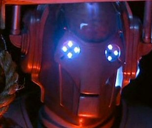
Isaac13: That avatar is ok. I don't like the green text all over it however. Your name at the top looks nice and decent. I love Zelda also. ^^ 7/10.
#3028
- Disciple
-
- Group: Veterans
- Posts: 2,489
- Joined: 08-November 04
Posted 25 January 2005 - 06:59 AM
agatios new one wins me over with the "owning you since Feb 2004"
that rocks! as for the rest, blue is always good and the volours and look of the overall signature are very good - 9/10
that rocks! as for the rest, blue is always good and the volours and look of the overall signature are very good - 9/10
#3029
- Disciple
-
- Group: Veterans
- Posts: 2,489
- Joined: 08-November 04
Posted 25 January 2005 - 07:02 AM
the new link look is cool, but there official art for it, rather then the screenshots would make it look better. 7/10
#3030

- Chaos Lord
-
- Group: Members
- Posts: 625
- Joined: 28-November 04
- Location:That place....over there...
- Interests:Just being me.
Posted 25 January 2005 - 03:22 PM
Raven: good, i like it. 8/10
#3031
- Disciple
-
- Group: Veterans
- Posts: 2,489
- Joined: 08-November 04
Posted 25 January 2005 - 04:13 PM
this is kinda totally out of the blue - but IZ2's sig - i lov eit, and it rocks, but its one huge link and that can mean i accidentally end up at SSL by clicking on it. I joined there anyways (as a result of hitting it). Or is that the plan IZ2? hehe
#3032
- Disciple
-
- Group: Members
- Posts: 1,585
- Joined: 25-October 04
- Gender:Female
- Location:Inside a Jar
- Interests:..Truffles, White Chocolates, Flying, RPGing & a Smile.
Posted 25 January 2005 - 05:25 PM
uh.. I13 is your new avatar a little too..much?
#3033
- Disciple
-
- Group: Veterans
- Posts: 2,489
- Joined: 08-November 04
Posted 25 January 2005 - 05:28 PM
yeah it is a little creepy I13...maybe toning it down to not having that particular image?
#3034

- Disciple
-
- Group: Members
- Posts: 1,472
- Joined: 19-January 05
- Gender:Male
- Location:San Jose, CA
Posted 25 January 2005 - 05:28 PM
yours is koool 9/10
Check mine out :(
Check mine out :(
#3035
- Disciple
-
- Group: Members
- Posts: 1,472
- Joined: 19-January 05
- Gender:Male
- Location:San Jose, CA
Posted 25 January 2005 - 05:30 PM
I think itz da plan, it seems to work also :D
Rate my new one.
Im a gallant :(
Rate my new one.
Im a gallant :(
#3036

- Master Adept
-
- Group: Veterans
- Posts: 2,686
- Joined: 06-August 04
- Gender:Male
- Location:Ontario,Canada..Eh?
- Interests:Myself, video games, sports,(especially basketball)T.V, the ladies and other things I have no time to mention. So now you know me and you proably already have fallen in love with me. Well, I can't blame you everyone else already loves me. :)
Posted 25 January 2005 - 06:28 PM
l3luemage: Your avatar looks great. Though her eyes scare me. 8/10
#3037

- Disciple
-
- Group: Members
- Posts: 2,064
- Joined: 11-February 04
- Gender:Male
- Location:Atlanta, GA, USA
- Interests:Computers and anything science-related
-
AKA Gimli the Great
Posted 25 January 2005 - 08:51 PM
Venus Dude21: 7/10
Its good, exept for that one image doesn't show up.
Its good, exept for that one image doesn't show up.
#3038
- Disciple
-
- Group: Members
- Posts: 2,064
- Joined: 11-February 04
- Gender:Male
- Location:Atlanta, GA, USA
- Interests:Computers and anything science-related
-
AKA Gimli the Great
Posted 25 January 2005 - 08:52 PM
Somia: 8/10, though i dunno why i like it o_O
Echo: 7/10, Not bad.
Echo: 7/10, Not bad.
#3039

- Master Adept
-
- Group: Veterans
- Posts: 3,165
- Joined: 10-October 04
- Gender:Male
- Location:Sydney, Australia
-
AKA watch
Posted 26 January 2005 - 01:12 AM
|3luemage, i like yours looks nice
i'm thinking on changing mine, isn't old but just sick of it.
i'm thinking on changing mine, isn't old but just sick of it.
#3040
- Disciple
-
- Group: Veterans
- Posts: 2,489
- Joined: 08-November 04
Posted 26 January 2005 - 11:21 AM
i think something more flashy perhaps watch - still its good, but think i already rated it
l3lue mage, i like that image although i also iked your last one. I cant really decide between them but im gonna give it an 8/10 - good stuff^^
l3lue mage, i like that image although i also iked your last one. I cant really decide between them but im gonna give it an 8/10 - good stuff^^
#3041
- Master Adept
-
- Group: Veterans
- Posts: 3,165
- Joined: 10-October 04
- Gender:Male
- Location:Sydney, Australia
-
AKA watch
Posted 27 January 2005 - 01:46 AM
Anyone like my new one? can anyone guess whats its off?
Raven i like yours, but i liked your old sig better
Raven i like yours, but i liked your old sig better
#3042
- Chaos Lord
-
- Group: Members
- Posts: 718
- Joined: 07-November 04
- Location:Between darkness and wonder...
- Interests:Anime, video games, sports, movies, urban music, hanging with friends, graphics design and many other things.
Posted 27 January 2005 - 04:40 AM
Gimli the Great: Suits you, nice picture. 8/10.
#3043
- Chaos Lord
-
- Group: Members
- Posts: 718
- Joined: 07-November 04
- Location:Between darkness and wonder...
- Interests:Anime, video games, sports, movies, urban music, hanging with friends, graphics design and many other things.
Posted 27 January 2005 - 04:53 AM
watch - Heh, black and gold are my favourite corresponding colors. I really like the font style of the "u" it looks cool. 8/10.
#3044
- Disciple
-
- Group: Members
- Posts: 1,472
- Joined: 19-January 05
- Gender:Male
- Location:San Jose, CA
Posted 27 January 2005 - 11:32 AM
Illidan nice, 9/10.
Btw Illidan his picture on his signature changes every time you refresh the page.
Btw Illidan his picture on his signature changes every time you refresh the page.
#3045
- Master Adept
-
- Group: Veterans
- Posts: 2,686
- Joined: 06-August 04
- Gender:Male
- Location:Ontario,Canada..Eh?
- Interests:Myself, video games, sports,(especially basketball)T.V, the ladies and other things I have no time to mention. So now you know me and you proably already have fallen in love with me. Well, I can't blame you everyone else already loves me. :)
Posted 27 January 2005 - 02:52 PM
Watch: That a sick symbol. Gold and black do go together.*taps his gold chain around his neck*I should know :(. 8.5/10
#3046
- Disciple
-
- Group: Veterans
- Posts: 2,489
- Joined: 08-November 04
Posted 27 January 2005 - 02:56 PM
another inuyashea one ed? it doesnt seem quite as "avatar like" as the last one but still good - 8/10
Watch i agree with the dude - very cool - 9/10
Watch i agree with the dude - very cool - 9/10
#3047

- Disciple
-
- Group: Members
- Posts: 1,860
- Joined: 22-January 05
- Gender:Female
- Location:Outside your window, watching....waiting
- Interests:Go Away...
Posted 27 January 2005 - 03:03 PM
I always liked Ravenblade's Avitar and his signiture!!!! The look scary, but cool :(
#3048
- Disciple
-
- Group: Members
- Posts: 1,472
- Joined: 19-January 05
- Gender:Male
- Location:San Jose, CA
Posted 27 January 2005 - 03:14 PM
I like your avatar, makes him look like a freak lol j/k
#3049

- Captain Cannabis
-
- Group: Veterans
- Posts: 4,901
- Joined: 08-July 04
- Gender:Male
- Location:Manitouwadge, Ontario
-
AKA Mallick/PDM/GDUB3000/Sir
Posted 27 January 2005 - 07:18 PM
Gimli: You tend to steal everything from me. 0/10 for originality. 3/10 overall.
Illidan: You own...that's all I can say. 10/10
Blue Mage: It's good, but I'm not the hugest fan of the font, as I used to use it all the time. 7/10
It's gettin' old, to me.
Illidan: You own...that's all I can say. 10/10
Blue Mage: It's good, but I'm not the hugest fan of the font, as I used to use it all the time. 7/10
It's gettin' old, to me.
#3050
- Disciple
-
- Group: Members
- Posts: 2,064
- Joined: 11-February 04
- Gender:Male
- Location:Atlanta, GA, USA
- Interests:Computers and anything science-related
-
AKA Gimli the Great
Posted 27 January 2005 - 07:21 PM
Whaaat?! I didn't steal the sign!
#3051

- Master Adept
-
- Group: Moderator
- Posts: 4,875
- Joined: 19-August 04
- Gender:Male
- Location:Calabasas, California
- Interests:Inside your pants.
Posted 27 January 2005 - 07:55 PM
PDM: I like your hockey sig. it has nice color and detail. Awesome...9.6/10
#3052
- Master Adept
-
- Group: Moderator
- Posts: 4,875
- Joined: 19-August 04
- Gender:Male
- Location:Calabasas, California
- Interests:Inside your pants.
Posted 27 January 2005 - 08:05 PM
l3lueMage: Nice detail. It looks good, 9.1/10
#3053
- Master Adept
-
- Group: Veterans
- Posts: 3,679
- Joined: 26-August 04
- Gender:Female
Posted 27 January 2005 - 09:36 PM
Miss Brightside (a.k.a Love_Guardian_Yuki): You took that from my xanga, and you wanted me to put words on it. o.O; 7.8/10
#3054
- Master Adept
-
- Group: Moderator
- Posts: 4,875
- Joined: 19-August 04
- Gender:Male
- Location:Calabasas, California
- Interests:Inside your pants.
Posted 27 January 2005 - 09:39 PM
Linear: Cool avie. I like the dog! YAY doggy! 9/10
#3055
- Chaos Lord
-
- Group: Members
- Posts: 718
- Joined: 07-November 04
- Location:Between darkness and wonder...
- Interests:Anime, video games, sports, movies, urban music, hanging with friends, graphics design and many other things.
Posted 28 January 2005 - 12:40 AM
l3lueMage, on Jan 28 2005, 04:32 AM, said:
Err what do you mean? ^_^
I hardly change my signatures often, I just added a Vash banner that I made for the A4 Vashism Clan located in another forum.
Thanks PDM and I3lueMage.
#3056
- Chaos Lord
-
- Group: Members
- Posts: 718
- Joined: 07-November 04
- Location:Between darkness and wonder...
- Interests:Anime, video games, sports, movies, urban music, hanging with friends, graphics design and many other things.
Posted 28 January 2005 - 12:56 AM
Linear: OMG poor doggy, that girl is like torturing it. -1000/10! ;_;
J/k it's cute, 8/10. Still don't like tortured doggies though. >_>
J/k it's cute, 8/10. Still don't like tortured doggies though. >_>
#3057
- Disciple
-
- Group: Members
- Posts: 1,472
- Joined: 19-January 05
- Gender:Male
- Location:San Jose, CA
Posted 28 January 2005 - 01:14 AM
Lol, Geez that was harsh, the dog looks happy ^_^
#3058
- Chaos Lord
-
- Group: Members
- Posts: 718
- Joined: 07-November 04
- Location:Between darkness and wonder...
- Interests:Anime, video games, sports, movies, urban music, hanging with friends, graphics design and many other things.
Posted 28 January 2005 - 02:51 AM
I can hardly say that the dog looks "happy". I mean look at its expression. If you consider that as pleasant then I wonder what you consider as unpleasant.
#3059
- Disciple
-
- Group: Members
- Posts: 1,472
- Joined: 19-January 05
- Gender:Male
- Location:San Jose, CA
Posted 28 January 2005 - 03:31 AM
now that I look at it, looks like the girl dont know how to take care of the dog...look at her face all happy, and the dog all messed up :S
#3060
- Disciple
-
- Group: Veterans
- Posts: 2,489
- Joined: 08-November 04
Posted 28 January 2005 - 05:39 AM
um, apparently the dog is a plushie and therefore not real. So that ends that. The avatar itself pwns though. I keep getting transfixed by it for ages. @.@
9/10
9/10
#3061
- Disciple
-
- Group: Veterans
- Posts: 2,489
- Joined: 08-November 04
Posted 28 January 2005 - 06:06 AM
pdms is very cool - its blue so gets extra points too!
the image rocks and the overall effect is very tidy^^.
9/10
the image rocks and the overall effect is very tidy^^.
9/10
#3062
- Master Adept
-
- Group: Veterans
- Posts: 2,686
- Joined: 06-August 04
- Gender:Male
- Location:Ontario,Canada..Eh?
- Interests:Myself, video games, sports,(especially basketball)T.V, the ladies and other things I have no time to mention. So now you know me and you proably already have fallen in love with me. Well, I can't blame you everyone else already loves me. :)
Posted 28 January 2005 - 03:05 PM
Lin: Ha, I've seen that avatar at the AC. It's cute but I always get the wrong idea of what she is doing with that dog. At first glance it looks like there dancing but then I see the piano there and then everything becomes clear. 8.5/10. Nice job.
#3063
- Master Adept
-
- Group: Veterans
- Posts: 3,679
- Joined: 26-August 04
- Gender:Female
Posted 29 January 2005 - 12:33 AM
Yeah, I took it from Nem, but I just checked out the website in where he got it, so I didn't really take it from him. Just found the website in where you had the avie.
ED: Sonic avie, and he looks awesome in it! XD He looks ffiinnnee, lol, joking, but he does look tight. 8/10
ED: Sonic avie, and he looks awesome in it! XD He looks ffiinnnee, lol, joking, but he does look tight. 8/10
#3064
- Chaos Lord
-
- Group: Members
- Posts: 974
- Joined: 13-December 04
- Location:Good ol' England
- Interests:Nothing. I hate everything. Even you... except maybe warcraft
Posted 29 January 2005 - 01:54 AM
Lin: That avvie scares me.... It just starts, and in like 2 seconds, it has finished and started again. Not your best animated one......
#3065
- Chaos Lord
-
- Group: Members
- Posts: 974
- Joined: 13-December 04
- Location:Good ol' England
- Interests:Nothing. I hate everything. Even you... except maybe warcraft
Posted 29 January 2005 - 02:46 AM
GSninja: Very nic... like the image... well done. And that dancing banana just pwns!!!!!!
#3066
- Master Adept
-
- Group: Veterans
- Posts: 3,165
- Joined: 10-October 04
- Gender:Male
- Location:Sydney, Australia
-
AKA watch
Posted 29 January 2005 - 03:18 AM
gsninja, i like yours cos its from ff
ed your new one is ok, a bit cartoony for me.
any gussed what mines from yet? Raven you should know.
ed your new one is ok, a bit cartoony for me.
any gussed what mines from yet? Raven you should know.
#3067

- Disciple
-
- Group: Veterans
- Posts: 1,657
- Joined: 08-June 04
- Gender:Male
- Location:Karratha, Australia
- Interests:Gaming, Driving, Water sports, Karate, Magic the Gathering, Reading fantasy novels, My job (Holy crap im so glad I can say that), Lots of Music, Photography and so on.
-
AKA Memories Remain
Posted 29 January 2005 - 03:18 AM
gsninja's is great. hwo'd you get that wavy/spiraly effect anyway? I love it, but cant do it...
#3068
- Disciple
-
- Group: Veterans
- Posts: 1,657
- Joined: 08-June 04
- Gender:Male
- Location:Karratha, Australia
- Interests:Gaming, Driving, Water sports, Karate, Magic the Gathering, Reading fantasy novels, My job (Holy crap im so glad I can say that), Lots of Music, Photography and so on.
-
AKA Memories Remain
Posted 29 January 2005 - 04:02 AM
guess: Unreal tournament?
I thought not.
I thought not.
#3069
- Cool
-
- Group: Veterans
- Posts: 6,678
- Joined: 07-February 04
- Gender:Male
- Location:Room 101
- Interests:Metal, philosophy, percussion, literature, writing, theology, personal fitness, live music, tattoos.
-
AKA Agatio
Posted 29 January 2005 - 05:14 AM
A new avatar made by yours truly. Opinions?
MR: Good, but not great, sorry. 7/10
MR: Good, but not great, sorry. 7/10
#3070
- Cool
-
- Group: Veterans
- Posts: 6,678
- Joined: 07-February 04
- Gender:Male
- Location:Room 101
- Interests:Metal, philosophy, percussion, literature, writing, theology, personal fitness, live music, tattoos.
-
AKA Agatio
Posted 29 January 2005 - 05:15 AM
A new sig made by yours truly, opinions?
MR: Very nice indeed, love the transparency effect. 8.9/10
MR: Very nice indeed, love the transparency effect. 8.9/10
#3071
- Chaos Lord
-
- Group: Members
- Posts: 974
- Joined: 13-December 04
- Location:Good ol' England
- Interests:Nothing. I hate everything. Even you... except maybe warcraft
Posted 29 January 2005 - 06:25 AM
I made mine myself and I am very proud of it.
Agatio: Why against the spam forum? Anyhow, gotta love that image! It ownz!!
Agatio: Why against the spam forum? Anyhow, gotta love that image! It ownz!!
#3072
- Disciple
-
- Group: Veterans
- Posts: 2,489
- Joined: 08-November 04
Posted 29 January 2005 - 06:45 AM
i like that one agatio - again, its blue so i cant fault it for colour heh^^
i think i prefer your other one though - it was more suited to you. this one 8/10 though
i think i prefer your other one though - it was more suited to you. this one 8/10 though
#3073
- Disciple
-
- Group: Veterans
- Posts: 1,657
- Joined: 08-June 04
- Gender:Male
- Location:Karratha, Australia
- Interests:Gaming, Driving, Water sports, Karate, Magic the Gathering, Reading fantasy novels, My job (Holy crap im so glad I can say that), Lots of Music, Photography and so on.
-
AKA Memories Remain
Posted 29 January 2005 - 07:06 AM
Agatio: is that a cross-hatch effect? It looks great, and nice to see the ninja from SSII in there as well :P
Very cool.
I've really gotta change mine. It Says: "The paragon of time", which translates to: "The 'symbol of excellence or virtue' of time". It doesn't make sense. lol
Very cool.
I've really gotta change mine. It Says: "The paragon of time", which translates to: "The 'symbol of excellence or virtue' of time". It doesn't make sense. lol
#3074
- Disciple
-
- Group: Veterans
- Posts: 2,489
- Joined: 08-November 04
Posted 29 January 2005 - 07:09 AM
even still though MR - i like yours and i dont think i've rated it yet. 8/10. Its still a very good image^^
Ivan - its a tad large but yeah its cool. I'm having a little difficulty with the text though but that coud just be cos its early. 8/10
Agatio, i saw that over msn and seeing as how it isnt blue i can only give it 8/10 hehe - nah its a cool image but again, i think i prefered your old one
(were'nt my marks consistent today?)
#3075
- Cool
-
- Group: Veterans
- Posts: 6,678
- Joined: 07-February 04
- Gender:Male
- Location:Room 101
- Interests:Metal, philosophy, percussion, literature, writing, theology, personal fitness, live music, tattoos.
-
AKA Agatio
Posted 29 January 2005 - 07:21 AM
Mine is made up of a basic brush, with a cross hatched effect yes. I recoloured the ninja image and then filterd over it aswell. The text is just 8pt BitDust2 font, with a 1px black outer stroke, nothing special. But it looks nice if I do say so myself :P .
I'm against the spam forum because it's a load of crap, nuff said XD .
Ivan: Dimensions are too big IMO. What font are you using out of curiosity? The blend is simple, yet nice. 7.5/10
RB: Yes, very consistant :P
I'm against the spam forum because it's a load of crap, nuff said XD .
Ivan: Dimensions are too big IMO. What font are you using out of curiosity? The blend is simple, yet nice. 7.5/10
RB: Yes, very consistant :P
#3076
- Cool
-
- Group: Veterans
- Posts: 6,678
- Joined: 07-February 04
- Gender:Male
- Location:Room 101
- Interests:Metal, philosophy, percussion, literature, writing, theology, personal fitness, live music, tattoos.
-
AKA Agatio
Posted 29 January 2005 - 07:22 AM
Yah, this was my first real attempt of a home made avatar, I'm just a little tired of using other peoples work.
RB: Back to your original avatar, and better for it. 8/10.
RB: Back to your original avatar, and better for it. 8/10.
#3077

- Master Adept
-
- Group: Veterans
- Posts: 2,517
- Joined: 18-July 04
Posted 29 January 2005 - 07:26 AM
Agatio (rating the sig IMAGE; I don't read sig text):
Mechanics - 5/5
Personal rating - 3/5
The image is vibrant, colorful, clear, and personalized, but the text seems out of place, and it makes most of it look pretty bare. 8/10
Mechanics - 5/5
Personal rating - 3/5
The image is vibrant, colorful, clear, and personalized, but the text seems out of place, and it makes most of it look pretty bare. 8/10
#3078
- Disciple
-
- Group: Veterans
- Posts: 1,657
- Joined: 08-June 04
- Gender:Male
- Location:Karratha, Australia
- Interests:Gaming, Driving, Water sports, Karate, Magic the Gathering, Reading fantasy novels, My job (Holy crap im so glad I can say that), Lots of Music, Photography and so on.
-
AKA Memories Remain
Posted 29 January 2005 - 07:48 AM
I agree. Ivan, your pic is to tall. (People may remember my previous sig, now THAT was tall). and if were you, I would be proud of it as well. Even thought I can't understand the text. lol
Overall: 7.5/10
Ravenblade: different. IMO, it would look cool if you cropped a bit off the top and the bottom off the original image, then made your name bigger. But, I am a n00b to the sig rating game. Overall:8.1/10
Overall: 7.5/10
Ravenblade: different. IMO, it would look cool if you cropped a bit off the top and the bottom off the original image, then made your name bigger. But, I am a n00b to the sig rating game. Overall:8.1/10
#3079
- Cool
-
- Group: Veterans
- Posts: 6,678
- Joined: 07-February 04
- Gender:Male
- Location:Room 101
- Interests:Metal, philosophy, percussion, literature, writing, theology, personal fitness, live music, tattoos.
-
AKA Agatio
Posted 29 January 2005 - 08:40 AM
At long last, I have a nice matching avatar and signature set.
*can now sleep peacefuly*
*can now sleep peacefuly*
#3080
- Disciple
-
- Group: Members
- Posts: 1,588
- Joined: 10-November 04
Posted 29 January 2005 - 09:32 AM
agatio 6.7/10, too white, MR 9/10
#3081
- Disciple
-
- Group: Veterans
- Posts: 1,657
- Joined: 08-June 04
- Gender:Male
- Location:Karratha, Australia
- Interests:Gaming, Driving, Water sports, Karate, Magic the Gathering, Reading fantasy novels, My job (Holy crap im so glad I can say that), Lots of Music, Photography and so on.
-
AKA Memories Remain
Posted 29 January 2005 - 09:36 AM
Agatio, on Jan 29 2005, 10:40 PM, said:
Yes, it matches perfectly. But I'm personally not to fond of white sigs, so you lose a few points from me there. (This biases the rating, so think nothing of it if you like) Otherwise, it's cool, different, and since it has "Agatio" writen and a picture of Agatio, I'll give it 7.9 out of 10.
#3082
- Master Adept
-
- Group: Veterans
- Posts: 3,679
- Joined: 26-August 04
- Gender:Female
Posted 29 January 2005 - 12:40 PM
MR: (^o^) that looks so amazing! I like the effect, and...hihi there Time Guardian MR! 9/10
#3083
- Master Adept
-
- Group: Veterans
- Posts: 2,517
- Joined: 18-July 04
Posted 29 January 2005 - 12:44 PM
Linear:
Mechanics - 5/5
Personal Rating - 4/5
A nice clear, colorful image, depicting a cute anime girl, as usual: 9/10
Mechanics - 5/5
Personal Rating - 4/5
A nice clear, colorful image, depicting a cute anime girl, as usual: 9/10
#3084
- Chaos Lord
-
- Group: Members
- Posts: 974
- Joined: 13-December 04
- Location:Good ol' England
- Interests:Nothing. I hate everything. Even you... except maybe warcraft
Posted 29 January 2005 - 01:57 PM
Agatio, on Jan 29 2005, 01:21 PM, said:
What do you mean by dimensions are too big? Yes, i'm stupid. It isnt that big is it?.... The font....ahhhh... you arent meant to understand it. It is tau font in case you want to know. It has nothing to do with the real alpabet so dont try to decipher it.
Forte: Old one? Yes. I like it though. 8/10
#3085
- Master Adept
-
- Group: Veterans
- Posts: 3,679
- Joined: 26-August 04
- Gender:Female
Posted 29 January 2005 - 04:05 PM
Ivan: XD at least you made it a bit smaller, that's a good relief, it looks good, blackish is your fav. color or something? 8/10
#3086
- Disciple
-
- Group: Members
- Posts: 2,064
- Joined: 11-February 04
- Gender:Male
- Location:Atlanta, GA, USA
- Interests:Computers and anything science-related
-
AKA Gimli the Great
Posted 29 January 2005 - 04:50 PM
Agatio: 9/10. Its cool, but do you realize that you may be offending some people about the Spam forum part of it? I don't mean to be rude or anything.
#3087
- Master Adept
-
- Group: Veterans
- Posts: 2,517
- Joined: 18-July 04
Posted 29 January 2005 - 04:55 PM
I think it's fine. Not very offensive at all.
Gimli:
Mechanics - 3/5
Personal - 2/5
Well, it's mostly text, for one, and face it, not everyone's gonna' wanna' stop and read. The image is okay, not really special, just some randomly changing cartoony characters. It's not that visually impressive, but it's still pretty clever: 5/10.
Gimli:
Mechanics - 3/5
Personal - 2/5
Well, it's mostly text, for one, and face it, not everyone's gonna' wanna' stop and read. The image is okay, not really special, just some randomly changing cartoony characters. It's not that visually impressive, but it's still pretty clever: 5/10.
#3088
- Disciple
-
- Group: Veterans
- Posts: 2,489
- Joined: 08-November 04
Posted 29 January 2005 - 05:18 PM
FGX - it owns. 10/10
its you through and through. If you ever changed it i'd hurt you ^-^
its you through and through. If you ever changed it i'd hurt you ^-^
#3089
- Master Adept
-
- Group: Veterans
- Posts: 2,517
- Joined: 18-July 04
Posted 29 January 2005 - 05:32 PM
If I ever changed it, I'd hurt MYSELF. B)
Raven:
Mechanics - 4/5
Personal - 3.5/5
It's a little blurry, but you can still see the image just fine. The colors definitely suit you. The entire sig does. If it was just a little bit clearer, then it would be great: 7.5/10
Raven:
Mechanics - 4/5
Personal - 3.5/5
It's a little blurry, but you can still see the image just fine. The colors definitely suit you. The entire sig does. If it was just a little bit clearer, then it would be great: 7.5/10
#3090
- Master Adept
-
- Group: Veterans
- Posts: 2,517
- Joined: 18-July 04
Posted 29 January 2005 - 05:36 PM
Agatio:
Mechanics - 5/10
Personal - 3.5/10
It's clear, the coloring is good, and for the first time in AGES, the text actually goes with the depicted character (B)). I like: 8.5/10
Mechanics - 5/10
Personal - 3.5/10
It's clear, the coloring is good, and for the first time in AGES, the text actually goes with the depicted character (B)). I like: 8.5/10
#3091
- Disciple
-
- Group: Veterans
- Posts: 2,489
- Joined: 08-November 04
Posted 29 January 2005 - 05:37 PM
FGX - i could copy and paste what i just said in the siggy topic. Its you all the way, and it actually makes you look important and stuff cos of the expression and everything o.o 9/10
#3092
- Master Adept
-
- Group: Veterans
- Posts: 2,517
- Joined: 18-July 04
Posted 29 January 2005 - 05:41 PM
Thankya', Raven. B)
Raven:
Mechanics - 5/5
Personal - 4/5
What can I say? It's clear and it's cool, and it suits you just as well. The lack of color also works well for the picture. I like it a lot: 9/10
Raven:
Mechanics - 5/5
Personal - 4/5
What can I say? It's clear and it's cool, and it suits you just as well. The lack of color also works well for the picture. I like it a lot: 9/10
#3093
- Chaos Lord
-
- Group: Members
- Posts: 953
- Joined: 26-August 04
- Gender:Male
- Location:Gundam
- Interests:Auck.
Posted 29 January 2005 - 07:16 PM
How do you like this one, guys? I think it looks good.
#3094
- Disciple
-
- Group: Members
- Posts: 1,585
- Joined: 25-October 04
- Gender:Female
- Location:Inside a Jar
- Interests:..Truffles, White Chocolates, Flying, RPGing & a Smile.
Posted 29 January 2005 - 07:24 PM
^as I said I still thinks it's a bit too much..
Agatio: your new one is nice! and the color you chose are really good. 8\10
Agatio: your new one is nice! and the color you chose are really good. 8\10
#3095
- Chaos Lord
-
- Group: Members
- Posts: 953
- Joined: 26-August 04
- Gender:Male
- Location:Gundam
- Interests:Auck.
Posted 29 January 2005 - 07:26 PM
This sig was made by Yuki!
#3096
- Disciple
-
- Group: Veterans
- Posts: 1,657
- Joined: 08-June 04
- Gender:Male
- Location:Karratha, Australia
- Interests:Gaming, Driving, Water sports, Karate, Magic the Gathering, Reading fantasy novels, My job (Holy crap im so glad I can say that), Lots of Music, Photography and so on.
-
AKA Memories Remain
Posted 29 January 2005 - 07:29 PM
#3097
- Disciple
-
- Group: Members
- Posts: 1,585
- Joined: 25-October 04
- Gender:Female
- Location:Inside a Jar
- Interests:..Truffles, White Chocolates, Flying, RPGing & a Smile.
Posted 29 January 2005 - 07:29 PM
yay now we have a time guardian~ it's a really nice sig. 8\10!
Agatio: the sig match your avie at loong last, great job on it~ 8\10
Agatio: the sig match your avie at loong last, great job on it~ 8\10
#3098
- Master Adept
-
- Group: Veterans
- Posts: 3,679
- Joined: 26-August 04
- Gender:Female
Posted 29 January 2005 - 08:10 PM
Somia: kingdom hearts! *happy*happy* I saw that in a wallpaper, the background color, but me likeish! 9/10
#3099
- Chaos Lord
-
- Group: Members
- Posts: 718
- Joined: 07-November 04
- Location:Between darkness and wonder...
- Interests:Anime, video games, sports, movies, urban music, hanging with friends, graphics design and many other things.
Posted 29 January 2005 - 08:45 PM
New banner:
http://img.photobucket.com/albums/v341/Outlaw2424/kAKAYAYcopy.jpg
:agitated:
http://img.photobucket.com/albums/v341/Outlaw2424/kAKAYAYcopy.jpg
:agitated:
#3100
- Master Adept
-
- Group: Veterans
- Posts: 3,679
- Joined: 26-August 04
- Gender:Female
Posted 29 January 2005 - 09:07 PM
That looks awesome Illidan! =D
Shade..bluish like, and that is my fav. color! 9.9/10!
Shade..bluish like, and that is my fav. color! 9.9/10!
#3101
- Cool
-
- Group: Veterans
- Posts: 6,678
- Joined: 07-February 04
- Gender:Male
- Location:Room 101
- Interests:Metal, philosophy, percussion, literature, writing, theology, personal fitness, live music, tattoos.
-
AKA Agatio
Posted 29 January 2005 - 09:10 PM
Issac13, that avatar would suit a female, not you, sorry. 5/10.
Somia, nice, did you make it? 7.8/10
Somia, nice, did you make it? 7.8/10
#3102
- Cool
-
- Group: Veterans
- Posts: 6,678
- Joined: 07-February 04
- Gender:Male
- Location:Room 101
- Interests:Metal, philosophy, percussion, literature, writing, theology, personal fitness, live music, tattoos.
-
AKA Agatio
Posted 29 January 2005 - 09:12 PM
Gimli: The idea is to openly show what I think of the spam forum, obviously it's working :agitated: .
Illidian: Shexy new shiggy! 9.6/10, your best yet IMO.
Illidian: Shexy new shiggy! 9.6/10, your best yet IMO.
#3103
- Chaos Lord
-
- Group: Members
- Posts: 718
- Joined: 07-November 04
- Location:Between darkness and wonder...
- Interests:Anime, video games, sports, movies, urban music, hanging with friends, graphics design and many other things.
Posted 29 January 2005 - 09:18 PM
Hey thanks alot guys, I included it in my signature.
Agatio: Simple but it looks nice 8/10.
Linear: Is it me or are you getting better with fonts? Nice for a PSP made siggy 8/10.
Agatio: Simple but it looks nice 8/10.
Linear: Is it me or are you getting better with fonts? Nice for a PSP made siggy 8/10.
#3104
- Master Adept
-
- Group: Veterans
- Posts: 3,679
- Joined: 26-August 04
- Gender:Female
Posted 29 January 2005 - 09:33 PM
lol, I didn't us PSP for this Sig. Heheh.
Agatio: nice one! Even with the background white, it's all good. :agitated: Heehee 8/10
Agatio: nice one! Even with the background white, it's all good. :agitated: Heehee 8/10
#3105
- Master Adept
-
- Group: Veterans
- Posts: 3,679
- Joined: 26-August 04
- Gender:Female
Posted 29 January 2005 - 09:35 PM
I think she did make it, if she didn't, it's still cool ^^
Somia: I like the font, since it blends in with the avatar, and that's one of the most of my fav. characters in kingdom hearts. n.n 8.5/10
Somia: I like the font, since it blends in with the avatar, and that's one of the most of my fav. characters in kingdom hearts. n.n 8.5/10
#3106
- Chaos Lord
-
- Group: Members
- Posts: 718
- Joined: 07-November 04
- Location:Between darkness and wonder...
- Interests:Anime, video games, sports, movies, urban music, hanging with friends, graphics design and many other things.
Posted 29 January 2005 - 09:38 PM
Oh did you use Photo Shop? Or...
#3107
- Master Adept
-
- Group: Veterans
- Posts: 3,679
- Joined: 26-August 04
- Gender:Female
Posted 29 January 2005 - 10:11 PM
I don't have photoshop in the computer I'm on, but I'm downloading it.
#3108
- Disciple
-
- Group: Veterans
- Posts: 1,657
- Joined: 08-June 04
- Gender:Male
- Location:Karratha, Australia
- Interests:Gaming, Driving, Water sports, Karate, Magic the Gathering, Reading fantasy novels, My job (Holy crap im so glad I can say that), Lots of Music, Photography and so on.
-
AKA Memories Remain
Posted 29 January 2005 - 10:18 PM
awesome sig Illiadan. 9/10.
How do you get that pixle effect?
How do you get that pixle effect?
#3109
- Chaos Lord
-
- Group: Members
- Posts: 718
- Joined: 07-November 04
- Location:Between darkness and wonder...
- Interests:Anime, video games, sports, movies, urban music, hanging with friends, graphics design and many other things.
Posted 30 January 2005 - 02:37 AM
Linear, on Jan 30 2005, 03:11 PM, said:
What did you use then?
Memories Remain: I downloaded a specific font, settings: size: 8, 1px black stroke and that's basically it. Do you want me to give you the name of the specific font and site I got it from?
#3110
- Master Adept
-
- Group: Veterans
- Posts: 3,165
- Joined: 10-October 04
- Gender:Male
- Location:Sydney, Australia
-
AKA watch
Posted 30 January 2005 - 03:28 AM
Isaac13, on Jan 30 2005, 12:16 PM, said:
suits you,despite the fact your are a male. 7/10
Linear:another one already? 8.5/10
Agaito:suits your name but i liked Sora better. but since you made it that gives you credit from me at least:9/10
And MR yes it is the Unreal Tournament logo.
#3111
- Disciple
-
- Group: Members
- Posts: 2,064
- Joined: 11-February 04
- Gender:Male
- Location:Atlanta, GA, USA
- Interests:Computers and anything science-related
-
AKA Gimli the Great
Posted 30 January 2005 - 03:29 AM
Illidan: 9/10. Nice banners btw. Same as for Lin. :blink:
#3112
- Master Adept
-
- Group: Veterans
- Posts: 3,165
- Joined: 10-October 04
- Gender:Male
- Location:Sydney, Australia
-
AKA watch
Posted 30 January 2005 - 03:32 AM
Agatio, on Jan 30 2005, 02:12 PM, said:
How is it working? are you asking for the spam to die or people to ask your opinion
LIN:very nice8/10
Illidan:good same as always9/10
What do you all use for your sigs?
#3113
- Cool
-
- Group: Veterans
- Posts: 6,678
- Joined: 07-February 04
- Gender:Male
- Location:Room 101
- Interests:Metal, philosophy, percussion, literature, writing, theology, personal fitness, live music, tattoos.
-
AKA Agatio
Posted 30 January 2005 - 03:56 AM
I13: Just read the text on your avatar, and now I'll give you a 0/10.
#3114
- Cool
-
- Group: Veterans
- Posts: 6,678
- Joined: 07-February 04
- Gender:Male
- Location:Room 101
- Interests:Metal, philosophy, percussion, literature, writing, theology, personal fitness, live music, tattoos.
-
AKA Agatio
Posted 30 January 2005 - 03:57 AM
It's working because people are noticing it and asking about it.
#3115
- Disciple
-
- Group: Veterans
- Posts: 1,657
- Joined: 08-June 04
- Gender:Male
- Location:Karratha, Australia
- Interests:Gaming, Driving, Water sports, Karate, Magic the Gathering, Reading fantasy novels, My job (Holy crap im so glad I can say that), Lots of Music, Photography and so on.
-
AKA Memories Remain
Posted 30 January 2005 - 05:24 AM
Illidan, on Jan 30 2005, 04:37 PM, said:
Yeah, sure Id love it. But whats the font got to do with the pixel-things in the background?
watch: I use Photoshop. As you can see, Im not to good yet.
#3116
- Disciple
-
- Group: Veterans
- Posts: 2,489
- Joined: 08-November 04
Posted 30 January 2005 - 08:47 AM
yikes, many to catch up on...
MR- same kinda style but different o.o! i like it though cos its more like...a development of your last one. 8/10
Linear - i like!! darkness and moon-ness (<<;; thats a word...) its seems dark and yet happy and light o.O 9/10
Illidan - very cool, blue which rocks. Just a very nice image all in all. 9/10
#3117
- Disciple
-
- Group: Veterans
- Posts: 2,489
- Joined: 08-November 04
Posted 30 January 2005 - 09:07 AM
Agatio - it looks great. You look evil and powerful again ( a lot like how you are!! ^^, - you know i mean that in a good way im sure). Still think i prefered your old, old one though. But that could grow on me - 9/10
Linear - yay its kawaii^^ very good effort with the text and everything. plus it says "yay" so i have to give it a high score dont i? 9/10
Linear - yay its kawaii^^ very good effort with the text and everything. plus it says "yay" so i have to give it a high score dont i? 9/10
#3118
- Disciple
-
- Group: Members
- Posts: 1,585
- Joined: 25-October 04
- Gender:Female
- Location:Inside a Jar
- Interests:..Truffles, White Chocolates, Flying, RPGing & a Smile.
Posted 30 January 2005 - 11:54 AM
#3119
- Disciple
-
- Group: Members
- Posts: 2,064
- Joined: 11-February 04
- Gender:Male
- Location:Atlanta, GA, USA
- Interests:Computers and anything science-related
-
AKA Gimli the Great
Posted 30 January 2005 - 12:44 PM
Linear- 8/10 (its cool!)
Somia- 9/10 (cute)
And how does everyone like my new Ivan avatar?
(btw- its not hotlinked from VLH)
Somia- 9/10 (cute)
And how does everyone like my new Ivan avatar?
(btw- its not hotlinked from VLH)
#3120
- Master Adept
-
- Group: Veterans
- Posts: 2,517
- Joined: 18-July 04
Posted 30 January 2005 - 12:55 PM
Gimli:
Mechanics - 2/5
Personal - 1/5
Yikes... sprites don't really make the best avatars. They're blurry and blocky when you enlarge them; the only thing really going for it is the color and *slight* animation: 3/10
Mechanics - 2/5
Personal - 1/5
Yikes... sprites don't really make the best avatars. They're blurry and blocky when you enlarge them; the only thing really going for it is the color and *slight* animation: 3/10
#3121
- Cool
-
- Group: Veterans
- Posts: 6,678
- Joined: 07-February 04
- Gender:Male
- Location:Room 101
- Interests:Metal, philosophy, percussion, literature, writing, theology, personal fitness, live music, tattoos.
-
AKA Agatio
Posted 30 January 2005 - 04:20 PM
I'd only give Gimli a 2 for his current. You had the Gimli avatar since you came, why the change? I didn't even know it was you at first.
#3122

- Gallant
-
- Group: Members
- Posts: 150
- Joined: 18-January 05
- Location:Minnesota
- Interests:Ummmmmm I like being on the computer ^_^; making avies, reading, eh....talking to friends....wow I'm a nerd >.<
Posted 30 January 2005 - 04:44 PM
muahaha >>
I have made matching stuff! :P
EDIT: yes I like fire T_T this is for those days..... XD;;;;
EDIT2: This is my first one for this too o.o;; I stole the idea from an avie I found
I have made matching stuff! :P
EDIT: yes I like fire T_T this is for those days..... XD;;;;
EDIT2: This is my first one for this too o.o;; I stole the idea from an avie I found
#3123
- Master Adept
-
- Group: Veterans
- Posts: 2,517
- Joined: 18-July 04
Posted 30 January 2005 - 05:19 PM
Bekita:
Mechanics - 4/5
Personal - 4/5
Not bad at all. The image is clear, and text goes well. The coloring is good for that kind of image: 8/10
Mechanics - 4/5
Personal - 4/5
Not bad at all. The image is clear, and text goes well. The coloring is good for that kind of image: 8/10
#3124
- Chaos Lord
-
- Group: Members
- Posts: 718
- Joined: 07-November 04
- Location:Between darkness and wonder...
- Interests:Anime, video games, sports, movies, urban music, hanging with friends, graphics design and many other things.
Posted 31 January 2005 - 12:02 AM
Memories Remain, on Jan 30 2005, 10:24 PM, said:
O_o I thought you meant the pixel text. XD
Erm new image 3 x 3 transparent. Make a cross in black with the pencil.
T B T
B B B
T B T
T: Transparent
B: Black
Define pattern. Should be available in the pattern section now. Then when you want to insert it on your banner, do so then go to blending options, and on the second opacity scale, reduce it 0. That's it I think.
#3125
- Master Adept
-
- Group: Veterans
- Posts: 2,686
- Joined: 06-August 04
- Gender:Male
- Location:Ontario,Canada..Eh?
- Interests:Myself, video games, sports,(especially basketball)T.V, the ladies and other things I have no time to mention. So now you know me and you proably already have fallen in love with me. Well, I can't blame you everyone else already loves me. :)
Posted 31 January 2005 - 11:02 AM
I just saw Agatio's avatar and look it's a picture of Agatio himself :huh:. I actually really like it. Maybe there could be a colored backround to go with it but it looks really good. 9/10 Nice stuff.
#3126
- Disciple
-
- Group: Veterans
- Posts: 2,489
- Joined: 08-November 04
Posted 31 January 2005 - 11:04 AM
Bekita - yeah its nice and...burny..with the fire..and the burning..*cough*
nah its nice - very original IMO 8/10
Ed - So relieved that Inuyasha guys face isnt there anymore..7/10 cool image^^
back to sonic.
nah its nice - very original IMO 8/10
Ed - So relieved that Inuyasha guys face isnt there anymore..7/10 cool image^^
back to sonic.
#3127
- Cool
-
- Group: Veterans
- Posts: 6,678
- Joined: 07-February 04
- Gender:Male
- Location:Room 101
- Interests:Metal, philosophy, percussion, literature, writing, theology, personal fitness, live music, tattoos.
-
AKA Agatio
Posted 01 February 2005 - 12:24 AM
ED: Nice, but kind of hard to make out, and text should probably say your name. Good image though, 7.6/10.
#3128
- Chaos Lord
-
- Group: Members
- Posts: 718
- Joined: 07-November 04
- Location:Between darkness and wonder...
- Interests:Anime, video games, sports, movies, urban music, hanging with friends, graphics design and many other things.
Posted 01 February 2005 - 02:43 AM
Agatio: Nice crop. Text is nice, overall good 8/10.
#3129
- Disciple
-
- Group: Veterans
- Posts: 2,489
- Joined: 08-November 04
Posted 01 February 2005 - 06:27 AM
Agatio: It's cool! I like it - it kinda has that very um..well it links well with your personality i'd say but dont ask me why co sim not sure. Anyways yeh its cool^^
8/10
8/10
#3130
- Cool
-
- Group: Veterans
- Posts: 6,678
- Joined: 07-February 04
- Gender:Male
- Location:Room 101
- Interests:Metal, philosophy, percussion, literature, writing, theology, personal fitness, live music, tattoos.
-
AKA Agatio
Posted 01 February 2005 - 06:38 AM
Thanks, I was looking for something a little more 'serious' you could say.
Plus is a f***ing good image :P
There's actually 5 at this site, and I was having trouble deciding, but this one I guess ended up being my favourite.
*needs someone new to rate*
Plus is a f***ing good image :P
There's actually 5 at this site, and I was having trouble deciding, but this one I guess ended up being my favourite.
*needs someone new to rate*
#3131
- Master Adept
-
- Group: Veterans
- Posts: 2,686
- Joined: 06-August 04
- Gender:Male
- Location:Ontario,Canada..Eh?
- Interests:Myself, video games, sports,(especially basketball)T.V, the ladies and other things I have no time to mention. So now you know me and you proably already have fallen in love with me. Well, I can't blame you everyone else already loves me. :)
Posted 01 February 2005 - 02:22 PM
Agatio: That looks sick man. Though I it could be brighter so we could see it better. I really like the mist effect on your avatar. 8.5/10. I think it may be one of the best avatars you got.
#3132
- Chaos Lord
-
- Group: Members
- Posts: 776
- Joined: 28-January 04
- Location:Brooklyn, New York
- Interests:Duh, Golden Sun!
Posted 01 February 2005 - 03:57 PM
Agatio: *shudders* Squall, Cloud wanna-be... :wacko:
Anyways, 9/10 for nice blue tint and nice text...
Anyways, 9/10 for nice blue tint and nice text...
#3133
- Chaos Lord
-
- Group: Members
- Posts: 953
- Joined: 26-August 04
- Gender:Male
- Location:Gundam
- Interests:Auck.
Posted 01 February 2005 - 04:19 PM
As always, the famous Link sig and avie for Isaac_Zero2. 10/10 my friend.
#3134
- Disciple
-
- Group: Members
- Posts: 2,064
- Joined: 11-February 04
- Gender:Male
- Location:Atlanta, GA, USA
- Interests:Computers and anything science-related
-
AKA Gimli the Great
Posted 01 February 2005 - 08:26 PM
Agatio: 7/10 (it's a bit weird, but good.)
#3135
- Disciple
-
- Group: Members
- Posts: 2,064
- Joined: 11-February 04
- Gender:Male
- Location:Atlanta, GA, USA
- Interests:Computers and anything science-related
-
AKA Gimli the Great
Posted 01 February 2005 - 08:27 PM
Illidan: 120/10 (I like the way you made the banners! <_<)
#3136
- Disciple
-
- Group: Members
- Posts: 1,585
- Joined: 25-October 04
- Gender:Female
- Location:Inside a Jar
- Interests:..Truffles, White Chocolates, Flying, RPGing & a Smile.
Posted 01 February 2005 - 09:34 PM
Illidan: zat new one is great~ me likes it..9.5\10
#3137
- Disciple
-
- Group: Members
- Posts: 1,585
- Joined: 25-October 04
- Gender:Female
- Location:Inside a Jar
- Interests:..Truffles, White Chocolates, Flying, RPGing & a Smile.
Posted 01 February 2005 - 09:36 PM
Ed..your new one is nice..as least it doesn't contain..you know what i mean.. anyways..8\10
#3138
- Chaos Lord
-
- Group: Members
- Posts: 718
- Joined: 07-November 04
- Location:Between darkness and wonder...
- Interests:Anime, video games, sports, movies, urban music, hanging with friends, graphics design and many other things.
Posted 02 February 2005 - 12:46 AM
EDIT: Avatar rating not siggy! ><
Nice but I don't like the type of border. 8/10.
Nice but I don't like the type of border. 8/10.
#3139

- Chaos Lord
-
- Group: Members
- Posts: 926
- Joined: 19-June 04
- Location:Sweden
Posted 02 February 2005 - 02:34 AM
You guys can rate my avatar if you want to.
#3140
- Cool
-
- Group: Veterans
- Posts: 6,678
- Joined: 07-February 04
- Gender:Male
- Location:Room 101
- Interests:Metal, philosophy, percussion, literature, writing, theology, personal fitness, live music, tattoos.
-
AKA Agatio
Posted 02 February 2005 - 06:06 AM
The idea is to rate each others avatars :o .
Anywho, nice image VM1. Very clear, the right size. border wouldn't hurt, but thats no biggie. 80%
Somia: Probably your best so far. Great image, clear, works with the signature, and good dimensions. 90%
Forte: Same as Ayura's really, a border would be nice though. 89%
Bekita: Needs to be a little clearer, and a border again, but oh well. 65%
Linear: 1/2/05: Nice image, one of your better avatars out of the pile. 85%
#3141

- Master Adept
-
- Group: Veterans
- Posts: 3,190
- Joined: 24-October 04
- Gender:Male
- Location:the Netherlands
-
AKA Fire Dude, Diddy Kong
Posted 02 February 2005 - 12:01 PM
Look I have a new avie! :o
Rate please!
Rate please!
#3142
- Disciple
-
- Group: Veterans
- Posts: 2,489
- Joined: 08-November 04
Posted 02 February 2005 - 12:25 PM
Somichan!! - its cool!!! i like it lots - very cute and..well very YOU.
also...I..Love...CatGirls...
also...I..Love...CatGirls...
#3143
- Disciple
-
- Group: Veterans
- Posts: 2,489
- Joined: 08-November 04
Posted 02 February 2005 - 01:04 PM
um ok lets see...
Somichan - i really like that - its different to much of what ive seen before cos of the odd border - you have a real talent for avatars and signatures - 9.5/10
VM1 - the portrait image thing always looks kinda creepy IMO cos they're looking straight at you o.O;; but even so its nicely done - 8/10
Diddy - you had that for ages!!! although possibly you havent had it rated so fair enough - well its nice but i think your old one was better suited to you - it made you seem almost as hyper as you are.
#3144
- Chaos Lord
-
- Group: Members
- Posts: 776
- Joined: 28-January 04
- Location:Brooklyn, New York
- Interests:Duh, Golden Sun!
Posted 02 February 2005 - 01:59 PM
Illidan: Very nice banner of Sensei Kakashi...
The fade effect is nice and the text looks great as well...9/10
The fade effect is nice and the text looks great as well...9/10
#3145
- Disciple
-
- Group: Members
- Posts: 2,064
- Joined: 11-February 04
- Gender:Male
- Location:Atlanta, GA, USA
- Interests:Computers and anything science-related
-
AKA Gimli the Great
Posted 02 February 2005 - 03:04 PM
#3146
- Cool
-
- Group: Veterans
- Posts: 6,678
- Joined: 07-February 04
- Gender:Male
- Location:Room 101
- Interests:Metal, philosophy, percussion, literature, writing, theology, personal fitness, live music, tattoos.
-
AKA Agatio
Posted 02 February 2005 - 03:07 PM
Quote
Look I have a new avie!
Rate please!
Rate please!
You clearly didn't read the post directly above yours...
6/10, distorted, nothing personlised about it.
#3147
- Gallant
-
- Group: Members
- Posts: 150
- Joined: 18-January 05
- Location:Minnesota
- Interests:Ummmmmm I like being on the computer ^_^; making avies, reading, eh....talking to friends....wow I'm a nerd >.<
Posted 02 February 2005 - 05:28 PM
Issac I love that sig! The color is awesome and the belnding is great! 10/10 XD
#3148

- Lebron James
-
- Group: Veterans
- Posts: 10,366
- Joined: 04-October 04
- Gender:Male
- Location:Winnipeg, MB
Posted 02 February 2005 - 05:38 PM
Very cool sig, Bekita. Great colour contrast to make the eyes the focal point.
#3149
- Lebron James
-
- Group: Veterans
- Posts: 10,366
- Joined: 04-October 04
- Gender:Male
- Location:Winnipeg, MB
Posted 02 February 2005 - 05:39 PM
Agatio, 10/10. I don't know how you do it but your new avatars are out of this world.
#3150
- Disciple
-
- Group: Members
- Posts: 1,585
- Joined: 25-October 04
- Gender:Female
- Location:Inside a Jar
- Interests:..Truffles, White Chocolates, Flying, RPGing & a Smile.
Posted 02 February 2005 - 05:44 PM
Beki you new one is nice!~ tho a little blured..but it's all good 7.8\10
#3151
- Master Adept
-
- Group: Veterans
- Posts: 3,679
- Joined: 26-August 04
- Gender:Female
Posted 02 February 2005 - 06:39 PM
Becky: Yayz! The Hopeful Avatar/Signature! I saw a website with that as the wallpaper. I like the eye colors and the nice background of it! 8.9/10
Somia: Awww...! It's so kawaii!!! Who wouldn't NOT like that?! It's so cute! 9/10
Agatio: That is "awesome"! *is a bit speechless* Your good. Meep-o 9.5/10
Somia: Awww...! It's so kawaii!!! Who wouldn't NOT like that?! It's so cute! 9/10
Agatio: That is "awesome"! *is a bit speechless* Your good. Meep-o 9.5/10
#3152
- Master Adept
-
- Group: Veterans
- Posts: 3,679
- Joined: 26-August 04
- Gender:Female
Posted 02 February 2005 - 06:41 PM
Somia: Awww...cute animation of the neko! (I saw that...somewhere! Gah! I don't remember! >.<) 9/10
Becky: Yayz! The matchness! I like the words, and of course "hopeful"!!! 9/10
Becky: Yayz! The matchness! I like the words, and of course "hopeful"!!! 9/10
#3153
- Master Adept
-
- Group: Veterans
- Posts: 2,686
- Joined: 06-August 04
- Gender:Male
- Location:Ontario,Canada..Eh?
- Interests:Myself, video games, sports,(especially basketball)T.V, the ladies and other things I have no time to mention. So now you know me and you proably already have fallen in love with me. Well, I can't blame you everyone else already loves me. :)
Posted 02 February 2005 - 06:45 PM
Lin:*cough* To pink for my liking o.o;;. I'll give you credit for the great border line around it and the "happiness" text fits in perfectly but like I said pink isn't my color. 7.5/10
#3154
- Chaos Lord
-
- Group: Members
- Posts: 953
- Joined: 26-August 04
- Gender:Male
- Location:Gundam
- Interests:Auck.
Posted 02 February 2005 - 06:49 PM
New avie! I bet you guys were getting tired of the other one...
#3155
- Master Adept
-
- Group: Veterans
- Posts: 2,517
- Joined: 18-July 04
Posted 02 February 2005 - 07:21 PM
Agatio:
Mechanics - 5/5
Personal - 4/5
What can I say? You never cease to impress me, Agatio. The image is nice and clear, albeit a bit colorless, but it doesn't take away from the overally picture, and it's personalized; always a plus. :( 9/10
ED:
Mechanics - 5/5
Personal - 3.5/5
Nice and clear; and a refreshing change of pace from that Inuyasha picture (though it's still from the same show... *shudder*): 8.5/10
Isaac13:
Mechanics - 3/5
Personal - 2/5
Well, the picture and the text are both pretty blurry; looks like it may have to do with the sizing; not awful, though: 5/10
Mechanics - 5/5
Personal - 4/5
What can I say? You never cease to impress me, Agatio. The image is nice and clear, albeit a bit colorless, but it doesn't take away from the overally picture, and it's personalized; always a plus. :( 9/10
ED:
Mechanics - 5/5
Personal - 3.5/5
Nice and clear; and a refreshing change of pace from that Inuyasha picture (though it's still from the same show... *shudder*): 8.5/10
Isaac13:
Mechanics - 3/5
Personal - 2/5
Well, the picture and the text are both pretty blurry; looks like it may have to do with the sizing; not awful, though: 5/10
#3156
- Master Adept
-
- Group: Veterans
- Posts: 2,517
- Joined: 18-July 04
Posted 02 February 2005 - 07:30 PM
Somia:
Mechanics - 4/5
Personal - 3/5
It's very long; the picture is clear, and I don't really pay attention to the text; the "I :( catgirls" animation at the bottom is a cute touch: 7/10
Linear:
Mechanics - 5/5
Personal - 3/5
Very cheery and colorful, Linear. The image and text match well, too. Impressive as usual: 8/10
#3157
- Cool
-
- Group: Veterans
- Posts: 6,678
- Joined: 07-February 04
- Gender:Male
- Location:Room 101
- Interests:Metal, philosophy, percussion, literature, writing, theology, personal fitness, live music, tattoos.
-
AKA Agatio
Posted 02 February 2005 - 11:11 PM
Quote
Agatio:
Mechanics - 5/5
Personal - 4/5
What can I say? You never cease to impress me, Agatio. The image is nice and clear, albeit a bit colorless, but it doesn't take away from the overally picture, and it's personalized; always a plus. :( 9/10
Mechanics - 5/5
Personal - 4/5
What can I say? You never cease to impress me, Agatio. The image is nice and clear, albeit a bit colorless, but it doesn't take away from the overally picture, and it's personalized; always a plus. :( 9/10
I tried adding more saturation, but it looked odd, too birght, and overall ruined it. IMO it looks better when it's dulled.
Issac13: Finally got rid of that abomination. It's a little distorted, the text is appauling, and the image itself is a tad blurry. 4/10.
#3158
- Chaos Lord
-
- Group: Members
- Posts: 718
- Joined: 07-November 04
- Location:Between darkness and wonder...
- Interests:Anime, video games, sports, movies, urban music, hanging with friends, graphics design and many other things.
Posted 03 February 2005 - 02:11 AM
Agatio: Wow nice tone. Bit bland but the avatar is still good. 9/10.
#3159
- Disciple
-
- Group: Veterans
- Posts: 2,489
- Joined: 08-November 04
Posted 03 February 2005 - 06:14 AM
Lin: pink..kawaii...laughing and happiness. It's all good^^ suits you very well 8.5/10.
Echo - well its Inuyasha again...but he doesnt look so smug this time so im thinkiing about 8/10. It is begining to suit you now...
Echo - well its Inuyasha again...but he doesnt look so smug this time so im thinkiing about 8/10. It is begining to suit you now...
#3160
- Chaos Lord
-
- Group: Members
- Posts: 974
- Joined: 13-December 04
- Location:Good ol' England
- Interests:Nothing. I hate everything. Even you... except maybe warcraft
Posted 03 February 2005 - 09:55 AM
Forte_ Yours is good. I like the way you did your artwork and Guardian into one line. That picture is also very good quality.9/10. Please rate my image I made!!
#3161
- Chaos Lord
-
- Group: Members
- Posts: 974
- Joined: 13-December 04
- Location:Good ol' England
- Interests:Nothing. I hate everything. Even you... except maybe warcraft
Posted 03 February 2005 - 09:59 AM
Agatio: Very nice. Like the misty effect. Like it! ^^ Keep it up!!
#3162
- Chaos Lord
-
- Group: Members
- Posts: 953
- Joined: 26-August 04
- Gender:Male
- Location:Gundam
- Interests:Auck.
Posted 03 February 2005 - 07:45 PM
I have a better avie, now! I like this one better than the goku one.
#3163

- Slayer
-
- Group: Members
- Posts: 394
- Joined: 16-August 04
Posted 03 February 2005 - 08:29 PM
Isaac13 - 7.5
Dragon Ballz sucks (and no, that's not a typo), but the avie is nice and clean, so it redeems itself.
Dragon Ballz sucks (and no, that's not a typo), but the avie is nice and clean, so it redeems itself.
#3164

- Gallant
-
- Group: Members
- Posts: 157
- Joined: 12-November 04
- Gender:Female
- Location:Brazil
- Interests:Golden Sun<br />Japan<br />Much things that im too lazy to write here XD
Posted 03 February 2005 - 08:42 PM
And what do you think about mine? :huh:
#3165
- Disciple
-
- Group: Members
- Posts: 1,585
- Joined: 25-October 04
- Gender:Female
- Location:Inside a Jar
- Interests:..Truffles, White Chocolates, Flying, RPGing & a Smile.
Posted 03 February 2005 - 08:47 PM
^it's really cute SW~7.8\10 It might be better with a border.
#3166
- Cool
-
- Group: Veterans
- Posts: 6,678
- Joined: 07-February 04
- Gender:Male
- Location:Room 101
- Interests:Metal, philosophy, percussion, literature, writing, theology, personal fitness, live music, tattoos.
-
AKA Agatio
Posted 03 February 2005 - 11:31 PM
Everyone, can you please rate peoples avatars.
Don't just ask to have yours rated.
SW: Very nice, clear, smooth, could do with a border. But still, very good. 86%
T360: Bland and boring, sorry. 26%
Don't just ask to have yours rated.
SW: Very nice, clear, smooth, could do with a border. But still, very good. 86%
T360: Bland and boring, sorry. 26%
#3167
- Chaos Lord
-
- Group: Members
- Posts: 718
- Joined: 07-November 04
- Location:Between darkness and wonder...
- Interests:Anime, video games, sports, movies, urban music, hanging with friends, graphics design and many other things.
Posted 04 February 2005 - 01:38 AM
Lol thanks guys.
Ivan is my name: It's ok, the black and white looks cool for the picture color, but something about the text gives it an inbalance 7/10.
I made this one for a friend:
http://img.photobucket.com/albums/v341/Outlaw2424/MKbannercopy.jpg
Ivan is my name: It's ok, the black and white looks cool for the picture color, but something about the text gives it an inbalance 7/10.
I made this one for a friend:
http://img.photobucket.com/albums/v341/Outlaw2424/MKbannercopy.jpg
#3168
- Cool
-
- Group: Veterans
- Posts: 6,678
- Joined: 07-February 04
- Gender:Male
- Location:Room 101
- Interests:Metal, philosophy, percussion, literature, writing, theology, personal fitness, live music, tattoos.
-
AKA Agatio
Posted 04 February 2005 - 01:48 AM
As with every image Illidian, it's fantastic. 94%.
Ivan, I agree with Illdian about the text, it kinda puts me off and you would be better off without it.
Ivan, I agree with Illdian about the text, it kinda puts me off and you would be better off without it.
#3169
- Disciple
-
- Group: Veterans
- Posts: 2,489
- Joined: 08-November 04
Posted 04 February 2005 - 06:46 AM
i like it too illidan^^
you style is always consistantly good - 9/10
you style is always consistantly good - 9/10
#3170
- Disciple
-
- Group: Veterans
- Posts: 2,489
- Joined: 08-November 04
Posted 04 February 2005 - 07:12 AM
SW - i agree with agatio - its very nice and clear^^
and for the record people - your avatar will get rated when you post in here
ie rate other peoples and the natural progression is that yours will be rated.
and for the record people - your avatar will get rated when you post in here
ie rate other peoples and the natural progression is that yours will be rated.
#3171
- Disciple
-
- Group: Members
- Posts: 1,585
- Joined: 25-October 04
- Gender:Female
- Location:Inside a Jar
- Interests:..Truffles, White Chocolates, Flying, RPGing & a Smile.
Posted 04 February 2005 - 04:53 PM
Illidan: man, I just don't know how to put it.. your siggies are just pure A-W-S-O-M-E! 9.3\10
#3172

- Disciple
-
- Group: Veterans
- Posts: 2,416
- Joined: 28-August 04
- Location:London
- Interests:stuff :)
Posted 04 February 2005 - 04:58 PM
Somia- utter cuteness! but I am not a fan of cat girls ;) still it's purty 9/10
woah, another new sig by me? Awesome right?.....kay it isn't but the only program I've got is arc soft :c
woah, another new sig by me? Awesome right?.....kay it isn't but the only program I've got is arc soft :c
#3173
- Disciple
-
- Group: Veterans
- Posts: 1,657
- Joined: 08-June 04
- Gender:Male
- Location:Karratha, Australia
- Interests:Gaming, Driving, Water sports, Karate, Magic the Gathering, Reading fantasy novels, My job (Holy crap im so glad I can say that), Lots of Music, Photography and so on.
-
AKA Memories Remain
Posted 04 February 2005 - 08:55 PM
Heh, nice sig Kiku. A beautiful matching set. 9.8/10.
#3174
- Disciple
-
- Group: Veterans
- Posts: 2,416
- Joined: 28-August 04
- Location:London
- Interests:stuff :)
Posted 04 February 2005 - 09:00 PM
MR- Bonus points for being FF ^^ I likes 9.5/10
#3175
- Disciple
-
- Group: Veterans
- Posts: 2,489
- Joined: 08-November 04
Posted 04 February 2005 - 10:02 PM
Kikuchan - i like it, its new and caught my eye instantly. You dont change your set often so it always a nice surprise when you do. I think you suit your old one better though. 9/10
Somichan - the new sprite thingy on yours is really good especially since you made it yourself. Go you!! 9/10
Somichan - the new sprite thingy on yours is really good especially since you made it yourself. Go you!! 9/10
#3176
- Master Adept
-
- Group: Veterans
- Posts: 2,517
- Joined: 18-July 04
Posted 04 February 2005 - 10:03 PM
Kiku:
Mechanics - 5/5
Personal - 4/5
I like it a lot. It has a nice color scheme. Clear and impressive as usual. A nice change of pace: 9/10
Mechanics - 5/5
Personal - 4/5
I like it a lot. It has a nice color scheme. Clear and impressive as usual. A nice change of pace: 9/10
#3177
- Disciple
-
- Group: Members
- Posts: 2,064
- Joined: 11-February 04
- Gender:Male
- Location:Atlanta, GA, USA
- Interests:Computers and anything science-related
-
AKA Gimli the Great
Posted 04 February 2005 - 10:23 PM
Forte: 7/10. I like the banner though I got no idea what it is. ^_^
#3178
- Disciple
-
- Group: Members
- Posts: 2,064
- Joined: 11-February 04
- Gender:Male
- Location:Atlanta, GA, USA
- Interests:Computers and anything science-related
-
AKA Gimli the Great
Posted 04 February 2005 - 10:34 PM
SW: 9/10. Whoever that is, it looks slot like Sheba from GS. XD
#3179
- Chaos Lord
-
- Group: Members
- Posts: 718
- Joined: 07-November 04
- Location:Between darkness and wonder...
- Interests:Anime, video games, sports, movies, urban music, hanging with friends, graphics design and many other things.
Posted 05 February 2005 - 01:23 AM
ForteGX gets an 8/10 from me. Nice miniture banner there. Simple but good.
#3180
- Cool
-
- Group: Veterans
- Posts: 6,678
- Joined: 07-February 04
- Gender:Male
- Location:Room 101
- Interests:Metal, philosophy, percussion, literature, writing, theology, personal fitness, live music, tattoos.
-
AKA Agatio
Posted 05 February 2005 - 01:58 AM
Gimli: Those little signs are a bit bland now. And I'm not a fan of plain text, especially when it's advertising the spam clan, and about winning awards. Sorry, 17%
Forte: Nice image, good size. Nuff said ^_^ 84%
Kiku, nice image, and having a matching avatar is always a good look. 87%
Forte: Nice image, good size. Nuff said ^_^ 84%
Kiku, nice image, and having a matching avatar is always a good look. 87%
#3181
- Cool
-
- Group: Veterans
- Posts: 6,678
- Joined: 07-February 04
- Gender:Male
- Location:Room 101
- Interests:Metal, philosophy, percussion, literature, writing, theology, personal fitness, live music, tattoos.
-
AKA Agatio
Posted 05 February 2005 - 02:00 AM
Gimli: First of all, it's a standalone sprite, which is never smart for avatars, second, it's stretched, which is another bad move. And thirdly, your old one was tons better. 3 strikes dude, 4%.
#3182
- Disciple
-
- Group: Veterans
- Posts: 1,657
- Joined: 08-June 04
- Gender:Male
- Location:Karratha, Australia
- Interests:Gaming, Driving, Water sports, Karate, Magic the Gathering, Reading fantasy novels, My job (Holy crap im so glad I can say that), Lots of Music, Photography and so on.
-
AKA Memories Remain
Posted 05 February 2005 - 05:06 AM
Agatio, on Feb 5 2005, 04:00 PM, said:
Harsh, but deadly true. Personally, I recomend getting a better pic of Gimli if you do decide to revert. The old one was a little distorted. Sorry to sound mean as well.
Agatio, I love it. But I was a little aphrehsive (spelling?) with them calling Squall; "Leon" but that's got nothing to do with the ava. Very nice.
#3183
- Disciple
-
- Group: Veterans
- Posts: 1,657
- Joined: 08-June 04
- Gender:Male
- Location:Karratha, Australia
- Interests:Gaming, Driving, Water sports, Karate, Magic the Gathering, Reading fantasy novels, My job (Holy crap im so glad I can say that), Lots of Music, Photography and so on.
-
AKA Memories Remain
Posted 05 February 2005 - 05:13 AM
Agatio: Your sig? Is it a work in progress?
Somia: I can't say Im a big fan of "cuteness", but I'll try not and let that bias my opinion. Other than the "cuteness" thing, I think that it suits you quite well. 8/10
Summing up:
: -1 for sizing
: -1 for cuteness (I tried, I really did)
Somia: I can't say Im a big fan of "cuteness", but I'll try not and let that bias my opinion. Other than the "cuteness" thing, I think that it suits you quite well. 8/10
Summing up:
: -1 for sizing
: -1 for cuteness (I tried, I really did)
#3184
- Cool
-
- Group: Veterans
- Posts: 6,678
- Joined: 07-February 04
- Gender:Male
- Location:Room 101
- Interests:Metal, philosophy, percussion, literature, writing, theology, personal fitness, live music, tattoos.
-
AKA Agatio
Posted 05 February 2005 - 05:25 AM
#3185
- Disciple
-
- Group: Veterans
- Posts: 1,657
- Joined: 08-June 04
- Gender:Male
- Location:Karratha, Australia
- Interests:Gaming, Driving, Water sports, Karate, Magic the Gathering, Reading fantasy novels, My job (Holy crap im so glad I can say that), Lots of Music, Photography and so on.
-
AKA Memories Remain
Posted 05 February 2005 - 05:31 AM
lol. I thought so. Recomendations: A kingdom Heart's one to match your avatar.
#3186
- Cool
-
- Group: Veterans
- Posts: 6,678
- Joined: 07-February 04
- Gender:Male
- Location:Room 101
- Interests:Metal, philosophy, percussion, literature, writing, theology, personal fitness, live music, tattoos.
-
AKA Agatio
Posted 05 February 2005 - 05:57 AM
Something along these lines?
Oh, better rate...
Somia: The cate girl image is cute, but not very good dimensions for a signature image. The extra stuff is passabel, the link is awesome, but overall, it looks mishapen, with a tall image, and them some misc. stuff. sorry, 47%
Oh, better rate...
Somia: The cate girl image is cute, but not very good dimensions for a signature image. The extra stuff is passabel, the link is awesome, but overall, it looks mishapen, with a tall image, and them some misc. stuff. sorry, 47%
#3187
- Disciple
-
- Group: Veterans
- Posts: 1,657
- Joined: 08-June 04
- Gender:Male
- Location:Karratha, Australia
- Interests:Gaming, Driving, Water sports, Karate, Magic the Gathering, Reading fantasy novels, My job (Holy crap im so glad I can say that), Lots of Music, Photography and so on.
-
AKA Memories Remain
Posted 05 February 2005 - 06:13 AM
I've said it once and I'll say it again: I hate white Sigs. VERY plain but a cool image and very defining. Overall: 8.4/10.
#3188
- Disciple
-
- Group: Veterans
- Posts: 2,416
- Joined: 28-August 04
- Location:London
- Interests:stuff :)
Posted 05 February 2005 - 06:18 AM
I dunno, I like the simplicity of it so I'll give Agatio a 8.8/10
#3189
- Cool
-
- Group: Veterans
- Posts: 6,678
- Joined: 07-February 04
- Gender:Male
- Location:Room 101
- Interests:Metal, philosophy, percussion, literature, writing, theology, personal fitness, live music, tattoos.
-
AKA Agatio
Posted 05 February 2005 - 06:20 AM
I really wanted to make a background the same as my avatar, but no matter how hard I tried, I couldn't get it right.
#3190
- Disciple
-
- Group: Veterans
- Posts: 2,489
- Joined: 08-November 04
Posted 05 February 2005 - 07:41 AM
MR - its interesting but for some reason it keeps conjuring up an image of someone wearing a hockey mask, which is a little scary. Don't ask me why im getting that image though. Anyways its nice - 8/10
#3191
- Disciple
-
- Group: Veterans
- Posts: 1,657
- Joined: 08-June 04
- Gender:Male
- Location:Karratha, Australia
- Interests:Gaming, Driving, Water sports, Karate, Magic the Gathering, Reading fantasy novels, My job (Holy crap im so glad I can say that), Lots of Music, Photography and so on.
-
AKA Memories Remain
Posted 05 February 2005 - 07:54 AM
Ha ha. Clearly you have not played Final Fantasy X. lol.
Tachyon: Interesting. 8/10
SW: Cool. Love the font. 9/10
Agatio: Done.
GtG: Done. (would be cooler if it moved)
Ravenblade: Always liked it, though its a little plain. 8.7/10
Tachyon: Interesting. 8/10
SW: Cool. Love the font. 9/10
Agatio: Done.
GtG: Done. (would be cooler if it moved)
Ravenblade: Always liked it, though its a little plain. 8.7/10
#3192
- Disciple
-
- Group: Veterans
- Posts: 2,416
- Joined: 28-August 04
- Location:London
- Interests:stuff :)
Posted 05 February 2005 - 08:13 AM
haven't posted here for a while ^^
Tachyon-nice but not avatar material 5/10
SW- I love it but the font's abit too much of a contrast for my liking I guess 8.8/10
Somia- I like matching stuff, nice border too ^^ 8.9/10
Agatio- Nice...nuff said 9/10
RB-already rated
GTG- no, a big one at that. Overstretched and well sprites coolas they are, just not my cup of tea 3.5/10
MR- Again, nice FF gear 8.7/10
#3193
- Master Adept
-
- Group: Veterans
- Posts: 3,679
- Joined: 26-August 04
- Gender:Female
Posted 05 February 2005 - 12:13 PM
Kiku: Meep-o! I like it, lookish like it was done by..."someone" n.n! I like the darkish brown background, and the character too. 7.9/10
#3194
- Master Adept
-
- Group: Veterans
- Posts: 3,679
- Joined: 26-August 04
- Gender:Female
Posted 05 February 2005 - 02:28 PM
Took me 2 hours just to get it to the same color. *switched programs back and forth* not to mention the people IMing me.
Kiku: Kya! I likeish! I like the background too, and the character. ^^ 8/10
Kiku: Kya! I likeish! I like the background too, and the character. ^^ 8/10
#3195

- Squire
-
- Group: Members
- Posts: 68
- Joined: 12-October 04
- Interests:Golden Sun, Legend of Zelda.
Posted 05 February 2005 - 07:16 PM
Linear -Bit to much text, but looks pretty good. 6.8/10
#3196
- Disciple
-
- Group: Members
- Posts: 1,585
- Joined: 25-October 04
- Gender:Female
- Location:Inside a Jar
- Interests:..Truffles, White Chocolates, Flying, RPGing & a Smile.
Posted 05 February 2005 - 07:18 PM
Linny that new one is weallie weallie good~ me likes it alot 9\10.
#3197
- Chaos Lord
-
- Group: Members
- Posts: 718
- Joined: 07-November 04
- Location:Between darkness and wonder...
- Interests:Anime, video games, sports, movies, urban music, hanging with friends, graphics design and many other things.
Posted 05 February 2005 - 07:20 PM
Linear: Nice, but the text in the banner is a little too hard to read. The rest is pretty good though 9/10.
#3198
- Chaos Lord
-
- Group: Members
- Posts: 718
- Joined: 07-November 04
- Location:Between darkness and wonder...
- Interests:Anime, video games, sports, movies, urban music, hanging with friends, graphics design and many other things.
Posted 05 February 2005 - 07:34 PM
^ The eyes look a bit unreal and the avatar is a little dull. I can't even make out the text but it's link so 6/10.
#3199
- Cool
-
- Group: Veterans
- Posts: 6,678
- Joined: 07-February 04
- Gender:Male
- Location:Room 101
- Interests:Metal, philosophy, percussion, literature, writing, theology, personal fitness, live music, tattoos.
-
AKA Agatio
Posted 05 February 2005 - 07:40 PM
Looks like he's used too much bevel and emboss on the text. I think it says Dark Link. Like Illidian said, it's fairly dull but I think the eyes look kinda cool. 67%
#3200
- Master Adept
-
- Group: Veterans
- Posts: 3,679
- Joined: 26-August 04
- Gender:Female
Posted 05 February 2005 - 08:29 PM
Somia (again): I like the cute little guy that's under the neko siggy! 8/10 and of course and neko. :P