
Not really. I can't use brushes the way you do. I only really work with filters/effects and borders. Though the avatar is actually made up of two different fractals which I then zoom blurred. Paint.NET doesn't have a sharpen/blur touch up tool though, which forces me to open up the file in Photostudio 5 and work on it a bit in there once in a while.
But the set is something I made quite some time ago. When I thought about using it again, the colors looked bland to me so I threw some filters at it. The avatar is new though.
ANYWAY.
I don't know where the character's from, but I like how the colors don't just transition with a plain gradient. The avatar goes well with the Sig too. 10/10
Sig, Avatar, And Set Rating Topic Rate other people's Sig/Avatar and Set!
#6401

- The toast in your toaster
-

- Group: Veterans
- Posts: 12,421
- Joined: 04-April 06
- Gender:Male
- Location:The toaster in your kitchen.
- Interests:Parkour, Martial Arts, Music, Network Administration,
-
AKA The toast in the toaster in your kitchen.
Posted 25 June 2008 - 07:25 PM
#6402

- Banned
-
- Group: Veterans
- Posts: 4,301
- Joined: 05-September 05
- Gender:Male
- Location:where horses with broken legs go =D
- Interests:research it
-
AKA Dullahan
Posted 09 July 2008 - 05:11 PM
rate mah Yoko goodness plz
#6403

- Nebuchadnezzar
-
- Group: Veterans
- Posts: 11,279
- Joined: 16-December 05
- Gender:Male
- Location:37°48′S, 144°57′E.
- Interests:.5% per annum.
-
AKA Spam King
Posted 09 July 2008 - 05:16 PM
Sig looks fantastic, though I have no idea what that furry thing is supposed to be. xD
You should have shrunk the avatar to 100px though, because the forum resize looks terrible.
You should have shrunk the avatar to 100px though, because the forum resize looks terrible.
#6404

- God
-
- Group: Veterans
- Posts: 8,290
- Joined: 21-December 07
- Gender:Male
- Location:Fuck you stalker
-
AKA A Gangster Chimppp
Posted 09 July 2008 - 06:34 PM
Avy is nice. Not to fancy. Sig is bland, but funny.
Avy-7
Sig-7
Overall-8. How's that for a mindfuck?
EDIT-Whoever does mine, I realise they don't match.
Avy-7
Sig-7
Overall-8. How's that for a mindfuck?
EDIT-Whoever does mine, I realise they don't match.
#6405

- Disciple
-
- Group: Members
- Posts: 1,032
- Joined: 17-February 08
- Gender:Male
- Location:Florida, AMERICA
- Interests:Video games, music, drumming, and just chilling with my friends.
Posted 12 July 2008 - 05:41 PM
I am definitely not a pro at rating these things, but why not..
I like that fact that your avy is moving. And it doesn't bother me that your set doesn't match so I am going to say 7.5/10 for the set
7 for the avy
8 for the sig.
I like that fact that your avy is moving. And it doesn't bother me that your set doesn't match so I am going to say 7.5/10 for the set
7 for the avy
8 for the sig.
#6406

- Berserker
-
- Group: Members
- Posts: 540
- Joined: 25-December 07
- Gender:Male
- Location:UK
- Interests:I enjoy watching anime (Naruto, FMA, One Piece, Elfin Lied etc). I also enjoy flash animating. If you want to know me more just send me a message and if you want to add me onto msn just ask (prefer it that way). <br /><br />Of course I'm a gamer, I like mainly Nintendo games but I also like Microsoft and Sony's. My faves are: Golden Sun 1 and 2, Jump Ultimate Star, Naruto class of Ninja, Metroid prime 1, 2 and 3, Legend of Zelda, Bioshock, Medal of Honour etc and so on.
Posted 13 July 2008 - 07:30 PM
hmmmmmmmmm
I love Gio sig, the colors and the effects are amazing, and as well as the text (I can never really figure how people make them that epic) and as well its Falco :P he's an awesome character:
10 for Sig
9 for Av
I love Gio sig, the colors and the effects are amazing, and as well as the text (I can never really figure how people make them that epic) and as well its Falco :P he's an awesome character:
10 for Sig
9 for Av
#6407
- Nebuchadnezzar
-
- Group: Veterans
- Posts: 11,279
- Joined: 16-December 05
- Gender:Male
- Location:37°48′S, 144°57′E.
- Interests:.5% per annum.
-
AKA Spam King
Posted 13 July 2008 - 07:32 PM
Why is it that people tend to use PNGs as sigs and JPGs as avatars when, in terms of filesize, it should be the other way around?
#6408
- Berserker
-
- Group: Members
- Posts: 540
- Joined: 25-December 07
- Gender:Male
- Location:UK
- Interests:I enjoy watching anime (Naruto, FMA, One Piece, Elfin Lied etc). I also enjoy flash animating. If you want to know me more just send me a message and if you want to add me onto msn just ask (prefer it that way). <br /><br />Of course I'm a gamer, I like mainly Nintendo games but I also like Microsoft and Sony's. My faves are: Golden Sun 1 and 2, Jump Ultimate Star, Naruto class of Ninja, Metroid prime 1, 2 and 3, Legend of Zelda, Bioshock, Medal of Honour etc and so on.
Posted 14 July 2008 - 06:15 PM
hahaha good point xD And randomly I've done that xD
#6409

- High Sheriff
-
- Group: Moderator
- Posts: 11,988
- Joined: 21-July 04
- Gender:Male
- Location:Sitting on a fence and drinking root beer
-
AKA Wind Dude (WD)
Posted 14 July 2008 - 11:47 PM
Av: Boobs/10
Sig: boobs/10
Keep up the good work. :P Could use some borders though.
Sig: boobs/10
Keep up the good work. :P Could use some borders though.
#6410
- High Sheriff
-
- Group: Moderator
- Posts: 11,988
- Joined: 21-July 04
- Gender:Male
- Location:Sitting on a fence and drinking root beer
-
AKA Wind Dude (WD)
Posted 19 August 2008 - 06:26 PM
Set needs some more tweaking, I know. I cropped as much of the sig's image as I could stand. It's smaller than Blue's, at least. I'm also thinking about saturating the avatar's colors a bit to match the sig's color scheme.
#6411
- Banned
-
- Group: Veterans
- Posts: 4,301
- Joined: 05-September 05
- Gender:Male
- Location:where horses with broken legs go =D
- Interests:research it
-
AKA Dullahan
Posted 06 September 2008 - 06:30 AM
the sig is ripped from the cover of the crisis core OST, which looked fine as it was. 7/10
yay new sig, old avatar
yay new sig, old avatar
#6412
- God
-
- Group: Veterans
- Posts: 8,290
- Joined: 21-December 07
- Gender:Male
- Location:Fuck you stalker
-
AKA A Gangster Chimppp
Posted 06 September 2008 - 11:38 PM
i rrly like your new setup. the warm colours just strike out at you.
avy...7/10
sig...9/10
avy...7/10
sig...9/10
#6413

- Master Adept
-
- Group: Members
- Posts: 3,021
- Joined: 14-December 04
- Gender:Female
- Location:Brynmawr
-
AKA Love_Guardian_Yuki, Zimmy
Posted 03 October 2008 - 07:15 PM
;D
Riad and I match. <3
Baw.
Dipset, your sig is like...really patriotic. And I don't like it. But the graphics are cool, so 7/10.
As for your avatar...well...it has Cloud, so 8/10.
xD
Overall, 8/10.
Riad and I match. <3
Baw.
Dipset, your sig is like...really patriotic. And I don't like it. But the graphics are cool, so 7/10.
As for your avatar...well...it has Cloud, so 8/10.
xD
Overall, 8/10.
#6414

- Disciple
-
- Group: Veterans
- Posts: 1,300
- Joined: 07-March 04
- Gender:Male
- Location:Netherlands
-
AKA Neo_Genesis
Posted 17 October 2008 - 12:34 PM
New "return", new set. Anyone likes it?
#6415

- Master Adept
-
- Group: Veterans
- Posts: 8,730
- Joined: 09-June 06
- Gender:Male
- Location:England
- Interests:EVERYTHING EVER
Posted 18 October 2008 - 04:45 AM
The avatar doesnt match the sig in terms of effects and contrast, but the sig is incredible! I'd love to know how you got that background effect, is it just layering brushes over each other or something else?
9/10
9/10
#6416
- Disciple
-
- Group: Veterans
- Posts: 1,300
- Joined: 07-March 04
- Gender:Male
- Location:Netherlands
-
AKA Neo_Genesis
Posted 18 October 2008 - 01:04 PM
Indeed. At this signature I even kept it really simple! Just had the background image as a whole (didnt cut the skeleton from the background, just put in the whole image), and simply layered the brushes on top of it, as you said. The firs tone, black, had it's blending mode on normal. All the others on top of that either Overlay or Soft Light.
#6417
- Nebuchadnezzar
-
- Group: Veterans
- Posts: 11,279
- Joined: 16-December 05
- Gender:Male
- Location:37°48′S, 144°57′E.
- Interests:.5% per annum.
-
AKA Spam King
Posted 18 October 2008 - 03:42 PM
Do not want unnecessarily low quality sig.
#6418
- Master Adept
-
- Group: Veterans
- Posts: 8,730
- Joined: 09-June 06
- Gender:Male
- Location:England
- Interests:EVERYTHING EVER
Posted 20 October 2008 - 01:46 PM
http://img234.imageshack.us/img234/7752/fc2hardlightil9.png
http://img234.imageshack.us/img234/fc2hardlightil9.png/1/w400.png
not finished, but thoughts on it?
http://img234.imageshack.us/img234/fc2hardlightil9.png/1/w400.png
not finished, but thoughts on it?
#6419

- Disciple
-
- Group: Members
- Posts: 1,170
- Joined: 04-August 04
- Gender:Male
- Location:England
- Interests:I'M RICK JAMES, BITCH.
-
AKA Link
Posted 20 October 2008 - 01:50 PM
Looks good so far. The text blends nicely with the current background.
As for your current set, easily a 10/10. Good job.
As for your current set, easily a 10/10. Good job.
#6420
- Master Adept
-
- Group: Veterans
- Posts: 8,730
- Joined: 09-June 06
- Gender:Male
- Location:England
- Interests:EVERYTHING EVER
Posted 20 October 2008 - 02:11 PM
#6421
- Master Adept
-
- Group: Veterans
- Posts: 4,002
- Joined: 23-June 05
- Gender:Male
- Location:Somewhere in Europe
- Interests:Nom nom nom. Cookies.
Posted 21 October 2008 - 03:16 PM
I just spent 5 minutes staring at those two pics trying to see the difference.
...then I realised your just already using it as a sig.
...then I realised your just already using it as a sig.
#6422

- Can't touch this.
-
- Group: Admin
- Posts: 6,607
- Joined: 28-March 04
- Gender:Male
- Location:New York City, Boston
Posted 22 October 2008 - 07:21 PM
I claim no credit for this set, it's based on Final Fantasy VIII.
#6423

- Slayer
-
- Group: Members
- Posts: 311
- Joined: 23-February 07
- Gender:Male
- Location:Newton,MA
- Interests:Anime,Swiming,Annoying peolple,Video Games,and anything pengiun or Japanese related
Posted 22 October 2008 - 08:36 PM
I made the my sig after seeing the avatar on a Yggdra Union site
#6424
- Master Adept
-
- Group: Veterans
- Posts: 8,730
- Joined: 09-June 06
- Gender:Male
- Location:England
- Interests:EVERYTHING EVER
Posted 23 October 2008 - 12:58 AM
Tasuki, they dont really fit well together. And the sig is blurred too much so you cant even read the text. Make an avatar that fits the sig, or a sig that fits the avatar, and unblur them and it'll look a lot better.
#6425

- Disciple
-
- Group: Veterans
- Posts: 1,769
- Joined: 06-October 07
- Gender:Male
- Location:LongGuy Land
Posted 23 October 2008 - 04:04 PM
Caael, I like the background of your sig, it's really awesome and goes well with the font and color of the letters. If you could make a fiery avatar to go with that, it would be amazing.
#6426
- Master Adept
-
- Group: Veterans
- Posts: 8,730
- Joined: 09-June 06
- Gender:Male
- Location:England
- Interests:EVERYTHING EVER
Posted 24 October 2008 - 12:20 AM
Oh yeah, after finishing the sig I completely forgot about the avatar.
Thanks for the comments :D
Thanks for the comments :D
#6427

- Captain Cannabis
-
- Group: Veterans
- Posts: 4,901
- Joined: 08-July 04
- Gender:Male
- Location:Manitouwadge, Ontario
-
AKA Mallick/PDM/GDUB3000/Sir
Posted 24 October 2008 - 11:53 AM
Sig text'd look better with a border. Maybe.
#6428
- Nebuchadnezzar
-
- Group: Veterans
- Posts: 11,279
- Joined: 16-December 05
- Gender:Male
- Location:37°48′S, 144°57′E.
- Interests:.5% per annum.
-
AKA Spam King
Posted 24 October 2008 - 09:05 PM
It does have a border.
#6429

- Lord
-
- Group: Members
- Posts: 252
- Joined: 11-July 04
- Gender:Male
- Location:The Darkest Corner In Space
- Interests:Full Metal Alchemist<br /><br />Final Fantasy<br /><br />Fire Emblem<br /><br />Golden Sun<br /><br />Maybe drawing<br />(not that good)<br /><br />Naruto<br /><br />Bleach<br /><br />Ice cream<br /><br />Rocky I, II, III, IV, & V
-
AKA EarthAdept
Posted 30 October 2008 - 02:37 AM
Avatar: 10/10
Sig: just a bunch of text
Sig: just a bunch of text
#6430

- Gallant
-
- Group: Members
- Posts: 174
- Joined: 03-August 07
- Gender:Male
- Location:Far away from somewhere
- Interests:Manga, art, games, T.V, friends, music, etc.
Posted 03 November 2008 - 03:13 PM
I have a terrible avatar and sig, due to lack of photoshop and whatnot.
Tell me what you think of it anyway.
Tell me what you think of it anyway.
#6431

- Berserker
-
- Group: Members
- Posts: 436
- Joined: 18-January 07
- Gender:Female
- Location:Look behind you~ >3
- Interests:Anime: Trinity Blood, Bleach, and Samurai Champloo.<br />Manga: Xxx Holic, X/ 1999, and Dragon Knights<br />Game: Final Fantasy VII, .Hack GU, KH II, [b]Tales of the Abyss[/b]<br />---------------------<br />Favorite Characters: Sephiroth, Vincent, Leon/Squall, [b]JADE CURTISS[/b]<br />Favorite Online Game: RO<br />Favorite Colors: Blue, Purple, Black, Green<br />Favoirte Music: J-pop, Rock, Metal, J-rock, Pop.<br />Favorite all time artist: CLAMP<br />Favorite Band: System of a Down<br />Favorite Song: Kiss by a Rose, Sail (sp?)<br />Favorite Food: Chocolate<br />Favorite Word: Pie<br />---------------------<br />Total RPC: 5<br /><br />Names of RPC:<br /><br />Yuki Shadow (F)<br />Fay W. Sabakura (M)<br />Black Cat (F)<br />White Cat (M)<br />Fionn (M)
Posted 14 November 2008 - 03:53 PM
It is a really pretty sig, but the black that mets the sky is so straight... You'll need something there to break it up or make the road more apparent then the dark shade it is. your ava match but you'll need a little black in it to make it look more like the sig.
I like it over all, but it needs just a tad bit more work to make it an awesome sig. C:
7/10
P.S: I like oddly shaped sigs more then the traditional box. C:
I like it over all, but it needs just a tad bit more work to make it an awesome sig. C:
7/10
P.S: I like oddly shaped sigs more then the traditional box. C:
#6432

- Master Adept
-
- Group: Veterans
- Posts: 2,902
- Joined: 21-June 04
- Gender:Female
- Location:Tucson, Arizona
- Interests:I've got hobby A.D.D.
-
AKA lightningstar/Icy
Posted 03 June 2009 - 10:44 PM
Wow, are you really serious? This thread died in November? You people make me sadface!
I just thought I'd share this set for old times sake. Yep. This was my first set on gssf (Im glad I didn't delete it off my photobucket album)
I also have one that I made for PERCY when he was PDM, but that was so long ago... ;)
I just thought I'd share this set for old times sake. Yep. This was my first set on gssf (Im glad I didn't delete it off my photobucket album)
I also have one that I made for PERCY when he was PDM, but that was so long ago... ;)
#6433

- Loose cannon Cop with nothing to lose
-
- Group: Veterans
- Posts: 4,998
- Joined: 22-March 07
- Gender:Male
- Location:Segmentum Obscurus
-
AKA Darksword
Posted 03 June 2009 - 10:46 PM
 Icy, on Jun 3 2009, 09:44 PM, said:
Wow, are you really serious? This thread died in November? You people make me sadface!
I just thought I'd share this set for old times sake. Yep. This was my first set on gssf (Im glad I didn't delete it off my photobucket album)
I also have one that I made for PERCY when he was PDM, but that was so long ago... ;)
I just thought I'd share this set for old times sake. Yep. This was my first set on gssf (Im glad I didn't delete it off my photobucket album)
I also have one that I made for PERCY when he was PDM, but that was so long ago... ;)
Well, no one was making any new sets, and everyone had already had their sets rated. Posting in here became pointless.
#6434
- Master Adept
-
- Group: Veterans
- Posts: 2,902
- Joined: 21-June 04
- Gender:Female
- Location:Tucson, Arizona
- Interests:I've got hobby A.D.D.
-
AKA lightningstar/Icy
Posted 04 June 2009 - 01:38 AM
Aww, so pretty much because I stopped making sets for everyone, they all got lazy and didn't change their own? You guys fail. ;)
#6435
- God
-
- Group: Veterans
- Posts: 8,290
- Joined: 21-December 07
- Gender:Male
- Location:Fuck you stalker
-
AKA A Gangster Chimppp
Posted 04 June 2009 - 01:47 AM
Icy, on Jun 4 2009, 03:38 AM, said:
Aww, so pretty much because I stopped making sets for everyone, they all got lazy and didn't change their own? You guys fail. ;)
WAs anyone here here ever not lazy?
#6436
- The toast in your toaster
-
- Group: Veterans
- Posts: 12,421
- Joined: 04-April 06
- Gender:Male
- Location:The toaster in your kitchen.
- Interests:Parkour, Martial Arts, Music, Network Administration,
-
AKA The toast in the toaster in your kitchen.
Posted 04 June 2009 - 02:05 AM
^ Tru dat
Anywho, finished mah sig. Yeah yeah, everybody's using the same art. Don't care. I had already spent enough time on this thing by the time I realized other people had the same idea.
Avatar coming soon. Done. Probably change it later though.
Anywho, finished mah sig. Yeah yeah, everybody's using the same art. Don't care. I had already spent enough time on this thing by the time I realized other people had the same idea.
#6437
- Nebuchadnezzar
-
- Group: Veterans
- Posts: 11,279
- Joined: 16-December 05
- Gender:Male
- Location:37°48′S, 144°57′E.
- Interests:.5% per annum.
-
AKA Spam King
Posted 04 June 2009 - 06:31 AM
Avatar sucks, you might as well have just resized the sig.
The sig itself looks great though, if a little on the cliche side. And fix that name. D:
8/10
The sig itself looks great though, if a little on the cliche side. And fix that name. D:
8/10
#6438
- High Sheriff
-
- Group: Moderator
- Posts: 11,988
- Joined: 21-July 04
- Gender:Male
- Location:Sitting on a fence and drinking root beer
-
AKA Wind Dude (WD)
Posted 04 June 2009 - 12:26 PM
Fuggin' sweet sig.
I want to get a GS themed set now, but there isn't a lot of material now =(
I suppose I could try to make an Ivan-themed set with old art of the old games but I'm not the Ivan fanboy I used to be.
I want to get a GS themed set now, but there isn't a lot of material now =(
I suppose I could try to make an Ivan-themed set with old art of the old games but I'm not the Ivan fanboy I used to be.
#6439
- God
-
- Group: Veterans
- Posts: 8,290
- Joined: 21-December 07
- Gender:Male
- Location:Fuck you stalker
-
AKA A Gangster Chimppp
Posted 04 June 2009 - 01:18 PM
The girl's uniform's sexy.
#6440
- High Sheriff
-
- Group: Moderator
- Posts: 11,988
- Joined: 21-July 04
- Gender:Male
- Location:Sitting on a fence and drinking root beer
-
AKA Wind Dude (WD)
Posted 04 June 2009 - 01:19 PM
I'm glad I'm not alone in that opinion.
#6441

- Master Adept
-
- Group: Veterans
- Posts: 5,429
- Joined: 18-July 05
- Gender:Male
- Location:Chandler, AZ
- Interests:Video Games and Drift Racing
Posted 04 June 2009 - 09:52 PM
****, I'm gonna have to do something now too...
I have an idea. Hopefully some one else doesn't do it...
I have an idea. Hopefully some one else doesn't do it...
#6442
- The toast in your toaster
-
- Group: Veterans
- Posts: 12,421
- Joined: 04-April 06
- Gender:Male
- Location:The toaster in your kitchen.
- Interests:Parkour, Martial Arts, Music, Network Administration,
-
AKA The toast in the toaster in your kitchen.
Posted 05 June 2009 - 12:51 AM
Split Infinity, on Jun 4 2009, 05:31 AM, said:
Avatar sucks, you might as well have just resized the sig.
The sig itself looks great though, if a little on the cliche side. And fix that name. D:
8/10
The sig itself looks great though, if a little on the cliche side. And fix that name. D:
8/10
Noooo. GS3>>>>GSDS
The avatar was pretty much just thrown together compared to the time I spent doing conditional hue and saturation on the sig (Garet/whatever took the most time to change the colorm the other two weren't quite as bad).
I just didn't want to choose only one face for the avatar.
Someone Else, on Jun 4 2009, 12:19 PM, said:
I'm glad I'm not alone in that opinion.
Lawl, ditto
#6443
- Master Adept
-
- Group: Veterans
- Posts: 5,429
- Joined: 18-July 05
- Gender:Male
- Location:Chandler, AZ
- Interests:Video Games and Drift Racing
Posted 05 June 2009 - 07:04 PM
http://i75.photobucket.com/albums/i286/bluethewarrior/gsbannercopy-1.jpg
Its coming along, but I'm having an issue with Felix's face. The picture was of poor quality. D:
Its coming along, but I'm having an issue with Felix's face. The picture was of poor quality. D:
#6444
- Nebuchadnezzar
-
- Group: Veterans
- Posts: 11,279
- Joined: 16-December 05
- Gender:Male
- Location:37°48′S, 144°57′E.
- Interests:.5% per annum.
-
AKA Spam King
Posted 05 June 2009 - 07:54 PM
Is it Readers or Leaders?
#6445
- The toast in your toaster
-
- Group: Veterans
- Posts: 12,421
- Joined: 04-April 06
- Gender:Male
- Location:The toaster in your kitchen.
- Interests:Parkour, Martial Arts, Music, Network Administration,
-
AKA The toast in the toaster in your kitchen.
Posted 05 June 2009 - 10:37 PM
What do you think Split?
#6446
- Nebuchadnezzar
-
- Group: Veterans
- Posts: 11,279
- Joined: 16-December 05
- Gender:Male
- Location:37°48′S, 144°57′E.
- Interests:.5% per annum.
-
AKA Spam King
Posted 05 June 2009 - 10:39 PM
I just wanted to point out the ambiguity. :B
#6447
- Master Adept
-
- Group: Veterans
- Posts: 5,429
- Joined: 18-July 05
- Gender:Male
- Location:Chandler, AZ
- Interests:Video Games and Drift Racing
Posted 05 June 2009 - 11:43 PM
=/
Help me with the rest of it darn you!
Help me with the rest of it darn you!
#6448
- Nebuchadnezzar
-
- Group: Veterans
- Posts: 11,279
- Joined: 16-December 05
- Gender:Male
- Location:37°48′S, 144°57′E.
- Interests:.5% per annum.
-
AKA Spam King
Posted 05 June 2009 - 11:49 PM
Well, I'd save a better quality JPG to start with...
#6449
- The toast in your toaster
-
- Group: Veterans
- Posts: 12,421
- Joined: 04-April 06
- Gender:Male
- Location:The toaster in your kitchen.
- Interests:Parkour, Martial Arts, Music, Network Administration,
-
AKA The toast in the toaster in your kitchen.
Posted 05 June 2009 - 11:56 PM
One tip for resizing:
If the resizing tool sucks and produces sharp edges, a little gaussian blur before the resize will do wonders. I had that problem when making my current set, and that's how I fixed it.
Also, try adjust the hue/saturation and color levels to bring some body back into Felix's picture. Adjusting the brightness and contrast a bit too couldn't hurt.
fixed
If the resizing tool sucks and produces sharp edges, a little gaussian blur before the resize will do wonders. I had that problem when making my current set, and that's how I fixed it.
Also, try adjust the hue/saturation and color levels to bring some body back into Felix's picture. Adjusting the brightness and contrast a bit too couldn't hurt.
Split Infinity, on Jun 5 2009, 10:49 PM, said:
Well, I'd save a better quality PNG to start with...
fixed
#6450
- Master Adept
-
- Group: Veterans
- Posts: 5,429
- Joined: 18-July 05
- Gender:Male
- Location:Chandler, AZ
- Interests:Video Games and Drift Racing
Posted 06 June 2009 - 09:10 AM
Yeaaaah, JPG was a bad idea. Well I'll have to wait till after work to do it but ok. Thanks for the tips.
EDIT: I found a better picture of Felix. It looks a little better, got a small border on it
http://i75.photobucket.com/albums/i286/bluethewarrior/gsbanner1copy.png
EDIT: I found a better picture of Felix. It looks a little better, got a small border on it
http://i75.photobucket.com/albums/i286/bluethewarrior/gsbanner1copy.png
#6451
- God
-
- Group: Veterans
- Posts: 8,290
- Joined: 21-December 07
- Gender:Male
- Location:Fuck you stalker
-
AKA A Gangster Chimppp
Posted 08 June 2009 - 09:16 AM
No offense, it looks pretty amatuerish.
#6452
- Master Adept
-
- Group: Veterans
- Posts: 5,429
- Joined: 18-July 05
- Gender:Male
- Location:Chandler, AZ
- Interests:Video Games and Drift Racing
Posted 08 June 2009 - 11:31 AM
I got a D in photoshop, I admit that I'm not any good at it.
#6453

- New User
- Group: Members
- Posts: 9
- Joined: 14-December 08
-
AKA Darksword
Posted 08 June 2009 - 07:52 PM
Skidz, your set is gay.
lololololololololo
lololololololololo
#6454
- God
-
- Group: Veterans
- Posts: 8,290
- Joined: 21-December 07
- Gender:Male
- Location:Fuck you stalker
-
AKA A Gangster Chimppp
Posted 08 June 2009 - 07:57 PM
untill icy starts making sets again and the people at rb stop being assholes this will have to do.
#6455

- Squire
-
- Group: Members
- Posts: 73
- Joined: 03-June 09
- Gender:Female
- Location:USA
- Interests:Favorite Games: Golden Sun, Golden Sun: The Lost Age, Ys 1 & 2 Eternal, Lunia, Chrono Trigger, Pokémon Fire Red, Custom Robo Arena, Advanced Wars: Dual Strike, Summon Night 2
Posted 08 June 2009 - 09:57 PM
mine's simple and didn't take a lot of time to make. but that's how i do things, so it suites me fine. XP
#6456
- The toast in your toaster
-
- Group: Veterans
- Posts: 12,421
- Joined: 04-April 06
- Gender:Male
- Location:The toaster in your kitchen.
- Interests:Parkour, Martial Arts, Music, Network Administration,
-
AKA The toast in the toaster in your kitchen.
Posted 09 June 2009 - 12:55 AM
I still cba to make a new avatar.
Any suggestions on what I should use? One mug, or all three?
Any suggestions on what I should use? One mug, or all three?
#6457
- Nebuchadnezzar
-
- Group: Veterans
- Posts: 11,279
- Joined: 16-December 05
- Gender:Male
- Location:37°48′S, 144°57′E.
- Interests:.5% per annum.
-
AKA Spam King
Posted 09 June 2009 - 12:58 AM
Use the third one, suits you best. xP
#6458
- The toast in your toaster
-
- Group: Veterans
- Posts: 12,421
- Joined: 04-April 06
- Gender:Male
- Location:The toaster in your kitchen.
- Interests:Parkour, Martial Arts, Music, Network Administration,
-
AKA The toast in the toaster in your kitchen.
Posted 09 June 2009 - 01:03 AM
Haha. Hahahahaha.
Maybe.
Maybe.
#6459

- Gallant
-
- Group: Members
- Posts: 177
- Joined: 28-January 04
- Gender:Male
- Location:The Refuge
- Interests:Anime, Manga, Video Games, Cosplay, Conventions
Posted 16 June 2009 - 10:39 PM
Decided to remake a siggy I had years ago.
I've never been good at making images so......yeah.
FD28
I've never been good at making images so......yeah.
FD28
#6460
- Can't touch this.
-
- Group: Admin
- Posts: 6,607
- Joined: 28-March 04
- Gender:Male
- Location:New York City, Boston
Posted 16 June 2009 - 10:52 PM
Looks nice FD. The red/green background is excellent. The images you chose for the Pokemon and Oak stand out well. I'd make the red-orange color darker, make it a slightly deeper red. I'd shrink the text also, but overall quite nice. I'd give it a 3.5 or a 4, out of 5.
#6461
- The toast in your toaster
-
- Group: Veterans
- Posts: 12,421
- Joined: 04-April 06
- Gender:Male
- Location:The toaster in your kitchen.
- Interests:Parkour, Martial Arts, Music, Network Administration,
-
AKA The toast in the toaster in your kitchen.
Posted 16 June 2009 - 11:11 PM
I suggest you almost never use bright green in a sig. Same goes for mixing bright green with orange.
#6462
- Loose cannon Cop with nothing to lose
-
- Group: Veterans
- Posts: 4,998
- Joined: 22-March 07
- Gender:Male
- Location:Segmentum Obscurus
-
AKA Darksword
Posted 17 June 2009 - 12:07 AM
Fusiondragon28, on Jun 16 2009, 09:39 PM, said:
Decided to remake a siggy I had years ago.
I've never been good at making images so......yeah.
FD28
I've never been good at making images so......yeah.
FD28
Psychedelic colors, duuude.
#6463
- High Sheriff
-
- Group: Moderator
- Posts: 11,988
- Joined: 21-July 04
- Gender:Male
- Location:Sitting on a fence and drinking root beer
-
AKA Wind Dude (WD)
Posted 17 June 2009 - 11:35 AM
Kind of a rookie photoshop effect. I don't really like the color choice, but it isn't BAD.
#6464
- Disciple
-
- Group: Veterans
- Posts: 1,300
- Joined: 07-March 04
- Gender:Male
- Location:Netherlands
-
AKA Neo_Genesis
Posted 18 June 2009 - 10:44 AM
A come-back for me, so that also requires a new set. It was done fairly quick, max 10 minutes. Personally don't dislike it.
WD - Link, always does the trick! But overall the set is kind of plain. Secondly I'm not that fond of the sizes, but that's just me ;). I'd say 7/10
Darksword - Correct me if I'm wrong, but haven't you had that signature for decades now? Looks funny, though a bit unclear. 7/10
Toasty - Very nice. Good quality and I like the transparent corners. Looks really good. 9/10
#6465

- Disciple
-
- Group: Members
- Posts: 1,298
- Joined: 13-April 08
- Gender:Male
Posted 20 June 2009 - 08:07 PM
What about mah sig?
Its a bit smaller than I remember it for some reason.
Its a bit smaller than I remember it for some reason.
#6466
- The toast in your toaster
-
- Group: Veterans
- Posts: 12,421
- Joined: 04-April 06
- Gender:Male
- Location:The toaster in your kitchen.
- Interests:Parkour, Martial Arts, Music, Network Administration,
-
AKA The toast in the toaster in your kitchen.
Posted 22 June 2009 - 11:35 PM
Very nice. The colors go pretty well together. Makes for a good theme. 8/10
@Neo
The hardest part about my sig was resizing the pictures without getting horribly aliased results.
As for WD's sig, I'm pretty sure I made that one. Just added a border and did a slight recolor. That's all he wanted iirc.
@Neo
The hardest part about my sig was resizing the pictures without getting horribly aliased results.
As for WD's sig, I'm pretty sure I made that one. Just added a border and did a slight recolor. That's all he wanted iirc.
#6467
- Master Adept
-
- Group: Veterans
- Posts: 2,902
- Joined: 21-June 04
- Gender:Female
- Location:Tucson, Arizona
- Interests:I've got hobby A.D.D.
-
AKA lightningstar/Icy
Posted 23 June 2009 - 12:38 AM
It's nice to see more graphic talent
Neo: I'm loving the blending, but the red on the right sort of outweighs the left side. May I suggest a little bit of color or contrast on the left side to even out the composition? Otherwise, sweet set. 7.5/10
Legolastorm: I love the retro grunge look and the muted colors you used. I've always been a fan of the light blue/light yellow color combination. The only thing I would change is make the lines above and below a version of the red color on his scarf, maybe a bit darker. Other than that, looks great. 8/10
Toasty: I don't see why everyone's complaining--I love the three-dimensionality and the bright, vivid colors. Really grabs your attention, but is asthetically pleasing to look at. And I agree, GS3 > GS DS. 8/10
As for mine, Just rate the sig. I didn't make the avatar, and I don't mean for them to go together.
#6468
- The toast in your toaster
-
- Group: Veterans
- Posts: 12,421
- Joined: 04-April 06
- Gender:Male
- Location:The toaster in your kitchen.
- Interests:Parkour, Martial Arts, Music, Network Administration,
-
AKA The toast in the toaster in your kitchen.
Posted 23 June 2009 - 01:36 AM
Who's complaining? I think you misread some of the posts on the last page.
As for your sig Icy, it looks good, but I think it could use a bit more contrast. Too many light colors. Also, I can barely tell that the border is there. The right side of it is practically invisible. 8/10 for the moment
However, as for mine, I'm starting to think I over-did the color saturation a bit...
As for the gradient/3D border on mine, it's just the byproduct of a quick and dirty tool for creating borders/outlines in Paint.NET. I think it looks better than anything I could've hand-done, though.
#6469
- Master Adept
-
- Group: Veterans
- Posts: 2,902
- Joined: 21-June 04
- Gender:Female
- Location:Tucson, Arizona
- Interests:I've got hobby A.D.D.
-
AKA lightningstar/Icy
Posted 23 June 2009 - 01:44 AM
That's funny, 'cause I kicked up the contrast on this baby so much X3 But I may go back and fix the border, like you suggested.
Hmm, the saturation looks good in my opinion, but I do guess garet's clone looks a little drowned in the red...
Hmm, the saturation looks good in my opinion, but I do guess garet's clone looks a little drowned in the red...
#6470
- The toast in your toaster
-
- Group: Veterans
- Posts: 12,421
- Joined: 04-April 06
- Gender:Male
- Location:The toaster in your kitchen.
- Interests:Parkour, Martial Arts, Music, Network Administration,
-
AKA The toast in the toaster in your kitchen.
Posted 23 June 2009 - 02:11 AM
Yeah, I didn't like the color of his clothes so instead of keeping them the same as I did for the other two, I adjusted the color to be more reddish. I suppose I could always go back and change that though. If not just to see what it looks like.
Anyway, I'd suggest playing with the luminosity to be honest. That's probably your best bet.
Anyway, I'd suggest playing with the luminosity to be honest. That's probably your best bet.
#6471
- Master Adept
-
- Group: Veterans
- Posts: 2,902
- Joined: 21-June 04
- Gender:Female
- Location:Tucson, Arizona
- Interests:I've got hobby A.D.D.
-
AKA lightningstar/Icy
Posted 23 June 2009 - 03:56 PM
I made a new one! ^^
I decided not to bother editing the old one--I didn't like it that much anyways (though I did want to make a sig with Kushina in it)
I love this picture so I made a sig out of it.
I decided not to bother editing the old one--I didn't like it that much anyways (though I did want to make a sig with Kushina in it)
I love this picture so I made a sig out of it.
#6472
- God
-
- Group: Veterans
- Posts: 8,290
- Joined: 21-December 07
- Gender:Male
- Location:Fuck you stalker
-
AKA A Gangster Chimppp
Posted 23 June 2009 - 04:07 PM
Could I have a sig Icy? Pretty please. I'll accept yaoi as a legitimate form of entertainment xD
#6473
- Master Adept
-
- Group: Veterans
- Posts: 2,902
- Joined: 21-June 04
- Gender:Female
- Location:Tucson, Arizona
- Interests:I've got hobby A.D.D.
-
AKA lightningstar/Icy
Posted 23 June 2009 - 04:13 PM
I was about to say no but you totally just changed my mind :P (Although I admit I'm starting to lean towards yuri lately D:)
Whatchya want?
Whatchya want?
#6475
- Nebuchadnezzar
-
- Group: Veterans
- Posts: 11,279
- Joined: 16-December 05
- Gender:Male
- Location:37°48′S, 144°57′E.
- Interests:.5% per annum.
-
AKA Spam King
Posted 24 June 2009 - 04:06 AM
Who is this kid, anyway?
#6476
- God
-
- Group: Veterans
- Posts: 8,290
- Joined: 21-December 07
- Gender:Male
- Location:Fuck you stalker
-
AKA A Gangster Chimppp
Posted 24 June 2009 - 08:35 AM
Best thing to happen to rap & RnB in a looooong time.
#6477
- Disciple
-
- Group: Veterans
- Posts: 1,300
- Joined: 07-March 04
- Gender:Male
- Location:Netherlands
-
AKA Neo_Genesis
Posted 24 June 2009 - 09:34 AM
Drizzy:
good: Background, render cut properly
bad: Can't read the text, no border.
Overall I'd give it a 7. Not bad at all.
good: Background, render cut properly
bad: Can't read the text, no border.
Overall I'd give it a 7. Not bad at all.
#6478
- God
-
- Group: Veterans
- Posts: 8,290
- Joined: 21-December 07
- Gender:Male
- Location:Fuck you stalker
-
AKA A Gangster Chimppp
Posted 24 June 2009 - 10:58 AM
This sigs a little flashy, and Icy's should be better. but thanks brah. im digging the sig alot, but the avys just.. the sig. lol.
#6479
- Master Adept
-
- Group: Veterans
- Posts: 2,902
- Joined: 21-June 04
- Gender:Female
- Location:Tucson, Arizona
- Interests:I've got hobby A.D.D.
-
AKA lightningstar/Icy
Posted 24 June 2009 - 12:18 PM
x.x I'll see what I can do. Anyone care to rate mine? D:
#6480
- Disciple
-
- Group: Veterans
- Posts: 1,300
- Joined: 07-March 04
- Gender:Male
- Location:Netherlands
-
AKA Neo_Genesis
Posted 24 June 2009 - 03:01 PM
Drizzy Drake, on Jun 24 2009, 06:58 PM, said:
This sigs a little flashy, and Icy's should be better. but thanks brah. im digging the sig alot, but the avys just.. the sig. lol.
Yeh you're right. It's lame... but I was just way too lazy at the time hehe. I'm going to make a new set tomorrow, and put some more time in that one.
EDIT: New set! First time ever I made a signature without the use of brushes. Took me some time and I also had to check on a few tutorials to learn a few funky tricks. I'd love to get some critics on this one, since it was very fun to work on, and if it's a success I'll try more of these in the future.
#6481
- The toast in your toaster
-
- Group: Veterans
- Posts: 12,421
- Joined: 04-April 06
- Gender:Male
- Location:The toaster in your kitchen.
- Interests:Parkour, Martial Arts, Music, Network Administration,
-
AKA The toast in the toaster in your kitchen.
Posted 03 July 2009 - 02:41 PM
I think it looks good, but the little bit of lady off on the left side looks kinda weird. 9/10
Just made an awesome, badass new set. Check it, yo.
Just made an awesome, badass new set. Check it, yo.
#6482
- God
-
- Group: Veterans
- Posts: 8,290
- Joined: 21-December 07
- Gender:Male
- Location:Fuck you stalker
-
AKA A Gangster Chimppp
Posted 03 July 2009 - 06:02 PM
didn`t g-dubb make that...
#6483
- The toast in your toaster
-
- Group: Veterans
- Posts: 12,421
- Joined: 04-April 06
- Gender:Male
- Location:The toaster in your kitchen.
- Interests:Parkour, Martial Arts, Music, Network Administration,
-
AKA The toast in the toaster in your kitchen.
Posted 03 July 2009 - 06:05 PM
No, he gave me the idea. I made. So hush up and rate it yo.
#6484
- Captain Cannabis
-
- Group: Veterans
- Posts: 4,901
- Joined: 08-July 04
- Gender:Male
- Location:Manitouwadge, Ontario
-
AKA Mallick/PDM/GDUB3000/Sir
Posted 03 July 2009 - 06:55 PM
The effects are too much, and the text isn't very legible. 5/10
#6485
- The toast in your toaster
-
- Group: Veterans
- Posts: 12,421
- Joined: 04-April 06
- Gender:Male
- Location:The toaster in your kitchen.
- Interests:Parkour, Martial Arts, Music, Network Administration,
-
AKA The toast in the toaster in your kitchen.
Posted 03 July 2009 - 07:41 PM
The text was even harder to read at first. Did my best to make it legible.
And there's only one effect. It's an overlay of a red/yellow diamond pattern. After that, I just adjusted luminosity and saturation. And that's pretty much it.
Though I suppose the diamond pattern was a bit much.
And there's only one effect. It's an overlay of a red/yellow diamond pattern. After that, I just adjusted luminosity and saturation. And that's pretty much it.
Though I suppose the diamond pattern was a bit much.
#6486
- Loose cannon Cop with nothing to lose
-
- Group: Veterans
- Posts: 4,998
- Joined: 22-March 07
- Gender:Male
- Location:Segmentum Obscurus
-
AKA Darksword
Posted 03 July 2009 - 10:51 PM
It is. Fix it before I go cross eyed.
#6487

- Knight
-
- Group: Members
- Posts: 81
- Joined: 16-October 07
- Gender:Male
- Location:Kansas
Posted 07 July 2009 - 02:35 AM
Mine is simple enough as is.
Bash it as you like =P
Bash it as you like =P
#6488
- Master Adept
-
- Group: Veterans
- Posts: 8,730
- Joined: 09-June 06
- Gender:Male
- Location:England
- Interests:EVERYTHING EVER
Posted 07 July 2009 - 06:23 AM
I'm gonna make a pyro sig to go with the awesome faces avatar. Dont expect wonders.
#6489
- Disciple
-
- Group: Veterans
- Posts: 1,769
- Joined: 06-October 07
- Gender:Male
- Location:LongGuy Land
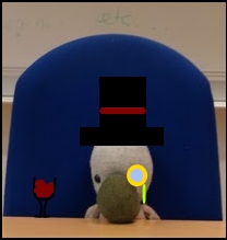
Posted 07 July 2009 - 05:05 PM
So...
I got a new set based on Mumbo Jumbo from the Banjo Kazooie series because he was one of my favorite characters when I was growing up. What do you think? All credit goes to Caael.
I got a new set based on Mumbo Jumbo from the Banjo Kazooie series because he was one of my favorite characters when I was growing up. What do you think? All credit goes to Caael.
#6490
- Master Adept
-
- Group: Veterans
- Posts: 8,730
- Joined: 09-June 06
- Gender:Male
- Location:England
- Interests:EVERYTHING EVER
Posted 07 July 2009 - 07:17 PM
WOW WHAT A DASHING SET YOU HAVE THERE IHK10/10
#6491
- Disciple
-
- Group: Veterans
- Posts: 1,300
- Joined: 07-March 04
- Gender:Male
- Location:Netherlands
-
AKA Neo_Genesis
Posted 07 July 2009 - 09:53 PM
GJ on that sig Caael. Only thing which I don't really like is the second, purple border. But besides that, I like it a lot! 9/10
#6492
- Master Adept
-
- Group: Veterans
- Posts: 8,730
- Joined: 09-June 06
- Gender:Male
- Location:England
- Interests:EVERYTHING EVER
Posted 08 July 2009 - 09:59 AM
I dont know what's happened IHK, but the link appears to have broken as its not showing up on my imageshack page or on the forum so here it is.
http://img142.images.../ihkrequest.png
To be safe, I'd save it to your computer incase it breaks again.
http://img142.images.../ihkrequest.png
To be safe, I'd save it to your computer incase it breaks again.
#6493
- God
-
- Group: Veterans
- Posts: 8,290
- Joined: 21-December 07
- Gender:Male
- Location:Fuck you stalker
-
AKA A Gangster Chimppp
Posted 08 July 2009 - 09:23 PM
Caael, on Jul 8 2009, 11:59 AM, said:
I dont know what's happened IHK, but the link appears to have broken as its not showing up on my imageshack page or on the forum so here it is.
http://img142.images.../ihkrequest.png
To be safe, I'd save it to your computer incase it breaks again.
http://img142.images.../ihkrequest.png
To be safe, I'd save it to your computer incase it breaks again.
:(
#6494
- Nebuchadnezzar
-
- Group: Veterans
- Posts: 11,279
- Joined: 16-December 05
- Gender:Male
- Location:37°48′S, 144°57′E.
- Interests:.5% per annum.
-
AKA Spam King
Posted 08 July 2009 - 10:29 PM
Damnit, that's how I lost my old sig.
#6495
- Master Adept
-
- Group: Veterans
- Posts: 8,730
- Joined: 09-June 06
- Gender:Male
- Location:England
- Interests:EVERYTHING EVER
Posted 04 August 2009 - 06:19 PM
New set, rate mother 'uckers
#6496
- God
-
- Group: Veterans
- Posts: 8,290
- Joined: 21-December 07
- Gender:Male
- Location:Fuck you stalker
-
AKA A Gangster Chimppp
Posted 04 August 2009 - 08:43 PM
Sig's fine, the avy is a fucking retarded cutjob.
3/10. the sig by itself though 7.
3/10. the sig by itself though 7.
#6497
- Master Adept
-
- Group: Veterans
- Posts: 8,730
- Joined: 09-June 06
- Gender:Male
- Location:England
- Interests:EVERYTHING EVER
Posted 04 August 2009 - 08:52 PM
Lol I'll make a different one then
#6498
- God
-
- Group: Veterans
- Posts: 8,290
- Joined: 21-December 07
- Gender:Male
- Location:Fuck you stalker
-
AKA A Gangster Chimppp
Posted 04 August 2009 - 08:53 PM
please do.
#6499
- Master Adept
-
- Group: Veterans
- Posts: 8,730
- Joined: 09-June 06
- Gender:Male
- Location:England
- Interests:EVERYTHING EVER
Posted 04 August 2009 - 09:04 PM
Better? Literally a 2 minute job. Getting the font size right took longer than everything else.
#6500
- God
-
- Group: Veterans
- Posts: 8,290
- Joined: 21-December 07
- Gender:Male
- Location:Fuck you stalker
-
AKA A Gangster Chimppp
Posted 04 August 2009 - 09:08 PM
2 mintues made it so much better; be proud.
#6501
- Master Adept
-
- Group: Veterans
- Posts: 8,730
- Joined: 09-June 06
- Gender:Male
- Location:England
- Interests:EVERYTHING EVER
Posted 04 August 2009 - 09:10 PM
:D
Out of 10 for set?
Out of 10 for set?
#6502
- Loose cannon Cop with nothing to lose
-
- Group: Veterans
- Posts: 4,998
- Joined: 22-March 07
- Gender:Male
- Location:Segmentum Obscurus
-
AKA Darksword
Posted 04 August 2009 - 09:13 PM
An 8 I guess? 9 feels too high.
#6503
- God
-
- Group: Veterans
- Posts: 8,290
- Joined: 21-December 07
- Gender:Male
- Location:Fuck you stalker
-
AKA A Gangster Chimppp
Posted 04 August 2009 - 09:13 PM
zero for demanding a score
#6504
- Master Adept
-
- Group: Veterans
- Posts: 8,730
- Joined: 09-June 06
- Gender:Male
- Location:England
- Interests:EVERYTHING EVER
Posted 04 August 2009 - 09:19 PM
Drizzy Drake, on Aug 5 2009, 04:13 AM, said:
zero for demanding a score
I'm not demanding, it's the purpose of the thread. I was merely requesting a recount due to an update.
#6505
- Banned
-
- Group: Veterans
- Posts: 4,301
- Joined: 05-September 05
- Gender:Male
- Location:where horses with broken legs go =D
- Interests:research it
-
AKA Dullahan
Posted 05 August 2009 - 02:09 PM
minus points for not having a Riza set
#6506
- God
-
- Group: Veterans
- Posts: 8,290
- Joined: 21-December 07
- Gender:Male
- Location:Fuck you stalker
-
AKA A Gangster Chimppp
Posted 05 August 2009 - 03:14 PM
his name's Rza!
#6507
- High Sheriff
-
- Group: Moderator
- Posts: 11,988
- Joined: 21-July 04
- Gender:Male
- Location:Sitting on a fence and drinking root beer
-
AKA Wind Dude (WD)
Posted 05 August 2009 - 04:09 PM
Laharl, on Aug 5 2009, 01:09 PM, said:
minus points for not having a Riza set
Actually, gotta agree.
#6508

- Master Adept
-
- Group: Veterans
- Posts: 3,165
- Joined: 10-October 04
- Gender:Male
- Location:Sydney, Australia
-
AKA watch
Posted 05 August 2009 - 05:47 PM
Anyone seen Rise of the Footsoldier?
#6509
- Master Adept
-
- Group: Veterans
- Posts: 8,730
- Joined: 09-June 06
- Gender:Male
- Location:England
- Interests:EVERYTHING EVER
Posted 07 August 2009 - 11:35 AM
Laharl, on Aug 5 2009, 09:09 PM, said:
minus points for not having a Riza set
Someone Else, on Aug 5 2009, 11:09 PM, said:
Actually, gotta agree.
Fuck you guys, I wanted to test out making fire effects with brushes.
#6510
- Nebuchadnezzar
-
- Group: Veterans
- Posts: 11,279
- Joined: 16-December 05
- Gender:Male
- Location:37°48′S, 144°57′E.
- Interests:.5% per annum.
-
AKA Spam King
Posted 08 August 2009 - 05:09 AM
I like the colours you've used, flamey orange against a raincloud blue backdrop. And you didn't go overboard and make them too bright or anything.
Only now I keep thinking you're Eugine. :x
Only now I keep thinking you're Eugine. :x
#6511

- Master Adept
-
- Group: Veterans
- Posts: 4,671
- Joined: 12-September 05
- Gender:Male
- Location:...
-
AKA Niko Bellic
Posted 09 August 2009 - 09:32 AM
watch, on Aug 6 2009, 01:47 AM, said:
Anyone seen Rise of the Footsoldier?
You have.
#6512
- Slayer
-
- Group: Members
- Posts: 311
- Joined: 23-February 07
- Gender:Male
- Location:Newton,MA
- Interests:Anime,Swiming,Annoying peolple,Video Games,and anything pengiun or Japanese related
Posted 12 August 2009 - 01:22 AM
I made a set from a picture I paint.neted of my new hoodie
#6513

- Master Adept
-
- Group: Moderator
- Posts: 4,875
- Joined: 19-August 04
- Gender:Male
- Location:Calabasas, California
- Interests:Inside your pants.
Posted 12 August 2010 - 11:53 AM
*revives thread*
10/10 because it's Konata. I heartz it.
10/10 because it's Konata. I heartz it.
#6514
- Banned
-
- Group: Veterans
- Posts: 4,301
- Joined: 05-September 05
- Gender:Male
- Location:where horses with broken legs go =D
- Interests:research it
-
AKA Dullahan
Posted 13 August 2010 - 05:20 AM
gay/10
#6515

- Berserker
-
- Group: Members
- Posts: 523
- Joined: 06-February 10
- Gender:Female
- Location:No one on the corner have swagga' like moi
-
AKA skidzors, Drizzy Drake, Dipset, etc.
Posted 13 August 2010 - 11:01 AM
alright avy, 8, but putting one's gamerscore in their sig is so dated.
#6516
- Captain Cannabis
-
- Group: Veterans
- Posts: 4,901
- Joined: 08-July 04
- Gender:Male
- Location:Manitouwadge, Ontario
-
AKA Mallick/PDM/GDUB3000/Sir
Posted 13 August 2010 - 01:42 PM
ThankMeLater, on Aug 13 2010, 10:01 AM, said:
putting one's gamerscore in their sig is so dated.
This is a ridiculous statement on so many levels
#6517
- Berserker
-
- Group: Members
- Posts: 523
- Joined: 06-February 10
- Gender:Female
- Location:No one on the corner have swagga' like moi
-
AKA skidzors, Drizzy Drake, Dipset, etc.
Posted 13 August 2010 - 09:02 PM
please, do elaborate