
The avatar and sig don't match, but I still think they go well together. If you could make a magical spraypaint sig that would be awesome.
Avatar: 9/10
Signature: 6/10
Overall: 8/10
And I agree with SoT, you really should shrink the text in your sig.
Sig, Avatar, And Set Rating Topic Rate other people's Sig/Avatar and Set!
#5001

- Nebuchadnezzar
-

- Group: Veterans
- Posts: 11,279
- Joined: 16-December 05
- Gender:Male
- Location:37°48′S, 144°57′E.
- Interests:.5% per annum.
-
AKA Spam King
Posted 21 March 2006 - 12:53 AM
#5002

- Banned
-
- Group: Veterans
- Posts: 4,301
- Joined: 05-September 05
- Gender:Male
- Location:where horses with broken legs go =D
- Interests:research it
-
AKA Dullahan
Posted 21 March 2006 - 01:26 AM
Kingdom Hearts Guy!
Avatar-is pretty basic 7/10
Sig-Very Nice, you could of put some text in the left 8/10
Overall-8/10
Avatar-is pretty basic 7/10
Sig-Very Nice, you could of put some text in the left 8/10
Overall-8/10
#5003

- Lebron James
-
- Group: Veterans
- Posts: 10,366
- Joined: 04-October 04
- Gender:Male
- Location:Winnipeg, MB
Posted 21 March 2006 - 10:59 AM
Split:
Both the avie and the sig match and KH is a pretty good game. So I'll give the avie 8, the sig 8, and the overall 9/10!
Both the avie and the sig match and KH is a pretty good game. So I'll give the avie 8, the sig 8, and the overall 9/10!
#5004

- Disciple
-
- Group: Members
- Posts: 1,227
- Joined: 28-June 05
- Gender:Male
- Location:State College, PA
Posted 21 March 2006 - 12:27 PM
My avatar is the best :(
#5005
- Lebron James
-
- Group: Veterans
- Posts: 10,366
- Joined: 04-October 04
- Gender:Male
- Location:Winnipeg, MB
Posted 21 March 2006 - 04:47 PM
Alrighty, I'll rate yours too.
Avie: *ahem* Very good if I do say so myself, though I really don't see what it has to do with the rest of your set? 8/10
Sig: Has nothing to do with the avie, I think a big fat picture of your girlfriend would do better in it's place. XDD 7/10
Overall: They don't match, but the sig is well done. 6/10
#5006
- Nebuchadnezzar
-
- Group: Veterans
- Posts: 11,279
- Joined: 16-December 05
- Gender:Male
- Location:37°48′S, 144°57′E.
- Interests:.5% per annum.
-
AKA Spam King
Posted 24 March 2006 - 09:57 PM
I'll rate both pHantOm and Sea of Time at once! :silence:
pHantOm
Avatar: It's just a photo... 3/10
Signature: It's well done, but I don't really like it that much. 6/10
Overall: Lost a point for having a non-matching set. 4.5/10 D:
Sea of Time
Avatar: Nonexistent. -100/10 :P
Signature: Nice pose, but is that the Rising Sun behind him? 7.5/10
Overall: Not counting the avatar. 7.5/10
#5007

- Master Adept
-
- Group: Members
- Posts: 3,798
- Joined: 28-December 04
- Gender:Male
- Location:British Columbia, Canada
- Interests:Martial Arts:<br />- Weapons (Bo staff :D)<br />- Chinese, Korean, Japanese, Filipino styles<br /><br />Video Games: <br />Fire Emblem, Zelda, Megaman, Super Smash Bros., Age of Empires/Mythology, Final Fantasy, etc.<br /><br />Movies, Web Design, Foruming-ing-ing, Sprites and Digital Art, Drawing, Writing, Anime, etc.
Posted 25 March 2006 - 04:21 PM
Split.
Avatar: It'd look better with a border, but it's okay. 8/10
Sig: I'd say it looks misleading due to the fact that the background is weird. Some blue effects would have been better. Nice shot of Sora. The Avatures are a little old, same with the egg. The MasterCard thing made me smile, though. 8.5/10
Set: They match pretty well, I suppose. 9/10
#5008

- High Sheriff
-
- Group: Moderator
- Posts: 11,988
- Joined: 21-July 04
- Gender:Male
- Location:Sitting on a fence and drinking root beer
-
AKA Wind Dude (WD)
Posted 25 March 2006 - 05:42 PM
 Sea_of_Time, on Mar 21 2006, 02:47 PM, said:
Very good if I do say so myself
Example: "The pizza was very good if do say so myself." Means that you liked the pizza you made, if you do say so yourself. :P
Split: I like that you used two seperate images of the same guy for your set, instead of the same image. Looks pretty good overall except for the fact that his hair seems a bit brighter in the sig, and as MD says the av could use a border.
Av: 7/10
Sig: 8.5/10
Set: 9/10
#5009
- Nebuchadnezzar
-
- Group: Veterans
- Posts: 11,279
- Joined: 16-December 05
- Gender:Male
- Location:37°48′S, 144°57′E.
- Interests:.5% per annum.
-
AKA Spam King
Posted 31 March 2006 - 01:18 AM
I made the Sora in my sig different to tie in with the flashiness of the border. I'd rather have the calmer-looking Sora as my avatar.
Wind Dude
Avatar: Looks a lot more mature than that one with Ivan. Good show. 8/10
Signature: Although it was probably tricky to make, I must admit it is a bit boring. 6/10
Overall: Is that a JPG I see? Oh noez! 6.5/10
Somebody rate my old set. Here it is, in case you forgot:
http://img386.imageshack.us/img386/6596/sepiablurreds2bg.png
http://img373.imageshack.us/img373/7968/sepiablurredsticks26yb.png
#5010

- Berserker
-
- Group: Members
- Posts: 468
- Joined: 21-January 06
- Location:Moses Lake, Washington, United States
- Interests:VIDEO GAMES, food, computers, cartoons,anime, and FOOD. <br />And Pie, pie is good, verrrryyyy good..........did I mention pie?
Posted 01 April 2006 - 01:10 AM
Avatar: It's just some curvy lines........5/10
Sig: It's just some straigt lines with your name :P 7/10
Overall: 6/10
Somebody give me a good program thingy to clear up my avie...........................It's to pixleated.
Sig: It's just some straigt lines with your name :P 7/10
Overall: 6/10
Somebody give me a good program thingy to clear up my avie...........................It's to pixleated.
#5011
- Nebuchadnezzar
-
- Group: Veterans
- Posts: 11,279
- Joined: 16-December 05
- Gender:Male
- Location:37°48′S, 144°57′E.
- Interests:.5% per annum.
-
AKA Spam King
Posted 01 April 2006 - 02:10 AM
Toasty64
Avatar: Terrible. It's a bad picture and it's horribly pixelated. 3/10
Signature: You're just using other people's images. Not very unique. 4.5/10
Overall: It's not bad...but it's not very good either. 4/10
If you want information on how to make a better set, feel free to PM me.
Avatar: Terrible. It's a bad picture and it's horribly pixelated. 3/10
Signature: You're just using other people's images. Not very unique. 4.5/10
Overall: It's not bad...but it's not very good either. 4/10
If you want information on how to make a better set, feel free to PM me.
#5012

- Master Adept
-
- Group: Veterans
- Posts: 2,686
- Joined: 06-August 04
- Gender:Male
- Location:Ontario,Canada..Eh?
- Interests:Myself, video games, sports,(especially basketball)T.V, the ladies and other things I have no time to mention. So now you know me and you proably already have fallen in love with me. Well, I can't blame you everyone else already loves me. :)
Posted 02 April 2006 - 11:45 AM
SI: I hate Sora. That's the kids name right. Anyways, the avatar is not bad 7/10 and neither is the sig 8/10. Still, I hate that kid. Mickey Mouse would have looked better.
#5013
- Nebuchadnezzar
-
- Group: Veterans
- Posts: 11,279
- Joined: 16-December 05
- Gender:Male
- Location:37°48′S, 144°57′E.
- Interests:.5% per annum.
-
AKA Spam King
Posted 03 April 2006 - 02:41 AM
I guess now would be a good time to point out that I stole my set from a fansite. :P
Echo_djinn
Avatar: Oh god, that's almost as bad as Toasty. Find a way to un-pixelate it. 3.5/10
Signature: Background is astounding. Would look better without Link, however. 7/10
Overall: Link's mug makes it difficult to focus on the actual signature. Great effort for the most part. 5.5/10
Echo_djinn
Avatar: Oh god, that's almost as bad as Toasty. Find a way to un-pixelate it. 3.5/10
Signature: Background is astounding. Would look better without Link, however. 7/10
Overall: Link's mug makes it difficult to focus on the actual signature. Great effort for the most part. 5.5/10
#5014
- Disciple
-
- Group: Members
- Posts: 1,227
- Joined: 28-June 05
- Gender:Male
- Location:State College, PA
Posted 03 April 2006 - 10:21 AM
Split Infinity, on Apr 3 2006, 04:41 AM, said:
I guess now would be a good time to point out that I stole my set from a fansite. :P
Split Infinity, on Mar 31 2006, 03:18 AM, said:
I made the Sora in my sig different to tie in with the flashiness of the border. I'd rather have the calmer-looking Sora as my avatar. I'm gonna rate WD now.
Your such a lying piece of sh!t.
#5015
- Nebuchadnezzar
-
- Group: Veterans
- Posts: 11,279
- Joined: 16-December 05
- Gender:Male
- Location:37°48′S, 144°57′E.
- Interests:.5% per annum.
-
AKA Spam King
Posted 03 April 2006 - 11:20 PM
Whoa, cut down on the language please. Somebody else rate my old set, which is legit, ftw.
http://img386.imageshack.us/img386/6596/sepiablurreds2bg.png
http://img373.imageshack.us/img373/7968/sepiablurredsticks26yb.png
http://img386.imageshack.us/img386/6596/sepiablurreds2bg.png
http://img373.imageshack.us/img373/7968/sepiablurredsticks26yb.png
#5016

- Master Adept
-
- Group: Veterans
- Posts: 2,770
- Joined: 28-January 04
- Gender:Male
- Location:London, UK
- Interests:Video Games & Hentai
-
AKA Anubis or Anu-chan
Posted 04 April 2006 - 10:03 AM
Hmph, watched FMA last week so decided to make a signature.
http://www.clanedge.co.uk/images/signatures/SG014.jpg
http://www.clanedge.co.uk/images/signatures/SG014.jpg
#5017

- Master Adept
-
- Group: Members
- Posts: 3,021
- Joined: 14-December 04
- Gender:Female
- Location:Brynmawr
-
AKA Love_Guardian_Yuki, Zimmy
Posted 04 April 2006 - 08:39 PM
I like your avatar: 9/10
Your sig is pretty cool: 8/10
OBVIOUSLY, they don't match but they're good seperately.
--I made my sig and I know it's not the best quality but it's good to match :)
Your sig is pretty cool: 8/10
OBVIOUSLY, they don't match but they're good seperately.
--I made my sig and I know it's not the best quality but it's good to match :)
#5018

- The toast in your toaster
-
- Group: Veterans
- Posts: 12,421
- Joined: 04-April 06
- Gender:Male
- Location:The toaster in your kitchen.
- Interests:Parkour, Martial Arts, Music, Network Administration,
-
AKA The toast in the toaster in your kitchen.
Posted 04 April 2006 - 10:15 PM
yur set looks................depresing.........................but well done none the less. Overall: 8/10
Just rate my avatar. Split, I'm pretty sure it's alot less pixleated this time. And believe it or not, I enhanced it myself. I think I'll post my Bugatti EB avie next time.
Just rate my avatar. Split, I'm pretty sure it's alot less pixleated this time. And believe it or not, I enhanced it myself. I think I'll post my Bugatti EB avie next time.
#5019
- Master Adept
-
- Group: Veterans
- Posts: 2,770
- Joined: 28-January 04
- Gender:Male
- Location:London, UK
- Interests:Video Games & Hentai
-
AKA Anubis or Anu-chan
Posted 05 April 2006 - 09:08 AM
Love_Guardian_Yuki, on Apr 5 2006, 03:39 AM, said:
I like your avatar: 9/10
Your sig is pretty cool: 8/10
OBVIOUSLY, they don't match but they're good seperately.
--I made my sig and I know it's not the best quality but it's good to match :D
Your sig is pretty cool: 8/10
OBVIOUSLY, they don't match but they're good seperately.
--I made my sig and I know it's not the best quality but it's good to match :D
That surprised me, I was expecting the signature to get the praise and the avatar to do worse. Yet infact the avatar was better and the signature I posted did worse. I'm getting so many mixed feelings about that signature, yet I can't seem to figure out why half the people love it and half the people hate it, so I can at least try and improve it a little and then present it again.
#5020
- Nebuchadnezzar
-
- Group: Veterans
- Posts: 11,279
- Joined: 16-December 05
- Gender:Male
- Location:37°48′S, 144°57′E.
- Interests:.5% per annum.
-
AKA Spam King
Posted 05 April 2006 - 01:19 PM
I think it's great and that you should use it.
#5021

- Disciple
-
- Group: Members
- Posts: 1,472
- Joined: 19-January 05
- Gender:Male
- Location:San Jose, CA
Posted 05 April 2006 - 02:10 PM
its cool, I like it 9/10
#5022
- Nebuchadnezzar
-
- Group: Veterans
- Posts: 11,279
- Joined: 16-December 05
- Gender:Male
- Location:37°48′S, 144°57′E.
- Interests:.5% per annum.
-
AKA Spam King
Posted 05 April 2006 - 03:03 PM
l3lueMage
Avatar: Can someone tell me what srsly means? 7/10
Signature: It's cool, I like it. Doesn't match however. 7/10
Overall: 7/10 (duh)
Avatar: Can someone tell me what srsly means? 7/10
Signature: It's cool, I like it. Doesn't match however. 7/10
Overall: 7/10 (duh)
#5023
- Master Adept
-
- Group: Members
- Posts: 3,021
- Joined: 14-December 04
- Gender:Female
- Location:Brynmawr
-
AKA Love_Guardian_Yuki, Zimmy
Posted 05 April 2006 - 05:14 PM
o.O;;
But I like my set T.T Just don't think of it negativly =)
SRSLY=Seriously
Your avatar is pretty awesome >.o 9/10
I like your sig =) Good work! o.o 9/10
overall:
9/10
But I like my set T.T Just don't think of it negativly =)
SRSLY=Seriously
Your avatar is pretty awesome >.o 9/10
I like your sig =) Good work! o.o 9/10
overall:
9/10
#5024
- Nebuchadnezzar
-
- Group: Veterans
- Posts: 11,279
- Joined: 16-December 05
- Gender:Male
- Location:37°48′S, 144°57′E.
- Interests:.5% per annum.
-
AKA Spam King
Posted 05 April 2006 - 05:43 PM
Love_Guardian_Yuki
Avatar: Looks pretty basic. 6/10
Signature: I like the 'dark angel' theme. Nice background. 8/10
Overall: 7/10
Avatar: Looks pretty basic. 6/10
Signature: I like the 'dark angel' theme. Nice background. 8/10
Overall: 7/10
#5025
- The toast in your toaster
-
- Group: Veterans
- Posts: 12,421
- Joined: 04-April 06
- Gender:Male
- Location:The toaster in your kitchen.
- Interests:Parkour, Martial Arts, Music, Network Administration,
-
AKA The toast in the toaster in your kitchen.
Posted 06 April 2006 - 12:45 PM
Split: Avatar 8/10...................Sig 6/10
Overall: 7/10
Just rate my Avatar. Tell me if you think it looks clearer than it did before.
Overall: 7/10
Just rate my Avatar. Tell me if you think it looks clearer than it did before.
#5026
- Nebuchadnezzar
-
- Group: Veterans
- Posts: 11,279
- Joined: 16-December 05
- Gender:Male
- Location:37°48′S, 144°57′E.
- Interests:.5% per annum.
-
AKA Spam King
Posted 06 April 2006 - 02:59 PM
It's even worse than before. Sorry. T_T
#5027
- The toast in your toaster
-
- Group: Veterans
- Posts: 12,421
- Joined: 04-April 06
- Gender:Male
- Location:The toaster in your kitchen.
- Interests:Parkour, Martial Arts, Music, Network Administration,
-
AKA The toast in the toaster in your kitchen.
Posted 07 April 2006 - 03:05 PM
Here, compare the two: http://img313.imageshack.us/img313/3532/dragon4zl.png Andhttp://img460.imageshack.us/img460/9153/dragonenhanced2el.png
#5028
- Nebuchadnezzar
-
- Group: Veterans
- Posts: 11,279
- Joined: 16-December 05
- Gender:Male
- Location:37°48′S, 144°57′E.
- Interests:.5% per annum.
-
AKA Spam King
Posted 08 April 2006 - 04:32 PM
I don't them either way. Why don't you use this as your avatar? :P
http://jimmyakin.typepad.com/photos/uncategorized/jtoast_1.jpg
http://jimmyakin.typepad.com/photos/uncategorized/jtoast_1.jpg
#5029

- Disciple
-
- Group: Veterans
- Posts: 2,333
- Joined: 27-January 04
- Location:California, USA
-
AKA Horasu
Posted 08 April 2006 - 07:39 PM
Mr.T, adding a border does wonders. And Split, I <3 Kingdom Hearts. 9/10!
And before anyone asks, yes, my signature is supposed to be blurry and hard-to-read.
And before anyone asks, yes, my signature is supposed to be blurry and hard-to-read.
#5030
- Nebuchadnezzar
-
- Group: Veterans
- Posts: 11,279
- Joined: 16-December 05
- Gender:Male
- Location:37°48′S, 144°57′E.
- Interests:.5% per annum.
-
AKA Spam King
Posted 08 April 2006 - 07:57 PM
Dig that piece of toast. It's got a face on it. O_o
MysticWarrior
Avatar: Blurry. 5/10
Signature: Hard to read. 8/10
MysticWarrior
Avatar: Blurry. 5/10
Signature: Hard to read. 8/10
#5031
- The toast in your toaster
-
- Group: Veterans
- Posts: 12,421
- Joined: 04-April 06
- Gender:Male
- Location:The toaster in your kitchen.
- Interests:Parkour, Martial Arts, Music, Network Administration,
-
AKA The toast in the toaster in your kitchen.
Posted 09 April 2006 - 12:07 PM
Split Infinity, on Apr 8 2006, 03:32 PM, said:
I don't them either way. Why don't you use this as your avatar? :P
http://jimmyakin.typepad.com/photos/uncategorized/jtoast_1.jpg
http://jimmyakin.typepad.com/photos/uncategorized/jtoast_1.jpg
OMG!! WHY DIDN'T I THINK OF THAT?!?!!..................Don't answer that question........
Split, Avie: 6/10.......sig: 6/10
Overall: 6/10. The backround on your sig should just be blotches of different shades of blue. That would look nicer.
#5032

- Disciple
-
- Group: Veterans
- Posts: 2,428
- Joined: 04-June 04
- Gender:Male
- Location:'straya
-
AKA sibsag, Lemontime
Posted 09 April 2006 - 05:41 PM
Rate me, I'm cool!
#5033
- Nebuchadnezzar
-
- Group: Veterans
- Posts: 11,279
- Joined: 16-December 05
- Gender:Male
- Location:37°48′S, 144°57′E.
- Interests:.5% per annum.
-
AKA Spam King
Posted 09 April 2006 - 08:15 PM
Five words per post, my friend.
sibsag
Avatar: A bit plain, but it looks nice with the border. 6/10
Signature: Great work, ties in well with Felix. The userbars are very flashy. 7.5/10
Overall: Very pleasant to look at. 7/10
I think I'm going to start using these 'userbars', since everybody else is.
sibsag
Avatar: A bit plain, but it looks nice with the border. 6/10
Signature: Great work, ties in well with Felix. The userbars are very flashy. 7.5/10
Overall: Very pleasant to look at. 7/10
I think I'm going to start using these 'userbars', since everybody else is.
#5034
- The toast in your toaster
-
- Group: Veterans
- Posts: 12,421
- Joined: 04-April 06
- Gender:Male
- Location:The toaster in your kitchen.
- Interests:Parkour, Martial Arts, Music, Network Administration,
-
AKA The toast in the toaster in your kitchen.
Posted 09 April 2006 - 10:30 PM
Well, same as last time split, 6/10. Just take my advice, it'll look better.
Anyway, what Avie do you like better? Or
Anyway, what Avie do you like better? Or
#5035
- Nebuchadnezzar
-
- Group: Veterans
- Posts: 11,279
- Joined: 16-December 05
- Gender:Male
- Location:37°48′S, 144°57′E.
- Interests:.5% per annum.
-
AKA Spam King
Posted 10 April 2006 - 12:52 AM
Mr.T, on Apr 10 2006, 02:30 PM, said:
Well, same as last time split, 6/10. Just take my advice, it'll look better.
Anyway, what Avie do you like better? attachment Or attachment
Anyway, what Avie do you like better?
attachment Or attachmentYou've rated me about three times now and my set hasn't changed one bit. :P
Anyway, I like the yellow one best.
#5036
- Master Adept
-
- Group: Veterans
- Posts: 2,770
- Joined: 28-January 04
- Gender:Male
- Location:London, UK
- Interests:Video Games & Hentai
-
AKA Anubis or Anu-chan
Posted 11 April 2006 - 04:59 AM
My latest creation, inspired by Maple Story. Feedback please.
http://www.clanedge.co.uk/images/signatures/SG015.jpg
http://www.clanedge.co.uk/images/signatures/SG015.jpg
#5037

- Chaos Lord
-
- Group: Members
- Posts: 798
- Joined: 30-November 04
- Gender:Male
- Location:Land of Cuckoo Clock
Posted 11 April 2006 - 07:03 AM
Nice, it looks very oldschool xD
#5038
- The toast in your toaster
-
- Group: Veterans
- Posts: 12,421
- Joined: 04-April 06
- Gender:Male
- Location:The toaster in your kitchen.
- Interests:Parkour, Martial Arts, Music, Network Administration,
-
AKA The toast in the toaster in your kitchen.
Posted 11 April 2006 - 02:41 PM
The guy looks like he either just got out of a big fight, or is stoned. XD Naww. It's preety good. 9/10
#5039
- Nebuchadnezzar
-
- Group: Veterans
- Posts: 11,279
- Joined: 16-December 05
- Gender:Male
- Location:37°48′S, 144°57′E.
- Interests:.5% per annum.
-
AKA Spam King
Posted 11 April 2006 - 07:20 PM
Much more uber than the last one. n_n
#5040
- Master Adept
-
- Group: Veterans
- Posts: 2,770
- Joined: 28-January 04
- Gender:Male
- Location:London, UK
- Interests:Video Games & Hentai
-
AKA Anubis or Anu-chan
Posted 12 April 2006 - 08:26 AM
Are you three talking about my signature or eachothers, because it helps if you say "Nemphtis" so I know whose signature you're rating.
#5041
- Chaos Lord
-
- Group: Members
- Posts: 798
- Joined: 30-November 04
- Gender:Male
- Location:Land of Cuckoo Clock
Posted 12 April 2006 - 09:05 AM
Well, it's sure that they weren't rating mine :P
#5042
- The toast in your toaster
-
- Group: Veterans
- Posts: 12,421
- Joined: 04-April 06
- Gender:Male
- Location:The toaster in your kitchen.
- Interests:Parkour, Martial Arts, Music, Network Administration,
-
AKA The toast in the toaster in your kitchen.
Posted 12 April 2006 - 11:13 PM
Split Infinity, on Apr 11 2006, 06:20 PM, said:
Much more uber than the last one. n_n
Well I've got a lot more pics like that where it came from.
Those are just the best I've got IMO. Although I could get more than what I have in my folder now, which is quite alot. I have like 50+ GS pic's, And 75+ Starwars pic's.
#5043
- Lebron James
-
- Group: Veterans
- Posts: 10,366
- Joined: 04-October 04
- Gender:Male
- Location:Winnipeg, MB
Posted 13 April 2006 - 09:03 AM
Mr. T:
I think that the cars are meant for sigs and not avies. You just can't measure their awesomeness in 100x100 pixels.
That being said:
Avie: Too small, I know there's a limit but you just can't marvel at the car. 7/10
Sig: Pretty much nonexistant. There's an egg. 4/10
Overall: 5/10
I think that the cars are meant for sigs and not avies. You just can't measure their awesomeness in 100x100 pixels.
That being said:
Avie: Too small, I know there's a limit but you just can't marvel at the car. 7/10
Sig: Pretty much nonexistant. There's an egg. 4/10
Overall: 5/10
#5044
- The toast in your toaster
-
- Group: Veterans
- Posts: 12,421
- Joined: 04-April 06
- Gender:Male
- Location:The toaster in your kitchen.
- Interests:Parkour, Martial Arts, Music, Network Administration,
-
AKA The toast in the toaster in your kitchen.
Posted 13 April 2006 - 02:07 PM
I don't usually spend that much time on the sig. I guess I don't really care. But I cut my avie down to 100X75 'cause it looked all distorted and stuff. Trust me, it looks better this way.
#5045
- Lebron James
-
- Group: Veterans
- Posts: 10,366
- Joined: 04-October 04
- Gender:Male
- Location:Winnipeg, MB
Posted 13 April 2006 - 06:30 PM
Yeah, I realize that. In fact, with the size limitations, that's probably the best you could do. I'm just saying that car would look a lot better in a sig.
#5046
- The toast in your toaster
-
- Group: Veterans
- Posts: 12,421
- Joined: 04-April 06
- Gender:Male
- Location:The toaster in your kitchen.
- Interests:Parkour, Martial Arts, Music, Network Administration,
-
AKA The toast in the toaster in your kitchen.
Posted 15 April 2006 - 08:23 PM
Well, I croped it, and in the second one, I tried to make it look like it was moving. I'm not so sure I did that well though. And I don't know how to shrink them. Unless I can just do that with image shack.
And
And
#5047
- High Sheriff
-
- Group: Moderator
- Posts: 11,988
- Joined: 21-July 04
- Gender:Male
- Location:Sitting on a fence and drinking root beer
-
AKA Wind Dude (WD)
Posted 16 April 2006 - 08:08 AM
The one where you added in the filter looks more like it's getting sucked into a vortex rather than it's moving. Keep practicing though, and I'm sure you'll figure out how to do it better. So use the original, but add a border! Seriously! :D
...assuming you know how to add a border?
As for shrinking images, well if you use Photoshop just go to Help and then Resize Image, and figure it out from there.
...assuming you know how to add a border?
As for shrinking images, well if you use Photoshop just go to Help and then Resize Image, and figure it out from there.
This post has been edited by Wind Dude: 16 April 2006 - 08:09 AM
#5048

- Knight
-
- Group: Members
- Posts: 83
- Joined: 05-April 05
- Location:Need to know basis only
- Interests:E mail me and I'll telll you (if your a female) Im also African American
Posted 16 April 2006 - 01:24 PM
Quick someone rate my new Avatar ans siggy :D
#5049
- The toast in your toaster
-
- Group: Veterans
- Posts: 12,421
- Joined: 04-April 06
- Gender:Male
- Location:The toaster in your kitchen.
- Interests:Parkour, Martial Arts, Music, Network Administration,
-
AKA The toast in the toaster in your kitchen.
Posted 16 April 2006 - 02:54 PM
XDD 8/10. They match!! And I'm pretty sure I know how to add a border. But I don't have photo shop, I use photo studio5. And know that I think about it, it does look like it's being sucked away... :D
#5050
- Lebron James
-
- Group: Veterans
- Posts: 10,366
- Joined: 04-October 04
- Gender:Male
- Location:Winnipeg, MB
Posted 17 April 2006 - 05:14 AM
Black Eyed Peas?!?! *calls cops* Somebody just funkified GSSF! </corny>
Anyways, they do match and the BEP are pretty cool, so I'll give you a 8/10 just because of some pixelation issues with the avie.
Anyways, they do match and the BEP are pretty cool, so I'll give you a 8/10 just because of some pixelation issues with the avie.
#5051
- Disciple
-
- Group: Members
- Posts: 1,472
- Joined: 19-January 05
- Gender:Male
- Location:San Jose, CA
Posted 17 April 2006 - 10:34 PM
I cant see your sig SoT
Nice egg Mr. T XD...5/10? looks rotton >.>
Nice egg Mr. T XD...5/10? looks rotton >.>
#5052
- High Sheriff
-
- Group: Moderator
- Posts: 11,988
- Joined: 21-July 04
- Gender:Male
- Location:Sitting on a fence and drinking root beer
-
AKA Wind Dude (WD)
Posted 18 April 2006 - 09:45 AM
You know what? I'm going to dock 3 points off of people's sig and set rating if have they a userbar or an egg in their sig from now on. >_> (no, joke eggs like mine don't count)
Bluemage
Av: The internet humor is... meh. But other than that, can't see anything wrong with it. 7/10
Sig: It's nice, plus, you don't have a userbar or an egg! Way to go! 8/10
Set: Doesn't match, but it doesn't clash either. 7/10
Bluemage
Av: The internet humor is... meh. But other than that, can't see anything wrong with it. 7/10
Sig: It's nice, plus, you don't have a userbar or an egg! Way to go! 8/10
Set: Doesn't match, but it doesn't clash either. 7/10
#5053
- The toast in your toaster
-
- Group: Veterans
- Posts: 12,421
- Joined: 04-April 06
- Gender:Male
- Location:The toaster in your kitchen.
- Interests:Parkour, Martial Arts, Music, Network Administration,
-
AKA The toast in the toaster in your kitchen.
Posted 18 April 2006 - 03:10 PM
O RLY?
WD: Set= 7/10
I just put in my new sig. And it has a border!! XDD
WD: Set= 7/10
I just put in my new sig. And it has a border!! XDD
#5054
- Master Adept
-
- Group: Members
- Posts: 3,798
- Joined: 28-December 04
- Gender:Male
- Location:British Columbia, Canada
- Interests:Martial Arts:<br />- Weapons (Bo staff :D)<br />- Chinese, Korean, Japanese, Filipino styles<br /><br />Video Games: <br />Fire Emblem, Zelda, Megaman, Super Smash Bros., Age of Empires/Mythology, Final Fantasy, etc.<br /><br />Movies, Web Design, Foruming-ing-ing, Sprites and Digital Art, Drawing, Writing, Anime, etc.
Posted 18 April 2006 - 04:03 PM
Toasty.
I second what the others said about the avatar. 7/10.
The sig's border isn't that well done, it's too big and cuts off the car. I think the border that would look better would be liek teh one I have on my avatar and sig. Just one solid black line. 6.5/10.
Overall, they match, obviously, them being the same picture. If you could get a different shot of the car, it would be more of a dramatic appearance. 7.5/10
#5055

- Disciple
-
- Group: Members
- Posts: 1,585
- Joined: 25-October 04
- Gender:Female
- Location:Inside a Jar
- Interests:..Truffles, White Chocolates, Flying, RPGing & a Smile.
Posted 18 April 2006 - 04:32 PM
MD - Well..what can I say? It's MD, pretty nice and clean I like it. 8.5/10
#5056
- Lebron James
-
- Group: Veterans
- Posts: 10,366
- Joined: 04-October 04
- Gender:Male
- Location:Winnipeg, MB
Posted 18 April 2006 - 04:37 PM
Would you be offended if I made a car set Toasty because you're inspiring me to try my hand at one!
I agree with MD, the border should not cut off the car but it is an innovative idea with the translucent border.
7/10
I agree with MD, the border should not cut off the car but it is an innovative idea with the translucent border.
7/10
#5057
- Disciple
-
- Group: Members
- Posts: 1,472
- Joined: 19-January 05
- Gender:Male
- Location:San Jose, CA
Posted 18 April 2006 - 05:37 PM
Somia your sig is nice, especially the drawings =O very nice ^^ 9/10
SoT...userbar sigs o.o from that site....XD
SoT...userbar sigs o.o from that site....XD
#5058
- Nebuchadnezzar
-
- Group: Veterans
- Posts: 11,279
- Joined: 16-December 05
- Gender:Male
- Location:37°48′S, 144°57′E.
- Interests:.5% per annum.
-
AKA Spam King
Posted 18 April 2006 - 07:10 PM
Somia
Avatar: She's cute. -_- 7/10
Signature: Image is a little too 'soft' for my liking. The border looks odd. 5/10
Overall: Hmm...average. 6/10
Avatar: She's cute. -_- 7/10
Signature: Image is a little too 'soft' for my liking. The border looks odd. 5/10
Overall: Hmm...average. 6/10
#5059

- Disciple
-
- Group: Members
- Posts: 1,860
- Joined: 22-January 05
- Gender:Female
- Location:Outside your window, watching....waiting
- Interests:Go Away...
Posted 18 April 2006 - 07:14 PM
i'm in the process of making up a new set on photoshop, but until then i'll rate all of yours -_-
Split: I give your whole set a 9.5/10
I love how you did the colors, and I do love kingdom hearts.
Split: I give your whole set a 9.5/10
I love how you did the colors, and I do love kingdom hearts.
#5060
- Disciple
-
- Group: Members
- Posts: 1,585
- Joined: 25-October 04
- Gender:Female
- Location:Inside a Jar
- Interests:..Truffles, White Chocolates, Flying, RPGing & a Smile.
Posted 19 April 2006 - 11:52 AM
Lol...I didn't know I was gonna come back so I just sticked some random avatar and sig I made before, I made a proper set now.
BlueMage - xD , love that avatar, and tha siggie is awsome too overall...9! <3
Split Infinity - Ooo...KH, nice colour choices, nice picture, very clean. 8.5
Golden Djinn13 - um...yeah xD
SoT - Usebars? o.o'
BlueMage - xD , love that avatar, and tha siggie is awsome too overall...9! <3
Split Infinity - Ooo...KH, nice colour choices, nice picture, very clean. 8.5
Golden Djinn13 - um...yeah xD
SoT - Usebars? o.o'
#5061
- Lebron James
-
- Group: Veterans
- Posts: 10,366
- Joined: 04-October 04
- Gender:Male
- Location:Winnipeg, MB
Posted 19 April 2006 - 12:28 PM
Look, I'm working on a car set, okay? *sigh*
Your set, Somia, is wonderful. The sig is kind of small but is very colorful. And they match! 10/10
Your set, Somia, is wonderful. The sig is kind of small but is very colorful. And they match! 10/10
#5062
- The toast in your toaster
-
- Group: Veterans
- Posts: 12,421
- Joined: 04-April 06
- Gender:Male
- Location:The toaster in your kitchen.
- Interests:Parkour, Martial Arts, Music, Network Administration,
-
AKA The toast in the toaster in your kitchen.
Posted 19 April 2006 - 02:13 PM
Only because your jelous of mine! -_-
Well....There's hardly anything there...yet...:5/10
I just did a new sig. I also got like another 50 pics of cars off the net while I was looking for this one. Litteraly. If I could post a link to my car folder, you'd be amazed.
Well....There's hardly anything there...yet...:5/10
I just did a new sig. I also got like another 50 pics of cars off the net while I was looking for this one. Litteraly. If I could post a link to my car folder, you'd be amazed.
#5063
- Nebuchadnezzar
-
- Group: Veterans
- Posts: 11,279
- Joined: 16-December 05
- Gender:Male
- Location:37°48′S, 144°57′E.
- Interests:.5% per annum.
-
AKA Spam King
Posted 19 April 2006 - 02:17 PM
Mr. T
Avatar: It's just a car. 3/10
Signature: It's just a really dumb-looking car. 2/10
Overall: Just using random pictures of cars doesn't make a good set. 3/10
Avatar: It's just a car. 3/10
Signature: It's just a really dumb-looking car. 2/10
Overall: Just using random pictures of cars doesn't make a good set. 3/10
#5064
- Disciple
-
- Group: Members
- Posts: 1,585
- Joined: 25-October 04
- Gender:Female
- Location:Inside a Jar
- Interests:..Truffles, White Chocolates, Flying, RPGing & a Smile.
Posted 19 April 2006 - 03:04 PM
Mr.T - Car eh? Need more work..maybe a border? 6/10
#5065
- Disciple
-
- Group: Members
- Posts: 1,860
- Joined: 22-January 05
- Gender:Female
- Location:Outside your window, watching....waiting
- Interests:Go Away...
Posted 19 April 2006 - 03:22 PM
Somia: Wow, how do you make such good sets?! ( I hate the color pink, and I still like it)
Avatar: 8.5/10
Sig: 9.5/10
Set: 9/10
Avatar: 8.5/10
Sig: 9.5/10
Set: 9/10
#5066
- Master Adept
-
- Group: Members
- Posts: 3,798
- Joined: 28-December 04
- Gender:Male
- Location:British Columbia, Canada
- Interests:Martial Arts:<br />- Weapons (Bo staff :D)<br />- Chinese, Korean, Japanese, Filipino styles<br /><br />Video Games: <br />Fire Emblem, Zelda, Megaman, Super Smash Bros., Age of Empires/Mythology, Final Fantasy, etc.<br /><br />Movies, Web Design, Foruming-ing-ing, Sprites and Digital Art, Drawing, Writing, Anime, etc.
Posted 19 April 2006 - 03:45 PM
Somia: Cute, real nice text on the sig. Matches real nicely. Simple colour-wise, but effective nonetheless. Still pretty well done. 8.5/10
#5067
- Master Adept
-
- Group: Veterans
- Posts: 2,770
- Joined: 28-January 04
- Gender:Male
- Location:London, UK
- Interests:Video Games & Hentai
-
AKA Anubis or Anu-chan
Posted 19 April 2006 - 04:47 PM
MD, even though you've been using that set for practically ages I still don't get annoyed when seeing it, but that's not to say it's great. The pixel stretch background is far too plain and would have been better if you had used the Mars Djinni render for the BG color of the stretch, the avatar or signature doesn't really have your name on it either so anyone who would for some reason want to "jack" your "sh*t" would probably get away with it. I think the set deserves a 7/10 for still not making me sick after all this time.
-------------------------------
Sincce I do not really have a signature to rate, I'd like you to rate my most recent creation below. It's a small experiment I've been doing and is the same style as the Maple Bandit signature but I've tried a different render and added/removed a few effects. The render is Rico from Gunslinger Girl.
http://www.clanedge.co.uk/images/signatures/SG016.jpg
#5068
- Lebron James
-
- Group: Veterans
- Posts: 10,366
- Joined: 04-October 04
- Gender:Male
- Location:Winnipeg, MB
Posted 20 April 2006 - 08:24 AM
Is it brushes that cause the effect behind the character? I just have some questions about photoshop that some people can help answer.
Anyways the "brushes" really help accentuate the character, and the colors are very cool. Having the name on there doesn't hurt, in fact, it makes it better! In my opinion, one of the best I've seen.
10/10
Anyways the "brushes" really help accentuate the character, and the colors are very cool. Having the name on there doesn't hurt, in fact, it makes it better! In my opinion, one of the best I've seen.
10/10
#5069
- Chaos Lord
-
- Group: Members
- Posts: 798
- Joined: 30-November 04
- Gender:Male
- Location:Land of Cuckoo Clock
Posted 20 April 2006 - 09:34 AM
Yes it's nice, but maybe you could move the girl a bit so we could see her whole head -_-
#5070
- Lebron James
-
- Group: Veterans
- Posts: 10,366
- Joined: 04-October 04
- Gender:Male
- Location:Winnipeg, MB
Posted 20 April 2006 - 09:51 AM
Gardna:
Your avatar is nice, the colors blend well and the textures give it a glassy feel. 9/10
Sig: It's just userbars, an egg and text so I can't really give it any more than a 5/10
Overall: They don't match, but the avatar is good, so 7/10
Your avatar is nice, the colors blend well and the textures give it a glassy feel. 9/10
Sig: It's just userbars, an egg and text so I can't really give it any more than a 5/10
Overall: They don't match, but the avatar is good, so 7/10
#5071
- Nebuchadnezzar
-
- Group: Veterans
- Posts: 11,279
- Joined: 16-December 05
- Gender:Male
- Location:37°48′S, 144°57′E.
- Interests:.5% per annum.
-
AKA Spam King
Posted 20 April 2006 - 02:11 PM
Sea_of_Time
Avatar: Nonexistant. -100/10 -_-
Signature: Sick, mon. 10/10
Overall: Signature could be shrunken slightly. 9/10
Avatar: Nonexistant. -100/10 -_-
Signature: Sick, mon. 10/10
Overall: Signature could be shrunken slightly. 9/10
#5072

- Disciple
-
- Group: Members
- Posts: 1,263
- Joined: 31-December 05
-
AKA lifeform288
Posted 22 April 2006 - 04:55 AM
Split: I like. I like alot. Good color, they, of course, match. 9/10.
Matt: Your avatar isn't as good as it would be on someone else, because you really do talk like that. e.e 4/10
Matt: Your avatar isn't as good as it would be on someone else, because you really do talk like that. e.e 4/10
#5073
- High Sheriff
-
- Group: Moderator
- Posts: 11,988
- Joined: 21-July 04
- Gender:Male
- Location:Sitting on a fence and drinking root beer
-
AKA Wind Dude (WD)
Posted 22 April 2006 - 04:55 PM
LF
Av: ... 0/10 XD
Sig: Grainy, and the zoom is annoying. 2/10
Set: 1/10
Av: ... 0/10 XD
Sig: Grainy, and the zoom is annoying. 2/10
Set: 1/10
#5074
- Nebuchadnezzar
-
- Group: Veterans
- Posts: 11,279
- Joined: 16-December 05
- Gender:Male
- Location:37°48′S, 144°57′E.
- Interests:.5% per annum.
-
AKA Spam King
Posted 22 April 2006 - 11:09 PM
Lifeform288
Avatar: Omg. 2/10
Signature: ^ Ditto, the zoom is incredibly irritating. Nice transition though. 5/10
Set: You win the 'Least Matching Set' award. 3.5/10
Avatar: Omg. 2/10
Signature: ^ Ditto, the zoom is incredibly irritating. Nice transition though. 5/10
Set: You win the 'Least Matching Set' award. 3.5/10
#5075
- Disciple
-
- Group: Members
- Posts: 1,263
- Joined: 31-December 05
-
AKA lifeform288
Posted 23 April 2006 - 04:54 AM
Just because you're jealous doesn't mean you have to take it out on my rating.
#5076
- Chaos Lord
-
- Group: Members
- Posts: 798
- Joined: 30-November 04
- Gender:Male
- Location:Land of Cuckoo Clock
Posted 23 April 2006 - 06:49 AM
It's just because you rule and they don't xD
#5077
- Lebron James
-
- Group: Veterans
- Posts: 10,366
- Joined: 04-October 04
- Gender:Male
- Location:Winnipeg, MB
Posted 23 April 2006 - 02:26 PM
Lifeform:
Avatar: Typical PDM stuff, 10/10 XD
Sig: Really freakin annoying. 5/10
Overall: You know they really don't match (technically), so 6/10
Avatar: Typical PDM stuff, 10/10 XD
Sig: Really freakin annoying. 5/10
Overall: You know they really don't match (technically), so 6/10
#5078 Guest_Wonky_*
Posted 23 April 2006 - 03:05 PM
SoT:
Avatar: N/A
Sig: **** THAT'S GOOD! 100/10
Overall:....you need an avie to match....8/10 till you get one.
Oh, and I know that you don't want to crop off some of that beeaauutiful car, but it needs to be more rectangular. Like this: But I couldn't find the font you used.
Avatar: N/A
Sig: **** THAT'S GOOD! 100/10
Overall:....you need an avie to match....8/10 till you get one.
Oh, and I know that you don't want to crop off some of that beeaauutiful car, but it needs to be more rectangular. Like this:
#5079
- Nebuchadnezzar
-
- Group: Veterans
- Posts: 11,279
- Joined: 16-December 05
- Gender:Male
- Location:37°48′S, 144°57′E.
- Interests:.5% per annum.
-
AKA Spam King
Posted 23 April 2006 - 06:59 PM
Lifeform288, on Apr 23 2006, 08:54 PM, said:
Just because you're jealous doesn't mean you have to take it out on my rating.
How could anyone be jealous of an 8 and a D playing soccer with a w on a field of ===?
#5080
- Lebron James
-
- Group: Veterans
- Posts: 10,366
- Joined: 04-October 04
- Gender:Male
- Location:Winnipeg, MB
Posted 23 April 2006 - 07:36 PM
I would crop it a bit but it looks too good the way it is. -_-
Wonky:
Avatar: Just a flame, and very pixelated at that. 6/10
Sig: Somewhat dull. Nice idea though. 7/10
Overall: They don't really match. 6/10
Wonky:
Avatar: Just a flame, and very pixelated at that. 6/10
Sig: Somewhat dull. Nice idea though. 7/10
Overall: They don't really match. 6/10
#5081

- Berserker
-
- Group: Members
- Posts: 477
- Joined: 23-April 06
- Gender:Male
- Location:The Netherlands, Zeeland.
Posted 26 April 2006 - 01:15 PM
SoT
Avatars pwn, non avatars s¾ck. 0/10
Signature: Could be shrunken a litlle bit. 7/10
Overall 2/10 the non avatar is not, i repeat, not good.
Avatars pwn, non avatars s¾ck. 0/10
Signature: Could be shrunken a litlle bit. 7/10
Overall 2/10 the non avatar is not, i repeat, not good.
#5082
- Master Adept
-
- Group: Veterans
- Posts: 2,686
- Joined: 06-August 04
- Gender:Male
- Location:Ontario,Canada..Eh?
- Interests:Myself, video games, sports,(especially basketball)T.V, the ladies and other things I have no time to mention. So now you know me and you proably already have fallen in love with me. Well, I can't blame you everyone else already loves me. :)
Posted 26 April 2006 - 04:01 PM
SOT: My moma could have picked a better car for her sig. The car sucks but because I am such a nice guy I'll give the sig an 8.5/10. -_- Hell yeah.
#5083
- Disciple
-
- Group: Members
- Posts: 1,585
- Joined: 25-October 04
- Gender:Female
- Location:Inside a Jar
- Interests:..Truffles, White Chocolates, Flying, RPGing & a Smile.
Posted 26 April 2006 - 04:11 PM
Whats with all those cars? o.o''
ED - They don't match, but they're both nice. 8.9/10
ED - They don't match, but they're both nice. 8.9/10
#5084
- Nebuchadnezzar
-
- Group: Veterans
- Posts: 11,279
- Joined: 16-December 05
- Gender:Male
- Location:37°48′S, 144°57′E.
- Interests:.5% per annum.
-
AKA Spam King
Posted 26 April 2006 - 09:36 PM
Echo_djinn
Avatar: Good to look at for about a minute. 7/10
Signature: SoT's car is better, but I like what you've done with it. 8.5/10
Overall: One's greenish-brown, the other's reddish-brown, they sort of match. 8/10
Avatar: Good to look at for about a minute. 7/10
Signature: SoT's car is better, but I like what you've done with it. 8.5/10
Overall: One's greenish-brown, the other's reddish-brown, they sort of match. 8/10
#5085

- Disciple
-
- Group: Members
- Posts: 1,000
- Joined: 07-January 05
- Gender:Male
- Location:Manchester, England
Posted 27 April 2006 - 12:24 PM
'Salright Split. I'd give the Avatar a black border if I were you, but the image is good. 8/10
As for the sig, I'd maybe add some text to the left of the image, as the background is a bit too dark and background-ish, and it kinda looks a bit plain. Image is decent. Userbar is meh. I don't like them.
As for your text, it should read "If you're one of the 0.2% who doesn't, blah blah"
At the moment it reads like, if you're one of the 0.2% who does "lack super powers"
8/10 for the set. They match.
{NEW SET: PLEASE RATE}
#5086
- Chaos Lord
-
- Group: Members
- Posts: 798
- Joined: 30-November 04
- Gender:Male
- Location:Land of Cuckoo Clock
Posted 27 April 2006 - 01:01 PM
Wow the avatar is... so strange, i can't describe it. Good work anyway 10/10
Sig - same as the avatar 10/10
Set - 10/10 (what else xD)
Sig - same as the avatar 10/10
Set - 10/10 (what else xD)
#5087
- Disciple
-
- Group: Members
- Posts: 1,585
- Joined: 25-October 04
- Gender:Female
- Location:Inside a Jar
- Interests:..Truffles, White Chocolates, Flying, RPGing & a Smile.
Posted 27 April 2006 - 09:17 PM
Wifle - Oh my..that's pretty n_n'' Somewhat plain but it works 8.5/10
#5088
- The toast in your toaster
-
- Group: Veterans
- Posts: 12,421
- Joined: 04-April 06
- Gender:Male
- Location:The toaster in your kitchen.
- Interests:Parkour, Martial Arts, Music, Network Administration,
-
AKA The toast in the toaster in your kitchen.
Posted 28 April 2006 - 06:59 PM
Somia: Overall: It's a matching pair and their both well done and clear. 10/10
For my sig, I did kinda 'borrow' SoT's idea, but it does look better than my last one IMO.
For my sig, I did kinda 'borrow' SoT's idea, but it does look better than my last one IMO.
#5089
- Nebuchadnezzar
-
- Group: Veterans
- Posts: 11,279
- Joined: 16-December 05
- Gender:Male
- Location:37°48′S, 144°57′E.
- Interests:.5% per annum.
-
AKA Spam King
Posted 28 April 2006 - 11:33 PM
I will congratulate you on your choice of vehicle, however, just about anybody could do what you have done in about 20 seconds. Go car signatures. :angry:
#5090
- The toast in your toaster
-
- Group: Veterans
- Posts: 12,421
- Joined: 04-April 06
- Gender:Male
- Location:The toaster in your kitchen.
- Interests:Parkour, Martial Arts, Music, Network Administration,
-
AKA The toast in the toaster in your kitchen.
Posted 28 April 2006 - 11:38 PM
Except that my avatar is one of a kind. I also tried to put a border on it, but when I loaded it into the avatar thingamajig, it didn't show. I think I'll fool around with the filters a while.
#5091
- Nebuchadnezzar
-
- Group: Veterans
- Posts: 11,279
- Joined: 16-December 05
- Gender:Male
- Location:37°48′S, 144°57′E.
- Interests:.5% per annum.
-
AKA Spam King
Posted 28 April 2006 - 11:43 PM
You know why it's not showing? Because your set is so dark. Try giving it a black border, and then put a white border inside of that. It should turn out really nice.
#5092
- The toast in your toaster
-
- Group: Veterans
- Posts: 12,421
- Joined: 04-April 06
- Gender:Male
- Location:The toaster in your kitchen.
- Interests:Parkour, Martial Arts, Music, Network Administration,
-
AKA The toast in the toaster in your kitchen.
Posted 29 April 2006 - 12:31 AM
Well, to do that on Photo Studio, I'd have to put a white border, then a black border. How much does it cost for photoshop CS2 anyway?
And thanks for the tip Split.
[EDIT] I added the border.
[EDIT AGAIN] NOW my signature is complete. It's perfect! XDD
And thanks for the tip Split.
[EDIT] I added the border.
[EDIT AGAIN] NOW my signature is complete. It's perfect! XDD
This post has been edited by Mr.T: 29 April 2006 - 12:43 AM
#5093
- Nebuchadnezzar
-
- Group: Veterans
- Posts: 11,279
- Joined: 16-December 05
- Gender:Male
- Location:37°48′S, 144°57′E.
- Interests:.5% per annum.
-
AKA Spam King
Posted 29 April 2006 - 06:39 AM
NO! That's terrible! Ever heard of pixel art? Just zoom in really close and draw the border by hand. If you're having trouble, hand it over to me and I'll show you the finished product.
#5094
- High Sheriff
-
- Group: Moderator
- Posts: 11,988
- Joined: 21-July 04
- Gender:Male
- Location:Sitting on a fence and drinking root beer
-
AKA Wind Dude (WD)
Posted 29 April 2006 - 02:40 PM
Toasty, your signature is too long and makes you look like a republican political dork.
#5095
- Lebron James
-
- Group: Veterans
- Posts: 10,366
- Joined: 04-October 04
- Gender:Male
- Location:Winnipeg, MB
Posted 29 April 2006 - 03:32 PM
Did someone say republican? *takes out shotgun*
You know, they said something interesting on the Daily Show the other day. Even though the president only has a 33% approval rating, this is still enough to win him an election because the voter turn-out is only 61%. Makes sense, huh?
Anyways, Toasty. Your sig is way too big, and Lambos just look better in black. Nice avie though, much better than your last few.
6/10 overall, it's too big.
#5096
- The toast in your toaster
-
- Group: Veterans
- Posts: 12,421
- Joined: 04-April 06
- Gender:Male
- Location:The toaster in your kitchen.
- Interests:Parkour, Martial Arts, Music, Network Administration,
-
AKA The toast in the toaster in your kitchen.
Posted 29 April 2006 - 05:48 PM
Okay, I fixed it. SoT, my rateing still stands for yours, but you REALLY need an avatar. Just google image search the Lamborghini GT-R for a different angle at the exact car in your sig, crop it, and scale it down. And what font did you use in your sig?
Here, use this for your avie: It's dimensions are 100 X 64.
Here's the original
Here, use this for your avie:
It's dimensions are 100 X 64.Here's the original
#5097
- Nebuchadnezzar
-
- Group: Veterans
- Posts: 11,279
- Joined: 16-December 05
- Gender:Male
- Location:37°48′S, 144°57′E.
- Interests:.5% per annum.
-
AKA Spam King
Posted 29 April 2006 - 06:46 PM
Ah yes, that's better. Speaking of which, it's high time I updated my set. I wonder what I'll put in it...oh wait, I know! XD
#5098
- Lebron James
-
- Group: Veterans
- Posts: 10,366
- Joined: 04-October 04
- Gender:Male
- Location:Winnipeg, MB
Posted 01 May 2006 - 11:08 AM
Mr.T, on Apr 29 2006, 06:48 PM, said:
Okay, I fixed it. SoT, my rateing still stands for yours, but you REALLY need an avatar. Just google image search the Lamborghini GT-R for a different angle at the exact car in your sig, crop it, and scale it down. And what font did you use in your sig?
I don't remember what the font was called. It started with an M, just go through those. :D
Anyways, thanks a lot for the avie, I owe you one.
#5099
- Berserker
-
- Group: Members
- Posts: 477
- Joined: 23-April 06
- Gender:Male
- Location:The Netherlands, Zeeland.
Posted 04 May 2006 - 10:58 AM
I rated that before, I'd border my sig if I were you. It suits the avatar.
#5100
- The toast in your toaster
-
- Group: Veterans
- Posts: 12,421
- Joined: 04-April 06
- Gender:Male
- Location:The toaster in your kitchen.
- Interests:Parkour, Martial Arts, Music, Network Administration,
-
AKA The toast in the toaster in your kitchen.
Posted 05 May 2006 - 04:45 PM
Nice set MP! :8/10
SoT's is still the best I've seen so far, and now that he has an avie (thanks to me), he gets 10/10, hands down. Even if that sig isn't the hardest to make, it's still a good picture.
SoT's is still the best I've seen so far, and now that he has an avie (thanks to me), he gets 10/10, hands down. Even if that sig isn't the hardest to make, it's still a good picture.
#5101
- Disciple
-
- Group: Veterans
- Posts: 2,428
- Joined: 04-June 04
- Gender:Male
- Location:'straya
-
AKA sibsag, Lemontime
Posted 05 May 2006 - 07:00 PM
Lyk, plzplz r8 me okokokokolololololloollolololololol111!
#5102
- The toast in your toaster
-
- Group: Veterans
- Posts: 12,421
- Joined: 04-April 06
- Gender:Male
- Location:The toaster in your kitchen.
- Interests:Parkour, Martial Arts, Music, Network Administration,
-
AKA The toast in the toaster in your kitchen.
Posted 05 May 2006 - 07:14 PM
Only if you rate me! You: 8/10
And SoT, I checked all my fonts. Didn't find it.
And SoT, I checked all my fonts. Didn't find it.
This post has been edited by Mr.T: 05 May 2006 - 08:15 PM
#5103
- Disciple
-
- Group: Veterans
- Posts: 2,428
- Joined: 04-June 04
- Gender:Male
- Location:'straya
-
AKA sibsag, Lemontime
Posted 05 May 2006 - 08:22 PM
Cars aren't my things, really... I like them, but I find them pretty boring...
But.. I'd give you about a... 7/10...
Thanks for rating mine..
But.. I'd give you about a... 7/10...
Thanks for rating mine..
#5104
- Lebron James
-
- Group: Veterans
- Posts: 10,366
- Joined: 04-October 04
- Gender:Male
- Location:Winnipeg, MB
Posted 06 May 2006 - 01:39 PM
Mr.T, on May 5 2006, 08:14 PM, said:
Only if you rate me! You: 8/10
And SoT, I checked all my fonts. Didn't find it.
And SoT, I checked all my fonts. Didn't find it.
Guess it depends on what OS you're running. I'll find the name for you and post it here, k? :blink:
#5105
- The toast in your toaster
-
- Group: Veterans
- Posts: 12,421
- Joined: 04-April 06
- Gender:Male
- Location:The toaster in your kitchen.
- Interests:Parkour, Martial Arts, Music, Network Administration,
-
AKA The toast in the toaster in your kitchen.
Posted 06 May 2006 - 03:58 PM
K thanks. And my rating still stands as long as you keep the avatar. :blink:
#5106
- Lebron James
-
- Group: Veterans
- Posts: 10,366
- Joined: 04-October 04
- Gender:Male
- Location:Winnipeg, MB
Posted 08 May 2006 - 10:40 AM
The font is called Magneto.
I'm on XP right now and that might be the only way to get it. If you want to try downloading it, just try google searching and try to download it.
Good luck. :rolleyes:
I'm on XP right now and that might be the only way to get it. If you want to try downloading it, just try google searching and try to download it.
Good luck. :rolleyes:
#5107
- The toast in your toaster
-
- Group: Veterans
- Posts: 12,421
- Joined: 04-April 06
- Gender:Male
- Location:The toaster in your kitchen.
- Interests:Parkour, Martial Arts, Music, Network Administration,
-
AKA The toast in the toaster in your kitchen.
Posted 08 May 2006 - 04:57 PM
Do you have home edition, office, or professional?
#5108
- Lebron James
-
- Group: Veterans
- Posts: 10,366
- Joined: 04-October 04
- Gender:Male
- Location:Winnipeg, MB
Posted 08 May 2006 - 06:27 PM
I have professional. Good point, that probably makes a difference.
#5109
- High Sheriff
-
- Group: Moderator
- Posts: 11,988
- Joined: 21-July 04
- Gender:Male
- Location:Sitting on a fence and drinking root beer
-
AKA Wind Dude (WD)
Posted 08 May 2006 - 08:03 PM
Your sets are too similiar. I keep getting you two confused. And I get testy when I get confused...
:rolleyes: ;) :angry:
:rolleyes: ;) :angry:
#5110
- The toast in your toaster
-
- Group: Veterans
- Posts: 12,421
- Joined: 04-April 06
- Gender:Male
- Location:The toaster in your kitchen.
- Interests:Parkour, Martial Arts, Music, Network Administration,
-
AKA The toast in the toaster in your kitchen.
Posted 09 May 2006 - 03:48 PM
Well, you've had that set for a while, but I always liked the avatar, and the quote is funny. 8/10
And SoT, I do think that that's why I don't have it. I'm running Home Edition. Professional probably has more font's because it's meant for professional use (duh). I did search for it, but either I didn't look hard enough, or it isn't there. Oh well.
And SoT, I do think that that's why I don't have it. I'm running Home Edition. Professional probably has more font's because it's meant for professional use (duh). I did search for it, but either I didn't look hard enough, or it isn't there. Oh well.
#5111
- High Sheriff
-
- Group: Moderator
- Posts: 11,988
- Joined: 21-July 04
- Gender:Male
- Location:Sitting on a fence and drinking root beer
-
AKA Wind Dude (WD)
Posted 09 May 2006 - 05:57 PM
Should I create a new set, or keep with this one? I've had this one for... I can't even remember. It might actually have been for half a year.
#5112
- Lebron James
-
- Group: Veterans
- Posts: 10,366
- Joined: 04-October 04
- Gender:Male
- Location:Winnipeg, MB
Posted 09 May 2006 - 06:06 PM
A new one would definitely be very different, but maybe called for. The one you have now is old, very old. I would like to see something new!
#5113
- High Sheriff
-
- Group: Moderator
- Posts: 11,988
- Joined: 21-July 04
- Gender:Male
- Location:Sitting on a fence and drinking root beer
-
AKA Wind Dude (WD)
Posted 09 May 2006 - 06:14 PM
I feel kind of attached to this set though... it's like, my identity! *DUUUUHHH...*
Oh wells, the biggest problem is finding an avatar that looks, or is of Ivan. Something we haven't seen before.
Oh wells, the biggest problem is finding an avatar that looks, or is of Ivan. Something we haven't seen before.
#5114
- The toast in your toaster
-
- Group: Veterans
- Posts: 12,421
- Joined: 04-April 06
- Gender:Male
- Location:The toaster in your kitchen.
- Interests:Parkour, Martial Arts, Music, Network Administration,
-
AKA The toast in the toaster in your kitchen.
Posted 09 May 2006 - 08:49 PM
Yeah. But I don't think you'll get any closer than with what you have unless it's Ivan himself. You could use a new set, but at least save your current one on your PC just in case.
#5115
- Disciple
-
- Group: Members
- Posts: 1,000
- Joined: 07-January 05
- Gender:Male
- Location:Manchester, England
Posted 10 May 2006 - 01:00 PM
@WD:
http://img137.imageshack.us/img137/5056/ivan4er.jpg
LOL
Alternatively, I found these links on Gamespot. I've not checked them all, but there might be some good ones. The first two look a bit chibi though.
Oh, and *Being Sick emote* @ number 11 'neko'
http://img137.imageshack.us/img137/5056/ivan4er.jpg
LOL
Alternatively, I found these links on Gamespot. I've not checked them all, but there might be some good ones. The first two look a bit chibi though.
Quote
http://img71.exs.cx/...5/10ivan9xv.png
http://img71.exs.cx/.../2257/311ag.png
http://img180.exs.cx...1/ankoku9at.jpg
http://img180.exs.cx...b400hit32nh.jpg
http://img178.exs.cx...262/ivan7op.jpg
http://img25.exs.cx/...40/ivan24la.jpg
http://img25.exs.cx/...48/ivan32si.jpg
http://img25.exs.cx/...06/ivan44cg.png
http://img25.exs.cx/...892/iwan0oo.jpg
http://img25.exs.cx/...848/iwan8mn.png
http://img68.exs.cx/...90/neko22xy.jpg
http://img175.exs.cx...563/ot037tq.gif
http://img175.exs.cx...0/otoe147lr.png
http://img205.exs.cx...3/pbbs896or.png
http://img8.exs.cx/i.../shineiv3ay.jpg
http://img58.exs.cx/.../tuemoti3gj.png
Oh, and *Being Sick emote* @ number 11 'neko'
#5116
- The toast in your toaster
-
- Group: Veterans
- Posts: 12,421
- Joined: 04-April 06
- Gender:Male
- Location:The toaster in your kitchen.
- Interests:Parkour, Martial Arts, Music, Network Administration,
-
AKA The toast in the toaster in your kitchen.
Posted 10 May 2006 - 04:33 PM
2nd from the bottom looks like a girl. So does 11. 7 is probably the best fit out of those, but none are as good as his current one. I say you just change your sig, unless you find a better avie.
[EDIT] Someone rate my new set.
[EDIT] Someone rate my new set.
#5117
- Squire
-
- Group: Members
- Posts: 40
- Joined: 08-March 06
- Location:Hell or Heaven OR here
Posted 16 May 2006 - 04:41 AM
SIG: Looks coolish its only ruined cos ur not lol
AVATAR: Well its been copied (like mine) but it does look cool
Set *Drumroll* Errr...whats it actually of??? but it looks alright
Overall: 7 out of 10
AVATAR: Well its been copied (like mine) but it does look cool
Set *Drumroll* Errr...whats it actually of??? but it looks alright
Overall: 7 out of 10
#5118

- Chaos Lord
-
- Group: Members
- Posts: 633
- Joined: 19-April 04
- Location:Mancheshire, England
Posted 17 May 2006 - 11:31 AM
Isaac53: That set is ancient, Unrated/10
I would prefer it if you rated this set *points down* rather than my current one, but critique for that is still welcome.
http://i10.photobucket.com/albums/a133/TheDogWho/avproper.gif
http://i10.photobucket.com/albums/a133/TheDogWho/sig.gif
Hmm... Lost-y. Wonder if I should make all the Numbers be entered as the animation... Wouldn't be to hard to do.
[spoiler] BOONE DIES!
#5119
- Knight
-
- Group: Members
- Posts: 83
- Joined: 05-April 05
- Location:Need to know basis only
- Interests:E mail me and I'll telll you (if your a female) Im also African American
Posted 17 May 2006 - 07:33 PM
Umm I would rate it but I have no clue as of what I'am looking at?
ava and sig ?/10
ava and sig ?/10
#5120
- The toast in your toaster
-
- Group: Veterans
- Posts: 12,421
- Joined: 04-April 06
- Gender:Male
- Location:The toaster in your kitchen.
- Interests:Parkour, Martial Arts, Music, Network Administration,
-
AKA The toast in the toaster in your kitchen.
Posted 17 May 2006 - 07:58 PM
Jai: you don't really have a sig there, so I give a 4/10
Your avi is [retty good though, 8/10
Your avi is [retty good though, 8/10
#5121
- Lebron James
-
- Group: Veterans
- Posts: 10,366
- Joined: 04-October 04
- Gender:Male
- Location:Winnipeg, MB
Posted 18 May 2006 - 06:29 AM
TheDogWho:
Avatar: The green could be easier to see, it really isn't the same without the ominous blooping noise. 7/10
Sig: Awesome, but it's not the same font as on the show! If you're gonna do this set, you have to do the show justice. 8/10
Overall: I love Lost, but you have to do the show justice with your set. 7.5/10
#5122
- Chaos Lord
-
- Group: Members
- Posts: 633
- Joined: 19-April 04
- Location:Mancheshire, England
Posted 18 May 2006 - 08:53 AM
Yeah, omnious blooping is impossible without making it like a Flash movie or something.
SoT: Overall, very nice car and font. w00t! Magneto! However, the sig needs a border. 8/10
SoT: Overall, very nice car and font. w00t! Magneto! However, the sig needs a border. 8/10
#5123
- Chaos Lord
-
- Group: Members
- Posts: 974
- Joined: 13-December 04
- Location:Good ol' England
- Interests:Nothing. I hate everything. Even you... except maybe warcraft
Posted 18 May 2006 - 12:06 PM
TDW: Yours is good, I like it. I cant hear the blooping, cuz my comp has no sound. When I first looked at it, I thought you had just cut an area off your sig for your av, but you havent, which is good. But the backgrounds change. Your av background is better, but the iposed letters look good
9/10
9/10
#5124
- The toast in your toaster
-
- Group: Veterans
- Posts: 12,421
- Joined: 04-April 06
- Gender:Male
- Location:The toaster in your kitchen.
- Interests:Parkour, Martial Arts, Music, Network Administration,
-
AKA The toast in the toaster in your kitchen.
Posted 19 May 2006 - 02:15 PM
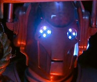
Ivan: The robots are cool, but you need a border. 8/10
Is anyone going to rate my new sig?
Is anyone going to rate my new sig?
#5125

- Disciple
-
- Group: Veterans
- Posts: 2,416
- Joined: 28-August 04
- Location:London
- Interests:stuff :)
Posted 20 May 2006 - 06:52 AM
no
jokes :(
avatar- image is a bit small and the image looks really cool. However, it is of good quality and has a spiffy border ;) 8/10
sig- nice quality image, but it's..a logo, y'know what i mean. But because it IS of super smash bros... 9/10 ;P
overall- 8.5/10
jokes :(
avatar- image is a bit small and the image looks really cool. However, it is of good quality and has a spiffy border ;) 8/10
sig- nice quality image, but it's..a logo, y'know what i mean. But because it IS of super smash bros... 9/10 ;P
overall- 8.5/10
#5126
- High Sheriff
-
- Group: Moderator
- Posts: 11,988
- Joined: 21-July 04
- Gender:Male
- Location:Sitting on a fence and drinking root beer
-
AKA Wind Dude (WD)
Posted 20 May 2006 - 09:42 AM
Wiflewood, on May 10 2006, 02:00 PM, said:
@WD:
http://img137.imageshack.us/img137/5056/ivan4er.jpg
LOL
Alternatively, I found these links on Gamespot. I've not checked them all, but there might be some good ones. The first two look a bit chibi though.
Oh, and *Being Sick emote* @ number 11 'neko'
http://img137.imageshack.us/img137/5056/ivan4er.jpg
LOL
Alternatively, I found these links on Gamespot. I've not checked them all, but there might be some good ones. The first two look a bit chibi though.
Oh, and *Being Sick emote* @ number 11 'neko'
I'm not sure if any of those images really suit my style.
#5127
- Master Adept
-
- Group: Members
- Posts: 3,798
- Joined: 28-December 04
- Gender:Male
- Location:British Columbia, Canada
- Interests:Martial Arts:<br />- Weapons (Bo staff :D)<br />- Chinese, Korean, Japanese, Filipino styles<br /><br />Video Games: <br />Fire Emblem, Zelda, Megaman, Super Smash Bros., Age of Empires/Mythology, Final Fantasy, etc.<br /><br />Movies, Web Design, Foruming-ing-ing, Sprites and Digital Art, Drawing, Writing, Anime, etc.
Posted 20 May 2006 - 10:03 AM
I have a new set now. I hosted it on Imageshack temporarily until I can get my archive back up.
#5128
- The toast in your toaster
-
- Group: Veterans
- Posts: 12,421
- Joined: 04-April 06
- Gender:Male
- Location:The toaster in your kitchen.
- Interests:Parkour, Martial Arts, Music, Network Administration,
-
AKA The toast in the toaster in your kitchen.
Posted 20 May 2006 - 09:07 PM
MD, I'll just rate your avatar: 9/10...the dragon's cool lookin'. :D
#5129
- Lebron James
-
- Group: Veterans
- Posts: 10,366
- Joined: 04-October 04
- Gender:Male
- Location:Winnipeg, MB
Posted 21 May 2006 - 11:59 AM
T:
Avatar: Pretty cool, but takes a while to discern what it is. Nice looking border. 8.5/10
Sig: The real Mr. T could come up with a more original sig than that. 7/10
Overall: Could use some originality. 7/10
Avatar: Pretty cool, but takes a while to discern what it is. Nice looking border. 8.5/10
Sig: The real Mr. T could come up with a more original sig than that. 7/10
Overall: Could use some originality. 7/10
#5130 Guest_robotkiller_*
Posted 21 May 2006 - 12:49 PM
So much hatred, makes me a sad panda.
I like the anime that your avatar is derived from and the gif itself is pretty good.
7.5/10
Arighty my first rate so please be gental.
I like the anime that your avatar is derived from and the gif itself is pretty good.
7.5/10
Arighty my first rate so please be gental.
#5131
- Master Adept
-
- Group: Members
- Posts: 3,798
- Joined: 28-December 04
- Gender:Male
- Location:British Columbia, Canada
- Interests:Martial Arts:<br />- Weapons (Bo staff :D)<br />- Chinese, Korean, Japanese, Filipino styles<br /><br />Video Games: <br />Fire Emblem, Zelda, Megaman, Super Smash Bros., Age of Empires/Mythology, Final Fantasy, etc.<br /><br />Movies, Web Design, Foruming-ing-ing, Sprites and Digital Art, Drawing, Writing, Anime, etc.
Posted 21 May 2006 - 03:57 PM
Robotkiller.
Avatar was done pretty well, I like how you merged the two images. Nice effects. I am far from being a fan of Zim, though. 7/10.
The sig also has pretty nice effects, but again, I don't like Zim. 8/10.
Overall, I hate Zim. 6.5/10
Avatar was done pretty well, I like how you merged the two images. Nice effects. I am far from being a fan of Zim, though. 7/10.
The sig also has pretty nice effects, but again, I don't like Zim. 8/10.
Overall, I hate Zim. 6.5/10
#5132
- The toast in your toaster
-
- Group: Veterans
- Posts: 12,421
- Joined: 04-April 06
- Gender:Male
- Location:The toaster in your kitchen.
- Interests:Parkour, Martial Arts, Music, Network Administration,
-
AKA The toast in the toaster in your kitchen.
Posted 22 May 2006 - 03:34 PM
You're so cruel MD. :D And SoT, I really just croped and added a border. It was a quick job.
RK: Avatar is ok, but I'm not a fan either 8/10 Sig is well done with effects: 9/10 Overall: You did a good job. Not a fan of zim, but a good set: 8.5/10
RK: Avatar is ok, but I'm not a fan either 8/10 Sig is well done with effects: 9/10 Overall: You did a good job. Not a fan of zim, but a good set: 8.5/10
#5133
- Master Adept
-
- Group: Members
- Posts: 3,798
- Joined: 28-December 04
- Gender:Male
- Location:British Columbia, Canada
- Interests:Martial Arts:<br />- Weapons (Bo staff :D)<br />- Chinese, Korean, Japanese, Filipino styles<br /><br />Video Games: <br />Fire Emblem, Zelda, Megaman, Super Smash Bros., Age of Empires/Mythology, Final Fantasy, etc.<br /><br />Movies, Web Design, Foruming-ing-ing, Sprites and Digital Art, Drawing, Writing, Anime, etc.
Posted 22 May 2006 - 03:59 PM
You can go ask Split why I hate Zim. He'll tell ya all about it :)
Mister T. Toasty:
Good shot of Pit, but there are obviously better. A shot of his face, maybe? Nice border, btw. 8/10
The sig's a plain logo, but it's the logo of an awesome game. Little grainy, but not too bad. Again, pretty good border. 7.5/10
Overall, I think you should get more gameplay screens other than logos, it'll look stunning. I suggest MetaKnight, but Pit's one of the cooler characters. 8/10
#5134
- The toast in your toaster
-
- Group: Veterans
- Posts: 12,421
- Joined: 04-April 06
- Gender:Male
- Location:The toaster in your kitchen.
- Interests:Parkour, Martial Arts, Music, Network Administration,
-
AKA The toast in the toaster in your kitchen.
Posted 23 May 2006 - 04:33 PM
I googled SSBB, but I didn't get very many good pics, so this was about what I had to work with. I think some day I'll post all of my past sigs to be rated.
#5135
- Master Adept
-
- Group: Members
- Posts: 3,798
- Joined: 28-December 04
- Gender:Male
- Location:British Columbia, Canada
- Interests:Martial Arts:<br />- Weapons (Bo staff :D)<br />- Chinese, Korean, Japanese, Filipino styles<br /><br />Video Games: <br />Fire Emblem, Zelda, Megaman, Super Smash Bros., Age of Empires/Mythology, Final Fantasy, etc.<br /><br />Movies, Web Design, Foruming-ing-ing, Sprites and Digital Art, Drawing, Writing, Anime, etc.
Posted 23 May 2006 - 04:45 PM
Go to IGN, there are some aswesome screens there.
#5136
- The toast in your toaster
-
- Group: Veterans
- Posts: 12,421
- Joined: 04-April 06
- Gender:Male
- Location:The toaster in your kitchen.
- Interests:Parkour, Martial Arts, Music, Network Administration,
-
AKA The toast in the toaster in your kitchen.
Posted 23 May 2006 - 04:49 PM
K thanks. I'll update my sig once I'm done photoshopping.
I also found some awesome pics of an MG SV XPower. MG is an old British motor company that died off. But it has since been resurected. We have a classic MGB in our garage.
I also found some awesome pics of an MG SV XPower. MG is an old British motor company that died off. But it has since been resurected. We have a classic MGB in our garage.
#5137
- Disciple
-
- Group: Members
- Posts: 1,585
- Joined: 25-October 04
- Gender:Female
- Location:Inside a Jar
- Interests:..Truffles, White Chocolates, Flying, RPGing & a Smile.
Posted 23 May 2006 - 05:03 PM
MD - YEAH high fives for red avatars! xP Love the fireyness. 4/5 on avatar
Mr.T - I like your avatar, but the sig just dont' interests me so much. 7.5/10
Mr.T - I like your avatar, but the sig just dont' interests me so much. 7.5/10
#5138
- The toast in your toaster
-
- Group: Veterans
- Posts: 12,421
- Joined: 04-April 06
- Gender:Male
- Location:The toaster in your kitchen.
- Interests:Parkour, Martial Arts, Music, Network Administration,
-
AKA The toast in the toaster in your kitchen.
Posted 23 May 2006 - 05:16 PM
Somia: Sig&Avie: 8/10 very well done
There, I updated MD. Hopefully it's better. :)
There, I updated MD. Hopefully it's better. :)
#5139
- Master Adept
-
- Group: Members
- Posts: 3,798
- Joined: 28-December 04
- Gender:Male
- Location:British Columbia, Canada
- Interests:Martial Arts:<br />- Weapons (Bo staff :D)<br />- Chinese, Korean, Japanese, Filipino styles<br /><br />Video Games: <br />Fire Emblem, Zelda, Megaman, Super Smash Bros., Age of Empires/Mythology, Final Fantasy, etc.<br /><br />Movies, Web Design, Foruming-ing-ing, Sprites and Digital Art, Drawing, Writing, Anime, etc.
Posted 23 May 2006 - 09:05 PM
Somia:
Pretty nice avatar. One of the smaller ones, you don't see that everyday. good, but you can't see the text to well. Maybe it's me. *shifts contacts around* 8.5/10.
The sig is really well done with nice fade effects and text. 9/10
Overall, I like the colour scheme. (Red rules!) It obviously fits, but there's a slight difference due to the flipped and shrunked avatar. 9/10
Toasty:
I'm just gonna rate the sig. This one's really nicely done, too. Still a little grainy, but it isn't too noticeable. The "Get Ready To Brawl!" is a real eye-catcher. Nice font, tell me where ya got it. Metaknight's one of the cooler characters of the BRAWL batch. 9/10
#5140
- The toast in your toaster
-
- Group: Veterans
- Posts: 12,421
- Joined: 04-April 06
- Gender:Male
- Location:The toaster in your kitchen.
- Interests:Parkour, Martial Arts, Music, Network Administration,
-
AKA The toast in the toaster in your kitchen.
Posted 23 May 2006 - 09:39 PM
The font is called Freshbot if you really want to know. I wish I had magnetto though.
[EDIT] I'll post all the sets I've been making for examples. If I get good enough feed back, I might just make a shop. :)
[EDIT] I'll post all the sets I've been making for examples. If I get good enough feed back, I might just make a shop. :)
#5141
- Disciple
-
- Group: Members
- Posts: 1,000
- Joined: 07-January 05
- Gender:Male
- Location:Manchester, England
Posted 24 May 2006 - 04:36 AM
I'd learn not to save your sigs as JPEGs first. Grainy = Horrible.
#5142
- The toast in your toaster
-
- Group: Veterans
- Posts: 12,421
- Joined: 04-April 06
- Gender:Male
- Location:The toaster in your kitchen.
- Interests:Parkour, Martial Arts, Music, Network Administration,
-
AKA The toast in the toaster in your kitchen.
Posted 24 May 2006 - 03:57 PM
Thanks. I'll keep that in mind.
Here are just a few Avies and Sigs:
Here are just a few Avies and Sigs:
- Avatar: http://img214.imageshack.us/img214/1656/koenigseggccravie1ft.jpg Sig:http://img214.imageshack.us/img214/9827/koenigseggccrsig9pg.jpg
- Avatar: http://img214.imageshack.us/img214/97/lamboconceptsavie7fz.jpg Sig:http://img53.imageshack.us/img53/2725/lamboconceptssig5id.jpg
- Avatar: http://img214.imageshack.us/img214/189/shelbycobraconcpetavie9tj.jpg Sig: I have two possibilities for this one: http://img53.imageshack.us/img53/9752/shelbycobraconceptsig27ws.jpg http://img53.imageshack.us/img53/8324/shelbycobraconceptsig0bj.jpg
- Avatar: http://img214.imageshack.us/img214/4315/ssbbavie13qc.jpg Sig:http://img214.imageshack.us/img214/3189/ssbbsig14dm.jpg
- Avatar: http://img53.imageshack.us/img53/628/ssbbavie25se.jpg Sig:http://img53.imageshack.us/img53/9484/ssbbsig24nz.jpg
- I havn't found a good avie for this one yet. Sig:http://img53.imageshack.us/img53/486/ssbbpitsig5ll.jpg
#5143
- Nebuchadnezzar
-
- Group: Veterans
- Posts: 11,279
- Joined: 16-December 05
- Gender:Male
- Location:37°48′S, 144°57′E.
- Interests:.5% per annum.
-
AKA Spam King
Posted 24 May 2006 - 09:40 PM
I'm getting just a little sick of these car sets now. I like it more when people have faces for their avatars.
#5144

- Knight
-
- Group: Members
- Posts: 80
- Joined: 14-April 06
Posted 24 May 2006 - 10:35 PM
this is what i got for my new avvy, i made it in like, literally, two minutes, so what can i change http://i52.photobucket.com/albums/g21/bigal78/avvy.gif my sig is my sig
#5145
- Nebuchadnezzar
-
- Group: Veterans
- Posts: 11,279
- Joined: 16-December 05
- Gender:Male
- Location:37°48′S, 144°57′E.
- Interests:.5% per annum.
-
AKA Spam King
Posted 24 May 2006 - 11:49 PM
Well, it's definately colourful. I'd expand it so that it fits better in the avatar space (100x100).
#5146
- Disciple
-
- Group: Members
- Posts: 1,585
- Joined: 25-October 04
- Gender:Female
- Location:Inside a Jar
- Interests:..Truffles, White Chocolates, Flying, RPGing & a Smile.
Posted 25 May 2006 - 12:04 PM
issac rules - you coudl add a border aroudn it and yea..I cant' think of anything else atm. it's pretty okay i g uess, the numbers are a bit random. 7.5/10
#5147
- Lebron James
-
- Group: Veterans
- Posts: 10,366
- Joined: 04-October 04
- Gender:Male
- Location:Winnipeg, MB
Posted 25 May 2006 - 12:18 PM
Somia:
Avatar: Goes with the sig, see blubbering praise below. 10/10
Sig: Amazing detail, great coloring, and it's always bonus marks when you have your name in there. 10/10
Overall: 10/10 Another photoshop masterpiece.
Avatar: Goes with the sig, see blubbering praise below. 10/10
Sig: Amazing detail, great coloring, and it's always bonus marks when you have your name in there. 10/10
Overall: 10/10 Another photoshop masterpiece.
#5148
- Disciple
-
- Group: Members
- Posts: 1,000
- Joined: 07-January 05
- Gender:Male
- Location:Manchester, England
Posted 25 May 2006 - 01:24 PM
SOT: I'm glad you got rid of the car sig, I didn't really like it that much, the avatar still looks good on its own though, not much you can do to improve there.
And of course that Last.fm play thing rocks. And so do Disturbed.
8/10. very good set.
Can someone please rate my new sig?
And of course that Last.fm play thing rocks. And so do Disturbed.
8/10. very good set.
Can someone please rate my new sig?
#5149
- Nebuchadnezzar
-
- Group: Veterans
- Posts: 11,279
- Joined: 16-December 05
- Gender:Male
- Location:37°48′S, 144°57′E.
- Interests:.5% per annum.
-
AKA Spam King
Posted 25 May 2006 - 04:38 PM
Wiflewood
Avatar: Kind of gross...it looks like somebody having their hair torn out. 5/10
Signature: It isn't really that special. It literally looks like something a 5 year old could draw. 3.5/10
Overall: It's a very weird set, I must say. 4.5/10
Avatar: Kind of gross...it looks like somebody having their hair torn out. 5/10
Signature: It isn't really that special. It literally looks like something a 5 year old could draw. 3.5/10
Overall: It's a very weird set, I must say. 4.5/10
#5150
- The toast in your toaster
-
- Group: Veterans
- Posts: 12,421
- Joined: 04-April 06
- Gender:Male
- Location:The toaster in your kitchen.
- Interests:Parkour, Martial Arts, Music, Network Administration,
-
AKA The toast in the toaster in your kitchen.
Posted 25 May 2006 - 05:30 PM
Why doesn't anybody rate all of my sigs And Avatars I made? ( see page 343 )
#5151
- Lebron James
-
- Group: Veterans
- Posts: 10,366
- Joined: 04-October 04
- Gender:Male
- Location:Winnipeg, MB
Posted 25 May 2006 - 07:28 PM
Why should we? You come on and demand so much! Try one at a time next time around.
Wifle:
Avatar: Very creative. I think it looks like a crazy swirl. Is it an album cover or something? 9/10
Sig: Where some people see 5 year old art, others see creativity. Different. That's all I have to say. And the Last.fm is sweet as well.
8/10
Overall: They don't match, but I won't take off too much for that. 8/10
#5152
- Disciple
-
- Group: Members
- Posts: 1,585
- Joined: 25-October 04
- Gender:Female
- Location:Inside a Jar
- Interests:..Truffles, White Chocolates, Flying, RPGing & a Smile.
Posted 25 May 2006 - 07:58 PM
Wiflewood - It's er...different. I like the idea of trying something new, I'll give you that much. The avatar is a bit rough. 6.5/10
#5153
- Master Adept
-
- Group: Members
- Posts: 3,798
- Joined: 28-December 04
- Gender:Male
- Location:British Columbia, Canada
- Interests:Martial Arts:<br />- Weapons (Bo staff :D)<br />- Chinese, Korean, Japanese, Filipino styles<br /><br />Video Games: <br />Fire Emblem, Zelda, Megaman, Super Smash Bros., Age of Empires/Mythology, Final Fantasy, etc.<br /><br />Movies, Web Design, Foruming-ing-ing, Sprites and Digital Art, Drawing, Writing, Anime, etc.
Posted 25 May 2006 - 08:03 PM
Wifle:
For your avatar, I wouldn't really call it weird, but unique. As SOT said, creative. Nice colours cheme, too. 8.5/10
I can't say your sig is bland, but it looks innovative. The reason being that the links on the white space indicate you did NOT lift your pencil from your paper. 9.5/10
Overall, they don't match as a set, but are pretty interesting. 9/10
EDIT: I hate my keyboard. Thanks for pointing it out before everyone started giving me wedding gifts, Somia. n.n;
#5154
- Disciple
-
- Group: Members
- Posts: 1,585
- Joined: 25-October 04
- Gender:Female
- Location:Inside a Jar
- Interests:..Truffles, White Chocolates, Flying, RPGing & a Smile.
Posted 25 May 2006 - 08:59 PM
xDDD MD wrote "Wife" instead of "Wifle".
Mr.T - you keep on changing it, but it's all the same game, nice screenies, i just don't like those colours alot u_u 8/10
Mr.T - you keep on changing it, but it's all the same game, nice screenies, i just don't like those colours alot u_u 8/10
#5155
- Nebuchadnezzar
-
- Group: Veterans
- Posts: 11,279
- Joined: 16-December 05
- Gender:Male
- Location:37°48′S, 144°57′E.
- Interests:.5% per annum.
-
AKA Spam King
Posted 25 May 2006 - 09:00 PM
Is it just me or does Toasty seem really desperate about having a good set?
#5156
- The toast in your toaster
-
- Group: Veterans
- Posts: 12,421
- Joined: 04-April 06
- Gender:Male
- Location:The toaster in your kitchen.
- Interests:Parkour, Martial Arts, Music, Network Administration,
-
AKA The toast in the toaster in your kitchen.
Posted 25 May 2006 - 11:47 PM
No, I'm just experimenting. I want to see what people think is good or not. Besides, I wanted a sig for SSBB, and since my first one didn't turn out, I made this one. As for all of the sigs, I just had spare time on my hands, and I enjoy makeing sets.
[EDIT] I'll just put up my new sigs, and once I get three to four rateings, I'll put up the next set. And Split, if you're going to rate the car ones bad just because they're common, I won't count yours. Anyway, your avatar's good, but it realy needs a border, even if it's just plain black. 6/10
[EDIT] I'll just put up my new sigs, and once I get three to four rateings, I'll put up the next set. And Split, if you're going to rate the car ones bad just because they're common, I won't count yours. Anyway, your avatar's good, but it realy needs a border, even if it's just plain black. 6/10
#5157
- Disciple
-
- Group: Members
- Posts: 1,000
- Joined: 07-January 05
- Gender:Male
- Location:Manchester, England
Posted 26 May 2006 - 03:18 AM
Thanks for the ratings everyone.
@Toasty: don't bother putting up the other sets. If they're all just pictures of cars, with the same border, same font and same font colours, you'll just get the same rating. Try something new or origonal, all your sets are just the same.
As for your current set with the orange car, the avatar looks too dark, and you've yet again saved them as .jpgs. How silly of you, as I said before, it makes it all blurry. Save them as a '.PNG'
5/10 all together.
@SOT: It's not an album cover, it's a picture of my eye, edited in paintshop pro.
#5158
- Disciple
-
- Group: Veterans
- Posts: 2,416
- Joined: 28-August 04
- Location:London
- Interests:stuff :)
Posted 26 May 2006 - 10:02 AM
I was going to do the usual thing of rating everyone sets on this page but..cant be bothered :)
WIFLE
avatar- I actually like how you manipulated you photo. It's just...cool 9/10, mainly for originality
sig- a sig of nothing but greys (yes GREYS not GRAY >P) I like the rough effect produced 9/10
overall- 9/10
rate mine, aint spectacular but meh
WIFLE
avatar- I actually like how you manipulated you photo. It's just...cool 9/10, mainly for originality
sig- a sig of nothing but greys (yes GREYS not GRAY >P) I like the rough effect produced 9/10
overall- 9/10
rate mine, aint spectacular but meh
#5159
- Master Adept
-
- Group: Members
- Posts: 3,021
- Joined: 14-December 04
- Gender:Female
- Location:Brynmawr
-
AKA Love_Guardian_Yuki, Zimmy
Posted 27 May 2006 - 09:25 PM
MISS KIK
I love Bleach with a anime passion. That black butterfly rockssss.
As for your avatar, it mezmerizes me @.@ And I got a headache x3;
And your sig matcheseses so I like it!
9/10
^.^
Note: Mine was not supposed to match. Well...it does. Because they're both Kingdom Hearts 2 O:!
I love Bleach with a anime passion. That black butterfly rockssss.
As for your avatar, it mezmerizes me @.@ And I got a headache x3;
And your sig matcheseses so I like it!
9/10
^.^
Note: Mine was not supposed to match. Well...it does. Because they're both Kingdom Hearts 2 O:!
#5160

- Master Adept
-
- Group: Veterans
- Posts: 3,679
- Joined: 26-August 04
- Gender:Female
Posted 04 June 2006 - 06:55 PM
x.X Whoa. I haven't been here in a while.
Lemme see...lemme see...@.@
Kiku - o.O Hey! Look! Matching! I love the black butterfly...it rocks...
You know your avatar makes me wanna swap it in a net? XD;; 9/10
Yuki - o.O Haha. Roxas. Both from Kingdom Hearts 2...well the siggy gots the lyrics. 6-7/10
Somia - 9-10/10 o_O I really can't decide. It has radiant colors ~ which I love ~ and in the signature I spot another girl. @.@ I forgot her name. *click*
Yay~!
Note: Nariko_Shina is my other nickname on another forum. o.O
#5161
- Nebuchadnezzar
-
- Group: Veterans
- Posts: 11,279
- Joined: 16-December 05
- Gender:Male
- Location:37°48′S, 144°57′E.
- Interests:.5% per annum.
-
AKA Spam King
Posted 05 June 2006 - 12:55 PM
I added a border, since everybody keeps saying I should have one.
http://img106.imageshack.us/img106/7315/317lz.jpg http://img193.imageshack.us/img193/4600/sora20en.png
http://img106.imageshack.us/img106/7315/317lz.jpg http://img193.imageshack.us/img193/4600/sora20en.png
#5162
- Master Adept
-
- Group: Members
- Posts: 3,798
- Joined: 28-December 04
- Gender:Male
- Location:British Columbia, Canada
- Interests:Martial Arts:<br />- Weapons (Bo staff :D)<br />- Chinese, Korean, Japanese, Filipino styles<br /><br />Video Games: <br />Fire Emblem, Zelda, Megaman, Super Smash Bros., Age of Empires/Mythology, Final Fantasy, etc.<br /><br />Movies, Web Design, Foruming-ing-ing, Sprites and Digital Art, Drawing, Writing, Anime, etc.
Posted 05 June 2006 - 08:10 PM
Lin: Avatar looks pretty awesome, but the words are hard to read. Maybe it's just me... 9/10. The sig's looking great, too. Excellent work, 9.5/10. Overall, the colour tone matches nicely and the effects look nice on both the avatar and sig. 9/10
#5163
- The toast in your toaster
-
- Group: Veterans
- Posts: 12,421
- Joined: 04-April 06
- Gender:Male
- Location:The toaster in your kitchen.
- Interests:Parkour, Martial Arts, Music, Network Administration,
-
AKA The toast in the toaster in your kitchen.
Posted 05 June 2006 - 09:51 PM
Split: Much better. The border makes it seem more....I dunno. But you copied my style. B) 8/10
#5164
- Disciple
-
- Group: Members
- Posts: 1,000
- Joined: 07-January 05
- Gender:Male
- Location:Manchester, England
Posted 06 June 2006 - 05:13 AM
Of course Toasty. No one else on the internet has a border like yours.
GJ Split.
GJ Split.
#5165
- Lebron James
-
- Group: Veterans
- Posts: 10,366
- Joined: 04-October 04
- Gender:Male
- Location:Winnipeg, MB
Posted 06 June 2006 - 11:11 AM
Wifle:
Avatar: I've rated it before. Very creative, once again.
Sig: I like the color scheme on that one, but I still like mine better. B) 8/10
Avatar: I've rated it before. Very creative, once again.
Sig: I like the color scheme on that one, but I still like mine better. B) 8/10
#5166
- Master Adept
-
- Group: Members
- Posts: 3,798
- Joined: 28-December 04
- Gender:Male
- Location:British Columbia, Canada
- Interests:Martial Arts:<br />- Weapons (Bo staff :D)<br />- Chinese, Korean, Japanese, Filipino styles<br /><br />Video Games: <br />Fire Emblem, Zelda, Megaman, Super Smash Bros., Age of Empires/Mythology, Final Fantasy, etc.<br /><br />Movies, Web Design, Foruming-ing-ing, Sprites and Digital Art, Drawing, Writing, Anime, etc.
Posted 06 June 2006 - 08:08 PM
SoT:
Avatar: Now that's what I call a car. Flashing me the tail-end is she? B) 9.5/10
Sig: Goes well with the colour scheme of the set. 8.5/10
Overall: It doesn't match image wise, but I love the colour scheme. Black's a pretty dramatic colour. 9/10
Avatar: Now that's what I call a car. Flashing me the tail-end is she? B) 9.5/10
Sig: Goes well with the colour scheme of the set. 8.5/10
Overall: It doesn't match image wise, but I love the colour scheme. Black's a pretty dramatic colour. 9/10
#5167
- Disciple
-
- Group: Veterans
- Posts: 2,333
- Joined: 27-January 04
- Location:California, USA
-
AKA Horasu
Posted 06 June 2006 - 08:15 PM
*Sigh* Because I'm forced to...
Mars Djinni, 7/10. Plain, but not a bad thing.
Mars Djinni, 7/10. Plain, but not a bad thing.
#5168
- Lebron James
-
- Group: Veterans
- Posts: 10,366
- Joined: 04-October 04
- Gender:Male
- Location:Winnipeg, MB
Posted 07 June 2006 - 07:41 AM
MW:
Avatar: It's good to see something outside of squares. Cool color scheme as well. 9.5/10
Sig: The color scheme matches, and once again the MS images are great. 9.5/10
Overall: Very good, but because I don't like the ice blue theme, even though it is cool, I'll give you 9.5/10
Avatar: It's good to see something outside of squares. Cool color scheme as well. 9.5/10
Sig: The color scheme matches, and once again the MS images are great. 9.5/10
Overall: Very good, but because I don't like the ice blue theme, even though it is cool, I'll give you 9.5/10
#5169
- The toast in your toaster
-
- Group: Veterans
- Posts: 12,421
- Joined: 04-April 06
- Gender:Male
- Location:The toaster in your kitchen.
- Interests:Parkour, Martial Arts, Music, Network Administration,
-
AKA The toast in the toaster in your kitchen.
Posted 08 June 2006 - 04:41 PM
SoT: Sig: Where is it? 6/10, not much there. Avie: 9/10, I made it ;) Overall: 8/10
#5170
- Berserker
-
- Group: Members
- Posts: 477
- Joined: 23-April 06
- Gender:Male
- Location:The Netherlands, Zeeland.
Posted 10 June 2006 - 07:00 AM
Hmph.. it's ok I guess. You people need new ideas...
Now rate mine!!!
Now rate mine!!!
#5171
- Disciple
-
- Group: Members
- Posts: 2,013
- Joined: 27-May 06
- Gender:Male
- Location:Your local pharmacist
- Interests:Drums, Guitar Hero, pretending to play guitar, getting awesome at the one song I know how to play on bass, school(yeah, I'm such a loser) music, mohney, etc.<br /><br />I suppose I'll give you an abbreviated list of bands that I like:<br />Relient K<br />Switchfoot<br />Guster<br />Angels and Airwaves<br />Arcade Fire<br />Porcupine Tree<br />Weezer<br />Mae<br /><br />It's sorta a weird mix of mainstream and not so mainstream.<br />I like a lot of single songs too...<br /><br />Bands I need to look at:<br />Plastic Constellations<br />Cauterize<br />Patent Pending<br />And a bunch of local bands that you'll probably never hear of.<br /><br />Pandora rocks.<br /><br />I'm running out of things to say here.<br /><br />Perhaps I like duct tape?<br /><br />Yeah. This likely won't be touched for another year when my tastes have completely changed.<br />
Posted 10 June 2006 - 08:17 AM
Your avatar is interesting...I can't exactly read whats on his shirt...8.5/10
Sig is uhhh...creative? 7/10
Overall: 8/10
Rate me!
Sig is uhhh...creative? 7/10
Overall: 8/10
Rate me!
#5172
- High Sheriff
-
- Group: Moderator
- Posts: 11,988
- Joined: 21-July 04
- Gender:Male
- Location:Sitting on a fence and drinking root beer
-
AKA Wind Dude (WD)
Posted 10 June 2006 - 11:45 AM
It says hi, and it's a little annoying now.
#5173
- Disciple
-
- Group: Members
- Posts: 1,585
- Joined: 25-October 04
- Gender:Female
- Location:Inside a Jar
- Interests:..Truffles, White Chocolates, Flying, RPGing & a Smile.
Posted 13 June 2006 - 06:35 PM
MW - Cute, another one of those MS sets, but still cute nontheless. Just the image needs better quality, other wise I like the shapes and colour and..yea. 9/10
Mindpatch - It's that archer girl o.o 8/10
FlamingDuck - Nice avvie, bery firey? o.o But the sig is just erm...yea. SHRINK EET >.> 7.5/10 overall
Mindpatch - It's that archer girl o.o 8/10
FlamingDuck - Nice avvie, bery firey? o.o But the sig is just erm...yea. SHRINK EET >.> 7.5/10 overall
#5174
- Nebuchadnezzar
-
- Group: Veterans
- Posts: 11,279
- Joined: 16-December 05
- Gender:Male
- Location:37°48′S, 144°57′E.
- Interests:.5% per annum.
-
AKA Spam King
Posted 13 June 2006 - 09:37 PM
Mr.T, on Jun 6 2006, 01:51 PM, said:
Split: Much better. The border makes it seem more....I dunno. But you copied my style. :P
How can I have copied your style when I suggested it in the first place? Quote:
Split Infinity, on Apr 29 2006, 03:43 PM, said:
You know why it's not showing? Because your set is so dark. Try giving it a black border, and then put a white border inside of that. It should turn out really nice.
#5175
- Master Adept
-
- Group: Veterans
- Posts: 2,770
- Joined: 28-January 04
- Gender:Male
- Location:London, UK
- Interests:Video Games & Hentai
-
AKA Anubis or Anu-chan
Posted 14 June 2006 - 12:36 AM
Blasphemy. Who the f*ck makes a 100x90 pixel avatar. Burn, traitor! -10/10, fool!
#5176
- Berserker
-
- Group: Members
- Posts: 477
- Joined: 23-April 06
- Gender:Male
- Location:The Netherlands, Zeeland.
Posted 14 June 2006 - 04:35 AM
Your avatar looks to nice for your forum personality. xD
Yay, I added a signature.
Yay, I added a signature.
#5177

- Knight
-
- Group: Members
- Posts: 78
- Joined: 08-October 04
- Gender:Male
- Location:Virginia,USA
- Interests:Alot of things
Posted 14 June 2006 - 05:28 PM
At least yours are good,MindPatch.Mine are most terrible,both sig and avi. -.-;
#5178
- Nebuchadnezzar
-
- Group: Veterans
- Posts: 11,279
- Joined: 16-December 05
- Gender:Male
- Location:37°48′S, 144°57′E.
- Interests:.5% per annum.
-
AKA Spam King
Posted 14 June 2006 - 07:50 PM
Hey...it really does look better in 100x100. Thanks Mr. Egyptian Dog guy! :P
#5179
- Master Adept
-
- Group: Veterans
- Posts: 2,770
- Joined: 28-January 04
- Gender:Male
- Location:London, UK
- Interests:Video Games & Hentai
-
AKA Anubis or Anu-chan
Posted 16 June 2006 - 02:54 AM
Egyptian GOD, not DOG. Type it backwards, b*tch.
#5180
- Nebuchadnezzar
-
- Group: Veterans
- Posts: 11,279
- Joined: 16-December 05
- Gender:Male
- Location:37°48′S, 144°57′E.
- Interests:.5% per annum.
-
AKA Spam King
Posted 16 June 2006 - 05:53 AM
Anubis had the head of a jackal, if I remember correctly.
I though it was time I gave myself a new 'face'. Any suggestions for an accompanying signature?
http://img73.imageshack.us/img73/1273/ultimaavatar8mw.png http://img71.imageshack.us/img71/3537/ultimaavatar22br.png
I though it was time I gave myself a new 'face'. Any suggestions for an accompanying signature?
http://img73.imageshack.us/img73/1273/ultimaavatar8mw.png http://img71.imageshack.us/img71/3537/ultimaavatar22br.png
#5181
- Master Adept
-
- Group: Veterans
- Posts: 2,770
- Joined: 28-January 04
- Gender:Male
- Location:London, UK
- Interests:Video Games & Hentai
-
AKA Anubis or Anu-chan
Posted 16 June 2006 - 05:34 PM
Yeah, something that isn't a quote, and looks pretty. Something funny would be a bonus.
Yes, Anubis had the head of a Jackal. But don't forget he was the God of the underworld. It's like calling a Ferrari Enzo just an "Itallian Car", you're missing the main detail. Punk.
Yes, Anubis had the head of a Jackal. But don't forget he was the God of the underworld. It's like calling a Ferrari Enzo just an "Itallian Car", you're missing the main detail. Punk.
#5182
- Nebuchadnezzar
-
- Group: Veterans
- Posts: 11,279
- Joined: 16-December 05
- Gender:Male
- Location:37°48′S, 144°57′E.
- Interests:.5% per annum.
-
AKA Spam King
Posted 16 June 2006 - 05:35 PM
Is the avatar showing up correctly for you? On my computer, it cuts off the bottom and right edges of the border.
#5183
- Master Adept
-
- Group: Veterans
- Posts: 2,770
- Joined: 28-January 04
- Gender:Male
- Location:London, UK
- Interests:Video Games & Hentai
-
AKA Anubis or Anu-chan
Posted 16 June 2006 - 05:49 PM
Yeah, same on my screen. Buttom and Right sides don't have borders. Fix it.
#5184
- Nebuchadnezzar
-
- Group: Veterans
- Posts: 11,279
- Joined: 16-December 05
- Gender:Male
- Location:37°48′S, 144°57′E.
- Interests:.5% per annum.
-
AKA Spam King
Posted 16 June 2006 - 05:52 PM
The source image is normal, it just breaks down when set to an avatar.
[EDIT] I resized the image to 99x99 and for some reason it works now.
[EDIT] I resized the image to 99x99 and for some reason it works now.
#5185
- Disciple
-
- Group: Veterans
- Posts: 2,428
- Joined: 04-June 04
- Gender:Male
- Location:'straya
-
AKA sibsag, Lemontime
Posted 16 June 2006 - 09:19 PM
Please rate my new MPH themed Set..
Split:
I liked your old ones better. 6/10.
Split:
I liked your old ones better. 6/10.
#5186
- The toast in your toaster
-
- Group: Veterans
- Posts: 12,421
- Joined: 04-April 06
- Gender:Male
- Location:The toaster in your kitchen.
- Interests:Parkour, Martial Arts, Music, Network Administration,
-
AKA The toast in the toaster in your kitchen.
Posted 16 June 2006 - 09:49 PM
Avatar: 5/10.....what the heck is it?
Sig: 8/10 It's pretty good, but I'd use a slightly different font.
Overall: 6.5/10 You need a better avatar
Sig: 8/10 It's pretty good, but I'd use a slightly different font.
Overall: 6.5/10 You need a better avatar
#5187
- Disciple
-
- Group: Veterans
- Posts: 2,428
- Joined: 04-June 04
- Gender:Male
- Location:'straya
-
AKA sibsag, Lemontime
Posted 16 June 2006 - 10:17 PM
Mr.T, on Jun 16 2006, 10:49 PM, said:
Avatar: 5/10.....what the heck is it?
Sig: 8/10 It's pretty good, but I'd use a slightly different font.
Overall: 6.5/10 You need a better avatar
Sig: 8/10 It's pretty good, but I'd use a slightly different font.
Overall: 6.5/10 You need a better avatar
Avatar: A picture of the red guys head.
Sig: What font would you suggest? Please help me ^^
#5188
- The toast in your toaster
-
- Group: Veterans
- Posts: 12,421
- Joined: 04-April 06
- Gender:Male
- Location:The toaster in your kitchen.
- Interests:Parkour, Martial Arts, Music, Network Administration,
-
AKA The toast in the toaster in your kitchen.
Posted 17 June 2006 - 12:01 AM
Try Freshbot. I think it'd go better, but that's just my opinion.
#5189
- Master Adept
-
- Group: Veterans
- Posts: 2,770
- Joined: 28-January 04
- Gender:Male
- Location:London, UK
- Interests:Video Games & Hentai
-
AKA Anubis or Anu-chan
Posted 17 June 2006 - 12:54 AM
Sibsaq, your signature is far too large and to make matters worse you didn't even bother make good use of the huge amount of space you gave yourself. If you don't have a reason to make your image large, then don't make it large in the first place.
#5190
- Master Adept
-
- Group: Members
- Posts: 3,021
- Joined: 14-December 04
- Gender:Female
- Location:Brynmawr
-
AKA Love_Guardian_Yuki, Zimmy
Posted 17 June 2006 - 03:59 AM
Anubis: Yay it's Sora :D <3 I'd like your avatar better if the writing went behind Sora, but that's just me. I'll only rate your avatar because...yeah.
Avie: 7/10
Avie: 7/10
#5191
- Nebuchadnezzar
-
- Group: Veterans
- Posts: 11,279
- Joined: 16-December 05
- Gender:Male
- Location:37°48′S, 144°57′E.
- Interests:.5% per annum.
-
AKA Spam King
Posted 18 June 2006 - 05:13 AM
Daymn Yuki, your avatar reminds me of how much I want that game...
#5192
- Disciple
-
- Group: Veterans
- Posts: 1,657
- Joined: 08-June 04
- Gender:Male
- Location:Karratha, Australia
- Interests:Gaming, Driving, Water sports, Karate, Magic the Gathering, Reading fantasy novels, My job (Holy crap im so glad I can say that), Lots of Music, Photography and so on.
-
AKA Memories Remain
Posted 19 June 2006 - 08:04 AM
Mr. T: Nice car.
sib: The sig is just... a big mess. It took me like 10 seconds to work out what it was. And the avatar is... well, a mess. At least they match though.
Anubis: At first the thought the idea of having little tiny scribble that looks like writing was a stupid idea. But it's growing on me. Im liking how the colour matches that Gamercard thing as well.
Yuki: If "{ My Sanctuary }" linked to something then yeah, it'd probably be cool and worthwhile. But since it doesn't, it's just... sporadic. But hell, it probably as some deep and profound meaning to you, yes? =)
#5193
- Nebuchadnezzar
-
- Group: Veterans
- Posts: 11,279
- Joined: 16-December 05
- Gender:Male
- Location:37°48′S, 144°57′E.
- Interests:.5% per annum.
-
AKA Spam King
Posted 19 June 2006 - 03:22 PM
Memories Remain
Avatar: Blank! -/10
Signature: Go Aussie! :P If you made it yourself, I'll give it a 9. If it's just a screenshot, send my regards to MapleStory.
Overall: 9/10 (duh)
Avatar: Blank! -/10
Signature: Go Aussie! :P If you made it yourself, I'll give it a 9. If it's just a screenshot, send my regards to MapleStory.
Overall: 9/10 (duh)
#5194
- Master Adept
-
- Group: Members
- Posts: 3,021
- Joined: 14-December 04
- Gender:Female
- Location:Brynmawr
-
AKA Love_Guardian_Yuki, Zimmy
Posted 19 June 2006 - 05:25 PM
Yes! Sanctuary is such a good song! And it's the opening theme for Kingdom Hearts 2.
#5195

- Master Adept
-
- Group: Veterans
- Posts: 3,165
- Joined: 10-October 04
- Gender:Male
- Location:Sydney, Australia
-
AKA watch
Posted 20 June 2006 - 11:27 PM
Yuki
I don't like the picture for the avatar, It just doesn't look like Sora and Riku...
Sig-Good song, try Passion aswell, even though Passon is the jap version it's still good.
Overall-KH2 ROCKS :)
I don't like the picture for the avatar, It just doesn't look like Sora and Riku...
Sig-Good song, try Passion aswell, even though Passon is the jap version it's still good.
Overall-KH2 ROCKS :)
#5196
- Nebuchadnezzar
-
- Group: Veterans
- Posts: 11,279
- Joined: 16-December 05
- Gender:Male
- Location:37°48′S, 144°57′E.
- Interests:.5% per annum.
-
AKA Spam King
Posted 20 June 2006 - 11:30 PM
watch
Avatar: None? -/10
Signature: It's too dark, yet too bright at the same time. The border is too obscure. 4/10
Overall: 4/10
Don't rate me. My set isn't in a good mood.
Avatar: None? -/10
Signature: It's too dark, yet too bright at the same time. The border is too obscure. 4/10
Overall: 4/10
Don't rate me. My set isn't in a good mood.
#5197
- Berserker
-
- Group: Members
- Posts: 477
- Joined: 23-April 06
- Gender:Male
- Location:The Netherlands, Zeeland.
Posted 21 June 2006 - 04:59 AM
Avatar is nice, everybody's gotta love Sora. 8/10 because it's been there for quite a while now.
Signature... That's... different.. 2 Nicknames in a box, I don't get it.
Sorry for rating you. :)
Signature... That's... different.. 2 Nicknames in a box, I don't get it.
Sorry for rating you. :)
#5198
- Lebron James
-
- Group: Veterans
- Posts: 10,366
- Joined: 04-October 04
- Gender:Male
- Location:Winnipeg, MB
Posted 21 June 2006 - 08:08 AM
Mindpatch:
Avatar: Very grown up, it takes the musk of noob off your membership. Good colour scheme. 9/10
Sig: It matches, so the same deal. 9/10
Overall: Nice match, maybe a bit more detail in the signature would help. 9/10
Avatar: Very grown up, it takes the musk of noob off your membership. Good colour scheme. 9/10
Sig: It matches, so the same deal. 9/10
Overall: Nice match, maybe a bit more detail in the signature would help. 9/10
#5199
- Master Adept
-
- Group: Members
- Posts: 3,021
- Joined: 14-December 04
- Gender:Female
- Location:Brynmawr
-
AKA Love_Guardian_Yuki, Zimmy
Posted 21 June 2006 - 02:45 PM
watch, on Jun 20 2006, 10:27 PM, said:
Yuki
I don't like the picture for the avatar, It just doesn't look like Sora and Riku...
Sig-Good song, try Passion aswell, even though Passon is the jap version it's still good.
Overall-KH2 ROCKS :P
I don't like the picture for the avatar, It just doesn't look like Sora and Riku...
Sig-Good song, try Passion aswell, even though Passon is the jap version it's still good.
Overall-KH2 ROCKS :P
Ha ha I have both versions :D
But I want the remixed version. KH2 is the new street drug.
#5200
- Master Adept
-
- Group: Veterans
- Posts: 3,165
- Joined: 10-October 04
- Gender:Male
- Location:Sydney, Australia
-
AKA watch
Posted 21 June 2006 - 08:00 PM
Yea I know. I heard Passion on the KH2 trailer and downloaded it. Then I found after the battle and Scantuary, then I found the Jap version of Simple and Clean.
:)
:)